Teammates: Instructor: edit course: make panel responsive
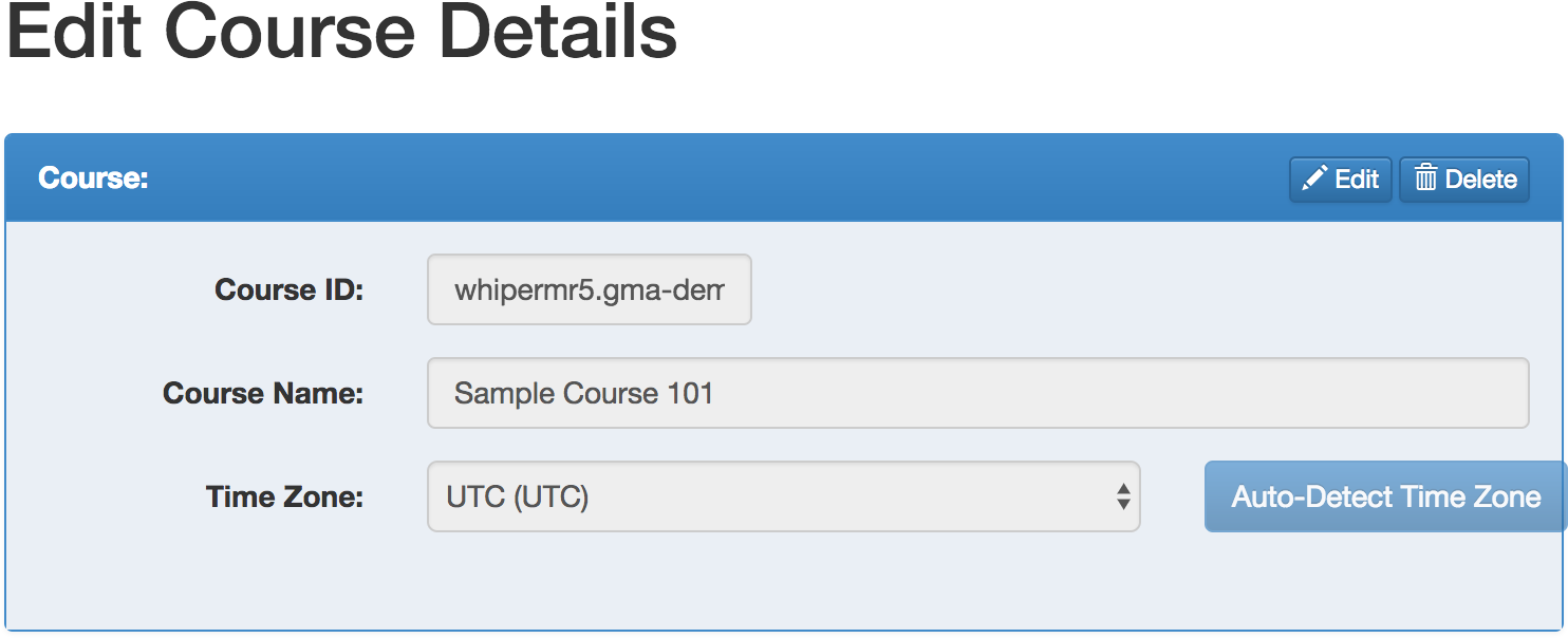
Noticed from #7841. At certain sm resolutions, the detect time zone button protrudes out:
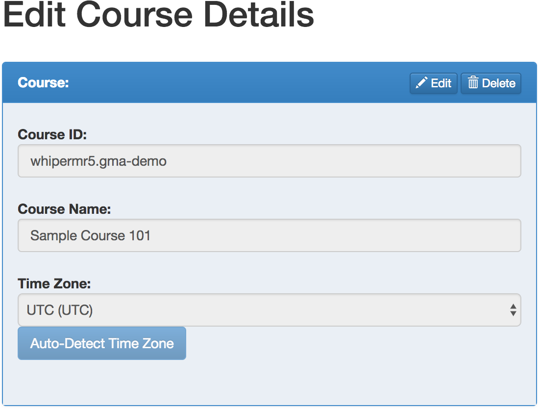
At xs resolutions, the button is stuck to the bottom of the select input (https://github.com/TEAMMATES/teammates/issues/7841#issuecomment-317754739):
 whipermr5
All 7 comments
@whipermr5 So what should be the correct way?? :-)
 stanislous
on 27 Jul 2017
stanislous
on 27 Jul 2017
@stanislous From the sm resolution screenshot you can see that the button is sticking out of the panel. That shouldn't happen and it should instead be resized to fit in the panel. In the xs resolution screenshot, you can see that the button sticks to the timezone dropdown. That shouldn't happen either and instead there should be the expected spacing between two form elements.
If you're not working on this, may I take it?
 HirdayGupta
on 27 Jul 2017
HirdayGupta
on 27 Jul 2017
@HirdayGupta it's OK. You can work on this. :-)
stanislous
on 27 Jul 2017
@damithc Sir, what's the lowest screen resolution that we support?
Also, @whipermr5, there are two approaches to solving this problem. The first, easy one, is to fix the behaviour at the individual levels of sm and xs without bothering to fix the underlying problem of why the elements (which are never more than 12 columsn) over flow in the first place. This is pretty straightforward and I have code for this approach ready for a PR.
The second, more complicated one, is to fix the underlying problem of why even 12 columns cause a horizontal overflow in the panel. I have been trying to figure this out over the past couple days, looking at the documentation for all the stock bootstrap classes we are using, but I cannot seem to figure it out. This approach is much harder, and in my opinion not worth the added effort even though it is, technically, 'the right thing to do.'
Which approach would you recommend?
HirdayGupta
on 1 Aug 2017
@damithc Sir, what's the lowest screen resolution that we support?
Not sure myself. What's the latest norm out there? Any input from other devs?
 damithc
on 1 Aug 2017
damithc
on 1 Aug 2017
@HirdayGupta The overflow happens because the button is only given col-sm-1 when its width requires more than one column. From trying, the button requires 4 columns at the width shown in the screenshot. Currently, the time zone label is given 3 columns and the dropdown is given 6 (so only 10 columns are utilised). We can redistribute it such that the dropdown is given 5 and the button is given 4. There is no underlying problem with bootstrap; it is our erroneous usage of it that results in such defects.
As for lowest resolution, I usually resize the browser window to the smallest possible width (it stops resizing beyond a certain width). As long as the UI still looks good at that width, it passes.
whipermr5
on 1 Aug 2017
There is no underlying problem with bootstrap; it is our erroneous usage of it that results in such defects.
@whipermr5 I see! My bad 😅.
The overflow happens because the button is only given col-sm-1 when its width requires more than one column. From trying, the button requires 4 columns at the width shown in the screenshot. Currently, the time zone label is given 3 columns and the dropdown is given 6 (so only 10 columns are utilised). We can redistribute it such that the dropdown is given 5 and the button is given 4
I had figured out the col-sm-1 thing haha. Just thought that there might've been a root problem that needed solving. The 5-4 distribution was my first solution, which I thought was inadequate :p.
Submitting a PR with my original solution soon :)
HirdayGupta
on 4 Aug 2017
Related issues
 rchliu
·
3Comments
damithc
·
4Comments
rchliu
·
3Comments
damithc
·
4Comments
 keoren3
·
3Comments
keoren3
·
3Comments
 Derek-Hardy
·
3Comments
Derek-Hardy
·
3Comments
 wkurniawan07
·
4Comments
wkurniawan07
·
4Comments
Most helpful comment
@whipermr5 I see! My bad 😅.
I had figured out the
col-sm-1thing haha. Just thought that there might've been a root problem that needed solving. The5-4distribution was my first solution, which I thought was inadequate :p.Submitting a PR with my original solution soon :)