Tasks: Adjust checkbox design to Nextcloud
We should adjust the checkboxes in Tasks to look like the core Nextcloud ones. :)
Compare:


See https://twitter.com/despens/status/1151098437875699719 by @despens
Documentation for how to do Nextcloud-style checkboxes are at https://docs.nextcloud.com/server/latest/developer_manual/design/html.html#checkboxes-and-radios
cc @nextcloud/tasks @nextcloud/designers
 jancborchardt
All 14 comments
I don't know, this looks really weird to me:

The checkbox is to small and it doesn't use the Tasks app icon anymore as the checkmark.
 raimund-schluessler
on 16 Jul 2019
raimund-schluessler
on 16 Jul 2019
The size of the checkbox is adjustable, right @skjnldsv @juliushaertl?
And then we can adjust the Tasks app icon too, being a checkmark in a box. I can do that. :)
jancborchardt
on 16 Jul 2019
And then we can adjust the Tasks app icon too, being a checkmark in a box. I can do that. :)
My argument with the same icon does not work in this direction 😉 I don't think we should change the app icon. The icon is
- clear, simple and friendly
- unambiguously
- used for many years
If you really think we have to adjust the checkboxes, I can live with it. I just wonder if the nextcloud design checkboxes might be understood as selecting a task rather than completing it.
raimund-schluessler
on 16 Jul 2019
I'd appreciate if the look of checkboxes was unified across Nextcloud apps.
Users see dozens of differently styled checkboxes all the time, in different desktop and web apps, not even to mention mobile apps. If it looks remotely like a checkbox they will assume it is a checkbox. :wink:
Also, there are tons of apps that use checkboxes for completing tasks, so for usability the exact styling is not an issue. But it would just be nice if at least within Nextcloud the visual clutter could be reduced and user interface elements provide the same functionality also look the same.
 despens
on 16 Jul 2019
despens
on 16 Jul 2019
I agree with @jancborchardt that the checkbox doesn't really fit into the rest of the UI, but also that the primary colored checkbox is more about something is selected then something is done.
How about this:

 juliushaertl
on 16 Jul 2019
juliushaertl
on 16 Jul 2019
I agree with @jancborchardt that the checkbox doesn't really fit into the rest of the UI, but also that the primary colored checkbox is more about something is selected then something is done.
How about this:
I would like this better than the primary colored checkbox, but this doesn't help in unifying the checkbox appearance all over Nextcloud.
raimund-schluessler
on 16 Jul 2019
Cool, @juliushaertl's suggestion is nice as well. I do think unification of the form is already a good step, it doesn't all need to be primary color.
jancborchardt
on 17 Jul 2019
Let’s do it like @juliushaertl suggested it then.
raimund-schluessler
on 17 Jul 2019
Anyone up for sending a PR? 😉
raimund-schluessler
on 17 Jul 2019
@juliushaertl Since we agreed on your design proposal, could you share the CSS for this (in case you have it). PR to adjust it is in https://github.com/nextcloud/tasks/pull/572.
raimund-schluessler
on 29 Aug 2019
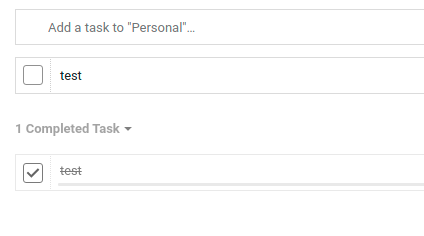
Not sure if the PR is actually still needed, it already looks quite fine for me on master. Just a small patch for some spacing issues:
diff --git a/css/src/style.scss b/css/src/style.scss
index 841a37f..dc9f06a 100644
--- a/css/src/style.scss
+++ b/css/src/style.scss
@@ -1199,9 +1199,14 @@
        border-radius: 3px;
        border: 1px solid var(--color-main-text);
        float: left;
-       margin: 9px;
+       padding: 9px;
+       margin: 7px 7px;
        opacity: 0.5;

+       &.icon-checkmark {
+           margin-top: 10px;
+       }
+
        &:not(.icon-checkmark) {
            background: unset;
        }
juliushaertl
on 29 Aug 2019
Ah sorry, forgot to build the svg sprite. If you just remove the custom background image from the icon-checkmark class and use the server shipped one, it should already be fine. cc @jakobroehrl
juliushaertl
on 29 Aug 2019
Have a look at #572.
raimund-schluessler
on 1 Sep 2019
Fixed with #572.
raimund-schluessler
on 2 Sep 2019
Related issues
 jakobroehrl
·
3Comments
jakobroehrl
·
3Comments
 Valdnet
·
7Comments
Valdnet
·
7Comments
 thomas-mc-work
·
3Comments
thomas-mc-work
·
3Comments
 tschiu
·
3Comments
tschiu
·
3Comments
 Viveur
·
3Comments
Viveur
·
3Comments
Most helpful comment
I'd appreciate if the look of checkboxes was unified across Nextcloud apps.
Users see dozens of differently styled checkboxes all the time, in different desktop and web apps, not even to mention mobile apps. If it looks remotely like a checkbox they will assume it is a checkbox. :wink:
Also, there are tons of apps that use checkboxes for completing tasks, so for usability the exact styling is not an issue. But it would just be nice if at least within Nextcloud the visual clutter could be reduced and user interface elements provide the same functionality also look the same.