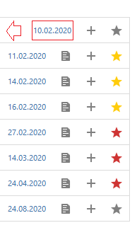
I suggest aligning task columns. Currently, if the task does not have a description, the task end date is shifted to the right in the list. This causes an unsightly appearance. In place of the details icon, you can leave the field blank or the icon inactive.
 Valdnet
All 7 comments
I would vote against that, because it would waste space and at least to me it would look weird if there is an empty space. But I am open to other opinions, so let's hear @nextcloud/designers.
 raimund-schluessler
on 4 Feb 2020
raimund-schluessler
on 4 Feb 2020
I think this allows a quicker "scanning" of the content, because one does not have to jump left/right when looking for one information, therefore: 👍
 stefan-niedermann
on 4 Feb 2020
stefan-niedermann
on 4 Feb 2020
While I understand why you want this, I still think it is problematic. There are up to four icons which are only shown when they are applicable:

Keeping this space free all the time wastes a lot of space, showing them greyed-out for all tasks out would look very busy.
raimund-schluessler
on 9 Feb 2020
maybe switching the (temporarily) icons with the (permanent?) date?
So position the items which are always there o the right side and the ones which only appear if applicable on the left side next to the others?
Might this be a solution?
stefan-niedermann
on 10 Feb 2020
maybe switching the (temporarily) icons with the (permanent?) date?
Hm, the date is also only there if you set a due date, so not really permanent either.
How about we move the active icons / actions (besides the star icon) into a drop-down menu and move the date to the right of the icons without an action?

We could then also add a delete action without further bloating the task list.
raimund-schluessler
on 10 Feb 2020
Have a look at #866
raimund-schluessler
on 12 Feb 2020
PR #866 is ready to be reviewed.
raimund-schluessler
on 2 Mar 2020
Related issues
 ghost
·
4Comments
raimund-schluessler
·
8Comments
ghost
·
4Comments
raimund-schluessler
·
8Comments
 enboig
·
9Comments
enboig
·
9Comments
 janvonde
·
8Comments
janvonde
·
8Comments
 CordlessWool
·
8Comments
CordlessWool
·
8Comments
Most helpful comment
I think this allows a quicker "scanning" of the content, because one does not have to jump left/right when looking for one information, therefore: 👍