Syndesis: [React-ui] selecting list elements only using 'select' button
See also https://issues.jboss.org/browse/ENTESB-11449
This is a...
[ ] Feature request
[x ] Regression (a behavior that used to work and stopped working in a new release)
[ ] Bug report
[ ] Documentation issue or request
Description
Selecting some list element (ingegration action, integration etc.) is possible currently only using select button unlike before. This feels like step back from UX POV. Especially on larger screens this feels rather odd.

 mmelko
All 18 comments
This is plain PatternFly 3, where the list item isn't clickable and you should have action buttons like we implemented.
We could make the whole list item clickable in this particular case, but on lists like the integrations list, it would be odd I think since there are more than one actionable elements - the details button and the kebab menu.
Anyhow, the last word about this should be of @syndesisio/uxd
 riccardo-forina
on 28 May 2019
riccardo-forina
on 28 May 2019
@riccardo-forina one thing that's super confusing about this is that hovering over the list items will highlight the whole item, suggesting that it should be possible to just click on it.
 asmigala
on 28 May 2019
asmigala
on 28 May 2019
I understand, but it's how it's supposed to be working.
riccardo-forina
on 28 May 2019
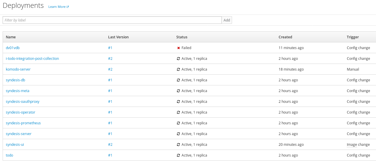
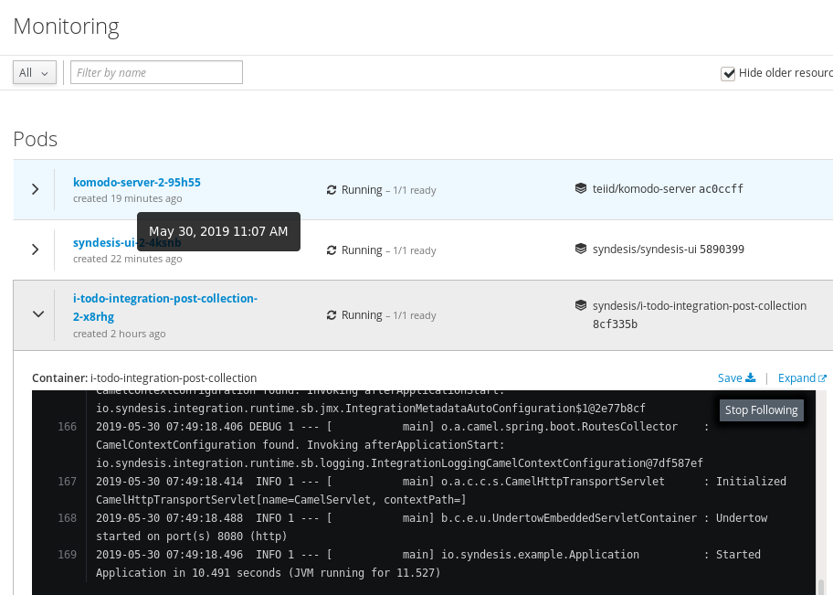
@riccardo-forina I see, so maybe we should use a different component than ListView for this use case. I looked at how the OpenShift web console does it and it seems they either use a table with clickable links [1] or make the names of the items in the list view clickable [2].
The way it's currently implemented gets super tiring for the user really fast (I've been working with this new react UI for a couple of days and I'm at a point when I groan every time I try to click the list item, only to realize I need to move my mouse all the way to the edge of the screen and click a tiny button there. True story.).
[1]
[2]
asmigala
on 30 May 2019
@dongniwang @seanforyou23 this conversations probably involves you more than us
 paoloantinori
on 30 May 2019
paoloantinori
on 30 May 2019
Making the name a link would be pretty sensible, agreed.
On Thu, May 30, 2019, 5:31 AM Andrej Smigala notifications@github.com
wrote:
@riccardo-forina https://github.com/riccardo-forina I see, so maybe we
should use a different component than ListView for this use case. I looked
at how the OpenShift web console does it and it seems they either use a
table with clickable links [1] or make the names of the items in the list
view clickable [2].The way it's currently implemented gets super tiring for the user really
fast (I've been working with this new react UI for a couple of days and I'm
at a point when I groan every time I try to click the list item, only to
realize I need to move my mouse all the way to the edge of the screen and
click a tiny button there. True story.).[1]
[image: image]
https://user-images.githubusercontent.com/9480152/58623166-a7679200-82cd-11e9-9d7e-4811d2312b44.png[2]
[image: image]
https://user-images.githubusercontent.com/9480152/58623228-cf56f580-82cd-11e9-8618-a05076c7b007.png—
You are receiving this because you are subscribed to this thread.
Reply to this email directly, view it on GitHub
https://github.com/syndesisio/syndesis/issues/5481?email_source=notifications&email_token=AACV3LFPBNGAY5ITWMO7QCTPX6NH3A5CNFSM4HQAQHG2YY3PNVWWK3TUL52HS4DFVREXG43VMVBW63LNMVXHJKTDN5WW2ZLOORPWSZGODWR3LEQ#issuecomment-497268114,
or mute the thread
https://github.com/notifications/unsubscribe-auth/AACV3LHBZMGLCXMQCGUQO6LPX6NH3ANCNFSM4HQAQHGQ
.
 gashcrumb
on 30 May 2019
gashcrumb
on 30 May 2019
Making the name a link would be pretty sensible, agreed.
Yes, but it's not really a solution. The description should be a link too then. They'd inherit the styling for a link.
Thes space between the two elements wouldn't be clickable, as all the white space all around.
I'd avoid "fixing" this in a way that's not the PF way. Maybe PF4 did solve the issue already. Again, we should really hear from @syndesisio/uxd
riccardo-forina
on 30 May 2019
I'd avoid "fixing" this in a way that's not the PF way
I agree that we should avoid hacks and workaround, but, as said in the original report, the experience now is objectively worse than it was before. This is something the user will have to deal with constantly, and frankly, it makes working with syndesis quite painful.
Having just the name clickable is a workaround and is not ideal, but it is _much_ better than the way it currently works.
asmigala
on 30 May 2019
The workaround is to make the whole item clickable and dump the action button, as it is done on the Angular app. I have not done this already because using the buttons the PF way was what we agreed upon, I'd like to have a green light from @syndesisio/uxd about this before changing anything.
riccardo-forina
on 30 May 2019
Hey everyone, thanks so much for the great input and feedback!
After talking to both @seanforyou23 and @mcoker, here’s what I recommend - We keep what we have for now since the time frame we’re in. What we have right now (the out of box PF3 component) helps us transition to the PF4 component better. But I agreed that having a clickable row is the better user experience.
Reasons behind this:
- Our application relies heavily on data list UI component, changing things for the integration list view will affect other areas of the application (e. g. API client connector page, extensions page, and also choose action when building an integration). Some of these pages have a similar use case for the list view but some do not. The OpenShift examples listed above don’t directly apply to all our use cases.
- The out-of-box PF3 List https://patternfly.github.io/patternfly-ng/#/list PF4 Data List http://patternfly-react.surge.sh/patternfly-4/components/datalist/ both do not support clickable row. We did some modification when implementing it in the Angular version using PF3. It’s great to know the clickable row is desirable behavior, and UX can take on a task to investigate how we can make better use of the PF4 Data List and provide a better design direction for our move to PF4.
cc: @syndesisio/uxd
 dongniwang
on 30 May 2019
dongniwang
on 30 May 2019
@dongniwang
We keep what we have for now
That's the problem -- what we have right now, i.e. the angular UI, _does_ allow clicking on the whole row. In other words, we are introducing a regression by switching to the new react UI.
asmigala
on 31 May 2019
Hi @asmigala -
I understand not able to click the entire row is painful and it's not the ideal user experience. As I stated in my previous comment, we hacked our way into making the row clickable. We can do that if we have sufficient resources in this release cycle. However, we're also trying to get many other higher priority items into this release. And this issue from my view is not a P0 issue.
The move to react would inevitably introduce some regressions, unfortunately. But we have also brought in some improvements. And we're paving our way to adopt PF4 fully in the future. This is not an easy lift and shift and I believe we all have every intention of making things easier for our users. Maybe we are not using the list component wisely for our use cases and we should investigate other ways, and this is a much larger problem. I'd love to take some time to research and design this properly and work with you all on this.
Here's what I proposed we can do in the meantime:
- I've opened issues #5525, happy to take your input and work together to iterate on a better solution
- We will take this feedback back to the PatternFly team and see if that's an enhancement they can support
What do you think?
dongniwang
on 31 May 2019
This has a pervasive impact on the user doc. The 7.3 doc contains a huge number of instances that say something like "Click the entry." and for 7.4 I was planning to change them to something like "Click the Select button to the right of the entry." This is a lot of work. If there is any chance that that Select button is going to go away and the behavior will return to clicking the entry, then I won't make these changes for 7.4. Which means that the 7.4 doc will be wrong.
Anyone have any advice for me?
 TovaCohen
on 14 Jun 2019
TovaCohen
on 14 Jun 2019
Hi Tova - I feel your pain. And I'm sorry I don't have a definite answer to the question of whether or not we will remove the buttons in 7.5 or we will keep them at the moment.
Is it possible for you to document the workflow in a more generic way?
dongniwang
on 14 Jun 2019
@TovaCohen from my pov the current description “Click the entry." works equally well for the old and new interaction model. I don’t think we would need to update the docs for this.
 heiko-braun
on 14 Jun 2019
heiko-braun
on 14 Jun 2019
@dongniwang Thanks! I think it's probably generic enough, and sounds like Heiko agrees that it is.
@heiko-braun From the user's POV, I agree. The user will be okay. There might be a momentary stutter if the user is actually reading doc :-)
But the doc is still wrong. You don't click the entry. You click SELECT.
Maybe I'm the only one bothered by this. That's okay. And I won't make any changes for this for 7.4.
TovaCohen
on 14 Jun 2019
@riccardo-forina @dongniwang @heiko-braun maybe it's time to revisit this issue?
asmigala
on 13 Aug 2019
Migrated to https://issues.jboss.org/browse/ENTESB-11449
heiko-braun
on 7 Sep 2019
Related issues
 mcada
·
5Comments
mcada
·
5Comments
mcada
·
5Comments
mcada
·
5Comments
 zregvart
·
4Comments
mcada
·
6Comments
zregvart
·
3Comments
zregvart
·
4Comments
mcada
·
6Comments
zregvart
·
3Comments
Most helpful comment
The workaround is to make the whole item clickable and dump the action button, as it is done on the Angular app. I have not done this already because using the buttons the PF way was what we agreed upon, I'd like to have a green light from @syndesisio/uxd about this before changing anything.