Survey-library: Theme colors do not affect all input types
Are you requesting a feature, reporting a bug or asking a question?
This is maybe a bug, or maybe I am just doing something wrong.
What is the current behavior?
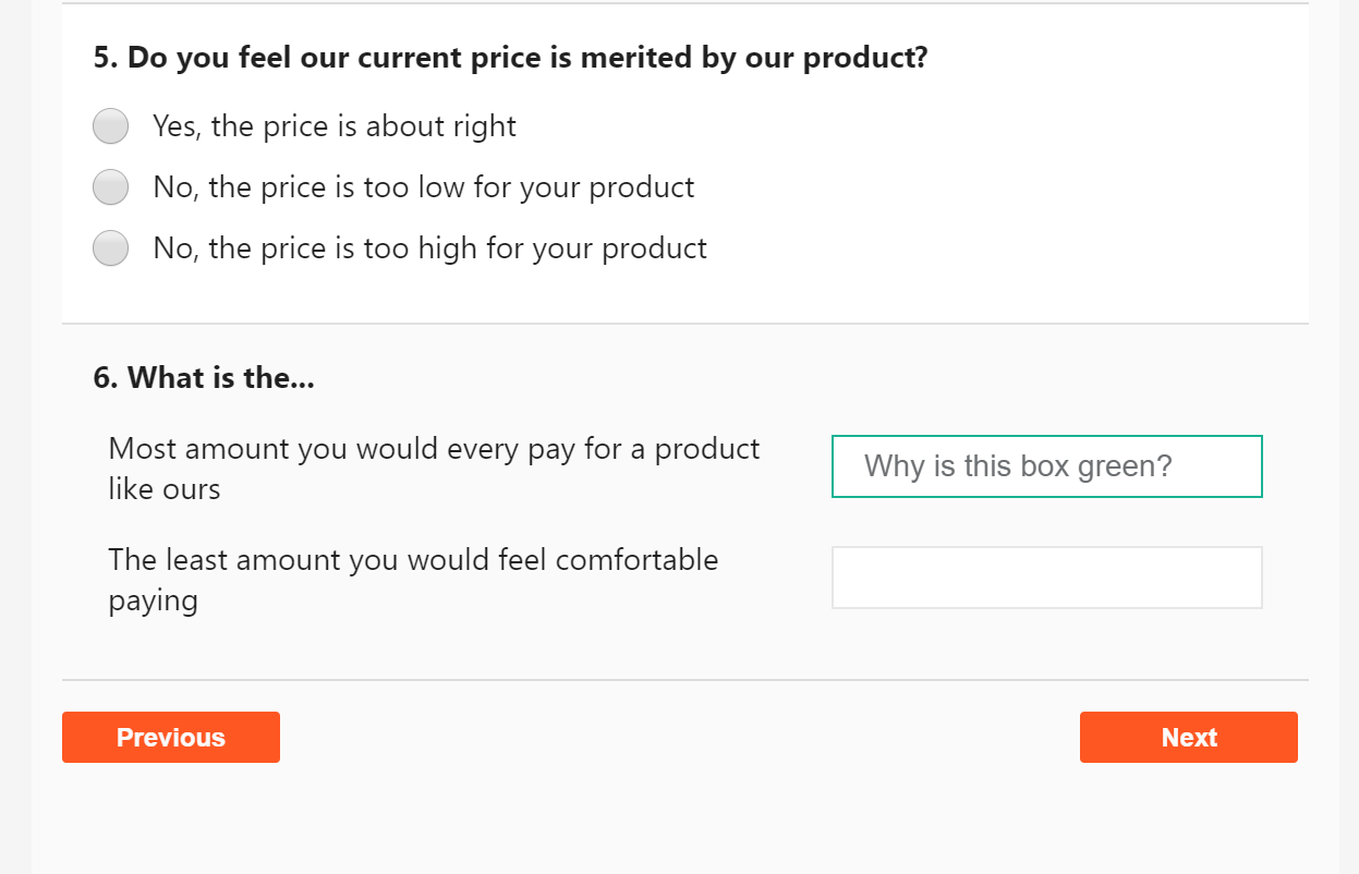
When I set the theme, my survey looks as shown here:

What is the expected behavior?
I expect setting the theme colors to affect the text for all the questions in the survey.
How would you reproduce the current behavior (if this is a bug)?
Set custom theme colors, as shown in the examples. The theme I am trying to set is a "dark" theme. Some of the questions have the light text and dark background I set, but many still have their default colors. Also, the dropdown ends up with light text _and_ a light background.
Provide the test code and the tested page URL (if applicable)
Test code
let themeColors = Survey.StylesManager.ThemeColors['default'];
themeColors["$main-color"] = palette.primary.main;
themeColors["$main-hover-color"] = palette.primary.dark;
themeColors["$text-color"] = palette.text.primary;
themeColors["$header-color"] = palette.secondary.main;
themeColors["$border-color"] = palette.divider;
themeColors["$header-background-color"] = palette.secondary.main;
themeColors["$body-background-color"] = palette.background.default;
themeColors["$body-container-background-color"] = palette.background.paper;
themeColors["$inputs-background-color"] = palette.background.paper;
themeColors["$error-color"] = palette.error.main;
themeColors["$error-background-color"] = palette.error.light;
Survey.StylesManager.applyTheme('default');
My palette contains the following:
{
  "common": {
    "black": "#000",
    "white": "#fff"
  },
  "type": "dark",
  "primary": {
    "50": "#fff8e1",
    "100": "#ffecb3",
    "200": "#ffe082",
    "300": "#ffd54f",
    "400": "#ffca28",
    "500": "#ffc107",
    "600": "#ffb300",
    "700": "#ffa000",
    "800": "#ff8f00",
    "900": "#ff6f00",
    "A100": "#ffe57f",
    "A200": "#ffd740",
    "A400": "#ffc400",
    "A700": "#ffab00",
    "main": "#ffc107",
    "light": "#ffd54f",
    "dark": "#ffa000",
    "contrastText": "rgba(0, 0, 0, 0.87)"
  },
  "secondary": {
    "light": "#ff4081",
    "main": "#f50057",
    "dark": "#c51162",
    "contrastText": "#fff"
  },
  "error": {
    "light": "#e57373",
    "main": "#f44336",
    "dark": "#d32f2f",
    "contrastText": "#fff"
  },
  "grey": {
    "50": "#fafafa",
    "100": "#f5f5f5",
    "200": "#eeeeee",
    "300": "#e0e0e0",
    "400": "#bdbdbd",
    "500": "#9e9e9e",
    "600": "#757575",
    "700": "#616161",
    "800": "#424242",
    "900": "#212121",
    "A100": "#d5d5d5",
    "A200": "#aaaaaa",
    "A400": "#303030",
    "A700": "#616161"
  },
  "contrastThreshold": 3,
  "tonalOffset": 0.2,
  "text": {
    "primary": "#fff",
    "secondary": "rgba(255, 255, 255, 0.7)",
    "disabled": "rgba(255, 255, 255, 0.5)",
    "hint": "rgba(255, 255, 255, 0.5)",
    "icon": "rgba(255, 255, 255, 0.5)"
  },
  "divider": "rgba(255, 255, 255, 0.12)",
  "background": {
    "paper": "#424242",
    "default": "#303030"
  },
  "action": {
    "active": "#fff",
    "hover": "rgba(255, 255, 255, 0.1)",
    "hoverOpacity": 0.1,
    "selected": "rgba(255, 255, 255, 0.2)",
    "disabled": "rgba(255, 255, 255, 0.3)",
    "disabledBackground": "rgba(255, 255, 255, 0.12)"
  }
}
Specify your
- browser: Vivaldi
- browser version: 2.3.1440.48
- surveyjs platform (angular or react or jquery or knockout or vue): react
- surveyjs version: 1.0.66
 awlayton
All 7 comments
Thank you for the reporting! I've fixed the bug. Fix will be available in the next minor update.
 dmitrykurmanov
on 25 Feb 2019
dmitrykurmanov
on 25 Feb 2019
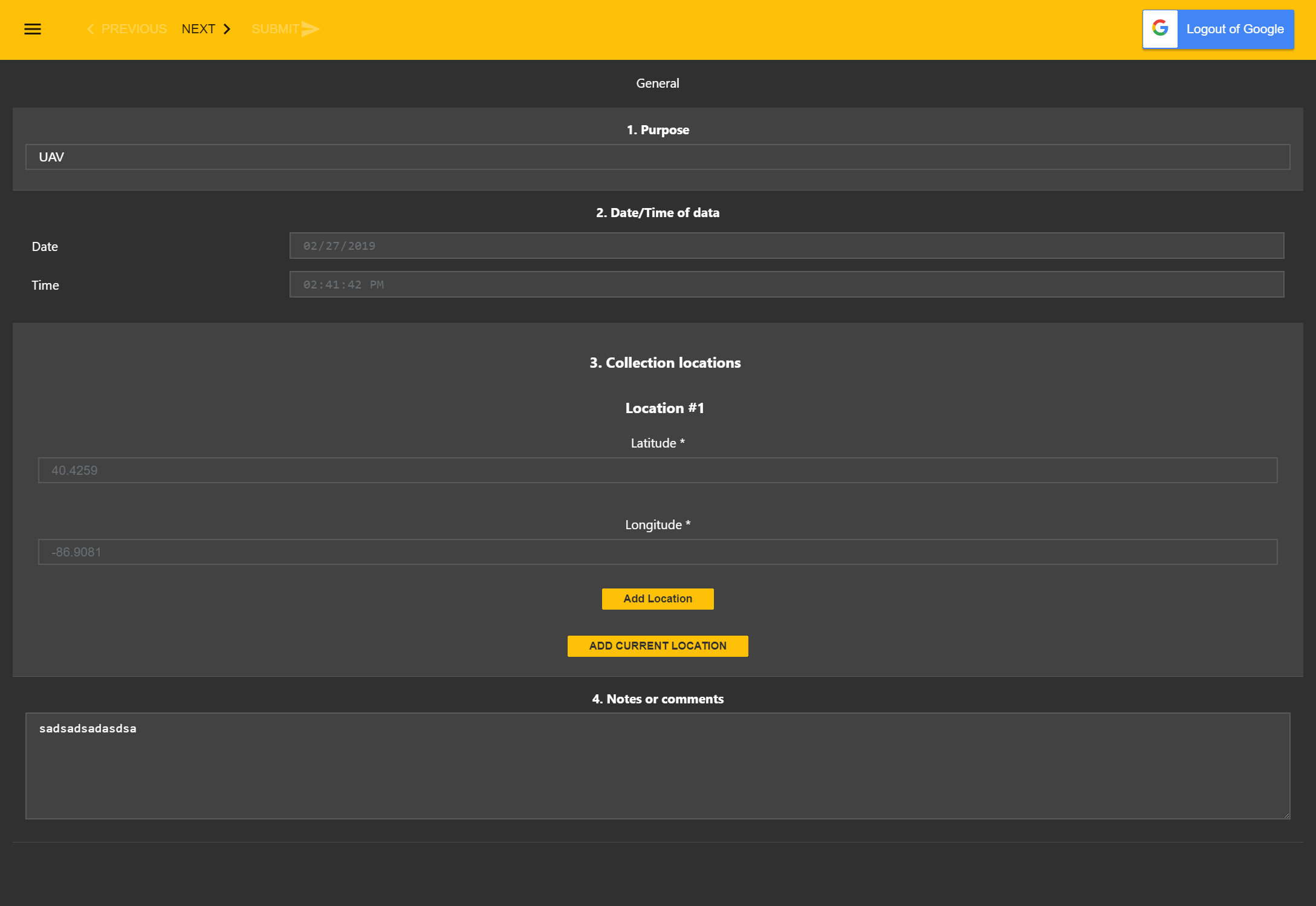
Very similar question but not sure it would be fixed in your existing bug fix. So, just in case: I have the exact code @awlayton has to set the default theme colors. However, take a look at the border of the textbox in the attached image. It's supposed to be the main color, which I've set to orange. However, the default green main-color is overriding it.
 Aadmaa
on 25 Feb 2019
Aadmaa
on 25 Feb 2019
@Aadmaa it should be fixed by the commit above.
Could you please check the example with the latest build: https://plnkr.co/edit/PzcCjxhFRKcVw5v4heRQ?p=preview and if you find any bugs please let me know.
Thanks.
dmitrykurmanov
on 26 Feb 2019
That looks right. Thanks!
Aadmaa
on 26 Feb 2019
It's much better now, however the inputs still do not all have the same text color. My understanding is my theme should make all of the text white, but some is still a shade of grey.
awlayton
on 27 Feb 2019
@awlayton looks like a bug for me. I will check it tomorrow. Thank you.
dmitrykurmanov
on 3 Mar 2019
@awlayton I've fixed the problem. Fix will be available in the next minor release. And I updated the plunker above https://plnkr.co/edit/PzcCjxhFRKcVw5v4heRQ?p=preview
dmitrykurmanov
on 4 Mar 2019
Related issues
 GuiAfonso
·
4Comments
GuiAfonso
·
4Comments
 halexiev-hedgeserv
·
4Comments
halexiev-hedgeserv
·
4Comments
 Lordchapter
·
3Comments
Lordchapter
·
3Comments
 faso
·
4Comments
faso
·
4Comments
 testweird123
·
4Comments
testweird123
·
4Comments