Survey-library: Mobile display of matrix q flows over
Are you requesting a feature, reporting a bug or asking a question?
question
Hi, How can I make the mobile matrix question display better
I only have 4 choices and it expands beyond the screen
I have set width of q to 90% but not change
Have also tried this
https://github.com/surveyjs/surveyjs/issues/453

ios/iphone 6
 frankwo1
All 22 comments
@frankwo1 Does it contain horizontal scroll ?
 dmitrykurmanov
on 7 Sep 2018
dmitrykurmanov
on 7 Sep 2018
In my css, I have
.sv_body {
overflow: scroll;
}
frankwo1
on 7 Sep 2018
@dmitrykurmanov,
Is it possible to set it up so it will replace this with dropdown on mobile width?
Thanks
Frank
frankwo1
on 7 Sep 2018
Hi @dmitrykurmanov,
I'm trying to make it more mobile friendly since more than 60% of surveys now are done on mobile - Aside from the horizontal scroll - is there a css/js solution in the future?
frankwo1
on 7 Sep 2018
@frankwo1 We are going to spend more time on improving the mobile rendering. Could you send here or me directly your survey json? We play with it and see what we can do.
Thank you,
Andrew
 andrewtelnov
on 7 Sep 2018
andrewtelnov
on 7 Sep 2018
Andrew, I have reduced it to 3 columns but still cannot show it without being cut-off
Some q's will always be difficult to do on mobile but this is a simple 3/4 rating matrix
        {
    type: "matrix", name: "FrequencyMedia", title: "How frequently do you use the following types of media?", width:"100%",
       columns:
       [
                  { value: 1, text: "Never/Rarely" },
                  { value: 2, text: "Regularly (once/ week)" },
                  { value: 3, text: "Frequently (Everyday+)" }],
        rows: [
               {value:"tv", text:"Television programs/shows"},
               {value:"radio", text:"Radio shows (not digital)"},
               {value:"movies", text:"Movies at theater"},
               {value:"mobile_music", text:"Mobile music/streaming (Apple music, Amazon music unlimited, Pandora, Spotify, etc.)"}
             ]
        },
@dmitrykurmanov Lets play with this matrix and check our css. It is very likely we have to change our styles. As I remember bootstrap styles are working fine.
Thank you,
Andrew
andrewtelnov
on 7 Sep 2018
ok I will check
dmitrykurmanov
on 7 Sep 2018
We've impoved it via the https://github.com/surveyjs/surveyjs/commit/c1e42064bef9c472928f13c8d795ccdf6b601b3b
Changes will be available in the next minor update (very likely today)
dmitrykurmanov
on 11 Sep 2018
Hello,
This is library's original example. Im just changed library's path latest cdn.

And Matrix question shows up with scroll. Can you explain how we can use as a responsive matrix question?
 HarunKARATAS
on 12 Sep 2018
HarunKARATAS
on 12 Sep 2018
also same behaviour on the official page.
Link
HarunKARATAS
on 12 Sep 2018
@HarunKARATAS As you can see from the commit, we've removed the min-size constraint for a matrix column. This allows to see more columns at the same time on the small screens.
At the moment SurveyJS hasn't have responsive widgets, that look different on different screens.
Creating responsive widgets is a large task. And we'll discuss it with the team.
Can you also share your thoughts - how SurveyJS responsive widgets should be implemented in your opinion?
 tsv2013
on 13 Sep 2018
tsv2013
on 13 Sep 2018
@tsv2013 I think maybe you can get ideas from Devexpress Js Components Devexpress . They have lots of widgets like yours. As you said it's a large task but it's extremely important and it can be reason for choice. Also i liked code in the #469 .
HarunKARATAS
on 13 Sep 2018
@HarunKARATAS Thank you for the information. Could you share your thoughts - what we can do for example with survey matrix questions in order to make them responsive?
tsv2013
on 13 Sep 2018
Using the example @SlowburnAZ gave as a starting point, I have come up with the following layout option to display a matrix question as individual questions on the mobile and matrix on desktop/tablet which is something I want to be able to achieve.
Desktop view:

Mobile view:
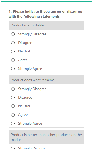
I have created a Plunker of the matrix example: https://plnkr.co/edit/aKuuB9ZnDHTWgrd7BEu0
I hope this helps others out in their quest for responsive matrices, and maybe adds an opinion on future responsiveness.
Also as a note, if something like this was added, I would prefer it to be optional.
 BarryGibson
on 19 Sep 2018
BarryGibson
on 19 Sep 2018
@BarryGibson Thank you for sharing your solution!
tsv2013
on 19 Sep 2018
We've added responsive behaviour in 1.0.45.
tsv2013
on 25 Sep 2018
We've added responsive behaviour in 1.0.45.
not work in bootstrap theme ?
 szakalq
on 26 Sep 2018
szakalq
on 26 Sep 2018
@szakalq Absolutely right. We'd like to get feedback.
tsv2013
on 26 Sep 2018
@tsv2013 In default theme works great, thanks for add :)
szakalq
on 26 Sep 2018
In matrix question, in mobile view text in option it's not clickable (only click on input works)
<td data-bind="attr: { headers: $data.locText.renderedHtml }" headers="Codziennie">
<label data-bind="css: question.getItemCss(row, $data)" class="sv_q_m_label">
<input type="radio" data-bind="css: question.koCss().itemValue, attr: {name: row.fullName, 'aria-label': question.locTitle.renderedHtml, value: $data.value, id: ($index() == 0) && ($parentContext.$index() == 0) ? question.inputId : ''}, checked: row.koValue, enable: !question.koIsReadOnly()" name="sq_105_Lidl" aria-label="2.&nbsp;JAK CZĘSTO ROBI PAN/I ZAKUPY?" value="1" id="">
<span class="circle"></span>
<span class="check"></span>
<span style="display: none" data-bind="text: $data.locText.text">Codziennie</span>
</label>
</td>
We've supported bootstrap theme and fixed matrix label non-clicable.
Thank you all for the feedback!
tsv2013
on 3 Oct 2018
Related issues
 aslanbeily
·
4Comments
aslanbeily
·
4Comments
 nadialo
·
4Comments
nadialo
·
4Comments
 testweird123
·
4Comments
testweird123
·
4Comments
 Lordchapter
·
3Comments
Lordchapter
·
3Comments
 halexiev-hedgeserv
·
4Comments
halexiev-hedgeserv
·
4Comments
Most helpful comment
Using the example @SlowburnAZ gave as a starting point, I have come up with the following layout option to display a matrix question as individual questions on the mobile and matrix on desktop/tablet which is something I want to be able to achieve.


Desktop view:
Mobile view:
I have created a Plunker of the matrix example: https://plnkr.co/edit/aKuuB9ZnDHTWgrd7BEu0
I hope this helps others out in their quest for responsive matrices, and maybe adds an opinion on future responsiveness.
Also as a note, if something like this was added, I would prefer it to be optional.