Sumatrapdf: Need icons for all supported file formats
Currently Sumatra only has one icon for all file types. We need a unique icon for every file type we support (8 icons: .pdf, .chm, .epub, .mobi, .xps, .djvu, .cbz, .cbr).
The current icon: https://github.com/sumatrapdfreader/sumatrapdf/raw/master/src/PdfDoc.ico
The idea is that they are all based on the same template, but with differences (e.g. differ in colors used).
The final icon must be in standard .ico format, each .ico file has 4 sizes of the same icons: 16×16, 32×32, 48×48, 256×256. We also need the source, presumably in vector (.svg) format, so that we can easily create derivative icons for more file types in the future, if the need arises.
The icon must be somewhat distinct when rendered on small sizes (16x16, 32x32), preferably related to main application icon (https://github.com/sumatrapdfreader/sumatrapdf/blob/master/gfx/SumatraPDF-256x256x32.png)
More information on the format of Windows icons:
- http://stackoverflow.com/questions/3236115/which-icon-sizes-should-my-windows-applications-icon-include
- http://www.visualpharm.com/articles/icon_sizes.html
- https://icons8.com/articles/choosing-the-right-size-and-format-for-icons/#windows
Previous discussions/propositions:
 kjk
kjk
All 43 comments
Absolutely!
And some file extensions also need to be associated upon installation.
CF: https://github.com/sumatrapdfreader/sumatrapdf/issues/237
 petrasteri
on 25 Aug 2016
petrasteri
on 25 Aug 2016
Atached file is a discussion piece showing how 16x16 pixels would best have a 7x4.5 font to allow for 3 letter extensions
The other suggestion is to maintain the approx ratio so that at 32x32 or 48x48 it uses fonts at roughly 14x9 and 21x12 pixels

 GitHubRulesOK
on 27 Aug 2016
GitHubRulesOK
on 27 Aug 2016
I can't really judge without seeing the bigger sizes. No offense, but the quality of the smallest icons is somewhat adequate (there's only so much that can be done), but the larger icon is far from being good enough. It doesn't even try anti-aliasing to smooth out the curves.
kjk
on 27 Aug 2016
@Source

Modified

Agreed Krzysztof
An anti-aliased approach is needed using for example an svg template.
my aim was to show that at the smaller sizes 16x16 & 32x32 that approach needs to be replaced for an element of clarity by hand crafted pixels. The 32x32 sample IS POOR but serves to show that a simple 2x ratio (or 3x for 48x48 pixel) needs to be hand crafted again for clarity.
Pretty anti-aliased icons at 48x48 can be produced from a larger 256x256 template but first you need to consider how that would translate to lower sizes.
"Pixel Fitting" has some merits over anti-aliasing for icons as described by Dustin Curtis the Markdown Mark [M↓] logo artist in https://dcurt.is/pixel-fitting
Above is your 16x16 pixel stock anti-aliased ICO but stretched slightly wider for stroke width clarity. The X-height is kept at 5 pix high and thus characters are 3 pix wide (=6x4 pixel character TILES that in theory would allow 4 chars for a total of 16) but this is highly limiting as kerning is severly restricted and would not allow for broad characters such as M in chM or Mobi, hence my suggestion to simplify with a larger font.
Here is a potential candidate for ePUB using their in house green (133,185,22)

Thus I am suggesting you as developer nominate your desired simplest shapes
The sample given is aiming to be approximate https://github.com/sumatrapdfreader/sumatrapdf/blob/master/gfx/SumatraPDF-256x256x32.png without bluring letters however at 48x48 icons could be replicated nearer your format using anti-aliasing.
Here are suggested colours based on file associations

Again as developer I suggest you nominate desired colours (in rgb/hex values?) for each extension and try to accept 2 or 3 chars would be the max readable at the two smallest sizes, so DjVu / Mobi / CB7Z would needs be avoided at that level although they could be accommodated at 48x48 upwards
In summary I suggest for 16 and 32 square Icons something along the lines of

note the upper two have a filled yellow "doc" background but as that may cause problems with other colours I would recommend the lower two with a white "doc" background
Kieran
GitHubRulesOK
on 27 Aug 2016
Hi,
Maybe something like this?

Thanks,
MK
 mikekov
on 29 Aug 2016
mikekov
on 29 Aug 2016
@mikekov the black of the cover is a bit overwhelming. Maybe would be better it the book was an outline or maybe lighter color. Or maybe the color of the cover/text could be different for different file types.
kjk
on 29 Aug 2016
Thanks for comments. I agree that this dark color makes icons heavy. I'll experiment with outlines to see if I can compose something reasonable.
mikekov
on 29 Aug 2016
mikekov
thats great however as kjk said the black could be reduced for example (just a crude hack of 48 32 and 16)

GitHubRulesOK
on 29 Aug 2016
GitHubRulesOK
That's a good idea. I experimented with different designs, including outlines, but nothing was an improvement over what I had before. Let me try your suggestion.
mikekov
on 29 Aug 2016
Hi, what about this:

I think the icon in the below link is very good except the snake.
So I replace it with Sumatran rhinoceros
PS: I am not a designer and I hope some one can polish the work of mine to replace the snake.
By the way the yellow color is very unpopular among the users. So we should avoid it.
Using animals as the icon have many benefits in software, and the rhino is the animal in Sumatra.
The designer can using the cute rhino to replace the unsuitable snake in the link above.
The topic can be found in the link.
 Bambooin
on 29 Aug 2016
Bambooin
on 29 Aug 2016
At last I try to produce it.

PS: I am not a designer but a coder. Hope someone can polish it.
The inspire from the link.
Bambooin
on 29 Aug 2016
Bambooin
This is a request for icons which are a different art from logos,
converting your suggestion to icons gives the following from 256 down to 16

note that they are fairly readable down to 64/32 i.e. should be usefull at 48x48 but beyond that they become blurred
I love your enthusiasm both here, and in the forum, keep up the good work
GitHubRulesOK
on 29 Aug 2016
Let's not use this thread as a brainstorming session. What Sumatra needs is someone who can produce all the needed icons, in high-quality, with little input from me.
Random designs from non-committed parties don't help.
kjk
on 29 Aug 2016
AGREED
however you did ask for suggestion here rather than clutter forum
I think you have an accomplished suggestion from Mikekov lets see how he deals with your comment
You know from experience the colours especially yellow will bring strong comments, I think I understand your aversion to 100% red, and the other colours above are the developers house colors except CBZ & CBR which shoud be mid grey but that would be very drab, hence I suggested you put your foot down as to what colours you wish to defend.
GitHubRulesOK
on 29 Aug 2016
A variation on a theme with bigger badges, corrected perspective (maybe overcorrected) and pixel-aligned text labels.

mikekov
on 29 Aug 2016
Fantastic
You have done exceptionally well on the 16x16 my only comment is the bottom could be skewed left "in keeping" but I guess you tried that and it looked "naff" ?
GitHubRulesOK
on 29 Aug 2016
@mikekov Bigger badges look better. Could possibly be even bigger.
kjk
on 29 Aug 2016
In 32x32 I ran out of space (perhaps they could be taller by a pixel). In 64x64 I made them smaller compared to 32x32 so they don't dominate; they are legible there.
Admittedly though icons look better on a high-res 4k display than 96 dpi one. It's hard to design good low-res images.
mikekov
on 29 Aug 2016
@kjk Sorry, you meant badges could be "bigger" or "better"?
mikekov
on 29 Aug 2016
bigger
kjk
on 29 Aug 2016
@mikekov
to clarify my comment on skew I have only hacked your 16x16 (but may have twirked a pixel or two elswhere)

GitHubRulesOK
on 29 Aug 2016
@GitHubRulesOK 16x16 book is upright for a reason: with this few pixels there's no way slanted lines could be legible. Just look at both of them and see if you could tell which of them represents a book.
@kjk Any particular size to have bigger badge or all of them?
mikekov
on 29 Aug 2016
Try on all sizes. Basically it seems the badge could be a bit bigger and as a result more centered over the cover (a bit lower and expanding more to the right).
kjk
on 29 Aug 2016
@mikekov
Your right yours is cleaner and I could have done better
You have the advantage of inkscape whilst for my sins i'm using MSPaint
how would this translate in inkscape ?

GitHubRulesOK
on 29 Aug 2016
@GitHubRulesOK I tried, but not even Inkscape can help it; 16 pixels is 16 pixels... It looks bad.
@kjk I made badges bigger still. All of them. Here in 16x16, 32x32 and 48x48 pixel sizes.

mikekov
on 30 Aug 2016

Agreed it looks bad (most 16x16 with text or curves do) thats why I have concentrated on getting the small ones right the bigger ones are easier :-)
Its up to kjk to chose however the point I am making is that an icon "at any size" should reflect a similar outline
GitHubRulesOK
on 30 Aug 2016
I see your point, but there's only so much we can do in 256 pixels. At least colors remain similar to reinforce the connection where shapes are gone.
mikekov
on 30 Aug 2016
Mikekov
I bow to your skill in getting icons as close to kjk's wishes and as crisp as you have, I have to sign off today as I need to work for my employer, good luck on completion.
GitHubRulesOK
on 30 Aug 2016
@mikekov looks good. In smaller sizes (16x16, 32x32) we could even get rid of the book background and just have different text/color of the badge, taking as much space as possible.
Another aspect of this is to do a really good job at bigger sizes. When you look at https://github.com/sumatrapdfreader/sumatrapdf/blob/master/gfx/SumatraPDF-256x256x32.png, what really makes the difference in quality of the icon are the subtle gradient changes.
I would be fine with just that icon (https://github.com/sumatrapdfreader/sumatrapdf/blob/master/gfx/SumatraPDF-256x256x32.png) being used as a template, even without additional background. Just produce high-quality variants (matching the subtlety of the icon) with different text/background color for different file types and simplified, decent versions at really small sizes (16x16, 32x32). 48x48 could probably look good enough as 256x256 scaled down..
kjk
on 30 Aug 2016
@kjk You are the master here and you decide what your product icons look like, but I'm afraid our stylistic judgements are at odds. I used to design photo-realistic icons in Blender 3D, but no more. Good design has to stand on its own, without being propped up by some cheap fake shadows and gradients.
IMHO big Sumatra icon would be better off stripped down to basic shapes.
So, I'm sorry but I won't be able to fulfill your request.
mikekov
on 30 Aug 2016
In smaller sizes (16x16, 32x32) we could even get rid of the book background and just have different text/color of the badge, taking as much space as possible.
I completely agree. Maximum legibility/clarity at 16x16 is important to me because I always stick to Details view in Explorer.
 SumatraPeter
on 20 Sep 2016
SumatraPeter
on 20 Sep 2016
Hi, I'm a professional designer. I think Sumatra PDF is fantastic and I would be interested in contributing a logo and icons for the program.
IMHO the current icon doesn't work very well - it's impossible to read at 16x16, and the plain white colour isn't at all distinctive, meaning you can't quickly identify PDF documents at a glance.
Before I can think about concepts, let me ask KJK, why was the name "Sumatra" chosen? Is there any meaning to it, or was it random? Also, to check, would you be OK with me suggesting both a logo and icon? I really think there needs to be consistency to your branding, as it makes your product visually stronger.
 Mr-Personality
on 3 Sep 2019
Mr-Personality
on 3 Sep 2019
Regarding the name: there is not deep meaning behind the name. Naming is hard, I was trying to find a unique name. I've considered a few and picked this one. I don't even remember why it was one of the names I considered. So just a random connection I made at the time.
Regarding the icons: I would love help in this area.
I'm reluctant to change the main icon of the program (i.e. https://github.com/sumatrapdfreader/sumatrapdf/blob/master/gfx/SumatraPDF-256x256x32.png) - it would confusing for current users if the icon changes dramatically.
But I would love your help in icons that show for file associations in explorer.
As this bug describes, we need icons for .pdf, .chm, .epub, .mobi, .xps, .djvu, .cbx, .txt
A logo for branding (to maybe show on the webpage and on main screen would be great too).
I did some work myself but it's rather uninspired: https://www.figma.com/file/P5DWXO4ZG73B9ATNjYPhvGgD/Sumatra-icon?node-id=1%3A2
The main criteria here is:
- they have to be consistent i.e. it should be obvious they all belong to the same family
- the work needs to be in figma.com. I need the source material to be able to make tweaks / derivatives in the future (e.g. when we add new format and need another icon and you're no longer available)
- they need to look good in small sizes (as those icons usually are shown small) and on typical windows backgrounds
I can make the final .ico from the vector art in figma.com, but if you know how to do it, that would be great.
It's probably good to work on 256x256 canvas in Figma and the generate smaller versions by downscaling.
kjk
on 3 Sep 2019
Hi KJK. Thanks for your reply.
Apologies but Figma would be a problem for me. I've never used it. Never even heard of it before. Plus, if it's vector-based software then I doubt it would be suitable for designing small icons, which need pixel-perfect precision.
Yes, I can make .ico files and have done plenty of them. I would be working in Photoshop (been using it 25 years), and I'd be happy to provide my Photoshop files when I'm done, which could then be updated by anyone with Photoshop (which is just about any designer). Then again I'm not planning on going anywhere and would always give you my email to keep in touch. And if I wasn't around, someone could just copy the style I'd done - it's a good idea to 'freshen up' logos every few years anyway, to keep things from looking dated.
Anyway, if you are still interested, I'd like to share some initial thoughts I had about the design, which would be the basis for my concept...
From what I understand, the key "selling point" of your application is that it's lightweight, easy-to-use, and uncluttered. (That's what I love about it!) So that would be my starting point and overall objective - to give a feeling of ease and simplicity.
Now one thing I always like to do is tie the name of a product together with its graphical style, to give a sense of cohesion. At the moment "Sumatra" is kind of meaningless, and a little confusing. Sumatra is a tropical island - something of a paradise by the look of it. So my initial thought is to draw upon this tropical theme, creating a graphical style which suggests "free and easy".
Acrobat Reader is bloated and feels highly commercial and kind of stressful and pushy, as well looking very "dark" (like all Adobe's products now are). In contrast, I would want to pitch Sumatra as the exact opposite - light, cheerful, simple, yet reliable and a viable option for professional use.
A palm tree came to mind, though obviously I would only be using very simple shapes in the icons, nothing cluttered or distracting. I would want the logo/icon to kind of give the feeling: "using this software is as stress-free as lying on a tropical beach".
As you mentioned, I would be mindful of abruptly changing the style, and confusing existing users. However, I would argue that any confusion would be short-lived, while many users would appreciate a fresh new look. The existing icon is pretty good, though I think it currently looks too industrial (power tools come to mind), and a little harsh. I would want to soften it, while still keeping bright colours, including a strong yellow element, for consistency.
Well that's my initial thoughts. Though, once again, I can't use Figma, so the ball's in your court if you'd like me to proceed or not :-)
James
Mr-Personality
on 4 Sep 2019
Sounds good, let's give it a try. As long as I have access to source material, like .psd file, I can archive it.
I totally agree with the "light, easy, fast, free" theme.
I wouldn't necessarily apply "tropical" but I don't want to constrain you on that one way or another. In the end the quality of execution is just as important as the conceptual design.
From my point of view, the must-have are the file association icons for for .pdf, .chm, .epub, .mobi, .xps, .djvu, .cbx, .txt that share a common theme but possibly differ visually a bit (e.g. with different colors).
Those are nice haves:
- a refreshed application icon
- a logo that could be used on e.g. website, in the main application window, in the installer window. This could be the same as icon or something closely derived from it or something that is different from icon but is connectable to the overall design
Thanks for your help.
kjk
on 4 Sep 2019
OK great, I'll see what I can come up with. Like you, I'm also very busy, so it may not be immediate but I'll fit it in when I get a chance over the coming days.
My plan would be to start with the logo, and then if I am able to create something you like for the logo, then I can translate that style and theme into icons. I know it's the icons you need, but logically the style really should start at the "top" and filter down into the icons. Hope that makes sense.
Mr-Personality
on 4 Sep 2019
By the way, if you're curious about my work, I'd be happy to send you some examples of logos I've designed. I'd need to do that privately though.
Mr-Personality
on 4 Sep 2019
That would be great. You can e-mail me at [email protected]
kjk
on 4 Sep 2019
@Mr-Personality Can you share your new icons in this comment?
So I can replace it in my compter and try to test with it.
Bambooin
on 19 Nov 2019

 andrecool-68
on 20 Dec 2019
andrecool-68
on 20 Dec 2019
can slightly change the title
andrecool-68
on 20 Dec 2019
Thanks. I did some work on this as well:
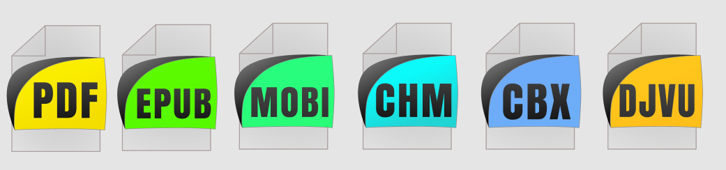
Here's the public figma.com document: https://www.figma.com/file/P5DWXO4ZG73B9ATNjYPhvGgD/Sumatra-icon?node-id=0%3A1
There are some important things here:
- the background "page" is simplified. it'll compress better
- those icons are often shown at a very low resolution, like 32x32 pixels so it's important to have the text as big as possible (relative to the size of the icon)
- to make things easier to distinguish visually, they share the common shape but different colors for different file types
- it has to be a vector file, publicly shared as on a platform like figma.com or similar. People come and go and when they go, a bunch of .png files becomes worthless without access to source files and ability to make derivatives in the future
The work that needs to be done is to add icons for more extensions and pick nice colors for them.
So if you want to contribute:
- copy the above figma.com document
- add missing file types
- pick good looking, distinct colors (I'm not a designer, the colors I picked so far are more or less random)
- share your figma document with changes
I'm not opposed to re-designing the icons, you can create other variants as separate figma documents, but I'm happy enough with this design.
kjk
on 20 Dec 2019
@kjk If you can make a separate dll-library ... then you will have a lot of people with different options for icons))
I can give an example on the 7 zip archiver a separate dll-library with icons of all supported file types is implemented.
andrecool-68
on 21 Dec 2019
Related issues
 Turbine1991
·
30Comments
kjk
·
25Comments
Turbine1991
·
30Comments
kjk
·
25Comments
 StefanMich
·
25Comments
StefanMich
·
25Comments
 Ne-vermind
·
21Comments
Ne-vermind
·
21Comments
 deveee
·
18Comments
deveee
·
18Comments
Most helpful comment
A variation on a theme with bigger badges, corrected perspective (maybe overcorrected) and pixel-aligned text labels.