Status-react: In profile address is shown instead of name and "Mailserver" label is overlapped when connected to custom mailserver
Description
Type: Bug
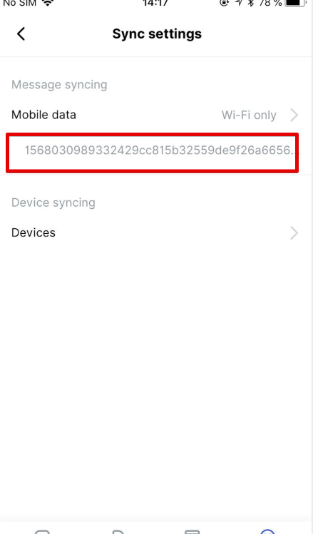
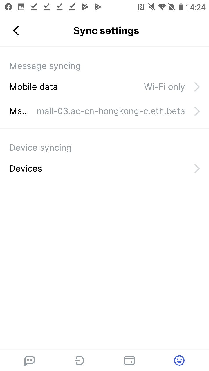
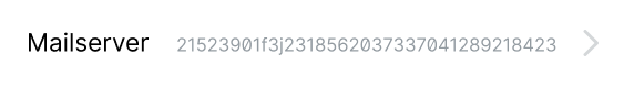
Summary: when connected to custom mailserver, address is shown instead of name and no "Mailserver" label in Profile > Sync settings
Expected behavior
Actual behavior
Reproduction
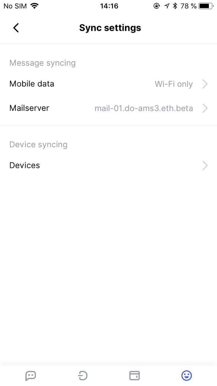
- Open Status
- Go to profile > Sync settings
- Add custom mailserver
- Connect to it
- Go back
Solution
Summary:
I'm actually not sure how we can handle mailservers with long names.
For now "Mailserver" label is overlapped, which is not right IMO:
@andmironov or @errorists please take a look, what is better from your POV.
Additional Information
- Status version: nightly09/09/2019
- Operating System: Android, iOS
 churik
All 8 comments
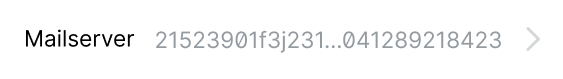
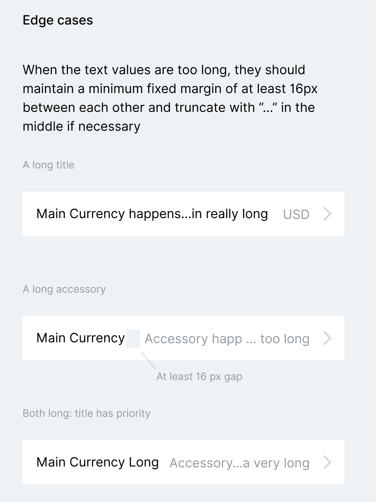
The Mailserver text label should not get truncated or overlapped, no question there 👍
This is the desired behaviour, 16px of blank space between and truncate the text accessory (mail server address) in the middle
so the following would work only on iOS but React Native does support text prop like adjustsFontSizeToFit where it will try and shrink the text down to make it fit up to a minimum scale factor minimumFontScale where 0.7 sounds like a reasonable value. No such luck on Android :(
This is how it would look like. It's optional, if it's only two lines of code to add we might as well do it.
 errorists
on 9 Sep 2019
errorists
on 9 Sep 2019
so the following would work only on iOS but React Native does support text prop like adjustsFontSizeToFit
I like it, but is it going to truncate the value if it's extremely long anyway?
Here's how this edge case is specified in our design system at the moment
 andmironov
on 9 Sep 2019
andmironov
on 9 Sep 2019
interesting! :)
I handeled it differently in #8912 so far
- I made it so that
textaccessory is no longer than 62% of device width. To be precise, I did this
(defn accessory-text [width last]
  {:color       colors/gray
   :max-width   (if last (* @width 0.62) (* @width 0.55))
   :line-height 22})
In that way, I kept it simple, for now.
Rationale is that in the nesting structure in the implementation, it is made such that column containing title (includes title-prefix, title-accessory, subtitle, subtitle accessory) is supposed to be the primary content - the king/queen if you will. Two columns on its side(icon/accessories) are supposed to be secondary/accessorial/peripheral if you will. So, title has flex 1 and is supposed to eat up majority of space, which it does on most cases.
A long accessory taking over the king/queen :) is in that perspective, a misbehavior :)
What I propose is, if there is a long content which wants to be aligned towards accssories, we put it in title. The black title goes in title-prefix. This facility exists already. We even have title-color-override to make it gray instead of default black. What would be needed is conditional 16px left margin on title, and title alignment prop. That would achieve the intent of the spec.
Also, title-elipsize-mode, because title has tail by default.
Note: list-item as it is implemented does NOT use any absolute positioning, negative margin, only one case of transform translateY(for chat-list unread count badge), flex-grow, flex-shrink and flex-basis. In my opinion, it is best to stay away from those as much as possible.
 bitsikka
on 9 Sep 2019
bitsikka
on 9 Sep 2019
thanks for commenting @bitsikka I appreciate your in-depth thoughts on this! I like what you're suggesting even if it doesn't match the semantic use of defined props to achieve this goal :) I don't want us to split hair over such a detail, the important bit is to truncate the accessory in the middle (since this way there's less chance the truncation will make recognising the selected choice among multiple others difficult) and block the text accessory from pushing pass this 62% threshold you suggest, so it doesn't force overflow on titles like on the attached screenshots.
errorists
on 9 Sep 2019
Another possibility is, without any change:
- make black title (eg
Mailserver) atitle-prefix - put the long text (eg
looooong.looong.mail.server.name) intitleas acomponent(yes,titlecan be component in this implementatino) - in the
titlecomponent usetextview with:margin-left 16,text-align right,ellipsize-mode middle
That ought to do it.. no change necessory in the implementation of list-item
bitsikka
on 9 Sep 2019
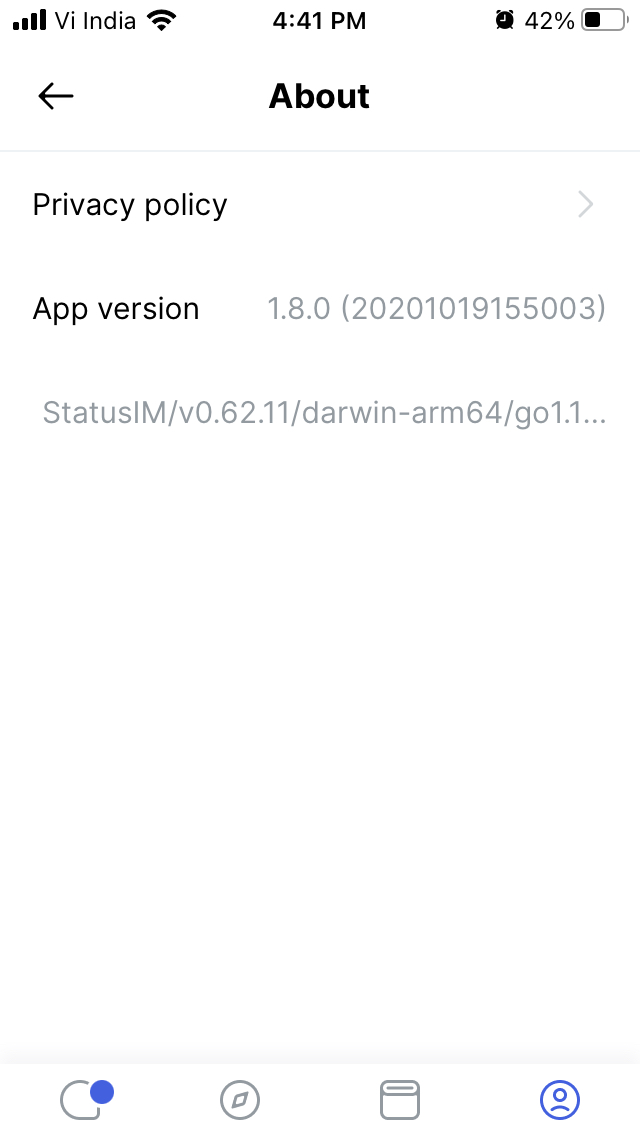
I did (as in the last idea) this(in #8912 ) for
node-versionandapp-versioninProfile > About >MailserverinProfile > Sync Settings >
[list-item/list-item
     {:type                :small
      :accessibility-label :node-version
      :title-prefix        :t/node-version
      :title
      [react/text
       {:number-of-lines 1
        :ellipsize-mode  :middle
        :style
        {:color        colors/gray
         :padding-left 16
         :text-align   :right
         :line-height  22}}
       node-version]}]
Not: About this issue's Original Post.. the part about
address is shown instead of name
is not handled in #8912. I figure mailserver-subscription need to be fixed, and that is not a part of the PR focused on polishing/putting-finishing-touches of list-item
bitsikka
on 9 Sep 2019
Still relevant in nightly 07/01/2020
churik
on 7 Jan 2020
This problem also occurs in the about section with status version.
 shivekkhurana
on 4 Nov 2020
shivekkhurana
on 4 Nov 2020
Related issues
 annadanchenko
·
3Comments
annadanchenko
·
3Comments
annadanchenko
·
3Comments
annadanchenko
·
3Comments
 andytudhope
·
4Comments
andmironov
·
3Comments
andytudhope
·
4Comments
andmironov
·
3Comments
 rachelhamlin
·
3Comments
rachelhamlin
·
3Comments
Most helpful comment
thanks for commenting @bitsikka I appreciate your in-depth thoughts on this! I like what you're suggesting even if it doesn't match the semantic use of defined props to achieve this goal :) I don't want us to split hair over such a detail, the important bit is to truncate the accessory in the middle (since this way there's less chance the truncation will make recognising the selected choice among multiple others difficult) and block the text accessory from pushing pass this 62% threshold you suggest, so it doesn't force overflow on titles like on the attached screenshots.