Status-react: Show progress bar when fetching messages from mailserver
Blocked by: https://github.com/status-im/status-go/issues/1036
User Story
As a user, I want to know when the app is fetching messages from the mailserver so I'm not wondering if the app is doing anything, or if my push notification was bogus.
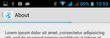
cc @andmironov for design input. My suggestion would be to have an indeterminate progress indicator near the top of the mobile app, like this (the indicator pictured is not indeterminate, but you get the gist):
Description
Type: Feature
Summary: It is confusing to receive a push notification telling me I have a new message, clicking on it and then seeing no new messages. Since the app only fetches messages after being brought to the foreground, we should show an indeterminate progress bar to inform the user that the app is working on something.
Expected behavior
- I receive a Push Notification
- I tap the PN
- The app opens on the main screen, and a progress bar indicates it is fetching messages
- After a few seconds, new unread messages appear
- After a predefined time limit or if a few more seconds have gone by without no new messages appearing, the progress bar is removed
Actual behavior
- I receive a Push Notification
- I tap the PN
- The app opens on the main screen, and no new unread messages are visible
- After a few seconds, new unread messages appear
Solution
Summary:
Right now it is not possible to know whether messages which are arriving come from the mailserver, nor if/when they have finished arriving. Therefore we have to do a best effort solution for now. For instance, we could follow these heuristics:
- Keep progress bar visible if
shhext_requestMessageswas called less than 10 seconds ago - Keep progress bar visible if a new unread message was added less than 5 seconds ago
- Hide progress bar if
shhext_requestMessageswas called more than 30 seconds ago
 pedropombeiro
All 22 comments
@PombeirP could it be this issue was resolved in the meantime through a grey notification bar (aka snackbar)?
Related issues:
https://github.com/status-im/status-react/issues/5371
https://github.com/status-im/design/issues/28
 hesterbruikman
on 6 Aug 2018
hesterbruikman
on 6 Aug 2018
@hesterbruikman In my humble opinion, I think that what fits best in this scenario is a progress bar. Are you suggesting that we do a temporary fix to resolve https://github.com/status-im/status-react/issues/5371, or actually change this issue to be about implementing a snackbar?
pedropombeiro
on 6 Aug 2018
I agree that a snackbar might not be the best fit here. As the snackbar was implemented I was curious if it had been in response to this issue (whether it's the best fit or not), or if no action had been taken on this issue yet.
I would say there's a temp fix opportunity to improve the snackbar and a long term fix opportunity to consider alternatives like progress bar, or pattern of notification.
@errorists is involved in both issues; so if there's any way these issues can be unified into one solution that offers a good fit for both cases, I'm sure he'll come up with it.
(And welcome back:))
hesterbruikman
on 6 Aug 2018
Thanks @hesterbruikman :-) I don't think anything was done regarding this issue (and I wasn't aware that we had changed to a snackbar), but the progress bar solution seems fairly nonintrusive and easy to implement, so hopefully we can move in that direction soon.
pedropombeiro
on 7 Aug 2018
Here's a proposed design, similar to WhatsApp, Telegram and many more. I think we should include all 'connection' related messages to use this pattern instead of the snackbar which blocks the view of tappable items.
This project was made with Framer, a design tool for turning original concepts into working prototypes.
 errorists
on 17 Sep 2018
errorists
on 17 Sep 2018
And here's the design spec.
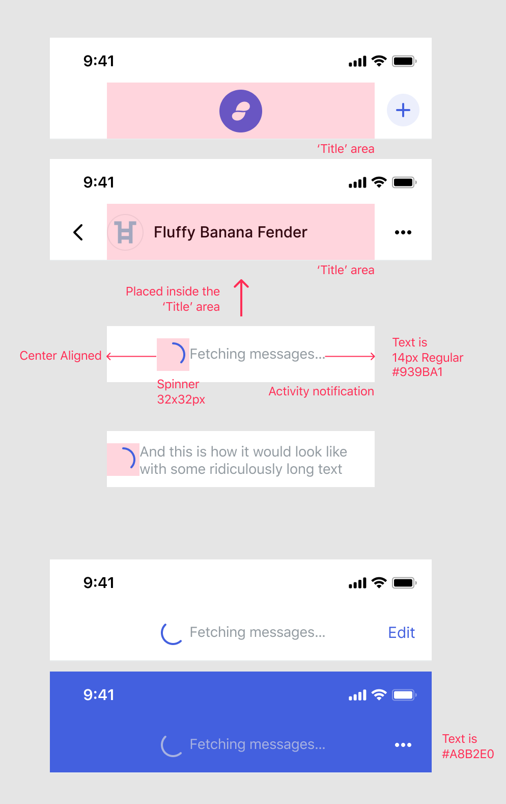
I'd like us to use a custom spinner there, which file format would we want to use here
• Lottie https://airbnb.design/lottie/
• APNG
• GIF
• PNG sequence
?
A nice to have -> Animate displaying the Activity notification
Animated.timing(
value: opacity from 0 to 1
duration: 100
easing: Easing.inOut
)
and reverse the animation when the notification is hidden
LottieEasily add high-quality animation to any native app. Lottie is an iOS, Android, and React Native library that renders After Effects animations in real time, allowing apps to use animations as easily as they use static images.
errorists
on 24 Sep 2018
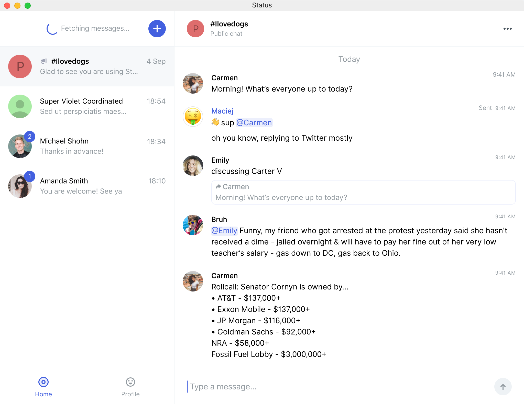
@errorists @EugeOrtiz what does this look like on desktop?
 chadyj
on 15 Oct 2018
chadyj
on 15 Oct 2018
I'd suggest to place it like so, I believe the left sidebar on desktop is the better choice for status notifications like this one. @EugeOrtiz wdyt?
errorists
on 15 Oct 2018
Got some mobile design feedback on this I wanted to share:
Hiding the username with the spinner isn't ideal because it blocks the user from knowing who they are chatting with. If "fetching" displays for some time (as it currently does) then the username is blocked for the duration.
I tend to agree.
chadyj
on 15 Oct 2018
Thanks for input! It's a tough one to answer because I thought about it while working on the design and did a couple of minor tweaks to help with any confusion, like displaying the notification with a slight delay after you enter a chat. In real-world use I personally doubt it will be much of an issue, since entering a chat with someone is a deliberate action and you're more than likely to remember with whom you wanted to chat or recognise the context — but I'd love to test it and be proven wrong. I'll give the design some more thought since I believe that overall it's a huge improvement, in that it doesn't cover any actionable - tappable items :)
errorists
on 15 Oct 2018
since entering a chat with someone is a deliberate action
Sure, but what about returning to the phone after an hour, or the next day, or other use cases where it is no longer deliberate? You could design around it with a flash/delay but that seems like working around the problems instead of fixing the cause.
On mobile with limited screen real estate the recipients name is crucial, so are there really no alternatives?
Testing sounds great but might be hard to test for this with mockups?
chadyj
on 15 Oct 2018
@errorists Got some other feedback about another point:
The chat screen is used to send and receive transactions, so it is important for a user to be certain who they are chatting with at all times. Hiding the user could lead to accidental transactions.
I'd love to see other concepts before we commit to further work on this.
chadyj
on 15 Oct 2018
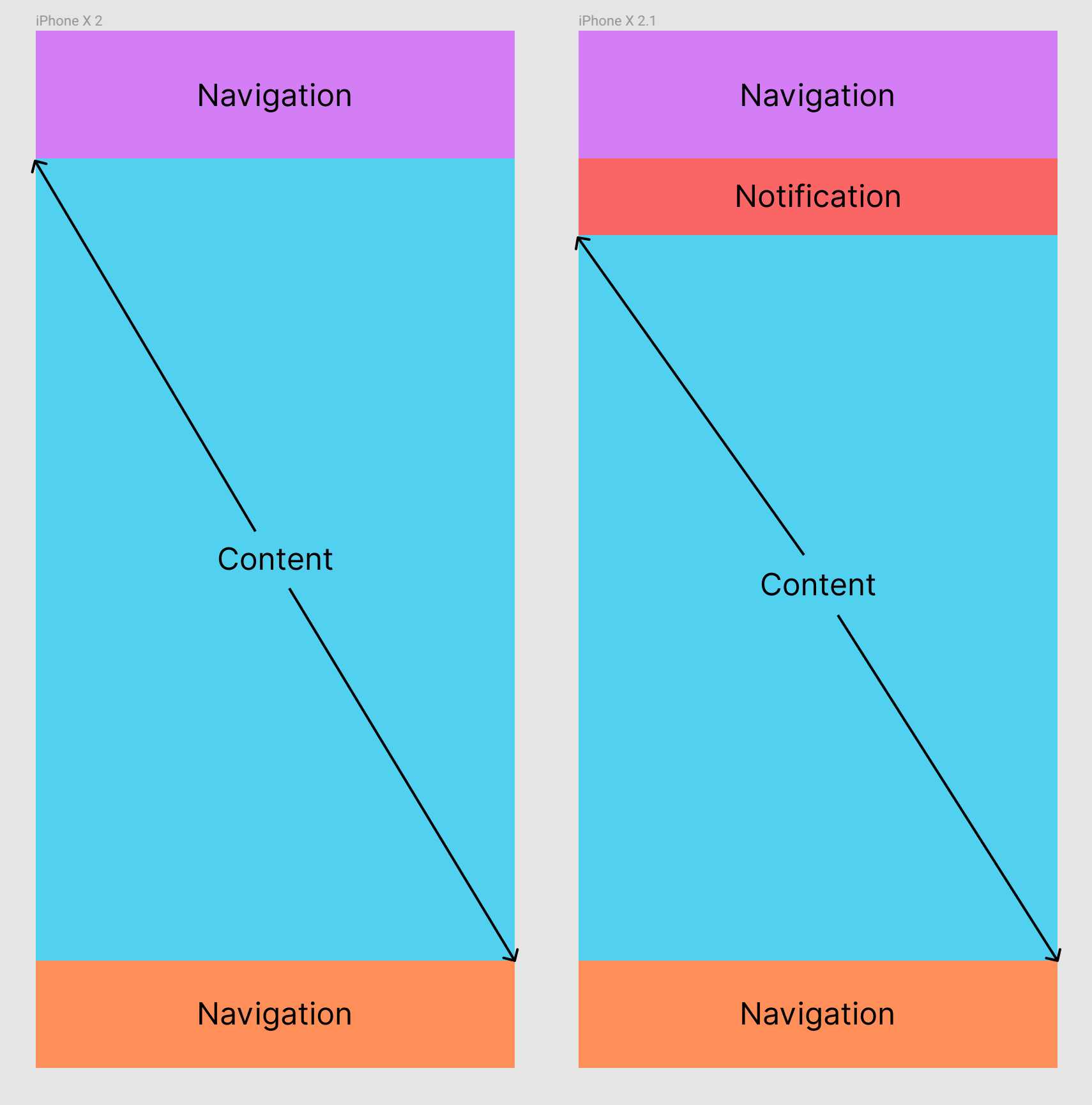
So another approach would be to make room for it, like lowering the entire content scroll area like pictured below. Not sure how feasible it is with React tho?
errorists
on 15 Oct 2018
@errorists we have more functionality coming for desktop, like _search_ that I think could be placed there.
Why do we want to change the current badges? Is it only aesthetics? If we want to redesign this, I would look for something more temporal, that doesn't need the original UI real state. Also, on desktop, I imagine notifications that are general (placed in a general space) and notifications that are more specific to a certain chat/person and they should be placed accordingly (e.g. X person is offline). zpl.io/V1qZyPk
Regarding the original issue, the fetching problem should be solved by now with current badges, right @PombeirP ?
 EugeOrtiz
on 15 Oct 2018
EugeOrtiz
on 15 Oct 2018
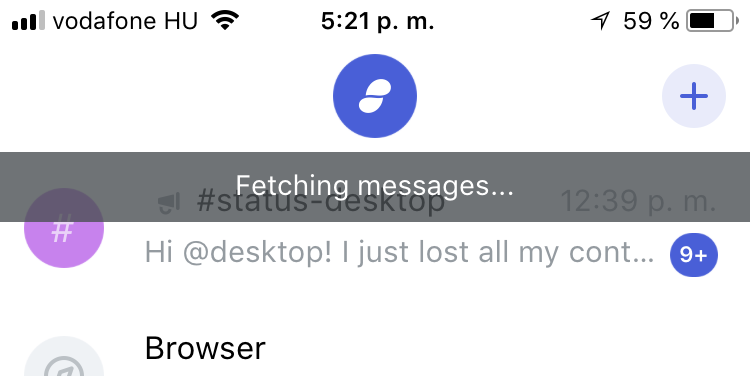
@EugeOrtiz because they obstruct actual functionality. You can't add a contact till they're there, so my morning routine looks like this: I have a couple of new contacts and I wait and wait till that fetching messages dialogue is gone till I can add them.
But aesthetics too, they're too much in your face, being by far the most prominent element on your screen whenever I reopen the app. I'd too love to reduce it to a little temporal element that gets out of the way but then we're stripping away the message on what is actually happening in the background :)
errorists
on 15 Oct 2018
I see, we don't have much of that problem on desktop _I think_. Pushing the content for as you suggest could be a quick solution.
EugeOrtiz
on 15 Oct 2018
@errorists do you feel it is absolutely necessary to have the Fetching messages text message visible? Wouldn't the unobtrusive horizontal marquee progress bar be enough by signaling to the user that work is being done in the background, without revealing the exact nature of the work?
pedropombeiro
on 26 Oct 2018
Hey, sorry for taking a while but here's the documentation for the fetching progress bar design.
Link to Prototype
It's an indeterminate progress bar however, I'd suggest to also implement the determinate one when working on it so we can use the component in other areas like the Browser 🙏
To retrace what's happening in the design in more details
- The progress bar track is rendered directly above the top navigation bar, aligned to its bottom. It's 3px high with Light Blue background colour.
Animation: value: opacity from 0 to 1, duration: 100ms, easing: easeOut - The progress bar indicator is placed on the left edge of the track, it's using our Blue accent colour, it's width is set a 0% of the track, height is 3px, border-radius is 1.5px.
- Progress indicator animates to
- X position : 20% of total track width
width: 60% of total track width
duration: 400ms, easing: easeIn - X position : 85% of total track width
width: 15% of total track width
duration: 400ms, easing: easeOut - X position : 20% of total track width
width: 60% of total track width
duration: 400ms, easing: easeIn - X position : 0% of total track width
width: 15% of total track width
duration: 400ms, easing: easeOut
And it repeats after that :)
- Progress bar can be terminated at any time, animates to: value: opacity from 1 to 0, duration: 100ms, easing: easeIn.
For a determinate progress bar, just animate the width of the track from 0% to 100%, easing: ease, duration: should be somehow proportionate to the distance animated so the entire width is 1 second, then animating from say 20% to 50% takes 300ms.
Please, let me know if further help is required, thanks!
errorists
on 3 Dec 2018
Implementation of indicator animation: https://github.com/status-im/status-react/pull/7000/files#diff-5a1ce6b28582016d18f9189701433442R107
GitHub
[#6851] Fix loading indicator in browser by flexsurfer · Pull Request #7000 · status-im/status-reactfixes #6851
 flexsurfer
on 4 Dec 2018
flexsurfer
on 4 Dec 2018
@errorists how long should the green "Connected" bar stay before disappearing?
If you can also specify the animation like you did for loading that'd be awesome
 yenda
on 18 Dec 2018
yenda
on 18 Dec 2018
Cool. It shouldn't stay long, 1500ms is enough. The animation for the bar:
• Value: Opacity from 0 to 1,
• easing: ease,
• duration: 150ms.
Reverse on disappearing.
In the design it uses a scaleY but in React Native we can't set the Transform Origin property so it won't work like that. Alternative solution, if the snackbar is placed below the Top Bar in stack, we could animate it along the Y axis so it slides in from below it, the easing and duration would then be the same as above, the value would then be Y position from minus snackbar's total height to 0.
If it's easy to add: changing the color of the snackbar should animate from 'Grey' to 'Green' with easing: ease and a 100ms duration
errorists
on 18 Dec 2018
Related issues
 andmironov
·
3Comments
andmironov
·
3Comments
 andytudhope
·
4Comments
flexsurfer
·
3Comments
andytudhope
·
4Comments
flexsurfer
·
3Comments
 jarradh
·
4Comments
jarradh
·
4Comments
 oskarth
·
4Comments
oskarth
·
4Comments
Most helpful comment
Hey, sorry for taking a while but here's the documentation for the fetching progress bar design.
Link to Prototype
It's an indeterminate progress bar however, I'd suggest to also implement the determinate one when working on it so we can use the component in other areas like the Browser 🙏
To retrace what's happening in the design in more details
Animation: value: opacity from 0 to 1, duration: 100ms, easing: easeOut
width: 60% of total track width
duration: 400ms, easing: easeIn
width: 15% of total track width
duration: 400ms, easing: easeOut
width: 60% of total track width
duration: 400ms, easing: easeIn
width: 15% of total track width
duration: 400ms, easing: easeOut
And it repeats after that :)
For a determinate progress bar, just animate the width of the track from 0% to 100%, easing: ease, duration: should be somehow proportionate to the distance animated so the entire width is 1 second, then animating from say 20% to 50% takes 300ms.
Please, let me know if further help is required, thanks!