Spyder: The capabilities/functions of the Plot panel
Description
What steps will reproduce the problem?
The plot panel works well but it is very simple.
But, is there any trick or technique to zoom in and out better (something like what in Matlab can be performed)
To qualitatively evaluate the data through data visualization, Spyder's Plot panel is really weak.
Versions
- Spyder version: 4.0.1
- Python version: 3.7.7
- Qt version: 5.9.6
- PyQt5 version: 5.9.2
- Operating System: Windows 10
Dependencies
atomicwrites >=1.2.0         :  1.3.0 (OK)
chardet >=2.0.0              :  3.0.4 (OK)
cloudpickle >=0.5.0          :  1.3.0 (OK)
diff_match_patch >=20181111  :  20181111 (OK)
intervaltree                 :  None (OK)
IPython >=4.0                :  7.13.0 (OK)
jedi =0.14.1                 :  0.14.1 (OK)
nbconvert >=4.0              :  5.6.1 (OK)
numpydoc >=0.6.0             :  0.9.2 (OK)
pexpect >=4.4.0              :  4.8.0 (OK)
pickleshare >=0.4            :  0.7.5 (OK)
psutil >=0.3                 :  5.7.0 (OK)
pygments >=2.0               :  2.6.1 (OK)
pylint >=0.25                :  2.4.4 (OK)
pyls >=0.31.2;<0.32.0        :  0.31.9 (OK)
zmq >=17                     :  18.1.1 (OK)
qdarkstyle >=2.7             :  2.8 (OK)
qtawesome >=0.5.7            :  0.7.0 (OK)
qtconsole >=4.6.0            :  4.7.2 (OK)
qtpy >=1.5.0                 :  1.9.0 (OK)
rtree >=0.8.3                :  0.9.3 (OK)
sphinx >=0.6.6               :  2.4.4 (OK)
spyder_kernels >=1.8.1;<2.0.0:  1.8.1 (OK)
watchdog                     :  None (OK)
cython >=0.21                :  0.29.15 (OK)
matplotlib >=2.0.0           :  3.1.3 (OK)
numpy >=1.7                  :  1.18.1 (OK)
pandas >=0.13.1              :  1.0.3 (OK)
scipy >=0.17.0               :  1.4.1 (OK)
sympy >=0.7.3                :  1.5.1 (OK)
 muSSar-SportsAndHealthScience
All 5 comments
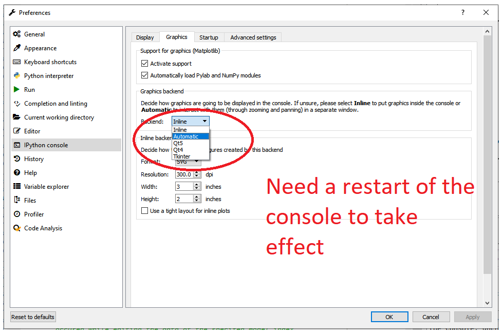
For data visualization you should plot in interactive mode. You can do that either from the preferences by selecting Automatic or by issuing the %matplotlib qt5 command in the console.

 jnsebgosselin
on 10 Apr 2020
jnsebgosselin
on 10 Apr 2020
@jnsebgosselin I think we need to provide an easy an more "ïntuitive"way of exposing this functionality without needin to know to much about magics or backends.
Maybe a toolbar button plus a context menu entry to make it clear?
Thoughts?
 goanpeca
on 10 Apr 2020
goanpeca
on 10 Apr 2020
Yes definitively. I will work on that.
jnsebgosselin
on 10 Apr 2020
Thank you guys so much for your comments and contributions.
For me, it is actually convenient to set the plotting style/output by writing the code in the console and then get the plot, inline or automatic or qt5 or ...
Thanks a lot. It really helped me now in signal processing.
muSSar-SportsAndHealthScience
on 10 Apr 2020
Closing because the initial question was answered.
 ccordoba12
on 10 Apr 2020
ccordoba12
on 10 Apr 2020
Related issues
 marianux
·
3Comments
marianux
·
3Comments
 neilsf1975
·
3Comments
neilsf1975
·
3Comments
 impact27
·
3Comments
impact27
·
3Comments
 JesterEE
·
3Comments
JesterEE
·
3Comments
 SapnaSM
·
3Comments
SapnaSM
·
3Comments