At the moment we don't see the last message's actor display name in the left side bar (Web UI).
In mobile clients we show it in different styles.
I think we should come up with a common style for all platforms.
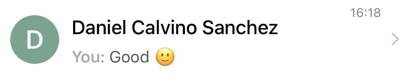
1-to-1 conversations:
If the message is from the other participant, just show the message:
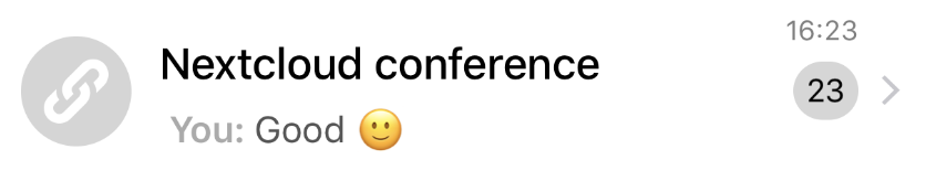
If the message is from you, show "You:" + last message:
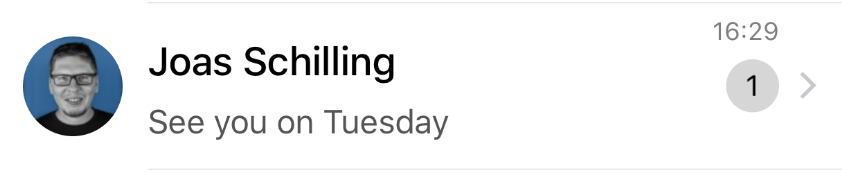
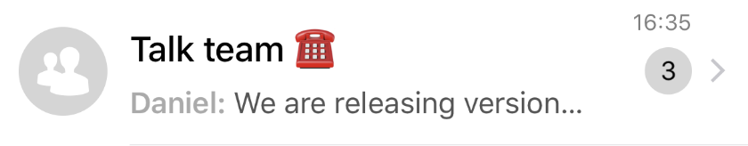
Group conversations:
If the message is from other participant, show just the first name + last message: [OPTION A]
Or show the complete name and the message in different rows: [OPTION B]
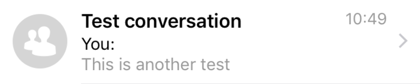
If the message is from you, show "You:" + last message: [OPTION A]
Or show "You" and the message in different rows: [OPTION B]
These are just some ideas we discussed yesterday. @nickvergessen
Any other ideas @nextcloud/designers-talk?
@mario @ma12-co @danxuliu
 Ivansss
All 12 comments
I think using the first name is quite some magic, might work for most languages thou.
But I'm strongly against the 3 lines layout....
 nickvergessen
on 9 Jan 2020
nickvergessen
on 9 Jan 2020
I'd opt against the first name as it indeed won't work everywhere. And apart from the three line layout, this is how the Android app works for one-to-one and group/public conversations pretty much (it uses full name though).
 mario
on 9 Jan 2020
mario
on 9 Jan 2020
The android app also shows the name of the other user for one-to-one conversations.
So currently it shows:
Ivan Sein
Ivan Sein: Hi there
Which is quite repetitive
nickvergessen
on 9 Jan 2020
That's fixed in master.
mario
on 9 Jan 2020
The problem with the full name is that "Daniel Calvino Sanchez" almost takes up all the space in the web already. We would only ever see 2-3 chars of the message
nickvergessen
on 9 Jan 2020
Well, we could elippsize end after 10 chars or so?
mario
on 9 Jan 2020
I vote for full name, ellipsized name + ellipsized message would look quite weird
e.g.
nickvergessen: Schmet...
as opposed to
nickverg...: Schmetterlin...
@nextcloud/designers-talk
 ma12-co
on 9 Jan 2020
ma12-co
on 9 Jan 2020
BTW this might be a good opportunity to increase the left sidebar width by 50px and maybe take them back from the right sidebar which is huge for what we need in talk!
doing that would bring it to 350px, which still fits most small mobile screen widths.
ma12-co
on 9 Jan 2020
maybe take them back from the right sidebar which is huge for what we need in talk!
Just remember that when you are in a call, the chat is in the right sidebar
nickvergessen
on 9 Jan 2020
While I’d also prefer option A, maybe it’s best to start with option B (3 rows) because we can’t determine what the first name is.
Now this here is a completely separate thing, but to move from option B to A what we could do is what we also consider for Contacts, that is moving from a combined "Name" field for the User management to a "First name" and "Last name" field, cc @skjnldsv. See Contacts issue: https://github.com/nextcloud/contacts/issues/1376#issuecomment-569604269
 jancborchardt
on 13 Jan 2020
jancborchardt
on 13 Jan 2020
Well user management != contacts
I really think the 3rd row is taking away way too much space
nickvergessen
on 13 Jan 2020
final decision after discussion: Display name until first space: message
ma12-co
on 13 Jan 2020
Related issues
ma12-co
·
3Comments
 q-wertz
·
3Comments
q-wertz
·
3Comments
 ChristophAGietl
·
4Comments
ChristophAGietl
·
4Comments
 danxuliu
·
3Comments
danxuliu
·
3Comments
 brylie
·
3Comments
brylie
·
3Comments
Most helpful comment
I think using the first name is quite some magic, might work for most languages thou.
But I'm strongly against the 3 lines layout....