Spoke: Feature Request: Streamline, add field labels and improve usability of the Account view
Problems
On mobile the account form doesn't always display the hint text so the fields are hard to decipher. Horizontal forms (what you currently see on desktop) are inefficient and error prone.
Solution
- Adjust the layout to match this mockup (attached)
- add the Alias field between first and last name (related to issue #1109 --- if the feature is not complete, ok to leave this field out until it is complete)
- add labels above the fields so that they can be deciphered without the hint text
Mockup

Related Features
Populate and display form fields: #1358
Texting Alias field: #1109
 arena
arena
All 10 comments
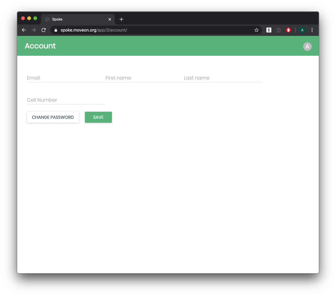
for reference this is how the account page currently displays for an existing user (Jan 2020)
(Note how the form is not populated)
arena
on 9 Jan 2020
@arena How do you want to handle "add the Alias field between first and last name (related to issue #1109)" ? Should we call this blocked until #1109 is done? Or should we encourage submissions without that field for now?
 ibrand
on 9 Jan 2020
ibrand
on 9 Jan 2020
@ibrand good point. I edited the solution above. I say, leave it out if the feature is not complete, then when the alias feature exists this mockup shows where the field should be placed.
arena
on 9 Jan 2020
Whoever picks this up is most welcome to break it into smaller pieces. I can definitely see the keeping the form populated being its own little puzzle that is separate from the layout change. @ibrand if you agree, maybe we should break it down now?
arena
on 9 Jan 2020
If we break it out into 2 issues, then I think each of those mini issues will be great good first issues so let's do it! Thanks!
ibrand
on 9 Jan 2020
Cool, I'll extract the populate one out to a new issue and edit this one. 🙌
arena
on 9 Jan 2020
@ibrand please tag this one a good first issue as well (if you agree) 😄
arena
on 9 Jan 2020
Working on this
 aschneit
on 20 Feb 2020
aschneit
on 20 Feb 2020
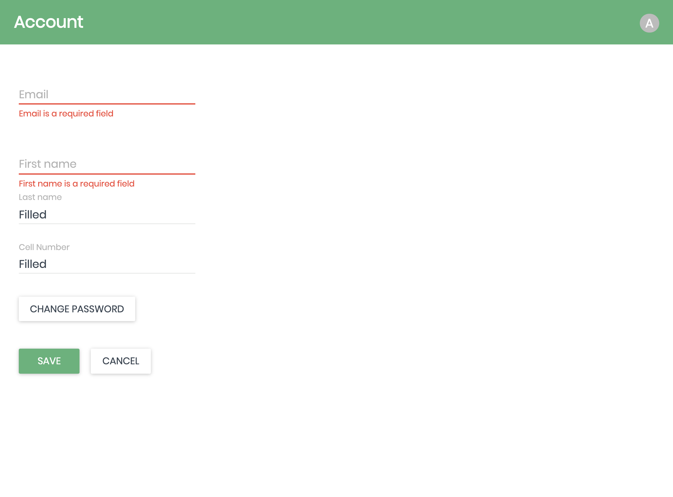
So, right now the form is populated for existing users. The way the material-ui TextField (standard) component works is that the hint/placeholder becomes a label above the field when the field is populated with text. So am I right that we want a custom form field that always has a label above regardless of whether it is filled or not, and placeholder/hint text when the field is not filled? Keeping in mind that since the form is populated now for existing users, labels will appear above the fields unless a user completely removes the text from one of them.
(screenshot demos how it works now, just with orientation fixed and Cancel button added)
aschneit
on 23 Feb 2020
Oh, I didn't realize that it had the label above when populated. Maybe it wasn't like that when I filed this, or if it was, I shouldn't have filed this issue. That's definitely good enough. Good catch!
arena
on 23 Feb 2020
Related issues
 schuyler1d
·
6Comments
schuyler1d
·
4Comments
schuyler1d
·
6Comments
schuyler1d
·
4Comments
 Frydafly
·
5Comments
Frydafly
·
5Comments
 ZevH
·
6Comments
ZevH
·
6Comments
 dev-mcm
·
4Comments
dev-mcm
·
4Comments
Most helpful comment
Cool, I'll extract the populate one out to a new issue and edit this one. 🙌