Spoke: proposed U.I. for Volunteer Texter View
hi all,
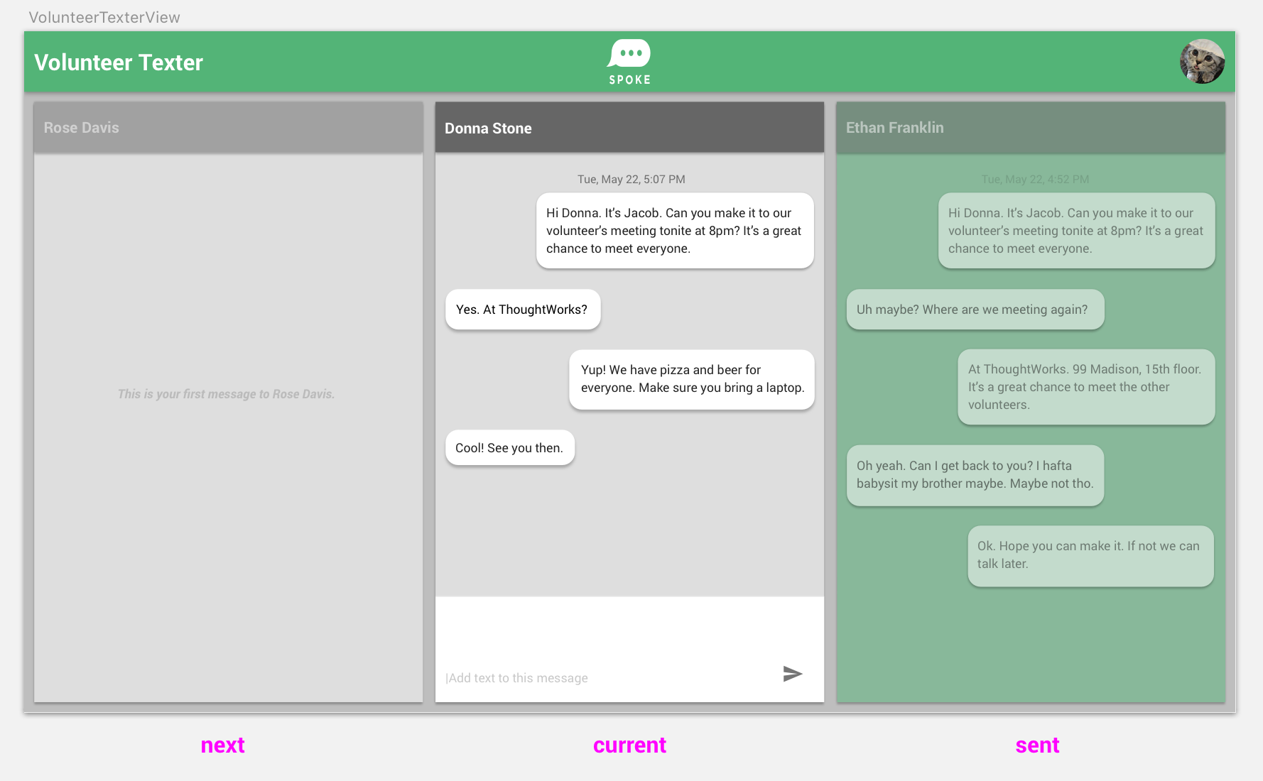
i'm interested in helping with U.I. issues. here is a proposed design for Volunteer Texter View. it might make better use of screen space than the existing single conversation screen.
let me know if this is helpful,
John
 jclarkejr
All 11 comments
Hey @jclarkejr this is interesting. I know there is a strong preference to not include the receiver's full name.
Also, to keep focus on completing initial sends, the default is to not show any replies until the sender has completed an assignment of sending X number,or, if the campaign is using dynamic assignments, chooses to go back to the sender Home to field replies.
I agree the single convo screen is not ideal, however, and kinda prefer the sender interface that Relay uses.
But we may want to be cautious in updating the UI in the near future.
Also, how would this (I'm not sure it would, actually) work, and look, on a mobile browser? Would be pretty tough to read on a phone.
 joemcl
on 18 Jul 2018
joemcl
on 18 Jul 2018
@joemcl gotcha.
jclarkejr
on 18 Jul 2018
i would imagine a single pane on mobile that would thumb-swipe left and right.
would it be helpful to mockup any of your feedback, or is this screen a non-issue at this point and I should focus elsewhere?
jclarkejr
on 18 Jul 2018
hey @jclarkejr - there's been discussion around a new feature Message Review Board for admins viewing incoming messages.
Maybe check out this issue: https://github.com/MoveOnOrg/Spoke/issues/713
Thanks for the UX help!
 shakalee14
on 18 Jul 2018
shakalee14
on 18 Jul 2018
thanks @shakalee14 i will check it out :)
jclarkejr
on 18 Jul 2018
I like the direction here! @jclarkejr . Another missing that exists now (and probably if anything it would expand) are the additional options that a texter does after receiving messages for reply/response:
- Marking how they answered a question (there's a drop down)
- Opting-out someone (with possible message)
- Choosing a 'Canned Reply' (drop down)
Those already exist. People have discussed other things here like: - an emoji / image library
- tagging a resonse (sort of related to 1.)
 schuyler1d
on 25 Jul 2018
schuyler1d
on 25 Jul 2018
@schuyler1d thanks for the feedback. i'm getting Spoke up and running on my phone and laptop today to be better able to address your comments
jclarkejr
on 26 Jul 2018
@jclarkejr Is this a visual design recommendation for a single screen in 3 different states, or is this a suggestion to have a 3-way split screen?
 arena
on 9 Jan 2020
arena
on 9 Jan 2020
Also, this issue has a pretty broad title --- it would be helpful if you could narrow it down to the part of the ui you want to redesign --- let me know if you'd like some help thinking through a more specific design recommendation. Otherwise, if I don't hear back from you, I'm going to suggest that we move all the design issues under an umbrella and give them specific titles and descriptions. I'm going to be adding a lot of little suggestions and I want to make sure that something as big as the entire texter ui isn't in a single issue without all the complex, interconnected features and edge cases.
arena
on 9 Jan 2020
I suggest that we archive this issue since it doesn't seem active. It has some interesting ideas in it but not enough granular detail to be actionable
arena
on 15 Jan 2020
Agreed with @arena. I'm going to close this, but feel free to reference it in future design issues!
 ibrand
on 15 Jan 2020
ibrand
on 15 Jan 2020
Related issues
ibrand
·
5Comments
arena
·
6Comments
 joshkpeterson
·
4Comments
schuyler1d
·
4Comments
joshkpeterson
·
4Comments
schuyler1d
·
4Comments
 Dayologic
·
5Comments
Dayologic
·
5Comments
Most helpful comment
Also, this issue has a pretty broad title --- it would be helpful if you could narrow it down to the part of the ui you want to redesign --- let me know if you'd like some help thinking through a more specific design recommendation. Otherwise, if I don't hear back from you, I'm going to suggest that we move all the design issues under an umbrella and give them specific titles and descriptions. I'm going to be adding a lot of little suggestions and I want to make sure that something as big as the entire texter ui isn't in a single issue without all the complex, interconnected features and edge cases.