Sp-dev-fx-webparts: select primary theme color in react-enhanced-powerapps
How do I select the primaryThemeColor in the react-emhanced-powerapps sample webpart? Looking at the docs at https://docs.microsoft.com/en-us/sharepoint/dev/spfx/use-theme-colors-in-your-customizations it seems to say that themePrimary is the 'default' color for my sites, bit that is not an option in the react-enhanced-powerapps.
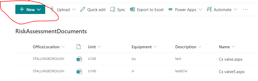
I'm looking to use the background color of the new button here:
Which option do I use?
 russgove
All 4 comments
Thank you for reporting this issue. We will be triaging your incoming issue as soon as possible.
![msftbot[bot] picture](https://avatars2.githubusercontent.com/in/26612?v=4&s=40) msftbot[bot]
on 1 Sep 2020
msftbot[bot]
on 1 Sep 2020
Hey @russgove,
Take a look at this post which lists all the colors available for semantic colors:
https://tahoeninjas.blog/2020/07/28/adding-support-for-theme-variants-in-spfx-web-parts/
It may help?
 hugoabernier
on 1 Sep 2020
hugoabernier
on 1 Sep 2020
Thanks hugo. menuHeader seems to work for me.
This webpart rocks! thanks
russgove
on 1 Sep 2020
Thank you @russgove! I'll #goahead and close this issue. Let us know if you need anything else at all.
hugoabernier
on 1 Sep 2020
Related issues
 albegut
·
4Comments
albegut
·
4Comments
 MaxDaxDax
·
4Comments
MaxDaxDax
·
4Comments
 shrirampophali
·
4Comments
shrirampophali
·
4Comments
 ChristianSaldivar
·
3Comments
ChristianSaldivar
·
3Comments
 sivanu137
·
4Comments
sivanu137
·
4Comments