Signal-desktop: Make link previews more compact
Link previews often are too large, especially when only a simple logo is displayed.
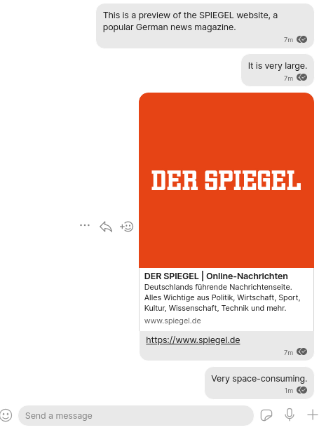
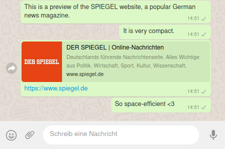
Below is a screenshot from Signal and one from WhatsApp for comparison.
Signal Screenshot
WhatsApp Web Screenshot
Solution:
I would strongly suggest switching to the WhatsApp-style mini-preview.
I see that sometimes a high resolution view of e.g. an article cover image looks quite nice, but arguably in 95% of the times it's just not worth the space. On the phone it is even more problematic, when the preview literally takes up more than half of the screen. Also, the preview image often isn't of any interest, which makes the current view extra annoying. Like here:
Platform Info
Signal Version: v1 39.4
Operating System: Linux Mint 20
Linked Device Version: Android
 GitMatze
All 6 comments
A quick fix might be to restrict the image height. It's still very space-consuming, however.
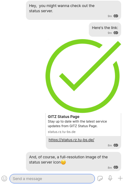
See Twitter for example:

GitMatze
on 9 Jan 2021
This is a good idea and something we'll look into soon.
 EvanHahn-Signal
on 9 Jan 2021
EvanHahn-Signal
on 9 Jan 2021
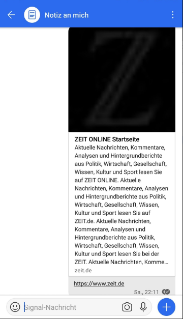
Thanks! Just to show you the urgency of this: The preview of www.zeit.de currently takes up more than the the entire screen on my Galaxy S7 phone. It's really a serious UX flaw..
(Signal 5.1.1 on Samsung S7)
GitMatze
on 10 Jan 2021
@GitMatze Thanks for reporting. The various client teams will take a look at this on their respective platforms.
EvanHahn-Signal
on 11 Jan 2021
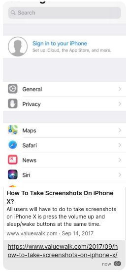
@EvanHahn-Signal . Great to see this fixed! I'm not sure though if large-height images are handled as intended.
Like a phone screenshot: https://www.valuewalk.com/2017/09/how-to-take-screenshots-on-iphone-x/
GitMatze
on 17 Jan 2021
@GitMatze Thanks—I think this is intentional, but we'll look into it just in case.
I'm going to close this issue because I believe it's resolved, but let me know if that's wrong and I can reopen.
EvanHahn-Signal
on 19 Jan 2021
Related issues
 fredaas
·
3Comments
fredaas
·
3Comments
 github-cygwin
·
3Comments
github-cygwin
·
3Comments
 McLoo
·
3Comments
McLoo
·
3Comments
 jeremymasters
·
3Comments
jeremymasters
·
3Comments
 bcsga
·
3Comments
bcsga
·
3Comments
Most helpful comment
@GitMatze Thanks for reporting. The various client teams will take a look at this on their respective platforms.