Signal-desktop: Responsive collapsable gutter (side menu)
It'd be nice if the "gutter" collapsed on narrow viewports. Something like
@media (max-width: 50em) {
  .gutter {
     display: none;
  }
  .conversation-stack {
    padding-left: 0px;
  }
}
This would of course require a replacement drop-down menu. Is this something you'd be interested in?
 fredefox
All 29 comments
What do you mean by 'gutter' exactly?
 scottnonnenberg-signal
on 12 Jun 2018
scottnonnenberg-signal
on 12 Jun 2018
That was probably a bad name to reference it by. It's the css class of the side menu.
fredefox
on 13 Jun 2018
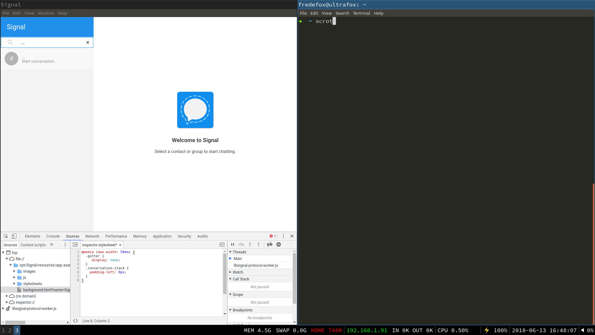
I've uploaded two screenshots here: http://web.student.chalmers.se/~hanghj/signal-screen-dump/
Didn't find a way to attach them to this issue directly, sadly.
The two pictures shows Signal (with the developer console open showing the added css). The first picture shows Signal at screen-width > 50em with the side menu visible. The second one is with a narrower viewport where the menu is not visible.
fredefox
on 13 Jun 2018
@fredefox You can drag images directly into your comments here. Note also that I don't have permission to view the files on your server.
scottnonnenberg-signal
on 13 Jun 2018

fredefox
on 14 Jun 2018
I think we'll need some sort of affordance for the left conversation list pane when it's collapsed. That second screenshot is really confusing - how would you know to make the window wider?
scottnonnenberg-signal
on 14 Jun 2018
Probably making it a thin strip, rather than fully hidden, so when you click on it, it will expand back out to the way it is now. This way there is a quick way to get it back without jumping through a lot of hoops. Think for example the Outlook left panel and how it collapses and comes back quite easily and maybe put a pin icon that will make it stay open or otherwise collapse again when it loses focus. Just my two cents on this.
 GuardianMajor
on 14 Jun 2018
GuardianMajor
on 14 Jun 2018
This wasn't intended as the final solution. Just an illustration of the problem and my proposed solution. Hence I this issue rather than a PR. Can I take it you'd be interested in this if I implement it?
fredefox
on 18 Jun 2018
@fredefox Yes, we are interested. But these questions are meant to illustrate that anything UI-centric like this is really visible, with lots of corner cases to consider. We really need it to be right before we merge, and that often means talking quite a bit before any code is written.
scottnonnenberg-signal
on 18 Jun 2018
Yeah, I totally agree with you. It's a good point and also why I wanted to float the idea before starting to work on it. I'd add, though, that implementing something that only affects narrow view ports cannot really deteriorate the interface, since, as it stands, the interface is not really usable when it is narrow.
But I'd be very interested in hearing input from the community/maintainers. Let me know when this is something you'd want to move forward with.
fredefox
on 20 Jun 2018
I second this proposal. I notice the screenshots show a tiling window manager, which I also use. In such contexts, Signal Desktop is simply too greedy in terms of screen space, with enforced minimum width and height and lack of a "minimised" display mode, which means we have to reserve a full screen for the app to be usable.
Also these screenshots seem to have been taken before the electron update that scales up the UI widgets on high density displays (> 72 dpi, e.g. mine is 166 dpi). Since then the problem has only exacerbated as now all widgets individually take even more space.
 karthanistyr
on 29 Oct 2018
karthanistyr
on 29 Oct 2018
@karthanistyr Can you provide a screenshot of the scaling up of the widgets under high DPI? I'm not sure I've seen that.
scottnonnenberg-signal
on 29 Oct 2018
Before it used to open like this:
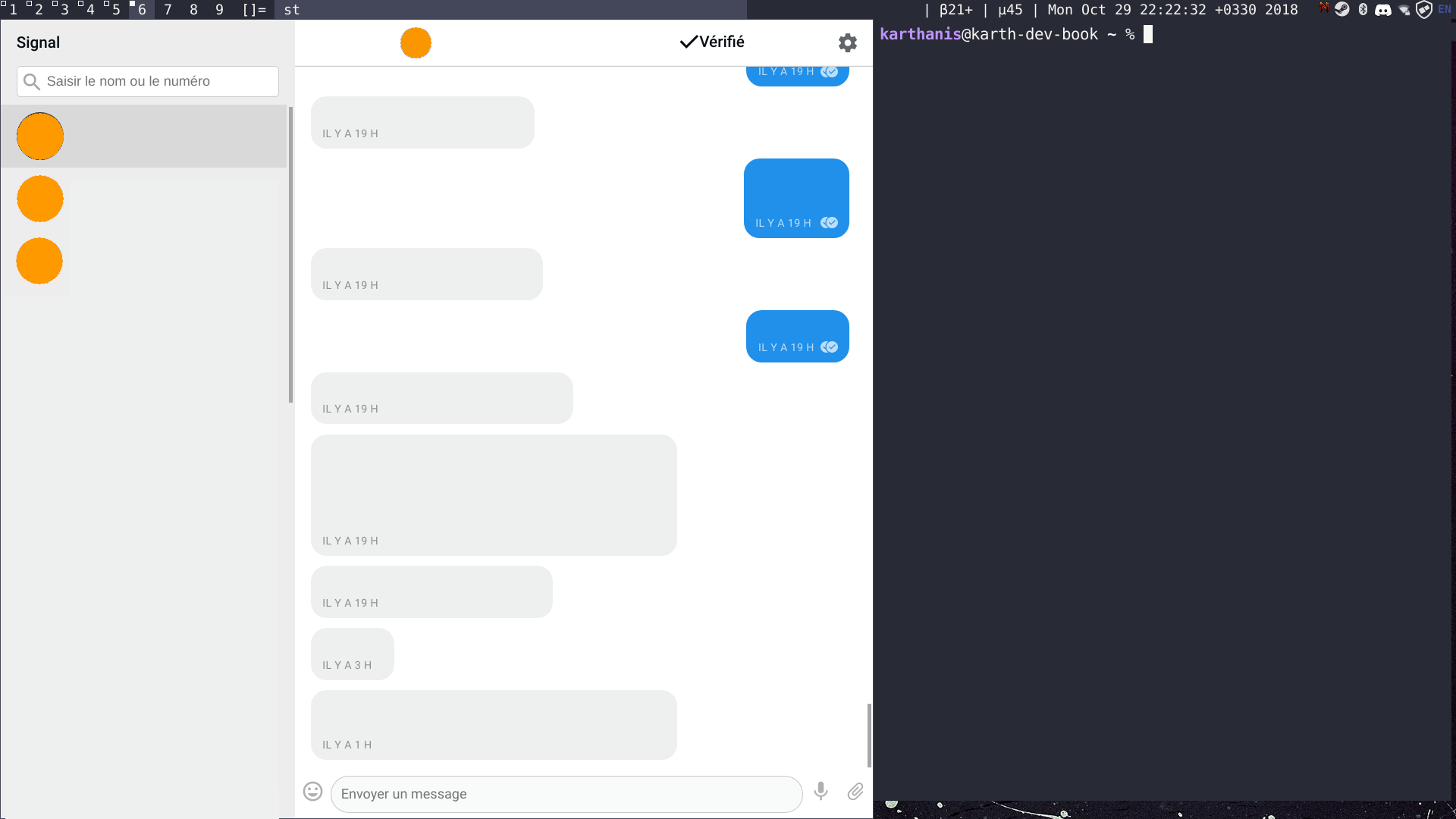
Now it's like this:

I find the text more legible, but the UI is becoming a bit cumbersome. The contacts sidebar is enormous (and non-collapsible).
Also the UI is such that when I try to allocate less than the minimum width to the Signal window, the part of the window that gets overlapped is the chat zone, leaving the Contacts sidebar intact (hard minimum width issue):

HTH.
karthanistyr
on 29 Oct 2018
@karthanistyr Interesting. When did that start happening? Can you tell me about Linux distro and window manager?
scottnonnenberg-signal
on 29 Oct 2018
Arch Linux running ˋdwmˋ (https://dwm.suckless.org).
I can’t date it precisely, but I’d say it occurred some time during the last three months...
karthanistyr
on 30 Oct 2018
I don't see anything wrong with what others do - simply collapse the contact names and only show the user photo/avatar. On mouse over show the name and last message in a tooltip. Ideally this would be a configuration option. You would have to figure out a nice way to handle the search field tho... perhaps expand it to full width when in :focus?
 adioe3
on 11 Mar 2019
adioe3
on 11 Mar 2019
I would be very interested about the ability to collapse the left panel. In fact, I would love Signal Desktop client to be more usable with a touch screen.
I'm a web developer & UX designer, can I help?
 Flaburgan
on 29 Aug 2020
Flaburgan
on 29 Aug 2020
@Flaburgan Yep, you can help! Draft up some proposed designs, and we can pass those along to our designers. That's always going to be the first step for anything that affects the UX. Thanks!
scottnonnenberg-signal
on 29 Aug 2020
@scottnonnenberg-signal here you go.
So, my thoughts were:
- Collapsing / revealing isn't an action you are going to do often. You probably have a preference and are going to stay on it. For that reason, I don't want the button triggering the action to be at the top of the app, where more important actions are.
- To still be able to switch between conversations, and to see if a conversation has a new message even if in collapsed mode seems important. So even in "Collapsed" mode, the sidebar still is apparent but way smaller (in my screenshot, 50px wide instead of 320). That also allows the "Uncollapse" button to be visible.
The way I see it, the action "Collapse sidebar" could be added at the bottom of the conversations list. Once clicked, the left sidebar retracts, the avatars size is reduced, and the "Collapse" button becomes an "Uncollapse" one, the arrow switching from left to right.

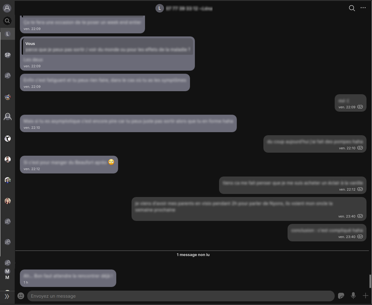
These are just raw drafts, colors, font size and style, margins, icons... are going to change. They are only posted to allow everyone to imagine the UX and the layout of the application. Also, I would like the top / bottom margin between avatars in collapsed mode to be smaller but due to the current implementation it was too much work to do it for those screenshots
Also please note that the "my profile" and the search bar actions at the top of the conversations list are now displayed below each other. Clicking on the search here would uncollapse the sidebar and focus on the text field.
Any feedback welcome everyone!
Flaburgan
on 29 Aug 2020
@scottnonnenberg-signal it's been more than 2 weeks now, any feedback to share? Did you forward that proposition to the UX team? Are they using github?
Flaburgan
on 16 Sep 2020
@Flaburgan I did follow up with the design team. It's possible that they may have time to work on this feature in the coming several weeks, and we'll comment back here if we end up with designs for you.
scottnonnenberg-signal
on 5 Oct 2020
A good workaround: https://github.com/signalapp/Signal-Desktop/issues/3433
Keep in mind the total width window is still constrained to total width as if the full list was present, so no way to make chat skinny/slender/tall, even when making gutter 75px.
 krstp
on 23 Nov 2020
krstp
on 23 Nov 2020
@Flaburgan I did follow up with the design team. It's possible that they may have time to work on this feature in the coming several weeks, and we'll comment back here if we end up with designs for you.
Any update on this?
 livejamie
on 21 Dec 2020
livejamie
on 21 Dec 2020
@livejamie Design has a smaller left pane on their list, but it'll be another several weeks.
scottnonnenberg-signal
on 4 Jan 2021
I see how @Flaburgan's suggested design can be welcomed in some situations, it will already be a nice improvement. But I think it would be really awesome to go a bit further and make the desktop app really responsive, meaning it would adapt to any size of screen. It feels to me like a natural evolution.
I'm used to the gnome desktop and to many desktop apps and websites being responsive, to the point it feels strange not being able to resize any window to any size you want (for instance, now you cannot "tile signal" on the side of your screen, which would prove to be useful in several situations).
What I expect from a responsive app/website, is to behave like a mobile app when the window is resized to small (in our case, you see the list of your conversation, you click on one of them to see the conversation, a backward arrow allows you to go back to the list of conversations, just like in the mobile app) and as a desktop app when the window is big enough. (I think Telegram has that kind of behaviour right now).
This would probably be espacially appreciated by people using linux mobile phones such as the pinephone or the librem5 as signal is currently not available on those platforms (as long as the desktop app can be built for arm devices).
 dorianve
on 21 Jan 2021
dorianve
on 21 Jan 2021
What I expect from a responsive app/website, is to behave like a mobile app when the window is resized to small (in our case, you see the list of your conversation, you click on one of them to see the conversation, a backward arrow allows you to go back to the list of conversations, just like in the mobile app) and as a desktop app when the window is big enough. (I think Telegram has that kind of behaviour right now).
I agree to an extend, though for a desktop app, even when the window is very narrow, I prefer to still see some of the sidebar. Like the design by @Flaburgan having a narrow sidebar at all times is what I'd prefer. Or at least the option for it, even if it's not the default behaviour.
 TheOddler
on 21 Jan 2021
TheOddler
on 21 Jan 2021
for instance, now you cannot "tile signal" on the side of your screen, which would prove to be useful in several situations
Tiling of the signal desktop app would definitely be a killer feature. Imagine chatting _on the same screen_ as you do other work instead of switching displays all the time
karthanistyr
on 21 Jan 2021
I've been lurking on this thread for months and want to chime in.
I think it’s really important to start moving away from the “desktop” vs. “mobile” design discussion. New devices in “mobile” form factors are capable of running full "desktop" Linux:
https://puri.sm/posts/my-first-week-of-librem-5-convergence/
This has the potential to be an epochal shift. I suspect in a decade it will be the norm. The success of these early devices depends a lot on whether the apps that early adopters want to use can be run successfully. Signal is at the top of that list right now for myself and many others.
Front-end devs fought a version of this war a decade ago. Developers expended a lot of effort trying to meaningful detect/distinguish touch vs non-touch devices. There are mass-market cases where this can be approximated. But, as it turns out, in the end, one can’t do this robustly. One has to assume all devices are touch, or could suddenly become touch when a touch display is connected. Displays can be touch, mouse, pointer, voice, or some dynamic combination of any of the above, at any time, during any part of any session. Informed designers have correctly adjusted for that reality.
Looking in the other direction, MacOS running on Apple silicon (the new M1 laptops and Mac minis) can run iOS apps _today_. Many of the design patterns (and tics) of iOS have already drifted over into Big Sur. The design direction reflects convergence, borne of the shrinking of hardware.
Based on all of this, I would counsel strongly against a design iteration for Signal “desktop” which retains the current 2 column layout menu for narrow viewports. IMHO the narrow-width design is already done. It’s the mobile app. Set a breakpoint below which the “desktop” app UI effectively effectively becomes the “mobile” app. This will require some extremely clever CSS/document structure and probably some light JavaScript.
I do understand that desktop-linux-on-a-phone is a vanishingly tiny market segment right now, and not realistic for a product manager to prioritize. In light of that reality, I'd be willing to help with this if we can converge on the design.
 albell
on 20 Mar 2021
albell
on 20 Mar 2021
IMHO the narrow-width design is already done. It’s the mobile app.
I disagree. The "narrow" on my desktop monitor, even though it's only like a 3rd of my screen (and in pixel-count much less than my phone), is physically at least 2.5 times as wide as my phone.
I think there is definitely space and need for something in between no-sidebar like in the mobile app, and a full-sized-sidebar like in the current desktop app.
TheOddler
on 21 Mar 2021
Related issues
 demux4555
·
3Comments
demux4555
·
3Comments
 muellermartin
·
3Comments
muellermartin
·
3Comments
 McLoo
·
3Comments
McLoo
·
3Comments
 fredaas
·
3Comments
fredaas
·
3Comments
 halb9
·
3Comments
halb9
·
3Comments
Most helpful comment
@scottnonnenberg-signal here you go.
So, my thoughts were:
The way I see it, the action "Collapse sidebar" could be added at the bottom of the conversations list. Once clicked, the left sidebar retracts, the avatars size is reduced, and the "Collapse" button becomes an "Uncollapse" one, the arrow switching from left to right.
These are just raw drafts, colors, font size and style, margins, icons... are going to change. They are only posted to allow everyone to imagine the UX and the layout of the application. Also, I would like the top / bottom margin between avatars in collapsed mode to be smaller but due to the current implementation it was too much work to do it for those screenshots
Also please note that the "my profile" and the search bar actions at the top of the conversations list are now displayed below each other. Clicking on the search here would uncollapse the sidebar and focus on the text field.
Any feedback welcome everyone!