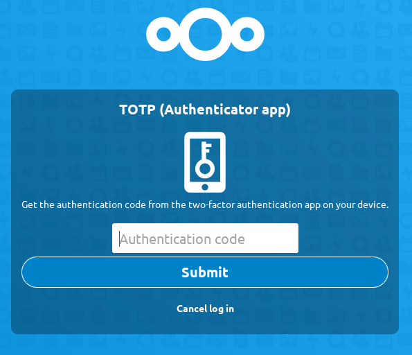
The submit button on the 2FA login screen is unusual super huge in _Nextcloud 18.0.0 RC1 Build:2020-01-05T22:01:57+00:00
Is that intended?
cc @nextcloud/designers
 wiswedel
All 4 comments
Seems somewhere somebody messes with some css ;)
On the plus side. Now it is easy to spot the button.
@juliushaertl @skjnldsv @ChristophWurst
 rullzer
on 6 Jan 2020
rullzer
on 6 Jan 2020
😄2
On the plus side. Now it is easy to spot the button.
So it's actually a pro-accessibility feature, huh? 😜
wiswedel
on 6 Jan 2020
Not a problem of 2FA but the arbitrary width of the container on update/install pages.
@jancborchardt knows more about it.
 ChristophWurst
on 7 Jan 2020
ChristophWurst
on 7 Jan 2020
This is fixed through https://github.com/nextcloud/server/pull/18898 :)
 jancborchardt
on 15 Jan 2020
jancborchardt
on 15 Jan 2020
Was this page helpful?
0 / 5 - 0 ratings
Related issues
 ThomasLeister
·
3Comments
ThomasLeister
·
3Comments
 williambargent
·
3Comments
williambargent
·
3Comments
 Django-BOfH
·
3Comments
Django-BOfH
·
3Comments
 MorrisJobke
·
3Comments
MorrisJobke
·
3Comments
 georgehrke
·
3Comments
georgehrke
·
3Comments
Most helpful comment
Seems somewhere somebody messes with some css ;)
On the plus side. Now it is easy to spot the button.
@juliushaertl @skjnldsv @ChristophWurst