Our current 2FA selection screen (if you have multiple providers). Looks like:
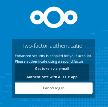
Which is not to pretty IMO.
Something like (excuse my awesome artistic skills):
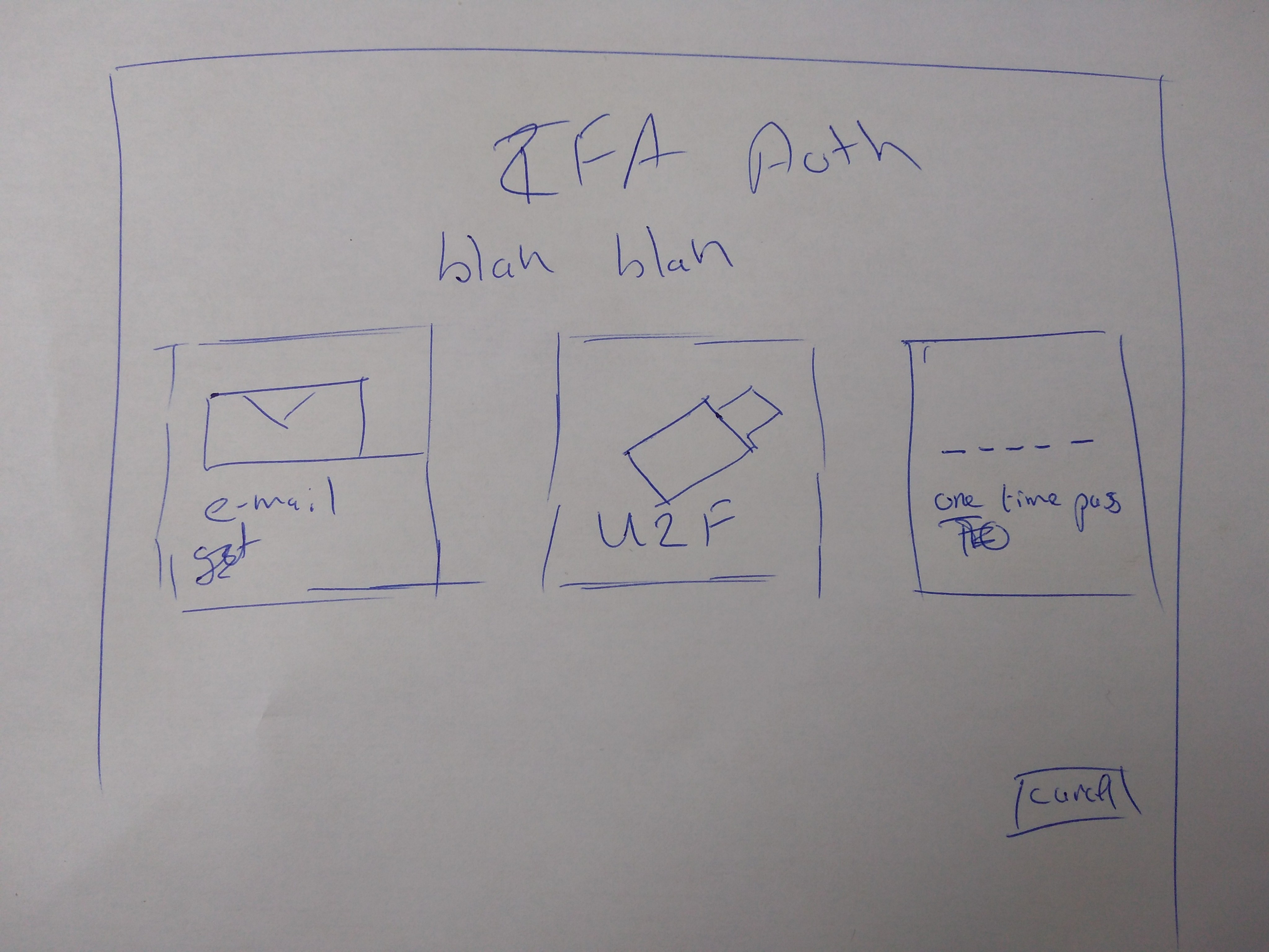
Would be nicer I think.
Tiles with a description would also be 'easy' (for somebody with CSS knowledge) to make responsive for the mobile UI.
@nextcloud/designers
@ChristophWurst as it is 2FA stuff ;)
 rullzer
All 3 comments
GitMate.io thinks possibly related issues are https://github.com/nextcloud/server/issues/1120 (2FA: skip selection screen if there's only one active provider for the user), https://github.com/nextcloud/server/issues/7018 (Backlink to 2FA selection), https://github.com/nextcloud/server/issues/6672 (Dedicated favicon selection), https://github.com/nextcloud/server/issues/9441 (Improve token handling), and https://github.com/nextcloud/server/issues/9113 (Improve loginflow text).
 nextcloud-bot
on 17 Aug 2018
nextcloud-bot
on 17 Aug 2018
I'm not fond of the "blah blah" text, can we change? :thinking:
Nice improvements btw ;)
 skjnldsv
on 17 Aug 2018
skjnldsv
on 17 Aug 2018
As discussed with @rullzer & @ChristophWurst – Christoph will create a branch with all that’s needed for the screen and I’ll do the layout. :)
 jancborchardt
on 1 Oct 2018
jancborchardt
on 1 Oct 2018
Related issues
 brylie
·
3Comments
brylie
·
3Comments
 juliushaertl
·
3Comments
juliushaertl
·
3Comments
 e-alfred
·
3Comments
e-alfred
·
3Comments
 ThomasLeister
·
3Comments
ThomasLeister
·
3Comments
 MariusBluem
·
3Comments
MariusBluem
·
3Comments
Most helpful comment
I'm not fond of the "blah blah" text, can we change? :thinking:
Nice improvements btw ;)