Server: Dyslexia-friendly font and theme enhancements
From https://axesslab.com/fonts-dont-matter/#a-note-on-dyslexia-friendly-fonts (emphasis mine)
There are a few fonts out there that market themselves as “dyslexia friendly” and they’ve gotten a lot of spread lately.
Below is Open Dyslexic, probably the most well known font designed for readers with dyslexia. As you can see, the foot of each letter is bold, which is meant to reduce risk of flipping the letters around when reading.
However, people with dyslexia tend to prefer common fonts to dyslexia-friendly fonts when comparing them.
Special fonts often result in the reader mentally thinking about the font, when reading actually is about getting beyond the font and reading the content.
– Representative from the Swedish Dyslexic AssociationThere is no evidence that dyslexia fonts help people with dyslexia to read faster and more accurately.
– Understood.orgSo don’t overestimate their dyslexia friendliness. Use common fonts instead.

So, should we keep or remove the "Dyslexia font" from the accessibility settings? cc @skjnldsv @nextcloud/designers @nextcloud/accessibility (You might argue that it's already implemented. But we will need to maintain it, and it's much stranger to remove it after a release than before.)
What do you think?
 jancborchardt
All 6 comments
@jancborchardt I really have no preferences as I don't have dyslexia.
If people who are the most affected really find this feature useless, I'd say we don't need to keep it on our accessibility app then :)
 skjnldsv
on 27 Jul 2018
skjnldsv
on 27 Jul 2018
@jancborchardt already had a small discussion about this. The Server should only contain things we know it helps. Such things are high contrast and dark theme. Things like a dyslexia font could exist as a separate app available in the appstore.
 MariusBluem
on 27 Jul 2018
MariusBluem
on 27 Jul 2018
Dyslexic person here: I use OpenDyslexic and aggressively change any black-on-white or white-on-black colourschemes with client-side CSS and browser addons as often as possible and would benefit from official font support.
I'd also like to point out that people who have varied issues with reading and writing will have to defend an accessibility option _in writing_ and may therefore not feel confident speaking up.
In defence of the font: It's not really about reading speed, which seems to be the only thing SAD and understood.org are using as metrics) but it significantly delays "visual stress" and fatigue from reading for me and others I've spoken to. An example of what one type of of visual stress looks like is on this page, along with some descriptions: visual stress example.
This font, with a properly tailored layout (which is what I hope the official support brings) and a low-contrast colourscheme can pretty-much eliminate that effect entirely for me.
 RetroRodent
on 27 Jul 2018
RetroRodent
on 27 Jul 2018
@RetroRodent thank you so much for weighing in and stating you would benefit from this!
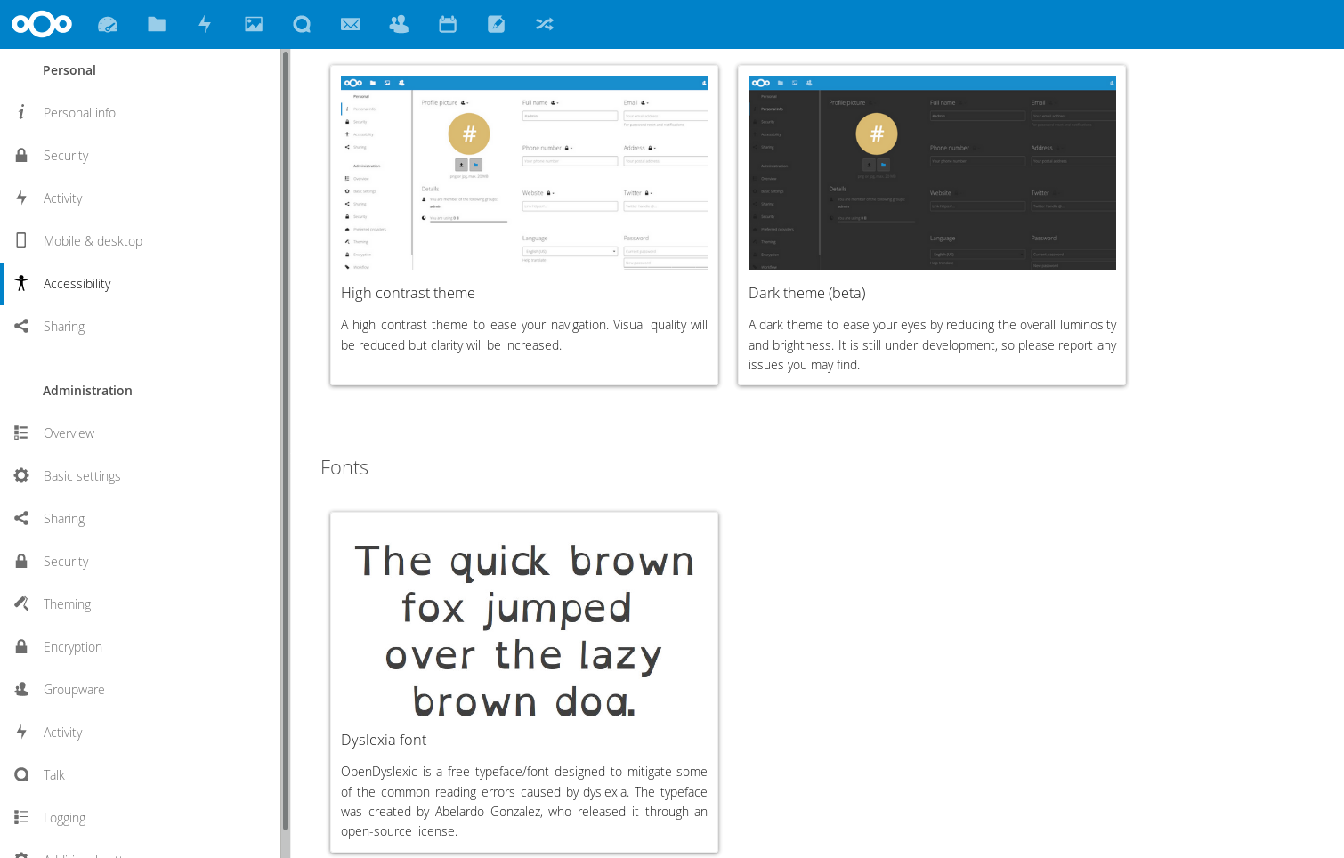
With the upcoming release of Nextcloud 14 we will have basic dyslexia-friendly font support from the settings:
You also mentioned the need for a low-contrast color scheme. Would the dark theme be something you would use? Or should we expand the dyslexia theme beyond just a font? For example changing the default white background to a light grey? And default dark text to a dark grey? What else would be specific changes you would like to see?
(I'm keeping this issue open but renaming it and removing it from Nextcloud 14, since we will keep the feature in. :)
jancborchardt
on 27 Jul 2018
It seems that this didn't made it to 15 as well. Let's move it to 16.
 MorrisJobke
on 5 Nov 2018
MorrisJobke
on 5 Nov 2018
I think we can even close it. We received interest in this feature, no need to remove it now :)
skjnldsv
on 6 Nov 2018
Related issues
 mfechner
·
3Comments
mfechner
·
3Comments
 juliushaertl
·
3Comments
juliushaertl
·
3Comments
 georgehrke
·
3Comments
georgehrke
·
3Comments
 Django-BOfH
·
3Comments
Django-BOfH
·
3Comments
 ThomasLeister
·
3Comments
ThomasLeister
·
3Comments
Most helpful comment
Dyslexic person here: I use OpenDyslexic and aggressively change any black-on-white or white-on-black colourschemes with client-side CSS and browser addons as often as possible and would benefit from official font support.
I'd also like to point out that people who have varied issues with reading and writing will have to defend an accessibility option _in writing_ and may therefore not feel confident speaking up.
In defence of the font: It's not really about reading speed, which seems to be the only thing SAD and understood.org are using as metrics) but it significantly delays "visual stress" and fatigue from reading for me and others I've spoken to. An example of what one type of of visual stress looks like is on this page, along with some descriptions: visual stress example.
This font, with a properly tailored layout (which is what I hope the official support brings) and a low-contrast colourscheme can pretty-much eliminate that effect entirely for me.