Server: Delete button as far as possible from selection box
Select a file in the web UI on the left. You'll find the delete button (and other buttons) totally on the right. You will probably not even notice they just appeared... @waazdakka pointed this out and I even had to look for the delete button myself...
Maybe it's simplistic to put them on the left, but... Better ideas?
@nextcloud/designers
 jospoortvliet
All 12 comments
This should be symmetric to the normal file list entries, with the actions in a 3-dot-menu. In this case the 3-dot-icon can be directly right next to the "2 folders & 5 files" text.
Also makes it work better on mobile where the 3 icons are close together without labels. On desktop, the 3-dot-icon could have a label like "Actions".
 jancborchardt
on 5 Jan 2018
jancborchardt
on 5 Jan 2018
Also cc @Abijeet who implemented this :)
jancborchardt
on 5 Jan 2018
That would indeed help a lot, I think... @waazdakka agreed?
jospoortvliet
on 16 Jan 2018
This is what I'm going to be doing in a separate PR -
- On mobile the actions - Move to, download and delete will be going into a 3-dot-menu.
- Ensure that the Delete label should be right of the icon, like with the other icons on all resolutions.
- 3-dot-menu should be right of the "2 folders & 1 file" text.
- In the guest view for a read-only shared folder, there will only be a single action: Download. In that case there should not be a 3-dot-menu, but the single action shown directly.
Note that if we go with the above changes there will be some HTML that will be duplicated.
 Abijeet
on 17 Jan 2018
Abijeet
on 17 Jan 2018
@MorrisJobke - These changes will not be minor, not sure if I'd label this as papercut.
Abijeet
on 20 Jan 2018
Maybe someone from the JS team can help me on this one.
For the new dropdown needed on lower resolutions, I'm planning to do the following,
- Create a new Backbone View to handle the dropdown needed on this one.
- Some of the methods in
filelist.jssuch as_onClickDownloadSelected,_onClickCopyMoveSelected,_onClickDeleteSelectedetc will have to be be made "public" so that the other component can use this. - Will initialize the view similar to the NewFileMenu dropdown.
Thoughts?
cc: @nextcloud/javascript
Abijeet
on 21 Jan 2018
@Abijeet the changes you mention sound perfect! :)
Maybe @skjnldsv @juliushaertl or @pixelipo can help with the JS?
jancborchardt
on 22 Jan 2018
Finally got round to working on this.
I've added the actions menu on the normal view as well and displaying it right next to the _1 folder and 1 file_ selected text. Not a huge fan of this approach though. I feel the move or copy, delete and download icons appearing earlier were cleaner and intuitive, especially on a large monitor.
@jancborchardt / @nextcloud/designers - What do you think?
Abijeet
on 27 May 2018
@Abijeet looks good! :) Only a detail: The triangle should be in the middle of the box, pointing towards the 3-dot-icon.
Regarding showing the contents of the actions menu earlier – sure: We could show »Move or copy« outside of the menu (left of it, with text) on a bigger screen. But more than 1 action outside the menu is too much.
jancborchardt
on 27 May 2018
@Abijeet looks good! :) Only a detail: The triangle should be in the middle of the box, pointing towards the 3-dot-icon.
Documentation: https://docs.nextcloud.com/server/13/developer_manual/design/popovermenu.html
:)
 skjnldsv
on 27 May 2018
skjnldsv
on 27 May 2018
@skjnldsv in the alignment it says Right is by default – seems it should be centered by default for sure, and right as an option, just like left. :)
jancborchardt
on 28 May 2018
The triangle should be in the middle of the box, pointing towards the 3-dot-icon.
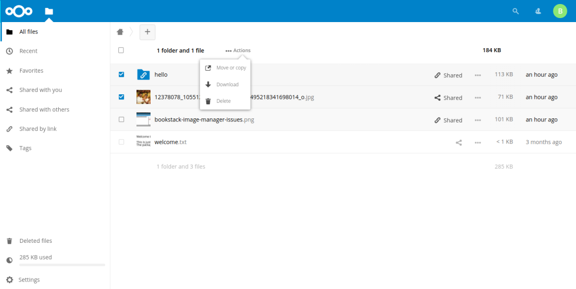
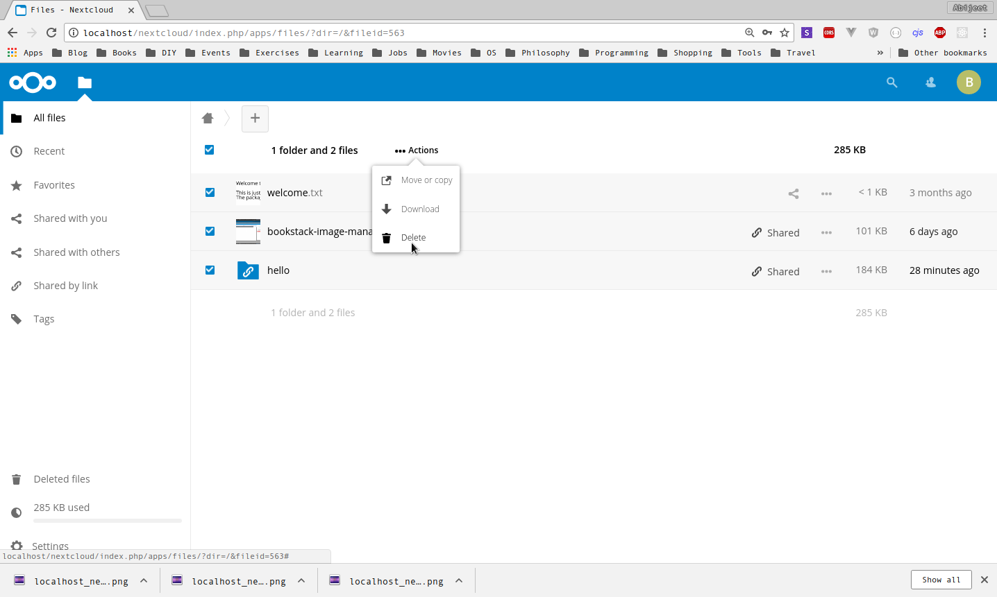
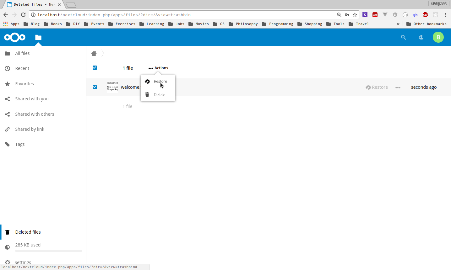
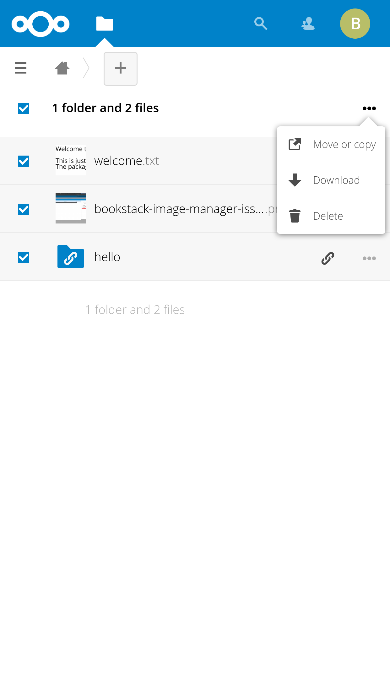
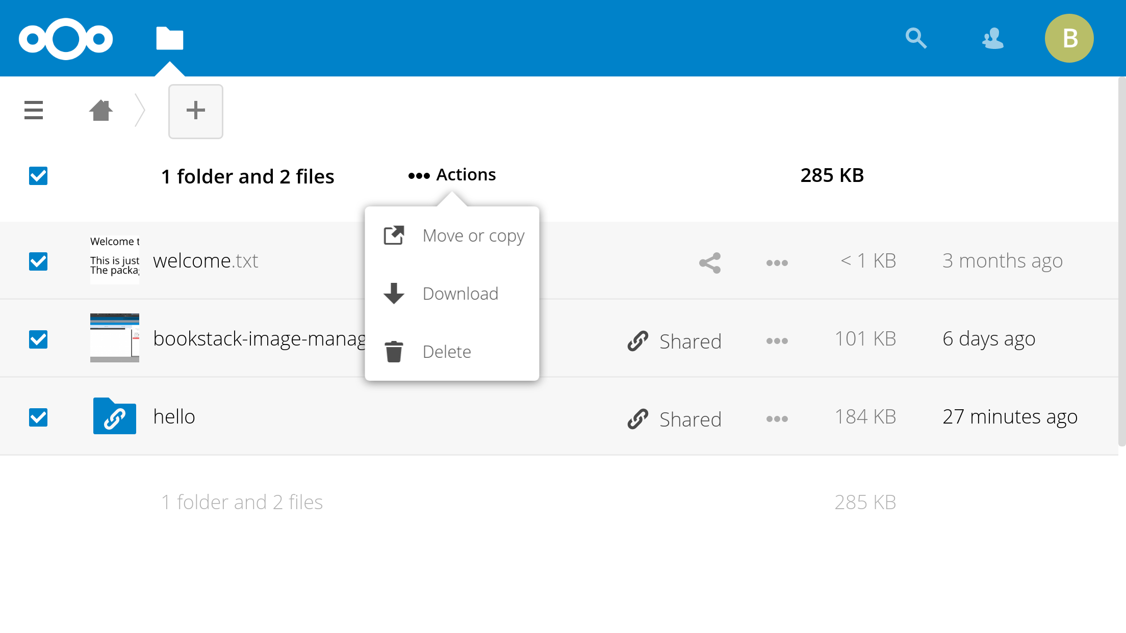
@jancborchardt - Done
Note that I also modified the trashbin plugin (Deleted files), I've put the restore and delete items under the actions menu.
Here are a few screenshots,
Laptop
Deleted files
Mobile
Landscape
Potrait
Abijeet
on 2 Jun 2018
Related issues
 georgehrke
·
3Comments
georgehrke
·
3Comments
 e-alfred
·
3Comments
e-alfred
·
3Comments
 ghost
·
3Comments
ghost
·
3Comments
 MariusBluem
·
3Comments
MariusBluem
·
3Comments
 rullzer
·
3Comments
rullzer
·
3Comments
Most helpful comment
@jancborchardt - Done
Note that I also modified the trashbin plugin (Deleted files), I've put the restore and delete items under the actions menu.
Here are a few screenshots,
Laptop
Deleted files
Mobile
Landscape
Potrait