Server: Ellipsis not working in all cases
Noticed a resizing problem at certain combinations of folder name length and browser width (tested on Firefox):
Everything looks fine @320px:

but there is a problem @480px:

This happens when current folder has a very long filename. It seems that it's not ellipsized "soon enough"
CC @nextcloud/designers
 pixelipo
All 5 comments
@pixelipo I don't understand the problem. What would you expect it to look like?
 comradekingu
on 12 Jul 2017
comradekingu
on 12 Jul 2017
It should ellipsize the title in the second screenshot because otherwise the "New" button drops into a second line
pixelipo
on 12 Jul 2017
This is related to the position of the upload button and the upload bar right next to it.
We can consider moving upload to the content area instead:
https://github.com/nextcloud/server/issues/4011#issuecomment-301176358
One issue is that it will not be easily available when scrolled down. (Also if we put it in the left navigation, it's too hidden on mobile.)
Maybe a floating action button on the bottom right like Android would work? My worry is that it doesn't align with the desktop view and thus will result in confusion.
 jancborchardt
on 14 Jul 2017
jancborchardt
on 14 Jul 2017
This should be fixed since my latest update on the breadcrumbs algorithm! Is this still occurring @pixelipo? :)
 skjnldsv
on 25 Mar 2018
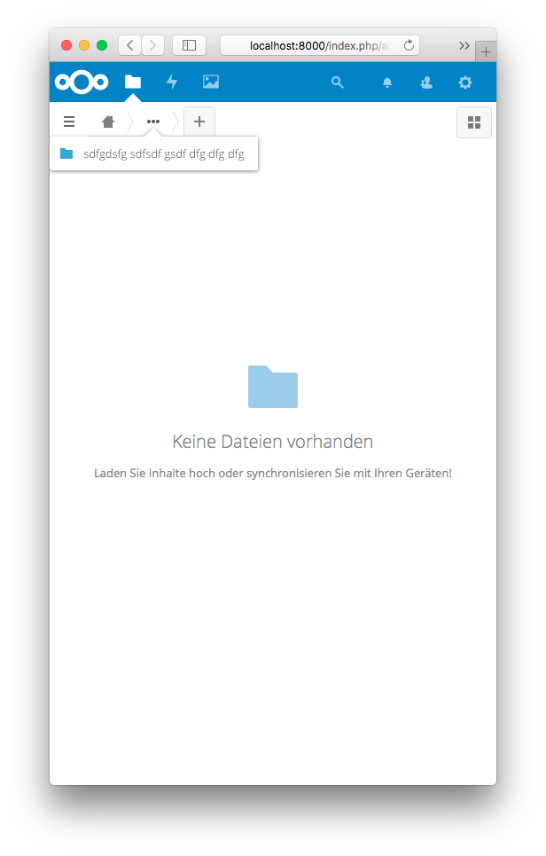
skjnldsv
on 25 Mar 2018
Can now be read in the collapsed menu:
 MorrisJobke
on 3 Apr 2018
MorrisJobke
on 3 Apr 2018
Related issues
 ThomasLeister
·
3Comments
ThomasLeister
·
3Comments
 rullzer
·
3Comments
rullzer
·
3Comments
 georgehrke
·
3Comments
georgehrke
·
3Comments
 Django-BOfH
·
3Comments
Django-BOfH
·
3Comments
 blackcrack
·
3Comments
blackcrack
·
3Comments