Securedrop: Update source interface instructions for Tor Browser 8.5
Description
Tor Browser 8.5 moved the onion icon to the right of the URL bar:
Comments
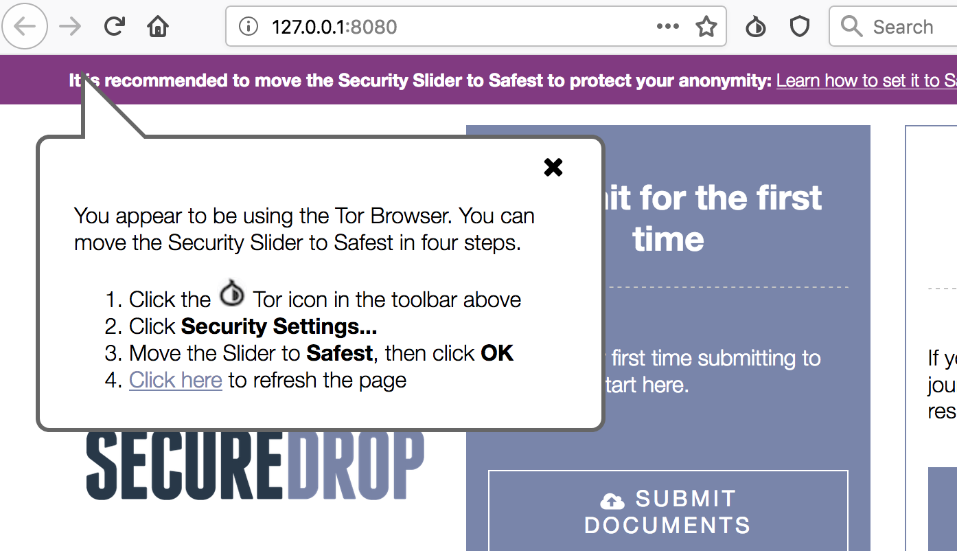
The point of the bubble used to direct the user to the Tor onion icon. We should move it to point to its new location in TB 8.5.
 redshiftzero
All 14 comments
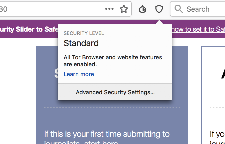
Note that the user has to click the "Shield" icon to access the security settings.
 eloquence
on 23 May 2019
eloquence
on 23 May 2019
FFS... it's not just the position, it's a whole other icon—and no longer the Tor Button icon.
Really, really stoked with the new design... but the moving-target of Tor UI stuff has been a kick for us to keep on top of. 😈
 ninavizz
on 23 May 2019
ninavizz
on 23 May 2019
Bigger picture tho, I adore the new implementation—because it's far more clear and easy to get one's head around, for non-techie folks. Will make our lives a lot easier and work towards keeping Sources safer, I suspect. 😃
@huertanix @zenmonkeykstop @eloquence Wd be good to review these changes against the TL;DR "Keep yo'self safe" page text we've been working on as a side project.
ninavizz
on 23 May 2019
Put another way the idea is to rewrite this rule
https://github.com/freedomofpress/securedrop/blob/develop/securedrop/sass/source.sass#L202
so that the bubble is positioned a fixed amount to the right of the window, correct?
If so I can tackle this.
 drewmassey
on 23 May 2019
drewmassey
on 23 May 2019
hey @drewmassey - yep that is the correct place to edit to move the bubble (the bubble div class is only used in this one place iirc).
The other thing we should do as part of this issue is updating the text in the bubble and the icon. Since as pointed out above by @eloquence, the security settings we want the user to modify actually got moved to under the shield icon here:
So the instructions in the bubble should also be updated to:
- Click the shield icon in the toolbar above
- Click "Advanced Security Settings..."
- Click "Safest"
- _(same as before, no change)_
redshiftzero
on 24 May 2019
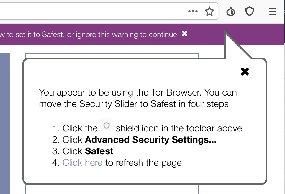
So it seems a little tough to get the pointer to align directly under the shield icon without crowding the right margin. Is this screenshot visually acceptable?
Also wanted to confirm that the desired behavior is not contextual on version of tor... i.e., that this warning will now be out of place for tor < 8.5.
Finally, the developer docs might benefit from calling out that you have to disable proxy for calls to 0.0.0.0 if you want to run locally. Should I open another issue or is it ok with the team to slip a mention of this into docs/development/setup_development.rst as part of this PR.
drewmassey
on 24 May 2019
Those are good points @drewmassey. I think we should drop the pointer and just ensure the popup's proximity to the "how to set it" link (we could add a relative div around the warning text, and move the absolutely-positioned bubble content into that).
I also agree that we should mention how to use Tor with the development server in docs/development/setup_development.rst, but I know from experience that slipping in unrelated changes will not pass review. :smile: I've created a separate PR for this -- if you're up for making that change, great, but at any rate thanks for pointing it out.
 rmol
on 24 May 2019
rmol
on 24 May 2019
Hey @drewmassey thank you so much for picking this up!
We've had some ongoing usability issues with this item that had been in the process of being tended to... so if you don't mind, I'd love to see those get bundled into this! Nothing major, just including the shield icon and copy edits to reduce the bulk of the text on the bar. None of this (¡awesome!) pointer-alignment stuff will matter, if nobody clicks on it—and... yeah.
Anywho, I'm locked into a funding deadline for the day, but can post recommendations here, tomorrow. Could that work for you? I can tell you now tho, that the Shield icon will go to the right of the text w/in the purple bar—that the line text will likely be shorter, and that the "x" to close the bar will also go away.
@redshiftzero @eloquence Do those things work for you both to keep this ticket in-scope, while also addressing the low-hanging fruit from the other purple-bar Issue?
ninavizz
on 24 May 2019
I generally prefer to keep tickets tightly scoped, but if @drewmassey is game to get some tiny design tweaks in along the way, we can re-scope.
eloquence
on 24 May 2019
@ninavizz et. al.: I'm fine either way; since this and #4461 are "getting to know you" PRs from me to you all I would rather close them out and incrementally make changes. But I am fine for reasonable in-line modifications #4462 if that's better for the team overall.
drewmassey
on 24 May 2019
@eloquence Since a much broader "fix" is in the works yet a low priority atm to the problem my suggestions addresses, I'd prefer to squeeze-in those tiiny bits of scope creep here, if you're ok with that.
@drewmassey Pleased to meet you—and delighted you're also doing the Font Awesome removal! Thank you for joining our fun little party—I in particular, am delighted to see some frontend luv given to our Source users. <3
ninavizz
on 24 May 2019
@ninavizz Cool, please propose a concise set of proposed further tweaks, and we can see if we can get them in at the same time. :)
eloquence
on 24 May 2019
hey @ninavizz feel free to open a new issue with any additional tweaks from the minimal fixes in
4462 and we can put a help wanted label on it
redshiftzero
on 25 May 2019
Guys, the "Security Slider" no longer exists—so the text I see in Drew's screenshot of the flyout, is still incorrect and misleading. Unless it's been updated w/o a screenshot.
As promised above, I am in my office to submit recommendations for this, so per Jen's ask am doing that in a separate ticket (that I will cross-reference, here)—but would prefer that ticket get merged into #4462 for this. The changes are minimal, but important for basic usability and source safety.
ninavizz
on 25 May 2019
Related issues
 psivesely
·
3Comments
redshiftzero
·
3Comments
psivesely
·
3Comments
redshiftzero
·
3Comments
 aydwi
·
3Comments
aydwi
·
3Comments
 conorsch
·
3Comments
conorsch
·
3Comments
 Hainish
·
6Comments
Hainish
·
6Comments
Most helpful comment
@ninavizz Cool, please propose a concise set of proposed further tweaks, and we can see if we can get them in at the same time. :)