Securedrop: Fix submission form styling on source interface
Description
In #2525 the source interface styling was refactored a bit to be more responsive. While most of these changes render great on both mobile and regular computers, the submission form is a bit wonky on a full size computer:
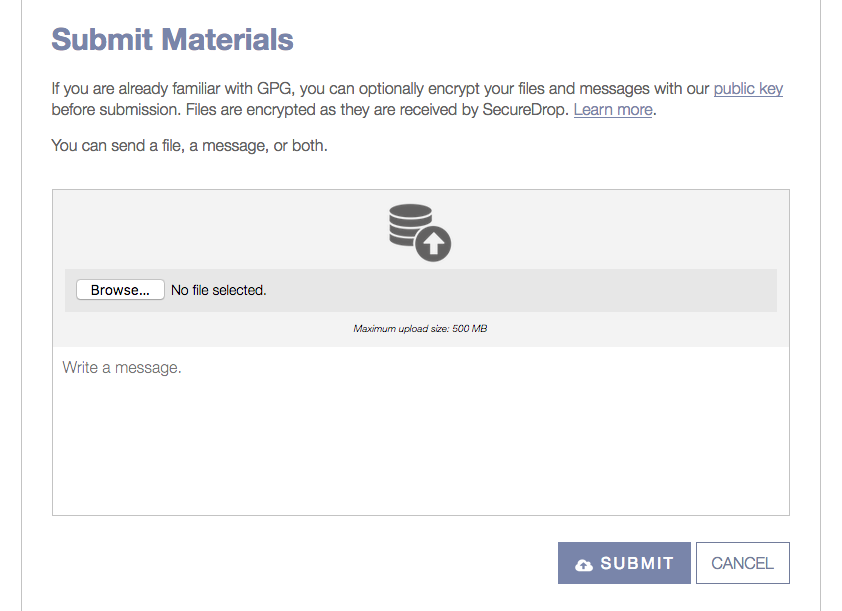
The right hand side of the bottom area named "Write a message" is not actually part of the form field, so if you click on the field nothing happens. We should return this to its prior configuration while preserving the stacked boxes on mobile.
 redshiftzero
All 3 comments
The generic stack of quarters (i guess its a database?) could use some more styling too. I would like @huertanix's feedback on this but I think we should have some documents with a :arrow_up: sign, maybe a video file etc.
 b-meson
on 8 Nov 2017
b-meson
on 8 Nov 2017
Yep - this was reported in user testing, see discussion in #2508 @freddymartinez9
redshiftzero
on 8 Nov 2017
Shoot, my bad on this one.
 ghost
on 8 Nov 2017
ghost
on 8 Nov 2017
Related issues
 conorsch
·
3Comments
conorsch
·
3Comments
 kushaldas
·
4Comments
kushaldas
·
4Comments
 jvoisin
·
5Comments
jvoisin
·
5Comments
 Hainish
·
6Comments
Hainish
·
6Comments
 psivesely
·
3Comments
psivesely
·
3Comments