Securedrop: [qt-journalist-updater] Design: Make SecureDrop logo less prominent
Description
[See epic #3076 for primary feature, PRs for this ticket should go into qt-journalist-updater]
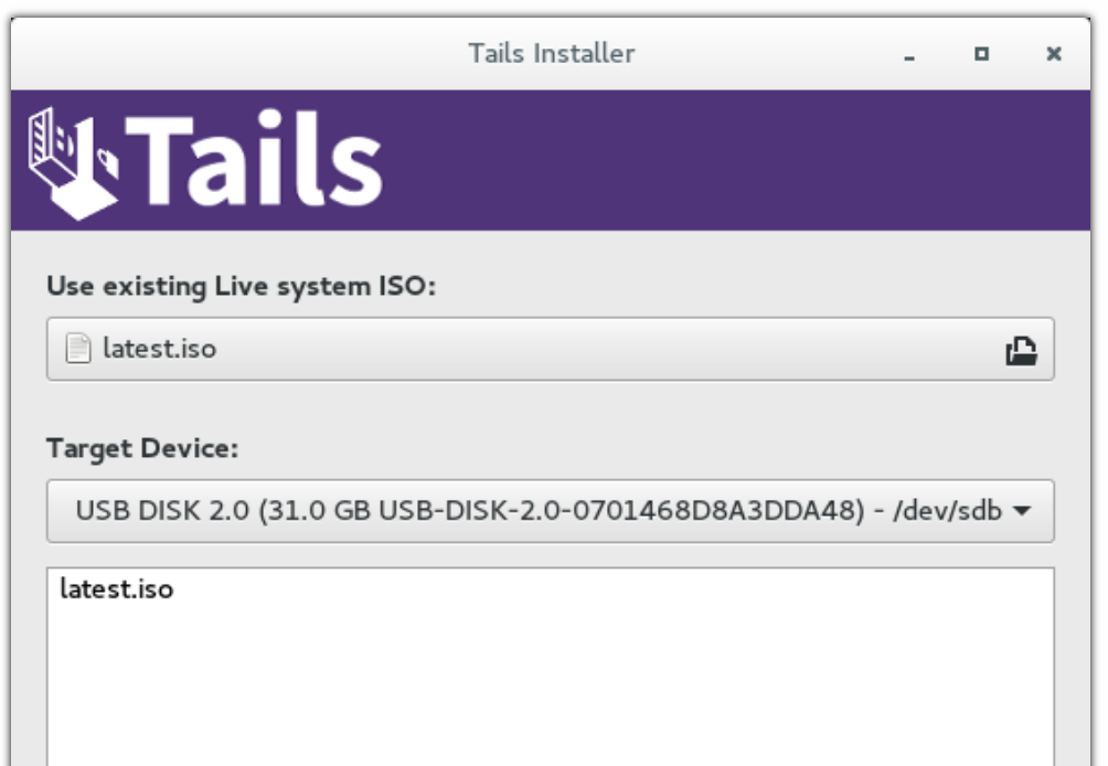
The logo is pretty large and central in the design right now, what about shrinking it a bit, maybe a design like the Tails banner here:
 redshiftzero
All 9 comments
I just made this which is 400px wide like the updater GUI:

Still trying to decide if I like this
redshiftzero
on 13 Apr 2018
LGTM, @redshiftzero ! Definitely go with that.
 conorsch
on 13 Apr 2018
conorsch
on 13 Apr 2018
Here is some design/UX feedback based on walking through the updater with @ei8fdb just now. Most of these items are just minor string changes:
- [x] "Install Later" and "Install Now" call to action buttons should be called "Update Later" and "Update Now".
- [x] The text should be in the place of the logo as it is the main thing we want people to read.
- [x] “SecureDrop” vs “Command Output” are bad names for the tabs: "Update" or "Details" are what is on the Gnome updater (also might modify the design further later, TBD)
- [x] The preferred call to action button ("Install Now" and "Install Later" are the call to action buttons) should be a different color or should somehow indicate that "Install Now" is the preferred action of the two. Right now they are the same visually.
- [x] Sudo password prompt - there is no explanatory text about the sudo password box that pops up. f I’m a journalist, I might not know what this is. They should click “Cancel” if they didn’t set it as they will need to reboot and be sure to set it.
- [x] The Tails configuration in progress 1 min left status update should occur after sudo password prompt comes up.
- [x]
"Close" instead of “OK” might make more sense once the updates succeeds.(I actually decided not to implement this one unless additional user feedback indicates it is needed, because now that I implemented the "don't close immediately if the updates are successful" item below, the text "OK" actually makes more sense) - [x] One might want to see the detailed output even if the update succeeded. Don’t close immediately if the updates are successful.
- [x] The wrong password message is unclear. It should say explicitly "Click Update Now to try again".
- [x] Add status update messages that appear along the bottom bar to the command output.
- [x] For the "Error updating SD Workstation" generic failure message, it currently just says "Contact your SecureDrop Administrator". But we should add “Or the SecureDrop development team at X” if they are the administrator and are unsure why the update failed.
redshiftzero
on 17 Apr 2018
A user feedback session using this script got moved to today - will make as many of these design changes as possible today so I can get the user's feedback on them
redshiftzero
on 18 Apr 2018
hea @redshiftzero thanks for letting us know. Good lukc with it today.
If it helps, in terms of priority (from the users point of view) I'd suggest the below priorty.
NB: I know time is short, so whatever you can implement is great.
We can talk about 2 below afterwards. I think this'd be a bit more work. I have some sketches done for this. We can talk about them tomorrow if it helps?
- One might want to see the detailed output even if the update succeeded. Don’t close immediately if the updates are successful
- The text should be in the place of the logo as it is the main thing we want people to read.
- If this is implemented then the “SecureDrop” vs “Command Output” are bad names for the tabs" is redundant
- The Tails configuration in progress 1 min left status update should occur after sudo password prompt comes up
- Sudo password prompt - there is no explanatory text about the sudo password box that pops up. f I’m a journalist, I might not know what this is. They should click “Cancel” if they didn’t set it as they will need to reboot and be sure to set it.
- Add status update messages that appear along the bottom bar to the command output.
- "Close" instead of “OK” might make more sense once the updates succeeds.
- The preferred call to action button ("Install Now" and "Install Later" are the call to action buttons) should be a different color or should somehow indicate that "Install Now" is the preferred action of the two. Right now they are the same visually.
- Only needed if 2 is not implentable in the short time: “SecureDrop” vs “Command Output” are bad names for the tabs
- I think keep the "SecureDrop" tab name and rename Command Output to "Updater details"
 ei8fdb
on 18 Apr 2018
ei8fdb
on 18 Apr 2018
Thank you for this ranking, that was very useful (I implemented the issues mostly in the order you provided in case I ran low on time :wink:)! Fortunately I managed to implement to all the major points, the code is in design-qt-journalist-updater and it looks like this now:
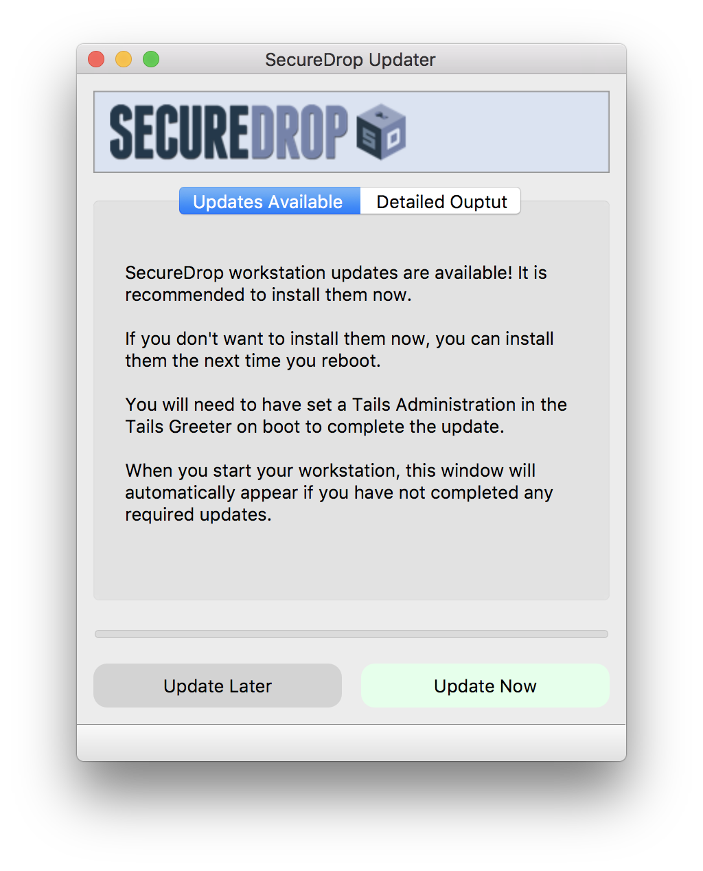
I did keep the tab for now (and renamed the tabs to be "Updates Available" to really drive the point home that updates need doing and "Detailed Output" inspired by your suggestion) as modifying that will require a bit more work. I'm holding off in pulling a PR for a couple hours in case there are any minor suggestions I can implement real quick after the user session later.
redshiftzero
on 18 Apr 2018
"Update available and Detailed Output" are good starting points. Having 3-5 people is ideal for reactions to the design.
As modifying that will require a bit more work.
I wouldn' t suggesta change without the need.
I'm holding off in pulling a PR for a couple hours in case there are any minor suggestions I can implement real quick after the user session later.
Thats cool. This weekend I have more time. Let me know what you're thinking.
ei8fdb
on 19 Apr 2018
Adding the main items of feedback from the user session today (will transcribe and send interview to participant for review such that I can post on the UX wiki):
- For Administrators, the main issue in updating in the past was due to git conflicts e.g. if there was a customization to the Ansible playbooks. The admin wanted to know what happened if there were a customization, but noted that they had not made customizations for some time and that since then the updates have been smooth. In the updater, if there are changes that need to be stashed or committed, the update won't proceed - this is intentional such that workstation customizations are not inadvertently destroyed - this addressed the user's concern.
- It's slightly unclear that "Detailed Output" will get populated with the output of the update. The user thought that it might contain detailed output about the update to come. So we should make this clearer.
- It's slightly unclear that the update only applies to the Workstation in some places - will write explicitly "SecureDrop Workstation" to make this clear.
- Otherwise the admin successfully updated the workstation and thought it was pretty simple and straightforward.
Once the two issues identified are addressed (both simple), I think we have a pretty nice improvement and can update the current branch with what we have.
Going forward, I'm happy to do a couple more user tests and convert that user feedback into tickets to improve the UI. @ei8fdb if you have time this weekend and feel like looking more at this, please feel free to file additional GitHub tickets with additional suggested improvements (I've been overloading this "decrease the size of the logo" ticket, oops) and we'll see what else we can get done under the wire :wink: else since we'll have a simple update flow in the workstation, it adds no additional burden on users as far as I can see to make further improvements to the design in the next release.
redshiftzero
on 19 Apr 2018
Closed in #3289
redshiftzero
on 23 Apr 2018
Related issues
 heartsucker
·
4Comments
redshiftzero
·
5Comments
redshiftzero
·
4Comments
conorsch
·
3Comments
heartsucker
·
4Comments
redshiftzero
·
5Comments
redshiftzero
·
4Comments
conorsch
·
3Comments
 ageis
·
3Comments
ageis
·
3Comments
Most helpful comment
hea @redshiftzero thanks for letting us know. Good lukc with it today.
If it helps, in terms of priority (from the users point of view) I'd suggest the below priorty.
NB: I know time is short, so whatever you can implement is great.
We can talk about 2 below afterwards. I think this'd be a bit more work. I have some sketches done for this. We can talk about them tomorrow if it helps?