Securedrop: Source interface: data store icon is confusing
Description
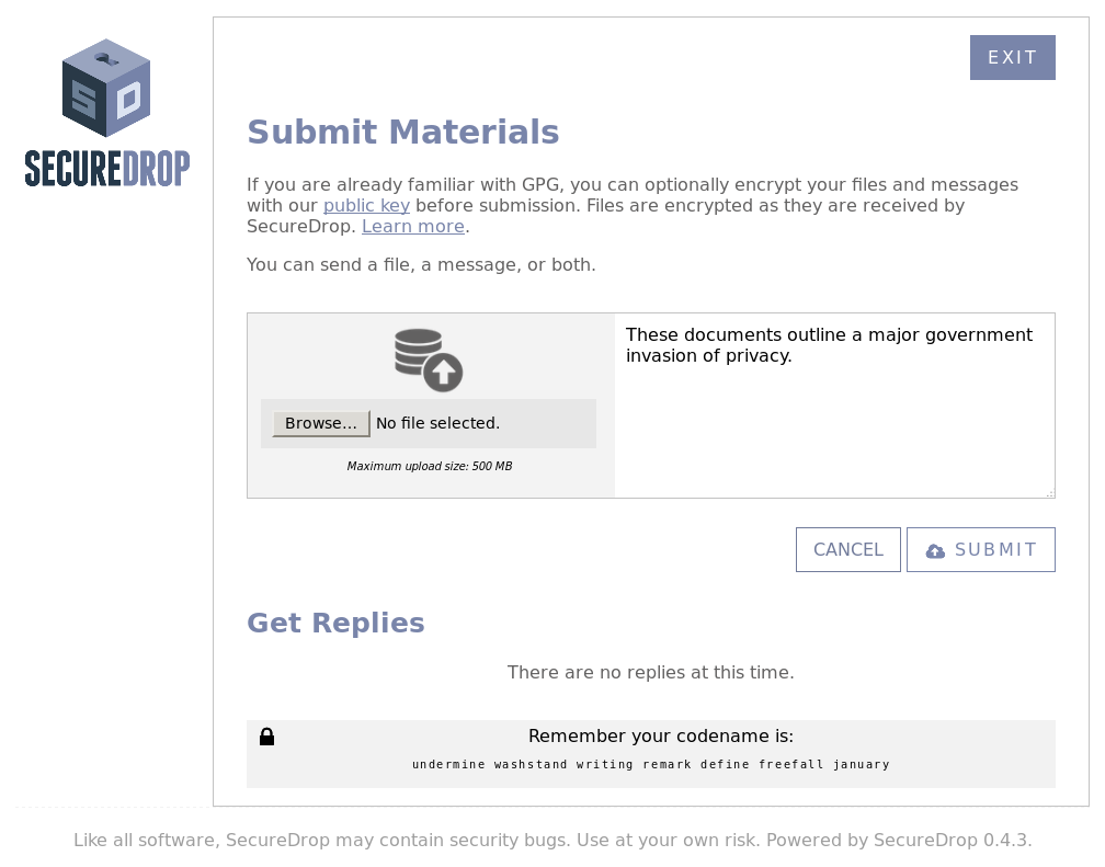
User feedback from user testing "what is this icon supposed to mean", "shouldn't this be a picture of a document or a video or image?":
User Stories
As a SecureDrop source, I want icons to aid in my comprehension of the functions of the interface.
 redshiftzero
All 5 comments
We use this (with a royalty-free license) for the SecureDrop t-shirt we sell: https://thenounproject.com/cathymoser/collection/economy/?i=1060752.
 huertanix
on 5 Nov 2017
huertanix
on 5 Nov 2017
cc @freddymartinez9
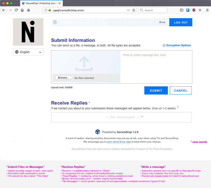
More thoughts on the pancake icon: DropBox and Google Drive's web interfaces at least use either no icon and just a text button or a blank file with an arrow like this: https://thenounproject.com/term/upload/1268576/.
Looks like there's already an upload icon being used in-line with the submit button; Arrow in a cloud. It's a bit out of place in the button imho; It might be advisable to replace the pancake icon with the cloud icon, then use a single-color checkmark-in-a-circle icon for the Submit button and add a x-in-a-circle for the Cancel button.
huertanix
on 8 Nov 2017
Thanks for the feedback - I like those suggestions @huertanix
redshiftzero
on 16 Feb 2018
I can update the icons based on @huertanix's suggestions and submit a PR.
 kvinton
on 11 Mar 2018
kvinton
on 11 Mar 2018
Hi Hi: The design rationale that had the "pancake icon" put in the Source UI in the first place, was that the prior icon used the cloud semiotics—which is misleading, because SD is not a cloud service.
It is hypothesized that this will matter a lot to sources keen on security things (and who likely are going on anecdotal "I learned this from Oprah" knowledge of info/opsec). Hence, I came up with the pancake icon... which later user feedback flagged as confusing. I would strongly recommend (per the OG rationale that had the pancake icon added) changing the icon to something that addresses the first issue—but is more clear. The icon used in these mockups is more widely used today, than the pancake icon ever was—and is what I've been working with in the Source UI.
Will create separate issue to recommend the swap-out, and will add to near-term UX meeting agenda.
 ninavizz
on 18 Jun 2019
ninavizz
on 18 Jun 2019
Related issues
 conorsch
·
3Comments
ninavizz
·
6Comments
conorsch
·
3Comments
ninavizz
·
6Comments
 jvoisin
·
5Comments
jvoisin
·
5Comments
 ageis
·
3Comments
ageis
·
3Comments
 kushaldas
·
4Comments
kushaldas
·
4Comments
Most helpful comment
I can update the icons based on @huertanix's suggestions and submit a PR.