Scratch-www: Project page responsive overall design
Tracking work in: https://github.com/LLK/scratch-www/issues/2310
Overview
For Phase 1, we are focusing on desktop (1280px) and mobile (320px) sizes for these views:
- Your own project
- Someone else's project
In-between breakpoint sizes are scheduled for phase 2, but I have included them here because @LiFaytheGoblin is already starting some of this work this iteration. 👍1280px and 320px will still be the most important sizes to finish.
Related Links
Invision Screens (for higher res images)
Issue: Landscape rotation to GUI on Tablet
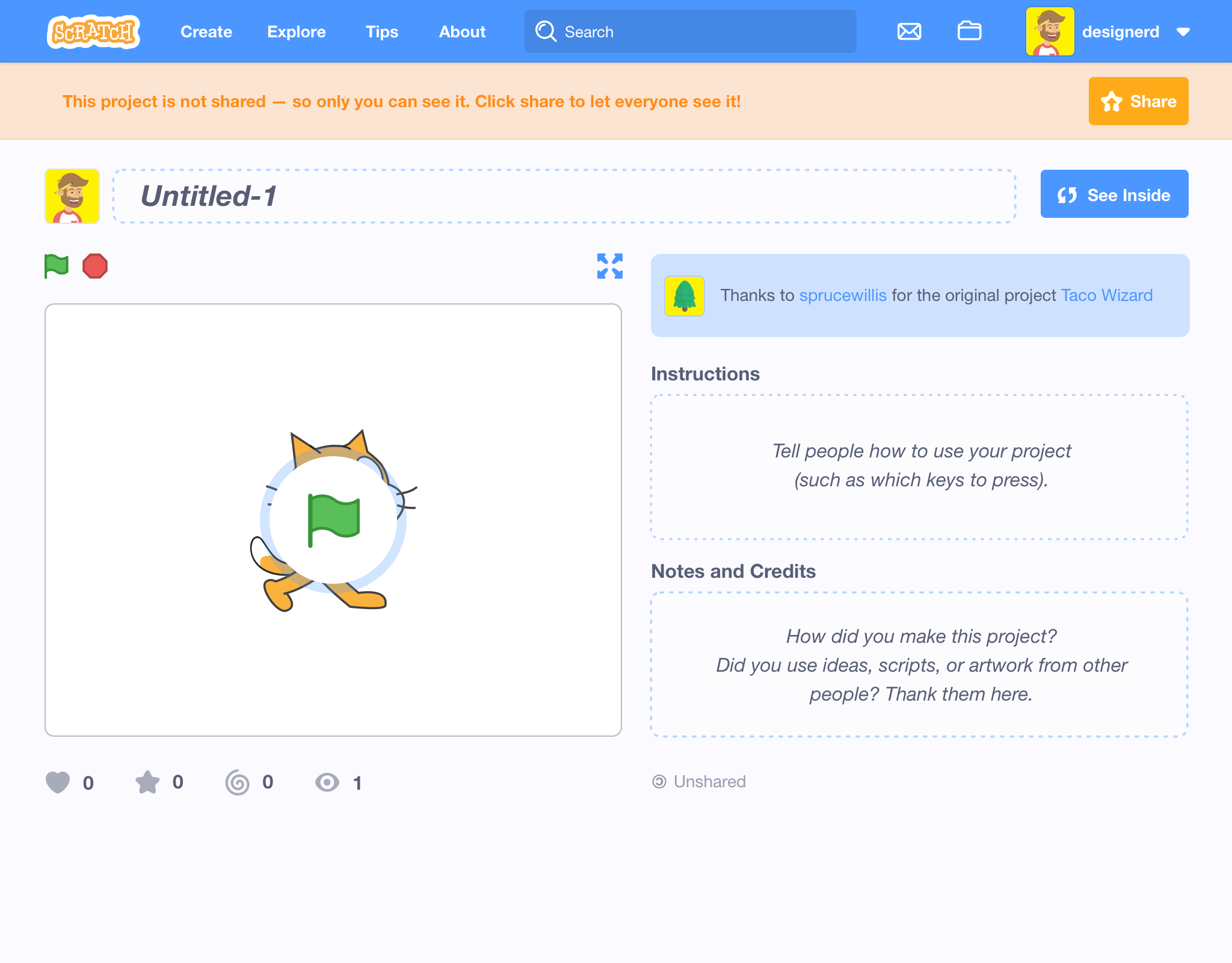
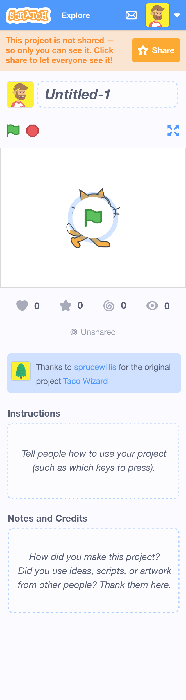
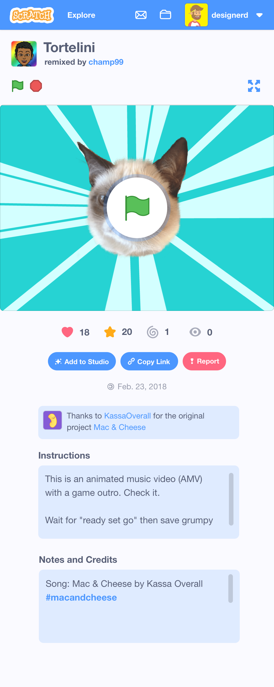
Your Own Project
1280 – Desktop

1024 – iPad in Landscape
960
768 – iPad in Portrait
480
Note: After 480px, all options to enter GUI go away. For example, REMIX & SEE INSIDE.
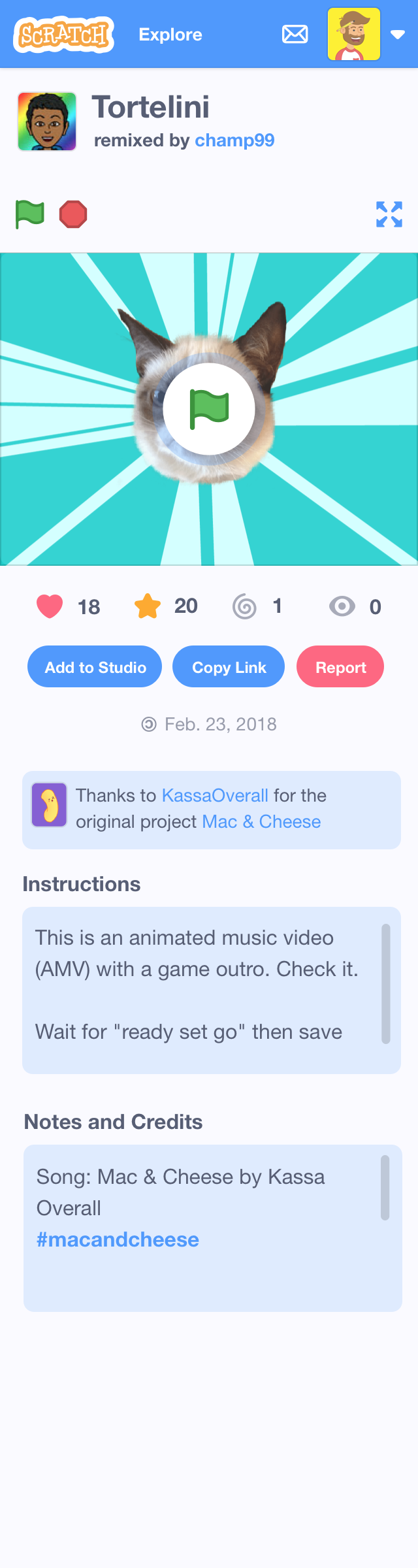
320 – Mobile
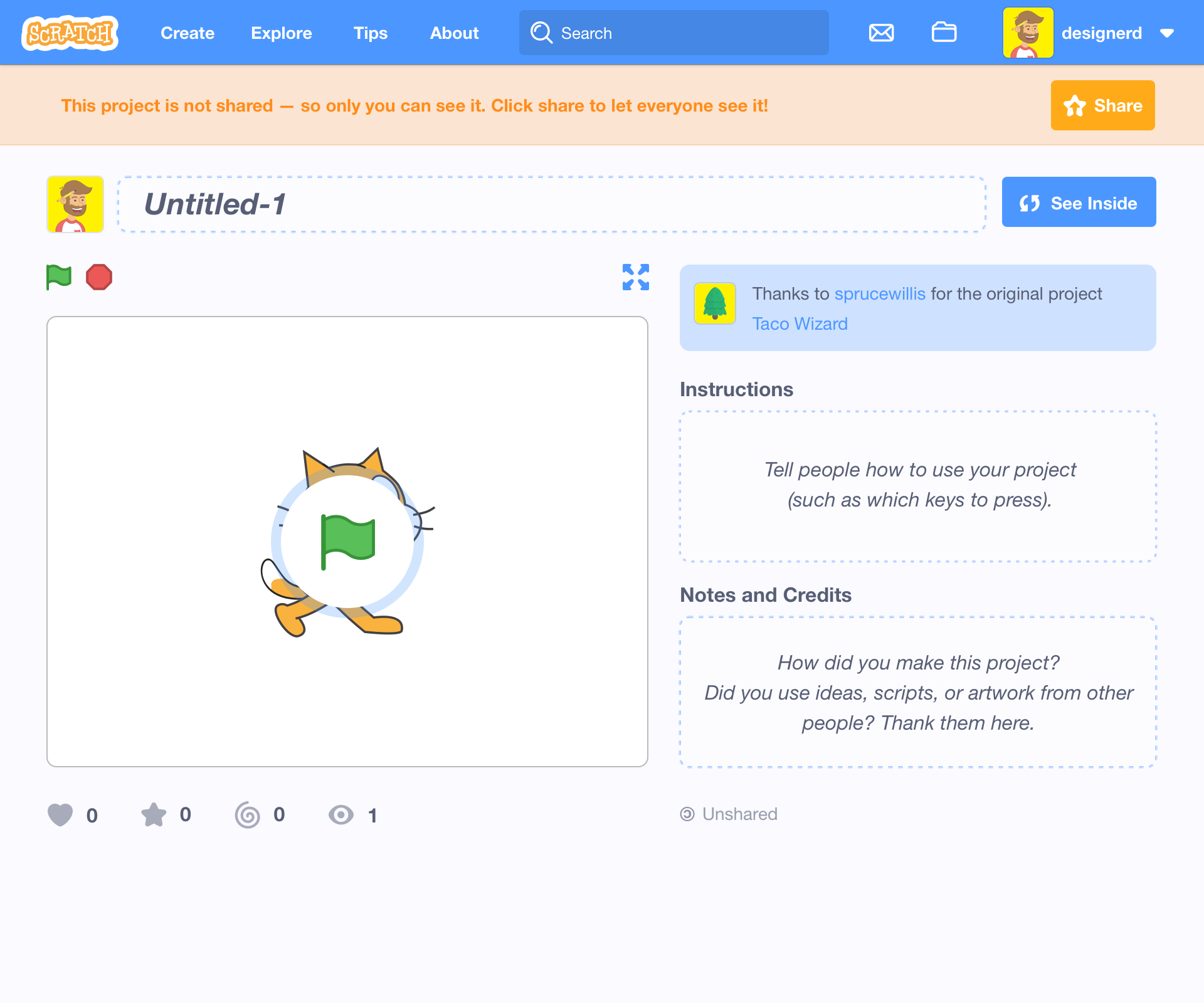
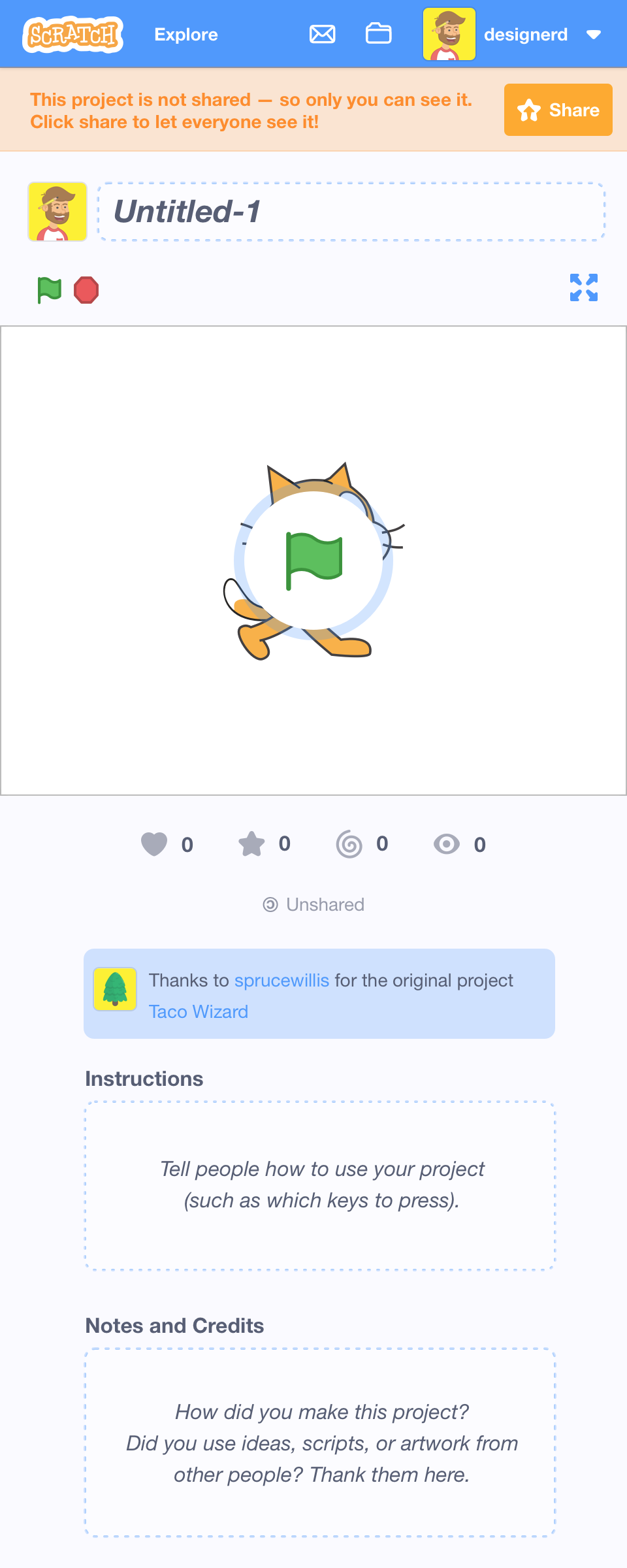
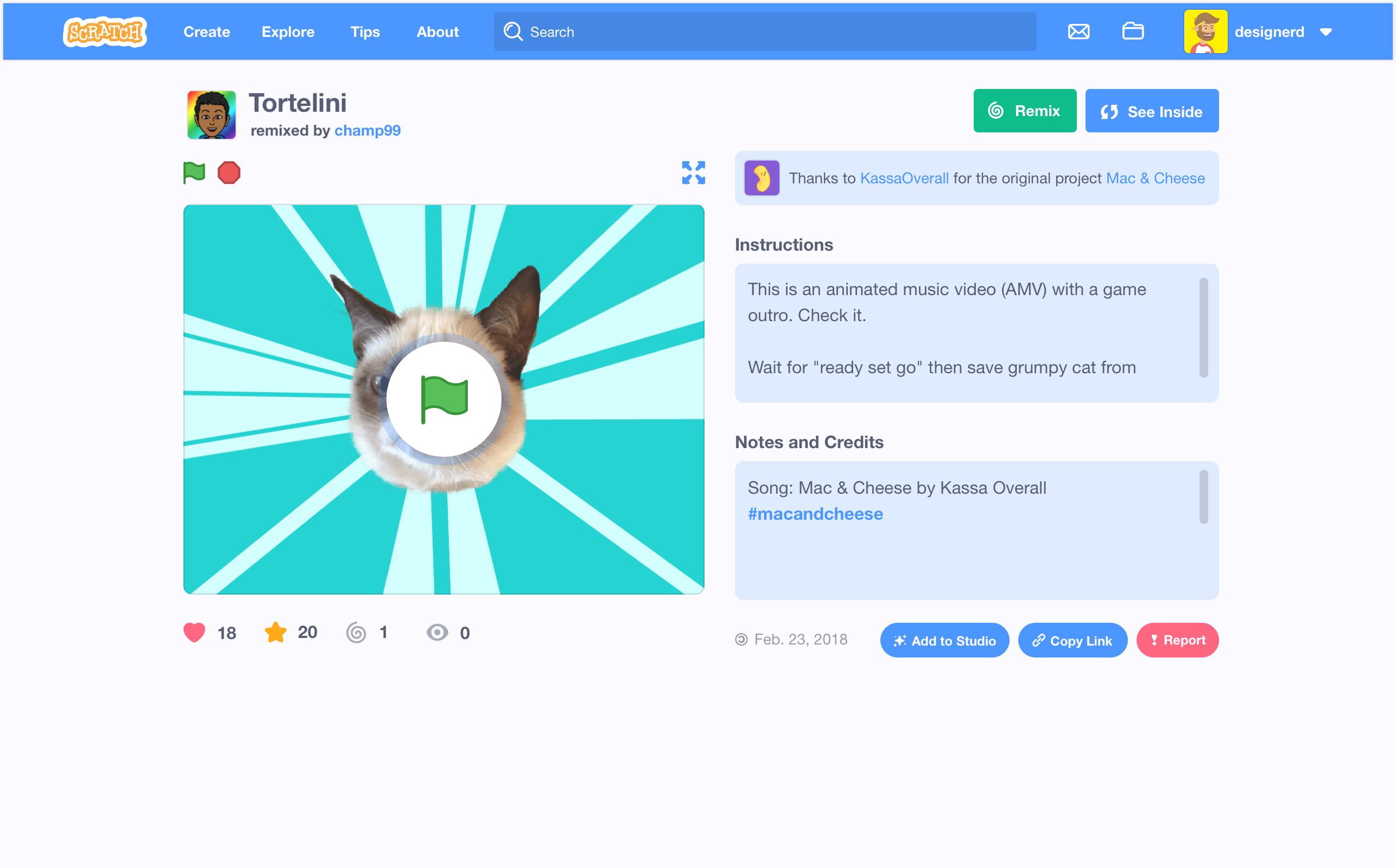
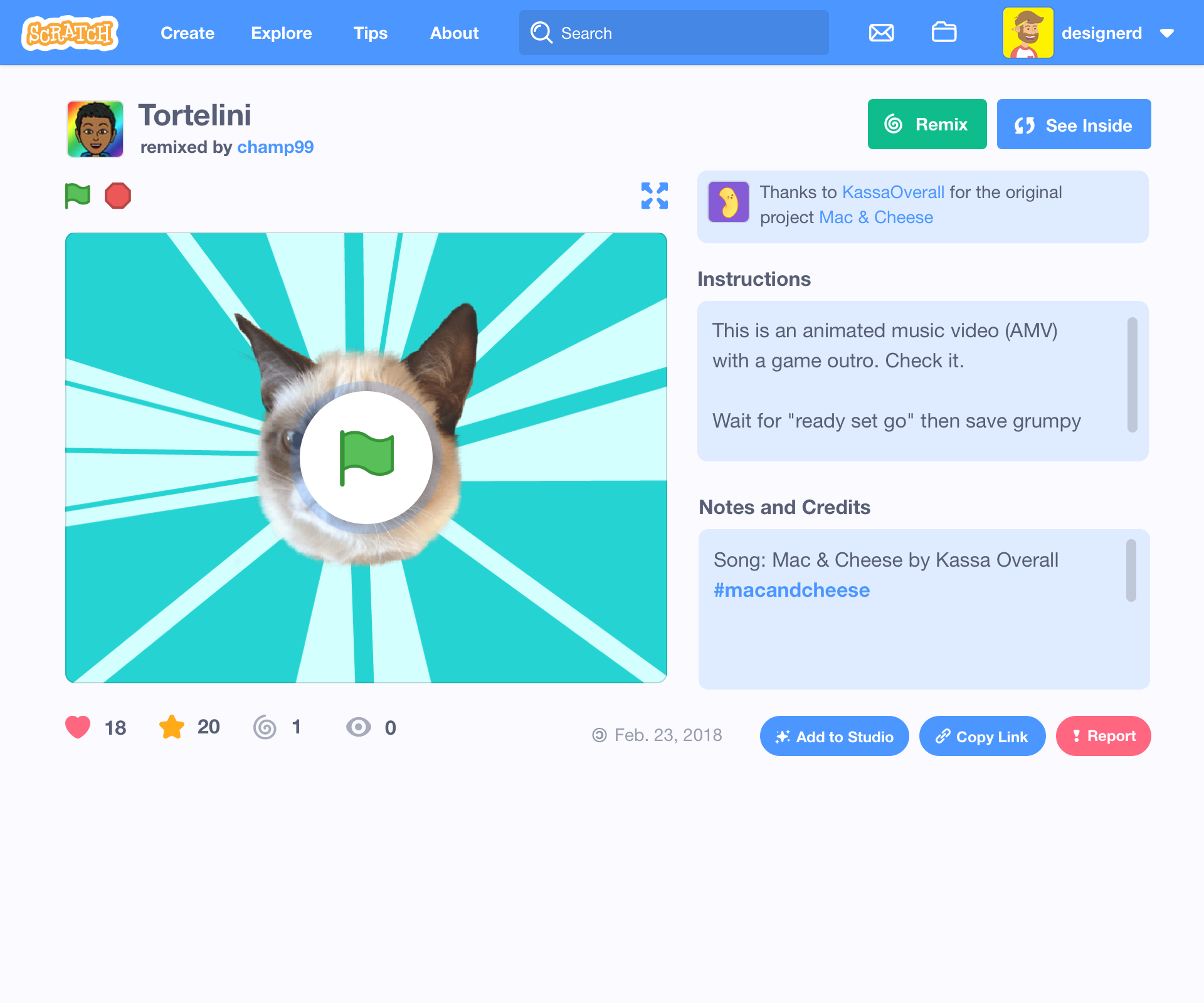
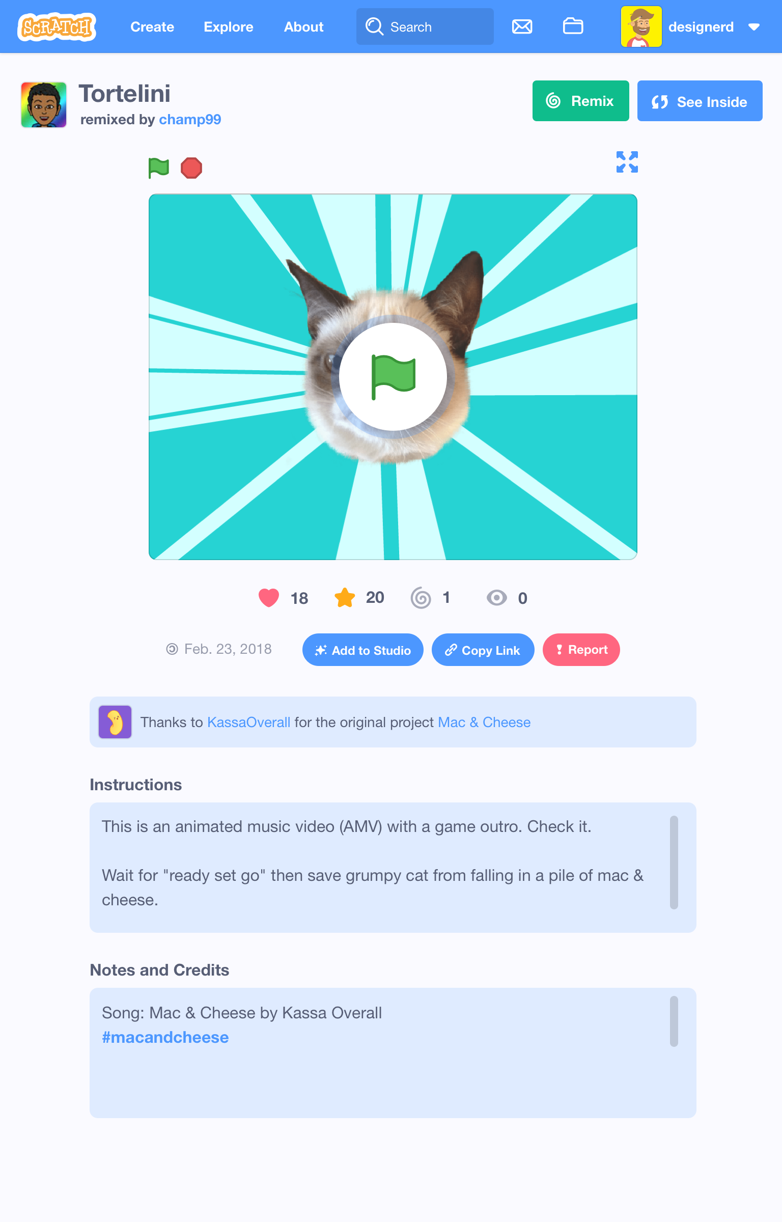
Someone Else's Project
1280 – Desktop
1024 – iPad in Landscape

960
768 – iPad in Portrait
480
Note: After 480px, all options to enter GUI go away. For example, REMIX & SEE INSIDE.
320 – Mobile
 kathymakes
All 11 comments
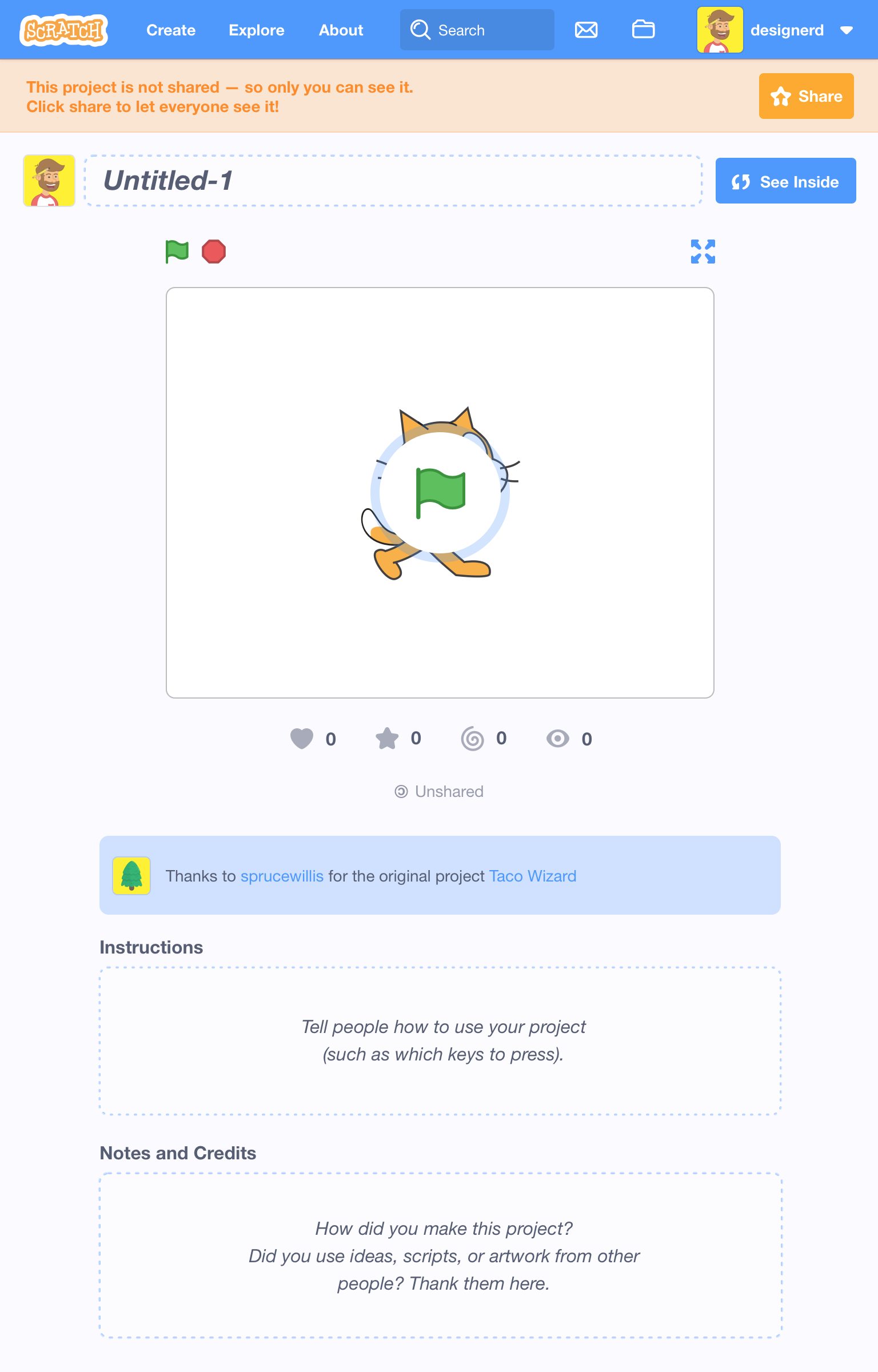
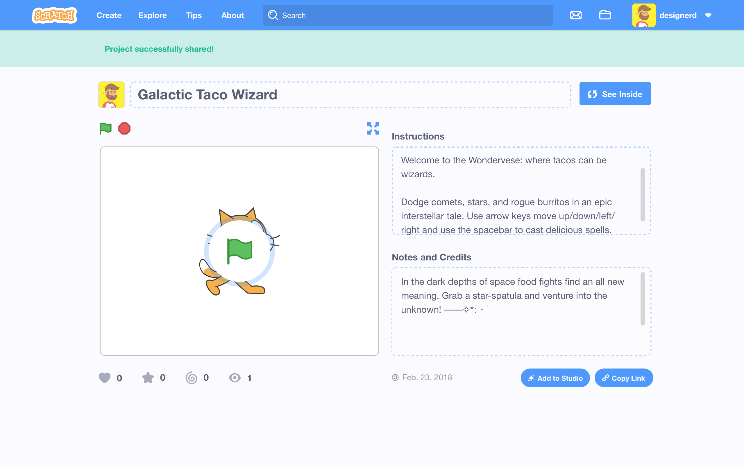
Thought it might be good to also add the "success" state for your shared project:
kathymakes
on 4 Oct 2018
There should still be an overlay between the green flag and the project stage
 locness3
on 7 Oct 2018
locness3
on 7 Oct 2018
I think mobile should have a search too
locness3
on 7 Oct 2018
@locness3 Good catch on both of those, thanks!
kathymakes
on 9 Oct 2018
@locness3 Wanted to let you know that we don't have plans to implement search bar for mobile in the near future but it is on our list to get done later! There are a host of reasons we aren't able to do it right away. Just in case you don't see any of the UI drawings update in the near term :) Thanks for pointing it out.
kathymakes
on 11 Oct 2018
@kathymakes I imagine something like this :

And this when you click Search icon :

Yeah it's very pixelated x) I used icons from the website directly
locness3
on 11 Oct 2018
@locness3 Nice! Yeah I like that pattern, I think we would do something like that; we could have an icon expand to take up the full space. Thanks for sharing :)
kathymakes
on 15 Oct 2018
Following our conversation, we decided to have read only comments after 480px. Here's an example:

Reply & post box are gone.
kathymakes
on 7 Nov 2018
Following our conversation, we decided to have read only comments after 480px. Here's an example:
Reply & post box are gone.
But... why ? It would be great to be able to reply from mobile...
locness3
on 7 Nov 2018
@locness3 I should clarify that we will have replying from mobile in the future... but not in the near future :)
It will be difficult to get the mobile keyboard interaction right now, so we are going to cross that bridge later. Thanks for the (super valid) note!
kathymakes
on 7 Nov 2018
Difficult to get the mobile keyboard interaction right now ?
locness3
on 8 Nov 2018
Related issues
 benjiwheeler
·
4Comments
benjiwheeler
·
4Comments
 kerrtravers
·
4Comments
kathymakes
·
3Comments
kerrtravers
·
4Comments
kathymakes
·
3Comments
 DeleteThisAcount
·
4Comments
DeleteThisAcount
·
4Comments
 apple502j
·
4Comments
apple502j
·
4Comments