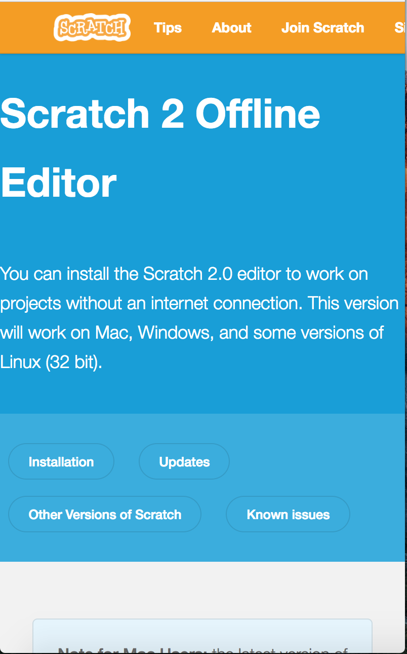
Scratch-www: Offline editor download page: top paragraph not centered
When the download page is displayed in a wide window, the paragraph at the top of the page ("You can install the Scratch 2.0 editor....") is aligned left and wrapped to an unnecessarily narrow column width.
Note that this problem existed on the old page, but IMO stands out more on the new version of the page.
Screenshot:

 cwillisf
All 10 comments
@cwillisf
This was purposefully done to match the design of other newly migrated pages, such as the Educators and Developers pages.
Another option could be to implement the plainer design used by the info pages, such as the FAQ page.
 TheGrits
on 29 Jun 2017
TheGrits
on 29 Jun 2017
The Educators & Download pages seem to behave differently at smaller widths, and there seems to be padding to the left of the Scratch logo in the navbar that isn't present to the left of the text at the top of the Download page.
Educators page is centered at small-ish width:

Educators & Download pages at the same widths:


Lack of padding next to the text:
 jwzimmer
on 29 Jun 2017
jwzimmer
on 29 Jun 2017
@jwzimmer Thank you, I understand the issue much more clearly now!
I don't have time to fix it at present, but may try to fix it at a later point.
Hey @St19Galla maybe you would be interested in tackling this help-wanted issue?
TheGrits
on 29 Jun 2017
@jwzimmer I feel like I'm seeing that padding misalignment on both pages, including Download – it looks like the logo is not being spaced out all the way to the edge of the box in all cases on that size of a screen.
As for the text on the download page taking up 100% – @carljbowman I think in our typography/global stylings we have text take up 100% on mobile. Should we consider standardizing a margin at that screen size, given that this is not the first time we're looking into this? Or do we just want to treat this as another exception to that rule?
 mewtaylor
on 29 Jun 2017
mewtaylor
on 29 Jun 2017
I'll try this
 Sheshank-s
on 8 Oct 2017
Sheshank-s
on 8 Oct 2017
Ok, created a pull request ^^
Sheshank-s
on 8 Oct 2017
Agreed with @mewtaylor that we probably need to normalize / standardize the rules here regarding when to center and assigning a standard margin for mobile (rather than the awkward spacing we have now). Until this is decided I'm going to remove "help-wanted".
 thisandagain
on 8 Oct 2017
thisandagain
on 8 Oct 2017
offtopic question, @cwillisf why is the navbar orange?
 DeleteThisAcount
on 25 Nov 2017
DeleteThisAcount
on 25 Nov 2017
I think it’s because it’s a testing/development version they’re using.
 kerrtravers
on 25 Nov 2017
kerrtravers
on 25 Nov 2017
@DeleteThisAcount as @VutonDesign said - our testing environment has an orange navbar so we can easily see if we're on the staging server or the live site.
 chrisgarrity
on 27 Nov 2017
chrisgarrity
on 27 Nov 2017
Related issues
jwzimmer
·
3Comments
mewtaylor
·
3Comments
 benjiwheeler
·
4Comments
benjiwheeler
·
4Comments
 kathymakes
·
3Comments
chrisgarrity
·
3Comments
kathymakes
·
3Comments
chrisgarrity
·
3Comments
Most helpful comment
@jwzimmer Thank you, I understand the issue much more clearly now!
I don't have time to fix it at present, but may try to fix it at a later point.
Hey @St19Galla maybe you would be interested in tackling this
help-wantedissue?