Scratch-blocks: Block drop-downs are inconsistent
The block drop-downs are inconsistent. Some are presented in a square shape and other ones are round. I can't see a pattern to this and it's seemingly random. On top of this the circle drop-downs are darkened while the square ones aren't. In Scratch 2.0 all block drop-downs looked identical.
Can we please make the drop-downs all look the same like in 2.0? I'd prefer if they were all square and darkened a little for some contrast to the block.
 Alzter
All 3 comments
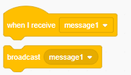
The darker, rounded ones mean that you can drop an operator block in the dropdown; you can't for the bordered square ones
 SheepTester
on 2 Jan 2019
SheepTester
on 2 Jan 2019
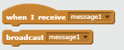
The darker, rounded ones mean that you can drop an operator block in the dropdown; you can't for the bordered square ones
Thank you, I missed that. I still think that maybe the square dropdowns should be darker, or maybe we should just darken the blocks entirely. They contrast poorly with the text on them, as well as the background, and they look too similar.
Alzter
on 2 Jan 2019
Thank you, I missed that. I still think that maybe the square dropdowns should be darker, or maybe we should just darken the blocks entirely. They contrast poorly with the text on them, as well as the background, and they look too similar.
I disagree - the round ones being darker makes them look more like a "slot" for a block. And the square ones being not dark makes them look "flat", like they don't take a block. As for darkening the entire block, I disagree because that would make round dropdowns no longer look like they are slots for blocks (since they would not contrast against the background of the block). (I do think the contrast of text on background could be improved in general, but that's being discussed in #1492 / elsewhere.)
 towerofnix
on 3 Jan 2019
towerofnix
on 3 Jan 2019
Related issues
towerofnix
·
4Comments
towerofnix
·
6Comments
 brianpoor5775
·
4Comments
brianpoor5775
·
4Comments
 thisandagain
·
5Comments
towerofnix
·
5Comments
thisandagain
·
5Comments
towerofnix
·
5Comments
Most helpful comment
The darker, rounded ones mean that you can drop an operator block in the dropdown; you can't for the bordered square ones