Scratch-blocks: Blocks not laid out optimally
This is a bit of a subjective decision, but I'll try to back things up with as much data as I can:
Currently, the Scratch 3.0 block palettes are laid out in the same way as they are in 2.0 (with the exception of groupings: #752). However, this layout isn't the best. After taking some time to look through the block usage statistics, I found that the blocks placed at the top of the palette aren't always the most used blocks. This is an issue because the further down a block is in the palette, the more likely it is that a user will need to scroll in order to reach it (especially with the larger 3.0-style blocks, which will require more scrolling in general).
Take, for instance, the say and think blocks. They are all placed at the very top of the "looks" palette, and take up a fair amount of room. Yet the block usage statistics (found at the bottom of the stats page) show that the think and say blocks make up a very small portion of all looks blocks used.
In order to aid with the creation of an alternate palette, I've created an ordered list of Scratch blocks, sorted by usage: https://gist.github.com/PullJosh/aa842db1cdfe1fe553b2a1ebe2396646
Based on these statistics, I've created an alternate layout for the Looks and Motion palettes: https://gist.github.com/PullJosh/85275f2b8f05ca255fa1891ec4cabdc1 (If this is something that people are interested in, I'd be happy to arrange the rest of the palettes as well.)
My goal with the new arrangement was to keep blocks grouped logically, while also ordering them based on usage. Every decision was made intentionally (I feel that I could justify every decision made), but things could always be changed if someone disagrees. The hope is that, with a new layout, Scratch could retain its user-friendliness while also saving time for users.
 PullJosh
All 18 comments
I get the feeling we're going to end up in large rants about every decision made here, all in one big thread... :)
"Point towards" and "set rotation style" look to be thrown beside each other because they aren't used much. I think it'd make more sense to put "point towards" next to "go to", since the two blocks involve acting/moving based on the position of another sprite.
I was kind of surprised that "move steps" isn't next to "turn (cw/ccw) degrees", since those all involve acting in relation to the current state of the sprite./essay
The looks category generally looks good to me. I guess you put "hide" above "show" because it's used more? That's fine, but it'll take a little getting used to. I don't think of hiding/showing, rather showing/hiding, but I guess Scratch projects do behave more like hiding/showing.
(I'm still shocked there's no "costume name" block.. I guess there's only a "backdrop name" block because of the concept of "scenes", though.)
 towerofnix
on 23 Dec 2016
towerofnix
on 23 Dec 2016
I get the feeling we're going to end up in large rants about every decision made here, all in one big thread... :)
That's all good! As long as nobody's angry, having some critical feedback can be extremely helpful. :smile: (In fact, this whole issue is basically feedback from me for the ST.)
I think it'd make more sense to put "point towards" next to "go to", since the two blocks involve acting/moving based on the position of another sprite.
This definitely makes a lot of sense. Edit: Updated gist to include this change.
I guess you put "hide" above "show" because it's used more?
This was actually one of the decisions I was happiest with. :3 The switch was made because a "show" block doesn't do anything unless a sprite has been hidden first. Putting the hide block first in the palette made this a bit more obvious for new users. (It's worth mentioning that this is also why the hide block is used more than the show block. The show block is essentially useless without the hide block as well, so it only makes sense for hide to be more common.)
(I'm still shocked there's no "costume name" block.. I guess there's only a "backdrop name" block because of the concept of "scenes", though.)
Costume name would definitely be an improvement. Perhaps a suggestions forum topic is in order.
PullJosh
on 23 Dec 2016
I had some random related thoughts to this that have been bouncing around in my head, let me know if its worthwhile to post separately somewhere else (and if you think if they're decent ideas or absolutely worthless!).
For more advanced users, I feel like Scratch has a lot of pervasive blocks (I'd personally never use think or say), but can still lack some core features that some might want. What about being able to customize which blocks show up at all, and where? If I don't want to use it, I could hide it. If I don't like the order or its subsection, I could move it (or make a new subsection). If there's a custom block that I feel should be more easily accessible, I could put it in one of the existing categories in the palette, or make a new category (perhaps either having the color of a custom block on its edges with the color of the category in the middle, or vice-versa, some symbol, or whatever). With all of this, it would be much easier to keep track of and use variables and custom blocks in addition to cleaning up the palette according to how the user likes it. Of course, loading a project wouldn't necessarily (and probably shouldn't) load that customization, how it would carry across projects for the user who is customizing is up for debate.
The fact that you need to show all commands explicitly is in my mind one of the biggest downfalls of GUI programming. Personally I wouldn't argue if there were improved ways to organize it, or even shortcuts allowing you to not need to go digging each time you want to get something.
 luxaritas
on 23 Dec 2016
luxaritas
on 23 Dec 2016
The only block arrangement I disagree with is having set rotation style at the very bottom
Certainly, I agree that it hardly ever gets used (I can't remember ever seeing it be used) but having the variable reporters before it triggers my OC 😛
@LFP6
From what you wrote, I was going to suggest having keyboard shortcuts to change the current toolbox category (eg. alt+1 is motion, alt+2 is looks, etc. ) until I realised that there are 11 categories 😿
 ed-cooper
on 23 Dec 2016
ed-cooper
on 23 Dec 2016
The fact that you need to show all commands explicitly is in my mind one of the biggest downfalls of GUI programming.
And one of its greatest strengths for beginners!
Personally I wouldn't argue if there were improved ways to organize it, or even shortcuts allowing you to not need to go digging each time you want to get something.
How would you feel about a search box for the palette? This is an idea that's been kicking around on blockly for a while, but needs a lot of thought to handle internationalization properly.
I'll leave discussion of the actual block ordering to the scratch team.
 rachel-fenichel
on 23 Dec 2016
rachel-fenichel
on 23 Dec 2016
@rachel-fenichel
The fact that you need to show all commands explicitly is in my mind one of the biggest downfalls of GUI programming.
And one of its greatest strengths for beginners!
I should probably rephrase what I said. When I said "one of the biggest downfalls", I meant "one of the biggest challenges". Reduction of complexity is a pretty important piece in designing any GUI, of course, but a visual programming environment naturally has a lot going on.
How would you feel about a search box for the palette? This is an idea that's been kicking around on blockly for a while, but needs a lot of thought to handle internationalization properly.
I think that would be neat, but I'd still like to just be able to get rid of "extra stuff" and put things in their own sections so that they're quicker to access just at a glace, and to be able to get your head around the tools you have access to easier. I do of course come into this with a bias, dealing with tools like Blender and Unity, which are very complex but, using extensive use of tabs and accordions, I find much simpler to understand since everything is grouped and able to be hidden away when you don't want it, just having what you need at your fingertips. Obviously these are way above the level of Scratch, but the concept is still the same.
At any rate, I feel like a search box would be most useful if I could just click on the bottom of the stack, and just start typing blocks I want to add, tabbing over inputs, etc. The bigger issue with the palette isn't that I can't find things fast enough, its just that it's overwhelming to look at and takes longer to access. I feel that typing in what I'm looking for into a search box every time would be even slower, except maybe in the case of a project with many variables and custom blocks, which again would make much better use of custom grouping/accordions.
luxaritas
on 23 Dec 2016
On the topic of a search bar:
There's an old, now abandoned project by the ATers which was meant to be a Sctatch-like website editor. Although the project itself never turned into something especially impressive, the search function (for finding blocks) was pretty helpful. Especially in the case of HTML or CSS, where there are countless options for elements and styles, a search feature was mandatory.
You can try Elemental in action here: https://elementalcode.herokuapp.com/projects/editor (Search is in the top right.)
One of the big things that I liked about the Elemental search bar was that it acted as more than just a ctrl+f for blocks. HTML element names aren't very descriptive (For example, h1 means nothing unless you've already been told). The search bar in Elemental was able to lead users to the correct element without them needing to know the name already. For instance, a user might want to add an image to their page. It might not be intuitive to abbreviate image to img, so Elemental handles that for you. Try searching for "image" in the search bar. ;) I feel the same could be done in a Scratch search bar:
Say a person wants to make a character spin. They might not know which block to use. But if they can search "spin" and have the turn right and turn left blocks presented to them, that's an extremely powerful feature. I've always been a fan of learning through trial and error, and an intelligent search bar would make that a little bit easier.
PullJosh
on 23 Dec 2016
@LFP6 Yes, I agree. From the Blockly perspective we frequently see toolboxes that scroll on and on, and they definitely detract from usability.
Dynamic categories are definitely technically doable (see the "More Blocks" category) but a lot of thought would have to go into the details--I would guess that this won't be considered until after all of the current scratch capabilities are built out. But again, this gets to design decisions that I'll leave to the scratch team.
@PullJosh Sounds cool. Do you have thoughts on how that would interact with internationalization?
rachel-fenichel
on 25 Dec 2016
@LFP6 @PullJosh I've been thinking about this more recently, and it sounds a lot like the backpack. Do you end up using the backpack for this functionality now?
rachel-fenichel
on 4 Jan 2017
@rachel-fenichel Aside from that thought never crossing my mind before (interesting thought!), you can't use the backpack for that. The backpack only stores scripts, not blocks, and neither does it have the ability to categorize (ie, put in folders)
luxaritas
on 4 Jan 2017
Well, you can put individual blocks there, but it fails for custom blocks from what I can see.
luxaritas
on 4 Jan 2017
What do you mean by "only scripts, not blocks"?
No folders: agreed that it doesn't provide that.
rachel-fenichel
on 4 Jan 2017
@LFP6 @PullJosh I've been thinking about this more recently, and it sounds a lot like the backpack. Do you end up using the backpack for this functionality now?
I use the backpack to store 15 of my favorite scripts and sprites that I might use in the future. I have things like a polygon block, which draws an n-sided pen polygon, a keyboard-controlled platformer character sprite, a couple of cloud engine sprites, two text-engine sprites, griffpatch's 16-frame Scratch cat walk cycle, and a few more.
Keeping blocks in the backpack seems more tedious than just clicking on the correct palette. Reordering blocks would be a micro-optimization, not a massive time saver. At least, not for any individual person. But on a website with millions of users, a few seconds saved here and there can really add up.
PullJosh
on 4 Jan 2017
I think a search bar would be nice. Maybe when this.jsonInit is called it will take the %X out of message0 and add message0 to a array as message0 would contain the translation (I think) you could then add a search bar to a dynamic category and search through the array containing all the message0's.
 TheBrokenRail
on 4 Jan 2017
TheBrokenRail
on 4 Jan 2017
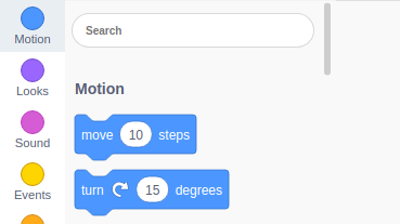
@rachel-fenichel Using an image just to make sure it's clear:

@PullJosh Agreed, blocks in the backpack would feel pretty clunky. It's in the wrong place, and requires another window to be used (not a huge deal, but a consideration).
luxaritas
on 4 Jan 2017
Thanks for the image--that makes it a lot clearer.
rachel-fenichel
on 5 Jan 2017
I skimmed through everything, but to respond to the first comment-- while the "say" and "think" blocks are not the most used, they are the first blocks that beginners to Scratch might reach for to get to know the structure of scripts. They might stop using it very soon, but they should be in their face from the start.
Which means that the positions of blocks should depend on how much you have been using Scratch? No, that would be confusing when it suddenly changes. So that leaves two options: leave the block positions as they are, perhaps with a search bar, and inconvenience users that are more familiar with Scratch; or let users manually drag blocks in the palette so that you can customise which blocks are at the top, and which are at the bottom.
idk tho.
 joker314
on 7 Feb 2017
joker314
on 7 Feb 2017
I was recently using scratch-blocks for my project and I needed a search bar for that. I did a basic implementation of search. Below is the snap attached.
Now I wanted to update blocks on search. Can anyone please help me??
 nmanumr
on 5 Oct 2018
nmanumr
on 5 Oct 2018
Related issues
 gengshenghong
·
3Comments
gengshenghong
·
3Comments
 MegaApuTurkUltra
·
4Comments
towerofnix
·
4Comments
MegaApuTurkUltra
·
4Comments
towerofnix
·
4Comments
 thisandagain
·
6Comments
towerofnix
·
6Comments
thisandagain
·
6Comments
towerofnix
·
6Comments
Most helpful comment
And one of its greatest strengths for beginners!
How would you feel about a search box for the palette? This is an idea that's been kicking around on blockly for a while, but needs a lot of thought to handle internationalization properly.
I'll leave discussion of the actual block ordering to the scratch team.