Scout: Symbols for male and female are hard to read!
The symbols small and hard to read. Since the sex of a patient is a important factor this could in lead to erroneous conclusions.
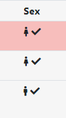
I think we should increase the figure size and possibly change the figure to a more clear pictogram. Alternatively use M/F to designate male and female respectively.
 mhkc
mhkc
👍2
All 3 comments
Agreed. We could check perhaps in fontawesome 5 if there are icons that are more clear to understand!
 northwestwitch
on 7 Jun 2021
northwestwitch
on 7 Jun 2021
I guess perhaps mars/venus is clearer. But adding back M/F is a very safe bet.
 dnil
on 7 Jun 2021
dnil
on 7 Jun 2021
👍2
@moedarrah an issue for your perhaps?
northwestwitch
on 9 Jun 2021
👍1
Was this page helpful?
0 / 5 - 0 ratings
Related issues
 ielvers
·
3Comments
northwestwitch
·
5Comments
ielvers
·
3Comments
northwestwitch
·
5Comments
 hassanfa
·
3Comments
hassanfa
·
3Comments
 heronikdin
·
4Comments
ielvers
·
3Comments
heronikdin
·
4Comments
ielvers
·
3Comments
Most helpful comment
I guess perhaps mars/venus is clearer. But adding back M/F is a very safe bet.