Scanpy: Not able to color groups on pca plot
I have an adata object and multiple CD4+ and CD8+ cells as observations and gene expression as variables. I want to draw a PCA with each dot corresponding to one cell and colored by cell type (e.g. all CD4 cells in blue, CD8 in orange). Each cell have a unique identifier, and I have a list cd4, which contains identifiers of only CD4 cells, and the same for CD8.
I tried the following:
scn.pl.pca(adata_needed, groups={"cd4":cd4, "cd8":cd8}, palette = ["red", "blue"])
But the result is the PCA plot in grey

I also tried to visualize only one sample:
scn.pl.pca(adata_needed, groups=["SRR1551000"])
But got exactly the same result.
I decided to use "color" parameter in pca plot:
scn.pl.pca(adata_needed, color="SRR1551000")
But got the following mistake:
ValueError: key 'SRR1551000' is invalid! pass valid observation annotation, one of [] or a gene name Index(['ENSG....', 'ENSG...', )
The observation names are there (adata_needed.obs_names outputs the observation I try to give to the function)
Here's the plot I need, but drawn with pandas.
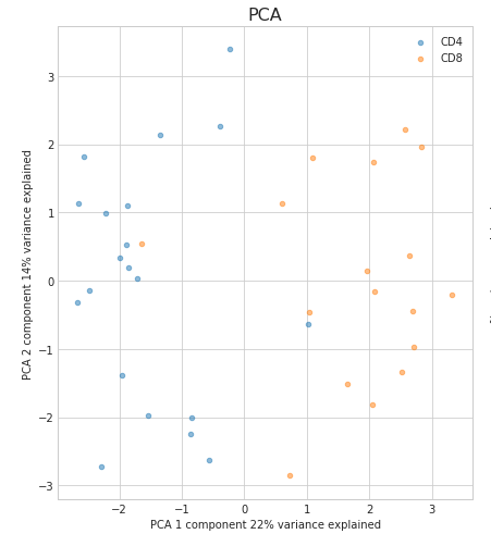
How can I draw a PCA plot like this?
 sonyasofia7
All 2 comments
Hi,
To make a pca plot you need the functions scn.tl.pca(adata_needed) and scn.pl.pca(adata_needed). If you would like to visualize your CD4+ and CD8+ cells on this plot, you need to store a variable in adata_needed.obs which contains the information which cell is CD4+ and which cell is CD8+. For example:
adata_needed.obs['cell_type'] = my_list_with_cd_labels
scn.tl.pca(adata_needed)
scn.pl.pac(adata_needed, color='cell_type')
Here the variable my_list_with_cd_labels should look someting like this:
my_list_with_cd_labels = ['CD8+', 'CD4+', 'CD4+', 'CD4+', 'CD4+', 'CD8+', 'CD8+', ..., 'CD8+', 'CD4+']
Where the length of the list is equal to the number of cells you have in adata_needed and the order is the same as well.
It may be helpful to consult this tutorial as well: https://nbviewer.jupyter.org/github/theislab/scanpy_usage/blob/master/170505_seurat/seurat.ipynb
I hope that helps!
 LuckyMD
on 30 Nov 2018
LuckyMD
on 30 Nov 2018
Thank you!
It was just not clear from the tutorial in the beginning that the same thing is used to define colors in plots :(
sonyasofia7
on 8 Dec 2018
Related issues
 Olivia117
·
4Comments
Olivia117
·
4Comments
 picciama
·
4Comments
picciama
·
4Comments
 a-munoz-rojas
·
6Comments
a-munoz-rojas
·
6Comments
 maxnguyen46
·
3Comments
maxnguyen46
·
3Comments
 wflynny
·
6Comments
wflynny
·
6Comments
Most helpful comment
Hi,
To make a pca plot you need the functions
scn.tl.pca(adata_needed)andscn.pl.pca(adata_needed). If you would like to visualize your CD4+ and CD8+ cells on this plot, you need to store a variable inadata_needed.obswhich contains the information which cell is CD4+ and which cell is CD8+. For example:Here the variable
my_list_with_cd_labelsshould look someting like this:my_list_with_cd_labels = ['CD8+', 'CD4+', 'CD4+', 'CD4+', 'CD4+', 'CD8+', 'CD8+', ..., 'CD8+', 'CD4+']Where the length of the list is equal to the number of cells you have in
adata_neededand the order is the same as well.It may be helpful to consult this tutorial as well: https://nbviewer.jupyter.org/github/theislab/scanpy_usage/blob/master/170505_seurat/seurat.ipynb
I hope that helps!