All 10 comments
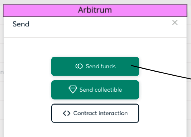
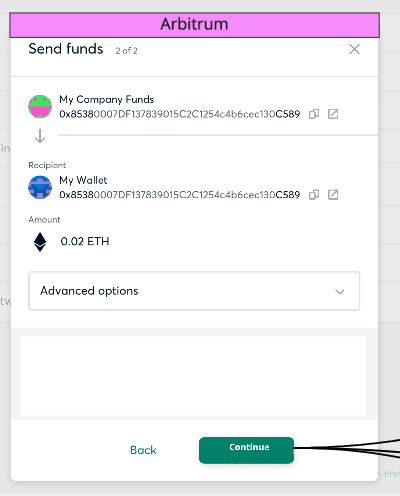
Here is the prototype for the Tx modal (only Send Funds flow)
I think we can reduce the height of the overlay when a modal is open. This way we will have the top navigation always visible and available (and the network label will be present anytime).
The network label will appear on top of the modal, this will not affect the appearance or proportions of the modal component as much. I also added an alternate design with the network label inside the modal, below the header, but I think it's too prominent.
Any suggestion? @tschubotz @katspaugh @dasanra
 alongoni
on 10 Jun 2021
alongoni
on 10 Jun 2021
I love the little tab label!
And nice idea with not covering the top bar with the overlay 👍
cc @KristinaMayman
 katspaugh
on 10 Jun 2021
katspaugh
on 10 Jun 2021
The tab label is an interesting idea! I agree it can work and be a bit less intrusive.
The only thing that I'm unsure about is the spacing in the "Your Safe only exists on Arbitrum" line, it seems a bit off. Maybe the Arbitrum label could be a bit closer and the text aligned so that it's all on the same height? Very tiny detail, I know, but I do notice it.
 KristinaMayman
on 10 Jun 2021
KristinaMayman
on 10 Jun 2021
I also like the tab label idea. It's less intrusive, but on the downside also less obvious. We are showing the network in 3 places, so I guess it's still enough
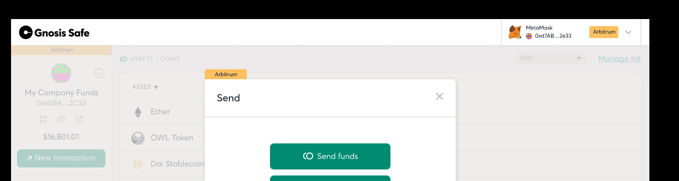
I'd still favor the non-tab-label option simply because, well the tab label it looks like a tab that I can click, which it isn't. Other than that, I don't have any tangible reason why I think it's less good. I wouldn't veto it either. So would let you and the team decide on what you prefer.
 tschubotz
on 10 Jun 2021
tschubotz
on 10 Jun 2021
I've added two more alternatives to place the network name inside the modal header (near to the close button). In some cases we are truncating long modal titles (e.g. in customs transactions), anyway I don't think that if we use that area we will have conflicts.
Same Figma link
alongoni
on 10 Jun 2021
Nice! this one is interesting I think:
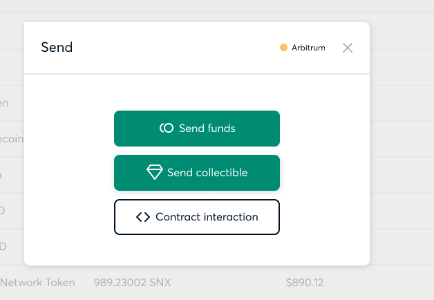
Why? In the background ,there are already 2 places, where the network color and name are displayed (Top right and above the Safe name). So perhaps no need to add another big colored canvas.
@elgatovital was making a similar suggestion for the Safe list on mobile yesterday. Perhaps that could fit nicely together. Vitaly, could you share the Safe list screen with the network indicator dots so Augustin can take a look? :)
tschubotz
on 11 Jun 2021
I like this one as well the most
 sche
on 11 Jun 2021
sche
on 11 Jun 2021
Hey @elgatovital. Please, could you share with me the Safe list screen with the network indicator dots you are working on? So I can take it in account to the web proposal. Thanks!
alongoni
on 14 Jun 2021
Hey @alongoni, here are the mobile mocks https://www.figma.com/file/FxiaO3ewqmxzQWJidO3sBT/Safe-Multiple-Networks-Mobile?node-id=1%3A31 I would use dots mainly on selection screens. As network indicators dots were dismissed as the are allegedly too subtle for this purpose.
 elgatovital
on 15 Jun 2021
elgatovital
on 15 Jun 2021
Related issues
katspaugh
·
3Comments
 francovenica
·
6Comments
francovenica
·
6Comments
francovenica
·
6Comments
francovenica
·
6Comments
 lukasschor
·
4Comments
francovenica
·
6Comments
lukasschor
·
4Comments
francovenica
·
6Comments