Me and the fellas over at the #development discord channel have come up with a few improvements to the current client UI, these are my proposed changes and I'm open to any suggestions or feedback.
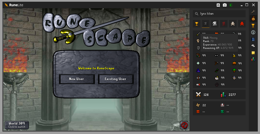
The main client frame
I feel like the current one is too "default-looking" and needs a bit of personality, in all my mockups bellow, a couple of changes I made were:
- Having my new and unofficial logo on the top left corner
- Having the discord/login/screenshot buttons slightly seperated from the minimize/maximize/close buttons to avoid confusion (This is unfinished as I do not know where to place the buttons)
- Darker colors on the top bar and side bar (this improves contrast between client UI and the game itself)
- Having the "selected" indicator of the buttons be a slightly darker color behind them
The grand exchange plugin (side panel)
There was nothing wrong with the current version, I just wanted to apply some of the new design rules to make it more modern, get rid of the borders and use different shades of grey for contrast and separation, changes made were:
- Material design style tabs
- Taller search bar, to give it more room to breathe (and removed border)
- Smaller and lighter search icon, just looks better imo
- Removed the borders on the ge item results
- Smaller and simpler scrolling bar that matches with the rest of the design

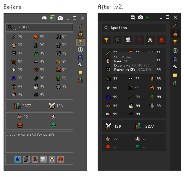
The hiscores plugin (side panel)
The hiscores panel had some issues, nothing to big, it just needed to be realigned with my new proposed look, a few changes were made:
- Made the search bar more in line with the rest of the dark layout
- Moved the account type button to the top, this follows a more logical sequence (Search Name -> Select account type -> View results)
- Changed the selection indicator on the buttons to a orange underline
- Reduced the size of the font on the skill levels
- Removed the bottom information panel as it was occupying a lot of unnecessary space, moving it to a on-hover action, this is also more inline with the current in-game behaviour
- Switched the order of the combat/total level indicators, to match the ingame order
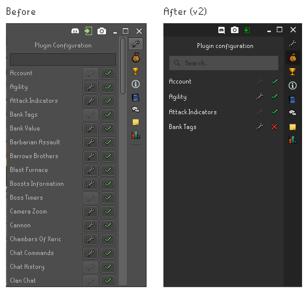
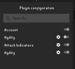
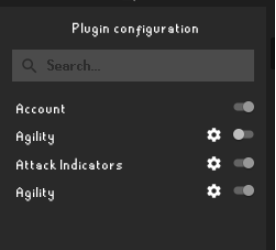
The config side panel
Again, I think there is nothing wrong with the configs panel, just changed it a bit to match the rest of the design, changes made were:
- Darker colors
- New search bar
- Removed the square around the buttons, to give it a cleaner look
- Added a line separating the configs, just to give them some structure
- On the second mockup only: instead of lowering the opacity on the wrench icon, I just removed it
to avoid user confusion
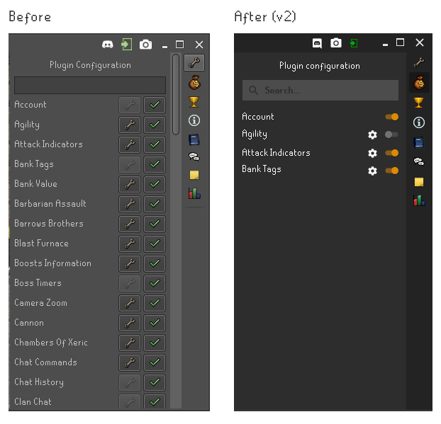
After some discussion on discord, some people asked me to try a material switcher look to the configs, here is that:
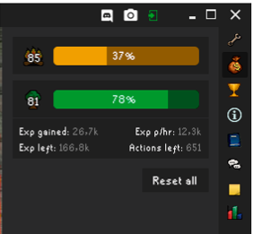
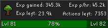
The XP Tracker plugin (side panel)
Many people like this plugin as it is, I think it could be better, however I'm not sure I have the solution, either way, here's an attempt:
- Made the progress bars have rounded corners
- Changed the progress bars' colors to match the skill icon
- Changed the skill icon to be darker, so that the level on top of it stands out more
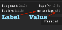
- Made the expanded tracker information different, following a "Key: value" structure, keeping the value in white to make it stand out.
- Reduced the size of the total exp indicator
- Moved the reset all button to the right side

PS: I'd be happy to develop some custom components to help these changes
 psikoi
All 29 comments
Personally I like it how it is currently but not like I have anything against your version so if I'm outvoted I won't complain too much =p
As for functionality I really only have one thing that I saw that needs addressing after a quick look through and thats the last thing you posted "XP Trackerplugin". The reset button imo needs to be at the top because if you have enough skills "open" it creates a scroll and I would rather not have to scroll to reset.
 Stickaplex
on 10 Apr 2018
Stickaplex
on 10 Apr 2018
In addition to what Stickaplex said, instead of centering the reset all button, you could add another label showing your Total XP gained for this session, and keep the reset on the right if you wanted to
 Infinitay
on 10 Apr 2018
Infinitay
on 10 Apr 2018
This looks nice
 SomeZer0
on 10 Apr 2018
SomeZer0
on 10 Apr 2018
Here be my comments with the perspective of a web developer.
Main client frame:
- The logo is more striking and less noisy, I think that's a good thing for recognition. However to my eyes it also looks like a cape or even close to the logo of impactjs http://impactjs.com/ I do like orange and dark neutral though.
- Is client version useful to end users? They have to update whenever runescape updates anyway. I say throw this out.
- The spacing seems unnaturally decided. I do think it is appropriate to separate these user-actions from the OS controls. Perhaps a horizontal bar between? Or something more fancy like a curve color change for the backdrop--isolating it from the user actions.
- This darker color is pleasant.
Grand exchange plugin:
- I already like the tab underline / centered styling.
- I feel the spacing between the search bar and the tabs is unnatural
- The bolded 'whip' text is surprisingly harder to read
- It's nice the icons show up..
- Do we want to show alc prices when they are zero? (This is probably more change in behavior)
- The borders indeed are unnecessary when going more material style.
- I like the new scroll bar, it is closer to what discord has as a reference.
Highscores:
Really you should use the same user as a reference so we don't see a difference in data..
- I do like the icons having their own boxes for *man mode selection. It also seems appropriate at the top as it changes what you see.
- The tooltip seems nice. It is easy on the eyes. Consistency with in game behavior is
trippple+++; - I do like the alignment of the total indicators.
- The trophy seems more appropriate than an arbitrary blue star.
Config side panel:
- Really not sure what is up with this bold font, it is harder to read and makes my eyes want to defocus.
- I like the better contrast with the background and the icons.
- Should we just not show a wrench when there's no settings, rather than a dimmed wrench?
- Line separations does help keep the titles and affordances easier to coordinate. However this is inconsistent with the material design inspired display in the grand exchange plugin
RE: Material switcher
I do like the toggle switches easier. The color difference is nice, though the value needs a bit more work.
XP Tracker plugin
- I like these rounded borders.
- The colors, like red, yellow, green for the progress complete is kinda odd to me, given it's not like a health thing, and at high levels, the progress is so slow the colors lose their meaning.
- Really feeling inconsistent with the plugin panel and the grand exchange plugin panel..
- The labels like Actions left: are less important than the values themselves. I look at "651" more than "Actions left". The focus should be on the value, not the label.
- I think it is the right move to move the reset button down since it is less used and less important than the progress bars.
- Aren't the values displayed under the skill (exp gained ..) attached to the skill? Why is there a separation line of the same color as the background there? It makes it seem cut off, rather than an attached stub.
- Not sure what is going on with fonts in these previews, but those numbers seem fuzzy to me.
 LeviSchuck
on 10 Apr 2018
LeviSchuck
on 10 Apr 2018
I would like to completely redo the config panel, turning it into a pop-out window similar to IntelliJ's. I have some code on this, but not anywhere near a working prototype. However as it requires breaking changes to almost every plugin, I would like to delay it until Adam's trip is near it's end.
 abextm
on 10 Apr 2018
abextm
on 10 Apr 2018
@Stickaplex I too think there's nothing "too" wrong with the current one, but don't let that ever stop you from trying to improve, if you feel like your attempts were unsucessful, just don't do it :P it's just a suggestion. But I do agree that the reset button should be at the top, I forgot the trackers would stack very high, will update my mockup in a second, thank you!
@LeviSchuck First of all thank you for the compreensive feedback, I have some things to say:
Main client frame:
- Please keep in mind this was just a resized png, if the logo suggestion gets approved (currently an issue in the runelite.net project) I will be making a vector version of the logo, so it will look a lot sharper and defined. As for the impactjs, it does look similar, I did not know of that logo but I see the concern.
- Okay fair point, agreed.
- It does feel unnatural. at first I simply separated them from the others, with the intent of finding a better position later on, and that time never came as I was not sure where to place them, however I did not understand your suggestions, mind showing me a visual example?
Grand exchange plugin:
- Upon reviewing, I think you are right, I will try and make it make more sense.
- Agreed, will change.
- The current version also has the icons, but the API was down when I was putting together this issue so no images were loaded.
I just copied it off the current client, but good question. I have been working with the ge plugin to add some more functionality to it, so I may take a look at this.
Highscores:
Again, the API was down for quite a while so I couldn't get real data, my bad, will update this.
- I thought so, makes more sense from a usability stand point
Yea I couldn't really figure out why they were using a blue star.
Config side panel:
- I had a few runescape fonts already installed and confused them, I fixed it for some mockups but some have slipped with the old one, will fix.
- I also like the icons by themselves, however they were some concerns on discord about it looking like a label instead of a button, so it could happen that users would think of it as a "enabled/disabled" indicator instead of a switch.
- That was my suggestion, as you can see by my second mockup I hid the cog for some configs as they were not available, I should probably have made that more apparent, but there was some discussion on discord about it and we couldn't come to agreement on that. (however I agree with you)
- You are right, will change.
I did not understand what you mean't by the value.
# XP Tracker plugin
- Just my thought exactly, but on my example, the colors matches the skills, not the progress itself.
- Mind explaining further?
- Great point, will change.
- See @Stickaplex's comment and it might change your mind, it changed mine.
- I do see your point, however I think that considering it's 1px tall and when compared to the rest of the margins of the image, it's reasonable to assume it's attached, just extra information.
- Same thing as before, will fix.
psikoi
on 10 Apr 2018
The label vs the value
The label is less important than the value, making the value harder to read makes it harder to use.
LeviSchuck
on 10 Apr 2018
I understood that, that was your 4th point, I had doubts on the 3rd
psikoi
on 10 Apr 2018
The dark theme has too much of "OSBuddy" with itself. Imo if this is being considered, I'd vouch for actually creating your own custom themes / choosing community made themes. But not for solely this theme
 YasinY
on 10 Apr 2018
YasinY
on 10 Apr 2018
Oh, I see.
Value in the sense of color theory. That's why I put up an image in gray-scale.
http://learn.leighcotnoir.com/artspeak/elements-color/hue-value-saturation/
For those with diminished color reception and for view in the periphery, the value of the toggles needs more contrast.
LeviSchuck
on 10 Apr 2018
@YasinY What do you have in mind? I suggested a light theme but it didn't get much traction, I think dark is the way to go, runescape is already very colorful as it is.
@LeviSchuck oh the gray-scale value, good catch, what is your suggestion? I just used the brand orange.
psikoi
on 10 Apr 2018
I suggest making the false value darker
LeviSchuck
on 10 Apr 2018
@psikoi I'd agree with the dark theme when the alignments of the icons would change for example:
maybe make them horizontal instead of vertical (I'm talking about the icons on the right bar)
Because right now, the current theme reminds me too much of the osbuddy theme. (imo)
and also
instead of making the false value darker, make the true value rather greenish, it'll look more interactive imo
YasinY
on 10 Apr 2018
Version 2
Updated the first post and applied some of the feedback from this comment section.
Main frame
- Deleted the version indicator next to the left side logo.
Ge plugin
- Decreased the margin between the search bar and the first result item to be equal to the distance between the tab and the top bar
- Improved the font on the "whip" search term
- Moved the elements to the right, centering them in relation to the right toolbar, not the scroll bar.
- Changed the "before" picture to better represent the current client status
Hiscores plugin
- Improved the font on the search bar
- Changed the data on both the before and after images to better present the changes
- Slightly moved the "2277" total level to the left
Configs plugin
- Improved the font
- Removed the horizontal lines
- On the material version: made the "off" version of the switcher darker
Experience trackers plugin
- Created a new total experience area on the top
- Moved the reset all button next to the total indicator, to prevent the user from having to scroll down when many trackers are stacked
- Changed the indicator's color to grey and the value's color to white on the expanded tracker
- Changed the before image to better represent the current client status
psikoi
on 10 Apr 2018
Also, another suggestion about the high alch issue, if it's 0, instead display N/A
so it's High alch: N/A instead of High alch: 0
YasinY
on 10 Apr 2018
I would love this to be a 2nd optional theme. It looks alot cleaner!
 ArjanStudent
on 13 Apr 2018
ArjanStudent
on 13 Apr 2018
If this will be implemented it will replace the default one.
 deathbeam
on 13 Apr 2018
deathbeam
on 13 Apr 2018
I really like this, but I don't think this is a priority? However I'd like to see it in the near future.
Edit; What I mean, if it's not too much of a work, implement it.
 ghost
on 13 Apr 2018
ghost
on 13 Apr 2018
Well, one of the good things at being open source is that there is infinite number of people who can work on infinite number of things at once :D So, @psikoi working on this one as priority will not slow down any other progress in the client by the slightest.
deathbeam
on 13 Apr 2018
Just a thought, what about trying to emulate osrs xp tracker? something like
(rs one for reference)
I guess this does make it look eerily similar to konduits
 sethtroll
on 15 Apr 2018
sethtroll
on 15 Apr 2018
@sethtroll Actually I drew some last night that are very similar, except they don't have the info at the bottom.
It's a tricky game between clean ui and information display.
psikoi
on 15 Apr 2018
Did you have a redesign for the info panel in mind?
I threw something up real quick, not sure what else to put there
sethtroll
on 16 Apr 2018
I hadn't yet, but now I do! a couple tweaks and it'll fit in real nicely, give me a few minutes.
psikoi
on 16 Apr 2018
@sethtroll what do you think of this?
psikoi
on 16 Apr 2018
Yeah looks good, could probably throw in current online players somewhere and also add a twitter link
sethtroll
on 16 Apr 2018
The dream lives on, this suggestion has been developed and is awaiting approval and merging, planned to be merged on the 17th of May. 🎉 🎉
psikoi
on 7 May 2018
This should not be closed until the PR is merged
deathbeam
on 7 May 2018
I'm new... how do you downbload this? or we can't?
 ely151
on 21 May 2018
ely151
on 21 May 2018
@ely151 it will be in release this thursday after RuneLite updates.
 Kamielvf
on 21 May 2018
Kamielvf
on 21 May 2018
Related issues
 Tehterokkar
·
28Comments
Tehterokkar
·
28Comments
 DoctaDread
·
29Comments
DoctaDread
·
29Comments
 Nightfirecat
·
22Comments
Nightfirecat
·
22Comments
 sadegr
·
52Comments
sadegr
·
52Comments
 src52
·
19Comments
src52
·
19Comments
Most helpful comment
@sethtroll Actually I drew some last night that are very similar, except they don't have the info at the bottom.
It's a tricky game between clean ui and information display.