Revolution: Design Suggestions for MODX3
Feature request
Summary
This is my (quick) take at what the MODX3 resource panel and resource sections should look like. Inspiration and colors are all from Stripe's manager page. Along with this, I think it would be really beneficial for a system setting to allow you to set the accent color. This color would attribute itself to the save button (?) as well as other borders/focus/switches.
Why is it needed?
In the current design, there are too many different off-white/grey colors that distract you from your workflow, and take away from the overall clean, modern design.
Suggested solution(s)
Here are the colors and special css attributes:
Background color: #e3e8ee
Panel color: #f7fafc
Burple (accent): #556cd6
Text color: #2a2f45
Faded Text color: #a3acb9
Sub-text color: #4f566b
Error color: #cd3d64
Line shadow: box-shadow: inset 0 -1px #e3e8ee;
Box shadow: box-shadow: 0 7px 14px 0 rgba(60,66,87, 0.1), 0 3px 6px 0 rgba(0, 0, 0, .07);
Border radius: 4px;
Screenshots of the suggestions


 kolbykruger
All 26 comments
Look nice. But why blue instead or current green?
 alroniks
on 20 Mar 2019
alroniks
on 20 Mar 2019
It looks great!
The only thing is, I would change the indent of the background-block of the buttons (like in the content block) or remove the background-block completely.
 Ruslan-Aleev
on 20 Mar 2019
Ruslan-Aleev
on 20 Mar 2019
A couple of comments on the proposed changes:
- change green to blue? What for? Green looks consistent and it is in the logo.
- gray is not so agreed look
- also the
box-shadowproperty
The current version by color is an exact hit as it should be. I would not like to see changes on these items.
But there are also things that can be made as changes.
 Ibochkarev
on 20 Mar 2019
Ibochkarev
on 20 Mar 2019
@Ibochkarev The base color can be changed, for example, in the settings, so it is not green, as I understand it.
Personally, I like gray, the usual gray color :)
Ruslan-Aleev
on 20 Mar 2019
https://twitter.com/vlijmscherp/status/892410969464418305 This is something new and very interesting in my opinion.
Ibochkarev
on 20 Mar 2019
Ooh, I like the idea of a tree nav.
The accent colors (replacing blue with the green) was more of an idea to have it be an option to change in system settings. I was trying to show that example.
Along with this, I think it would be really beneficial for a system setting to allow you to set the accent color.
It would be a fun and interesting thing to play with, but totally unnecessary.
kolbykruger
on 20 Mar 2019
It's time to expose a set of branding/style/color options and let those be imported/exported as JSON or something as a manager "theme".
Preferences are just preferences, but people might like to "brand" the backend a little bit for their clients.
All you really need for a nearly complete overhaul is about a dozen color choices, not a big deal. It could even have a small real-time UI as a "theme designer" where people can see their changes as they go.
And for sure if the manager theme gets an overhaul, it has to have a light AND dark theme option.
There, I solved all our problems ;)
 guyinpv
on 20 Mar 2019
guyinpv
on 20 Mar 2019
My feedback here would be that the font color (gray) is too light and needs to be darker for more contrast. Currently the design is too soft overall (all looks very similar). But that's an easy change.
 christianseel
on 28 Mar 2019
christianseel
on 28 Mar 2019
@christianseel Please indicate color layout options
Ibochkarev
on 28 Mar 2019
@kolbykruger Any news on design? It would be interesting to see :)
Ruslan-Aleev
on 11 Apr 2019
In general, the idea of reducing the number of off-white/grey colors is very useful. It will be easier in the future to make themes, for example, a dark theme :)
Ruslan-Aleev
on 11 Apr 2019
I honestly was just having fun, trying to show different style options. Right now the design does have a lot of different grey colors, which makes it feel dated.
I have a lot of internal issues with the MODX navigation regardless, as most of our websites we pass on to clients, and 99% of them never need to access anything in those menus. Would love to see it change, but it's hard as a lot of developers use MODX in different ways.
kolbykruger
on 12 Apr 2019
Just go super modern and have huge washes of solid bright colors with some background abstract shapes.
Look at October CMS: http://dev.goradiantweb.com/uploads/public/539/73a/9a5/53973a9a5f521976962657.png
;)
guyinpv
on 13 Apr 2019
@guyinpv As for October CMS - a controversial statement. Such a waste of workplace, as in the October CMS, I have not seen anywhere else :)
Ruslan-Aleev
on 13 Apr 2019
Indeed. Just because somebody else chooses a remarkably ugly design doesn't mean MODX has to do the same. Although I suppose that "ugly" is in the eye of the beholder...
 sottwell
on 13 Apr 2019
sottwell
on 13 Apr 2019
For sure, but "clean" not only mean everything is white and offwhite. Clean also means good white space, well organized, easy to reason about. And not just that there are background colors.
Also keep in mind, not everybody has their monitors calibrated the same. I tend to run mine bright and contrasty, so subtle shadows, outlines, and really light greys just wash out anyway.
Color also can be used to block in the main areas of the admin. By coloring the sidebar and/or top bar, it drives focus to the center content editing area. But when everything, all areas of the screen, are the same look and colors, it's less easy to visually keep a point of focus, the entire screen now looks like the main editing area.
None of this is to suggest the current look isn't good, because it is good. I just don't think people should be afraid of color either, color isn't what makes a design not clean.
Drupal uses their brand color as a highlight throughout the light grey admin.
Joomla creates color mostly through elements, lots of colored icons and links and status wingdings and so on.
Processwire has a few color shades, darker and light blues in the header, pink titles, light blue bg, green buttons and element selectors.
You've seen the glory of October.
Wordpress has a relatively standardized color scheme with primary/secondary colors, and multiple themes to choose from which change those base colors.
Craft has soft blueish greys but keeps the main sidebar dark to put focus on content area. Bolt CMS does the same.
Expression Engine seems to have a lot of blueish grey tones throughout, using darker bright colors for elements, links and so on.
Current MODX fits right in, with darker header, soft grey bg with darker purpleish grey headers and some green and blue accents.
The real question is, should the element tree be dark, to push focus to content area? And should the color scheme and accent colors change at all?
guyinpv
on 13 Apr 2019
How about serving a dark theme also with default white?
And from system settings option to change from default white to Modx Dark.
Or how about serving 4-5 themes like dark, white, blue or something inspired from VS code/Ace themes..
😂
 Mayanktaker
on 12 Jun 2019
Mayanktaker
on 12 Jun 2019
How about serving a dark theme also with default white?
And from system settings option to change from default white to Modx Dark.Or how about serving 4-5 themes like dark, white, blue or something inspired from VS code/Ace themes..
😂
For this you need a design and a lot of free time. But at the expense of a dark theme, I already had thoughts.
Ibochkarev
on 14 Jun 2019
@kolbykruger The MODX3 design was recently updated (the shadows were removed), I personally like it.
Maybe you have any other ideas? It would be interesting to see :)
Ruslan-Aleev
on 10 Sep 2019
I'll try and set some time this week to take a look, unless you wouldn't mind taking a screenshot or two.
I have always been a fan of 'more is less'
kolbykruger
on 11 Sep 2019
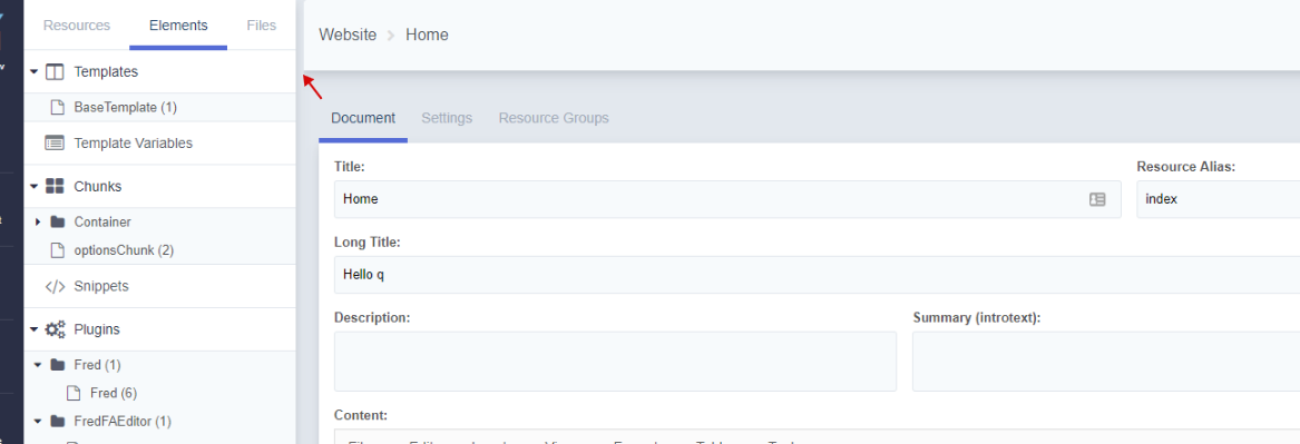
Here are some screenshots. This is already in the current version of MODX 3:


Of course, not everything is smooth and it would be great to get additional help with the design ;)
Ruslan-Aleev
on 11 Sep 2019
Thanks for the screenshots!
First, I will apologize for the following word vomit. Just throwing out my initial thoughts.
Resource Panel
I think going the flat ui route looks good. There still is something missing separating the resource-panel from the page info. I think it's mostly due to the page background and the resource-panel tabs using the same color grey. I don't have a solution - and I prefer the fact that there aren't 20 different grey colors being used now.
Button icons
I still think the icons on the buttons (save + view) are redundant and look strange.
Breadcrumbs
I really like the addition of the breadcrumbs at the top!
Deleted toggle
I think the addition of the deleted toggle (under published) is an odd placement. I don't think it's as important as the published states and dates. This maybe should be moved to settings? I imagine the Delete button still exists (in the dots menu) so this might not need as much focus as it's given now.
Font Sizes
There seems to be some font-size discrepancies between pages. This might be by design, but I'll bring it up just to talk about it. On the system settings page, the setting font sizes are different from the resource-panel. For consistency, it would be nice to pick 4-5 consistent font-sizes and use them throughout all elements - avoiding custom specified sizes. Just an opinion though...
Text Colors
This brings me to font-color. Looking at the system settings screenshot, on the page there are 5 different text colors - and that's a lot (white, dark blue, light-grey, grey, lighter-opaque blue). It might be nice to create some consistency here too.
Navigation Bar
The navigation bar on the left definitely needs some work.
- The icons are extremely heavy compared to the text. They might want to be lighter weight, or moved to the solid-filled icons used for the dashboard widgets.
- They have underlines to differentiate them from the others, but this doesn't exist below for the user/settings/help button. I think the underlines should be removed.
- The collapse button is a UX nightmare, and needs to be changed. From my perspective, the arrow should be moved to the resource-panel near the MODX Revolution title (on the right of it) when opened. When closed, I am open to suggestions. Right now there is no indication as to what it does until you click it - and that is bad.
- I think the actual menu structure needs work as well. I can go into detail more on this in a different post as it probably deserves it's own.
I can try and mess around with some mockups later this week/next week and see if I can come up with anything.
Thank you again for posting the screenshots!
kolbykruger
on 11 Sep 2019
Thanks for your thoughts!
I completely agree, except for the "Delete" switch :) we specifically moved it from the "Settings", because deletion is still often required for the resource, and with a large tree it is not clear whether the resource is deleted or not, until you see the styles of the resource in the tree, or go to the "Settings" of the resource.
With the new position of the "Delete" switch, it is easier to delete a resource and you can immediately see that it is deleted - it has become more useful for UX.
Ruslan-Aleev
on 11 Sep 2019
I could see that, and you've convinced me. You'll definitely be able to see immediately if a resource is deleted or not, which can definitely be handy.
kolbykruger
on 12 Sep 2019
I'm not a fan of mystery icons without labels, but what about a trash can icon with a red toggle, grayed out when inactive, and floated right on the same line as published? A trash can is a pretty universal symbol at this point. (Strongly agree on removing the save/view icons, also.)
Update: really great discussion and improvements here!
 rthrash
on 12 Sep 2019
rthrash
on 12 Sep 2019
and floated right on the same line as published
As it turned out, placing switches on one line is not easy (https://github.com/modxcms/revolution/pull/14545#discussion_r274344198), and it seems to me that this will also be a problem for the trash icon. Table layout limitations of old extJS.
Ruslan-Aleev
on 12 Sep 2019
Related issues
 akimsullec
·
4Comments
akimsullec
·
4Comments
 sdrenth
·
3Comments
sdrenth
·
3Comments
sottwell
·
3Comments
sdrenth
·
3Comments
sdrenth
·
3Comments
sottwell
·
3Comments
 netProphET
·
3Comments
netProphET
·
3Comments
Most helpful comment
Thanks for the screenshots!
First, I will apologize for the following word vomit. Just throwing out my initial thoughts.
Resource Panel
I think going the flat ui route looks good. There still is something missing separating the resource-panel from the page info. I think it's mostly due to the page background and the resource-panel tabs using the same color grey. I don't have a solution - and I prefer the fact that there aren't 20 different grey colors being used now.
Button icons
I still think the icons on the buttons (save + view) are redundant and look strange.
Breadcrumbs
I really like the addition of the breadcrumbs at the top!
Deleted toggle
I think the addition of the
deletedtoggle (under published) is an odd placement. I don't think it's as important as the published states and dates. This maybe should be moved to settings? I imagine the Delete button still exists (in the dots menu) so this might not need as much focus as it's given now.Font Sizes
There seems to be some
font-sizediscrepancies between pages. This might be by design, but I'll bring it up just to talk about it. On the system settings page, the setting font sizes are different from the resource-panel. For consistency, it would be nice to pick 4-5 consistent font-sizes and use them throughout all elements - avoiding custom specified sizes. Just an opinion though...Text Colors
This brings me to
font-color. Looking at the system settings screenshot, on the page there are 5 different text colors - and that's a lot (white, dark blue, light-grey, grey, lighter-opaque blue). It might be nice to create some consistency here too.Navigation Bar
The navigation bar on the left definitely needs some work.
I can try and mess around with some mockups later this week/next week and see if I can come up with anything.
Thank you again for posting the screenshots!