Revolution: MODX 3: Buttons - different button groups
Summary
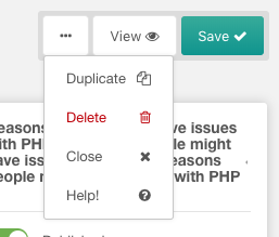
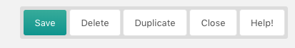
We have a great new button pattern when editing resources;
Observed behavior
I wonder if this should be applied to all button groups to make it consistent?
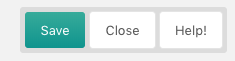
button group when editing template, tv, chunk, snippet, plugin:
/manager/?a=element/template/update&id=1
/manager/?a=element/tv/update&id=1
/manager/?a=element/chunk/update&id=1
/manager/?a=element/snippet/update&id=1
/manager/?a=element/plugin/update&id=1

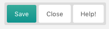
button group when updating a user:
/manager/?a=security/user/update&id=1

button group when editing a form customisation set:
/manager/?a=security/user/update&id=1
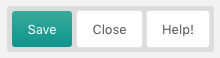
button group when updating a dashboard group:
/manager/?a=system/dashboards/update&id=1

button group when updating a context
/manager/?a=context/update&key=web

button group when updating a user group
/manager/?a=security/usergroup/update&id=1

button group when updating an access policy / policy template
/manager/?a=security/access/policy/update&id=2
/manager/?a=security/access/policy/template/update&id=1
button group when updating a media source
/manager/?a=source/update&id=1
Expected behavior
To follow the new button pattern that the resource page uses.
I appreciate that the resource page is the most import for content editors and the other parts of the CMS are more for site builders, but surely 1 pattern is better than 2?
Environment
3.x branch built from github
 jonleverrier
All 5 comments
Personally, I don't think "Close" should ever be in a group; it's used much too often by users in my experience.
 SnowCreative
on 16 Apr 2019
SnowCreative
on 16 Apr 2019
It's also weird that we are hiding functionality behind a dropdown menu that requires clicking.
 JoshuaLuckers
on 16 Apr 2019
JoshuaLuckers
on 16 Apr 2019
Yes, I also do not understand why hide the "Copy" button for example?
Why not to leave the same kind of buttons in MODX3 ?
 Ruslan-Aleev
on 20 Sep 2019
Ruslan-Aleev
on 20 Sep 2019
It's very pretty and clean, but I'm not sure quite as good on the UX front.
I wonder how it would work to change the help button into a clickable "?" icon and leaving the remaining buttons as text-only? I might could buy into the checkmark icon on the primary action (save), but adding icons to all the others gets too busy for my personal preference.
 rthrash
on 20 Sep 2019
rthrash
on 20 Sep 2019
Yes, the text + icons, it seems to me, looks superfluous.
We can think of something with various options, for example:


The help button in the form of an icon will look appropriate, because this button is not often needed :)
By the way, the delete button can also be made an icon - there will be less false clicks. If you need to remove - you need to aim :)
Ruslan-Aleev
on 20 Sep 2019
Related issues
 gadgetto
·
4Comments
gadgetto
·
4Comments
 netProphET
·
3Comments
netProphET
·
3Comments
 travisbotello
·
3Comments
Ruslan-Aleev
·
3Comments
travisbotello
·
3Comments
Ruslan-Aleev
·
3Comments
 dsuppiger
·
3Comments
dsuppiger
·
3Comments
Most helpful comment
It's also weird that we are hiding functionality behind a dropdown menu that requires clicking.