Revolution: MODX 3: small graphical glitches in resource tree
Summary
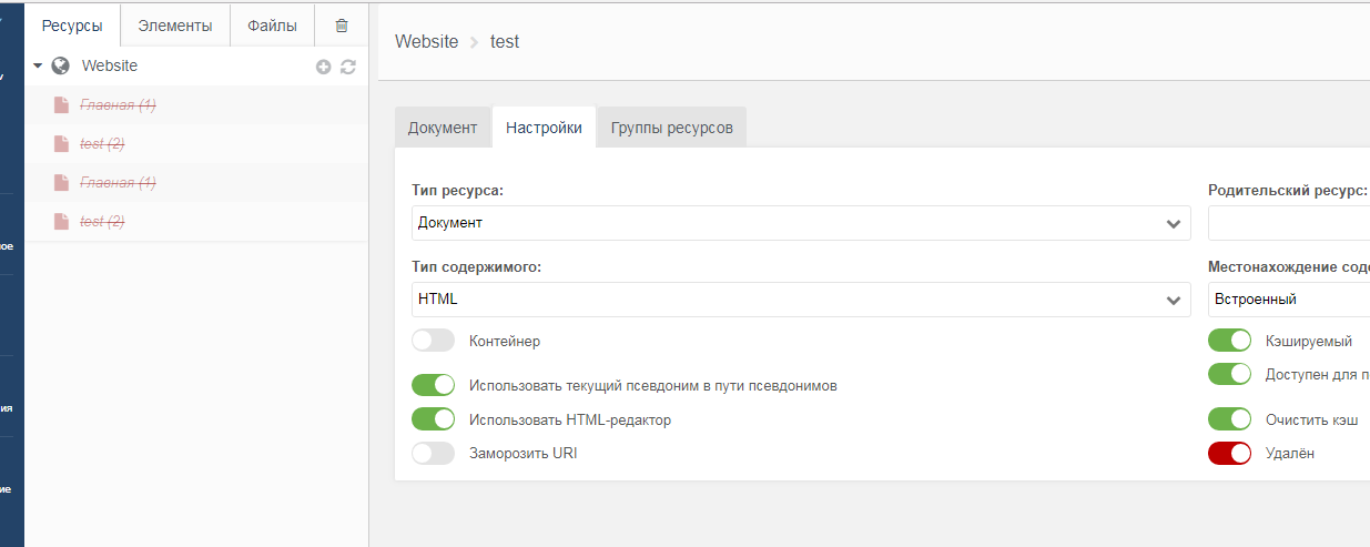
1) When you delete resources (checkbox in resource settings) - they are duplicated in the resource tree (until you refresh the page)
2) Visual inaccuracy (as it seems to me), goes from MODX Revo:
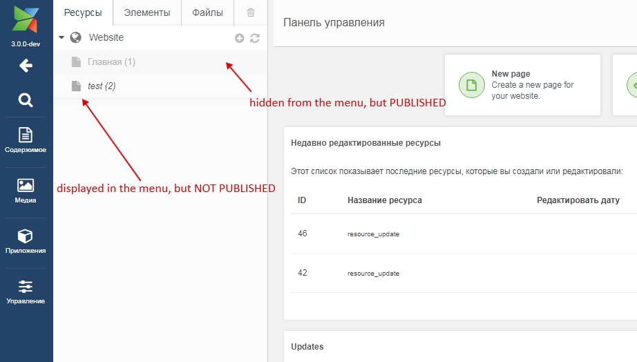
unpublished resources look brighter in the resource tree than hidden resources from the menu. In a large resource tree, "font-style: italic" of unpublished resources is not noticeable, but publishing is more important than hiding from the menu. Need styles do the opposite, or add some additional notation for unpublished resources (icon color, or change the icon).
MODX 3,
Goole Chrome 67.0.3396.99
 Ruslan-Aleev
All 27 comments
You can easily add your own CSS to style the tree elements however you like. Here's a sample for one site I worked on:
.unpublished, .unpublished a span, .unpublished i.icon, .unpublished i.icon-large {
color:#999 !important;
font-style: italic;
}
.hidemenu a span {
font-style: normal;
}
.unpublished.hidemenu a span {
color:#a8a8a8 !important;
}
This makes the text for Published the main blue color, Unpublished plain gray, and Hide from Menu italic (regardless of published setting). Save your styles in a CSS file ("manager.css" or whatever), create a Plugin called "customManagerStyles" (or whatever), set the System Event to "OnManagerPageInit", and use this code, subsitituting the actual path to your CSS file:
$modx->regClientStartupHTMLBlock('');
 SnowCreative
on 7 Jul 2018
SnowCreative
on 7 Jul 2018
Just an idea. Why not use different icons for published/unpublished/hidden resources/folders or use some badge on the icon.
 Jako
on 8 Jul 2018
Jako
on 8 Jul 2018
This does seem like something we could improve in MODX 3, but I'm not quite sure what the best solution is.
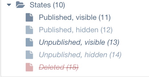
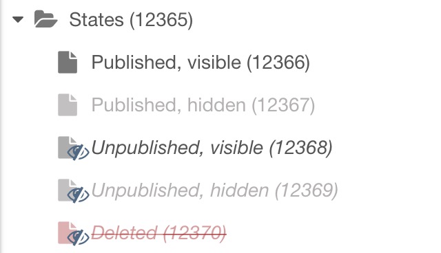
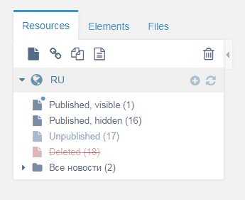
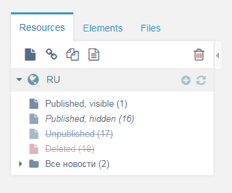
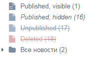
For context, here's what they look like in 2.7:
And in current 3.x:
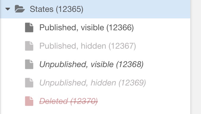
So at the very least, 2.7 and 3.x are consistent, which is good. If we change how this is displayed, I think we need to make sure it's absolutely obvious what it means, as this is one of those details that people get used to.
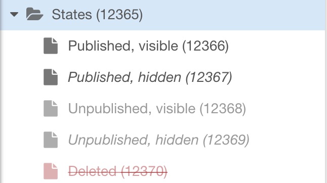
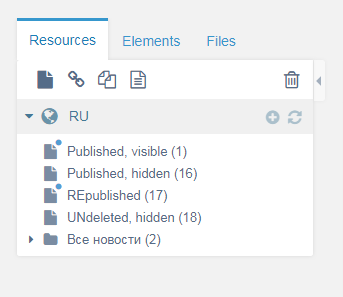
Attempt 1: adding the eye-slash icon as a badge like @Jako suggested (same colors/italics as current):
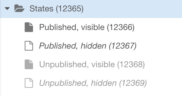
Attempt 2: published determines the color, and visibility is italics (so, reverse of current):
Attempt 3: same as attempt 2, but also empty icon for hidden resources:
Attempt 4: same as attempt 2, but using empty icon for _published_ instead of _hidemenu_:
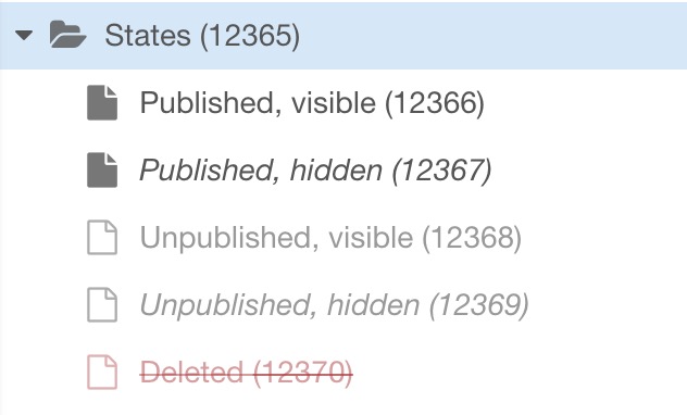
One note about the different icon in 3 and 4; that only works well for standard resources. Weblinks/custom resources only have the color/font style to differentiate states.
 Mark-H
on 28 Dec 2018
Mark-H
on 28 Dec 2018
Thanks for the visual presentation :)
I would combine 2 variants:
1) Variant with additional icon (attempt 1) - this variant covers any type of resource and any template icon. And an additional icon in the tree helps to immediately see that some resources are unpublished with a fast tree scroll, for example.
The only thing, I would change the additional icon color to link color (gray, red) and make additional icon smaller.
2) And attempt 2. In the attempt 1 without changes it’s bad that the unpublished resource is brighter than the published one (hidden in the menu), which, in my opinion, is illogical.
Resource publishing should always be brighter, because if the resource is not published - the resource is not on the site and it does not matter anymore whether it is shown in the menu or not.
Attempt 3 and 4 are complicated, in these variants, in addition to changing transparency and font-style, different icons are added, which further complicates the visual logic. And these variants will not cover template icons and other types of resources.
Ruslan-Aleev
on 28 Dec 2018
I think, for me, the problem is having two different statuses. If something is unpublished, how is it still visible? Isn't the point of unpublishing something to hide it? Or why would it still be visible in menus if I've unpublished it? Do we even need a visual reference at all regarding menu visibility?
I find the italics to be quite distracting. There are many pages hidden from menus, like 404 page, API endpoints, landing pages, sample pages, configs, utility pages, which won't be showing in menus, so having lots of italic links strewn about just isn't visually appealing anyway.
I would almost prefer the smallest of visual queues, like a tiny colored dot, to represent visible or not. If anything. Does anybody need to be able to see at all times, at a glance, every resource's menu visibility?
 guyinpv
on 29 Dec 2018
guyinpv
on 29 Dec 2018
@guyinpv Yes, options, such as unpublished, but hidden from the menu resource seem superfluous, but at the same time through the context menu in the tree you can publish the resource (without going inside the resource) and immediately see the status of the resource in the menu.
The idea with the dot is interesting.
Ruslan-Aleev
on 29 Dec 2018
Here is variant with simplified states (as @guyinpv mentioned): if a resource is deleted or unpublished, then it always has the same look in the tree, but only after we published it again, or undeleted - we already see the resource status in the menu.
Ruslan-Aleev
on 29 Dec 2018
A dot is just too hard to see, compared with changing color or type style. The empty icons seem much better, but as mentioned, this would only work for standard resources with no custom icon applied. I do, however, like the idea of some sort of icon (like the eye in Attempt 1) for unpublished, because my clients sometimes don't understand the difference between unpublished and hidden from menus, the latter still being accessible on the web. The slashed eye (or some other icon) makes it clear that those are the pages that can't be viewed on the website (unless someone is logged into the Manager).
SnowCreative
on 29 Dec 2018
Maybe it is worth adding text-decoration: line-through to an unpublished resource, by analogy with deleted resource? In fact, their states are identical - they are not visible on the site, in my opinion, the status of the resource with this style is immediately clear.
Ruslan-Aleev
on 29 Dec 2018
@Mark-H it seems to me, if you combine the attempt 2 and text-decoration: line-through to for unpublished resources - you get the best variant, that is why:
1) Unpublished resource with line-through is immediately visible in the tree and you do not need to add an additional icon/dot. This style is visually closer to the current style than the additional icon/dot.
2) Unpublished resource is in fact closer to deleted (than, for example, hidden from the menu) - both give 404.
3) The variant will work for all types of resources and template icons.
4) There is no need to simplify the state of the resource (for example, unpublished, but visible in the menu), because line-through visually overlaps these styles.
Ruslan-Aleev
on 29 Dec 2018
I like the idea of line-through for unpublished, but this means the only difference to deleted is the color red, which is not the best for accessibility visually.
I had a thought that the generic icon could be split into two versions. If the resource is visible in menus, it would have little lines in it. But if it's not visible in menus, it would look as it does now, with no "menu lines. Like this:
Sorry for less-than-perfect render, but you get the idea.
I just want all my resources to look like resources. And what "status" they have to not be a huge visual distraction. Most CMSes make use of something like a green dot/red dot/clear dot type thing. Deleted pages disappear entirely into a trash area aren't in the main listing at all. If I delete something, why do I want to keep looking at it at all?
guyinpv
on 29 Dec 2018
Since there is a trash manager it would make more sense to hide deleted resources from the tree.
 JoshuaLuckers
on 30 Dec 2018
JoshuaLuckers
on 30 Dec 2018
Please no! The main thing that attracted me to Etomite in the first place was the ability to see at a glance the entire resource structure and visualize their status.
 sottwell
on 30 Dec 2018
sottwell
on 30 Dec 2018
@sottwell It is planned to hide deleted resources through system settings, if desired, i.e. they can be left in the tree - https://github.com/modxcms/revolution/issues/14158
@guyinpv In my opinion, the color is just the most noticeable :) And if you do not show deleted resources in the tree, then you will not be confused.
The idea with the line, unfortunately, is not universal, if the template is set to an icon, the lines will not be visible everywhere, a dot is better. Although, in my opinion, the font-style: italic is also noticeable, all the more the question is not about publishing a resource, but about displaying it in the menu, which is not so important.
Ruslan-Aleev
on 30 Dec 2018
After discussion in PR - https://github.com/modxcms/revolution/pull/14576
An option was proposed:
@rthrash:
Perhaps we add s small red/green dot (with the right shades for sufferers of pantopia like me) to indicate published status, and black/gray/strikethrough for menu/deleted status?
Quick PS-mockup, would the following helpdistinguish the published status better:
@JoshuaLuckers:
Adding a coloured dot as one of the status indicators is solution I can be happy with. This behaviour is widely used in for example pages to indicate the status of a service.
We can keep the current behaviour and add this as additional and optional indicator.
@Ruslan-Aleev:
Also a good variant :)
Add a "title" attribute with a description to understand the dots and that's it.
Ruslan-Aleev
on 8 May 2019
Sorry, but I don’t like these points of resources at all ..
Maybe changing colors, reducing the size and if you remove the boundaries - it will look better.
Purely my opinion.
 Ibochkarev
on 8 May 2019
Ibochkarev
on 8 May 2019
@Ibochkarev This is a schematic image, the design will be more beautiful :)
Although I personally am for "line-through" (https://github.com/modxcms/revolution/issues/13969#issuecomment-450483884), but the community is against, apparently.
Ruslan-Aleev
on 8 May 2019
I like the dots now. Very clear. I assume this is something that would be customizable, just like the font styles are now. Personally, I would change it to this:
green : published
orange : published and not in menu
clear : unpublished, and also for deleted
so any dot that is filled in indicates published, and the color indicates whether it is in the menu.
SnowCreative
on 8 May 2019
Too many options will appear with color and font, and they are difficult to remember.
We need to simplify the font, for example, the color of the dot define the publication and position in the menu (we duplicate the status to the dot in the "title" attribute), and the font stay the same everywhere, but "line-through" will be added for the deleted ones.
In the current version of the logic is not clear, and with the new options of the dots color and the font will be even harder to understand.
I now come to the idea that I was in vain started this discussion, it is easier to leave as is :)
Or apply this:
Attempt 2: published determines the color, and visibility is italics (so, reverse of current):

The option is more logical, unpublished resources do not look brighter than those hidden from the menu, and hidden from the menu become italic. More - https://github.com/modxcms/revolution/issues/13969#issuecomment-450426844
Ruslan-Aleev
on 8 May 2019
Seems to me if a resource is UNpublished, it doesn't much matter whether it is or isn't seen in a menu, since it won't be seen in a menu anyway, because it's unpublished.
Maybe the menu/not-menu visual aid only matters once the page is actually published? It simply brings 5 visual styles down to 4.
Unpublished resources, lighter grey and italics, that's it. No menu distinctions.
Just a thought!
I might also add, this entire menu/not-menu thing seems like an old concept. It's just a checkbox and means nothing. One can code their menus however they like, paying attention to that checkbox or not.
Also, which menu? Websites can have many menus. Main menu, header menu, top bar menu, footer menu, sidebar menu. What if you want a resource in some menus and not others? The checkbox doesn't say which menu the resource should appear in. Do developers get to define menus and produce checkboxes to select which menu something should go in? Or just the one generic checkbox? What if a website doesn't even have a menu because it's a landing page?
Anyway, just rambling here, but we do have to see this 5th visual style and that's where the scales are tipped to being "too much". I just want published or unpublished, potentially deleted.
I still like the idea of changing the icon for menu/not-menu, it's so subtle that it will be ignored by anybody who doesn't actually need to know this information. Refer to my earlier screenshot/mock. An icon with a couple lines in it, versus no lines for no menu.
guyinpv
on 10 May 2019
@guyinpv I agree with you about excessive styles for the state of resources in the menu.
But I do not agree about changing icons or adding lines to them - this is not a universal solution, if you need change icons to non-standard ones in the template, we have already discussed this :)
Ruslan-Aleev
on 10 May 2019
The world revolves around every changing icons to show status.
What is the point of an icon? To tell you what something is. Otherwise it's just taking up space and serves no purpose. I'd be fine with icons alone showing various statuses.
guyinpv
on 11 May 2019
You did not understand me, I meant that adding lines is not a universal solution, because for the template, you can set any Font-Awesome icon and the line may not be noticeable.
And I consider additional icons superfluous, as well as a dot with color.
In general, the simplest and most relevant option is Attempt 2 (https://github.com/modxcms/revolution/issues/13969#issuecomment-450426844), in my opinion.
Ruslan-Aleev
on 11 May 2019
Deleted resources are way too prominent in the tree, we should remove them (we have the trash manager). This gives us one status less we have to worry about.
JoshuaLuckers
on 11 May 2019
Deleted resources are way too prominent in the tree, we should remove them (we have the trash manager). This gives us one status less we have to worry about.
@JoshuaLuckers Not everyone will agree - https://github.com/modxcms/revolution/issues/13969#issuecomment-450548366
Ruslan-Aleev
on 11 May 2019
Deleted resources are way too prominent in the tree, we should remove them (we have the trash manager). This gives us one status less we have to worry about.
@JoshuaLuckers Not everyone will agree - #13969 (comment)
I'm one of the disagree-ers. Make it a system setting. Creative freedom.
But the reason I disagree has more to do with the fact that the functioning of the new trash manager isn't complete yet. See all the discussions about what to do when undeleting something from the trash, and where to put a restored resource if the parent was deleted. It gets complicated. Once the trash manager is improved, I'm all for hiding deleted resources in the tree.
SnowCreative
on 11 May 2019
This landed in 3.x today, based on my initial "attempt 2" where unpublished is dimmed and hidden from menu is italicised.
Mark-H
on 29 Nov 2019
Related issues
 netProphET
·
3Comments
netProphET
·
3Comments
 sdrenth
·
3Comments
sdrenth
·
3Comments
 travisbotello
·
3Comments
travisbotello
·
3Comments
 dsuppiger
·
3Comments
Ruslan-Aleev
·
3Comments
dsuppiger
·
3Comments
Ruslan-Aleev
·
3Comments