Repo2docker: Make a logo for repo2docker?
Sometimes I'd like to have a visual way to describe repo2docker. Right now, It's hard to do this because there's no "visual" component to this project. Are folks generally +1 on having a logo of some kind for this project?
 choldgraf
All 40 comments
@tgeorgeux do you have any thoughts on what we should do?
 jzf2101
on 12 Oct 2018
jzf2101
on 12 Oct 2018
I would probably go with some combination of https://git-scm.com/images/logos/downloads/Git-Icon-1788C.png, the number 2 and the whale logo. Seems like a good place to start at least :)
 tgeorgeux
on 12 Oct 2018
tgeorgeux
on 12 Oct 2018
is there an IP issue wiht that?
jzf2101
on 12 Oct 2018
This is where I would check for that. https://git-scm.com/about/trademark
On Thu, Oct 11, 2018 at 4:35 PM J Forde notifications@github.com wrote:
is there an IP issue wiht that?
—
You are receiving this because you were mentioned.
Reply to this email directly, view it on GitHub
https://github.com/jupyter/repo2docker/issues/423#issuecomment-429156263,
or mute the thread
https://github.com/notifications/unsubscribe-auth/AVFcwKdYcZrpQlk2nsItg5mMl33kwStlks5uj9WrgaJpZM4XGVkb
.
tgeorgeux
on 12 Oct 2018
Can we use maybe a folder icon instead of a git logo so that we don't need to change the logo when we support things other than git repositories as source of the "repo"?
Some other ideas:
- a picture of a shipping container which on the left is shown as a sketch/drawing, the middle half of the container is half built and the right half is fully assembled. Kinda of showing how we go from a drawing of a repo to a fully made container
- a cartoon style production line that spits out shipping containers
Thoughts:
- don't get too tied to git
- ideally even get away from "docker" and instead focus on "container"
- has to print well to stickers
- red is a cool colour
- convey the idea that repo2docker constructs, builds or assembles stuff by following a recipe/blueprint
- the recipe is easy to follow like Ikea instructions
- repo2docker is a craftsman, proud and opinionated about what it builds
- repo2docker is simple and its logo is too
 betatim
on 12 Oct 2018
betatim
on 12 Oct 2018
I was just thinking "an abstract symbol representing a repository, surrounded by a box". I'm not sure what the "abstract symbol for a repository" part would look like though :-)
choldgraf
on 12 Oct 2018
If I were to stick with the marine deck equipment theme, would repo2docker be the crane that puts containers on the back of the whale, or would it rather be the operator of the crane, following instructions written on a paper?
 agahkarakuzu
on 13 Oct 2018
agahkarakuzu
on 13 Oct 2018
This illustration is from Behance. Maybe works as an inspiration trigger and can be used in a presentation (CC, non-comercial, no-derivatives) by giving credit to the source. I will try to come up with something more closer to @betatim's points.

agahkarakuzu
on 13 Oct 2018
I like the idea of a crane operator following instructions. One thing that might give the wrong impression: cranes shift around many containers but repo2docker just deals with one at a time. Maybe it is my kubernetes brain that is thinking: many containers, aha, must be a tool for orchestration!
betatim
on 13 Oct 2018
@betatim I agree! So I combined and stylized some free vector graphics from freepik and created this mockup:
agahkarakuzu
on 13 Oct 2018
This looks cool!
What do you think of a left to right container from drawing to finished with a person somehow interacting with it?
Should we already start thinking about how it will look when it is the size of a GitHub avatar logo or too early for those kinds of constraints?
betatim
on 13 Oct 2018
first off, these are super cool graphics, thanks @agahkarakuzu :-)
I think this is a nice start, with a few caveats. For me, designing a logo needs to happen with at least these constraints:
- Looks good from far away, and from up close
- Can be displayed with at most 3 colors
What if we took @agahkarakuzu 's design above, and made it more about dropping a repo into a container (or, finding another abstract way to symbolize "creating" a container, but that doesn't depend on color gradients because that breaks my 2nd rule of logo design :-) )
choldgraf
on 13 Oct 2018
@choldgraf not at all! The design was just to flesh out some ideas. I think we need such intermediary steps as the concept is quite abstract. Totally agree that a sane logo design should not go beyond tricolor and should be "iconazible" :) A question, would you prefer sticking with the colors in the Binder's logo?
You can also sketch your design ideas, I can create svg drawings from them.
What do you think of a left to right container from drawing to finished with a person somehow interacting with it?
@betatim I think having such designs is always a good idea, would come in handy for presentations. I am quite used to creating them without much effort, so do not hesitate :)
agahkarakuzu
on 13 Oct 2018
@agahkarakuzu I like the binder logo colors, but I don't think we need to constrain ourselves to those colors. Maybe having "jupyter orange" in there somewhere would be nice :-)
choldgraf
on 13 Oct 2018
@choldgraf noted. I will keep thinking and try to come up with something, is there a deadline for this? Please share if you have any ideas to symbolize "software environment".
agahkarakuzu
on 13 Oct 2018
I am quite used to creating them without much effort, so do not hesitate :)
This is why open-source is awesome. I could at best create a stick man drawing with a pencil and then take a picture of it :)
Let's collect some more ideas and sketches before we put on the straight jacket of "serious logo design".
What is a good pictogram to represent a "repository"? A folder like 🗂? A filing cabinet? It is something you store stuff in.
is there a deadline for this?
Not really. We should try and not let it drag on forever but also not be in a hurry. Especially as people are giving their free time.
betatim
on 13 Oct 2018
Another idea via twitter https://twitter.com/blairhudson/status/1051377648578916352 from @blairhudson
betatim
on 14 Oct 2018
I think this is a good design to work with! Putting empty sheets inside the container from sideways may be a better idea to represent the repo2docker's function (vs gravity). Branch out icon can be placed on the first sheet, as the container is for docker.
I mean something like this:

There is still a missing component in this design. Repo and docker are there, but we are missing "2", like an arrow pushing them inside the container etc.
agahkarakuzu
on 14 Oct 2018
I'm not against it but I think the angle in such that it's hard to read the git part.
jzf2101
on 14 Oct 2018
nice @agahkarakuzu! I like where this is heading - maybe per @jzf2101 's comment we can simplify a little bit and make the angle a bit less-pronounced so it's more readable. I think that'd look nice!
choldgraf
on 14 Oct 2018
Alright, I see your points. With this particular perspective, I cannot change the angle of the icon, otherwise it will look like intersecting with the paper instead of laying on its surface.
If everybody agrees on a shipping-container-like cube, a stack of papers and the branch out icon as the components of the logo, happy to iterate till everyone is happy.
@blairhudson, do you have .eps or .ai (or any other format that includes layers) for your design?
agahkarakuzu
on 14 Oct 2018
Yes, I agree. I guess my suggestion was to possibly change the particular perspective
jzf2101
on 14 Oct 2018
Would it help with the angle if we make the sheets horizontal instead of vertical?
Or maybe we have them vertical but rotate them 90degrees around the axis that is from the ground upwards towards the sky. A bit like when you look at a bookshelf with some books pulled out. So the pages/sheets are being pulled out of the container. Maybe a bit like this
Forgot to say: cube/container + sheets + branch out logo get my vote.
betatim
on 14 Oct 2018
I don't quite understand what you mean but maybe someone else does
jzf2101
on 14 Oct 2018
horizontal instead of vertical
Right now the sheets are standing up (vertical). For horizontal: imagine a stack of paper, that is what I imagine.
rotate the sheets
right now the sheets are like a sliding door on the container. I was thinking of orientating them like when you put books into a shelf. So they go into the container a bit.
betatim
on 14 Oct 2018
@blairhudson, do you have .eps or .ai (or any other format that includes layers) for your design?
@agahkarakuzu the attached zip contains the original .sketch file, and .eps and .png exports.
 blairhudson
on 14 Oct 2018
blairhudson
on 14 Oct 2018
Thank you @blairhudson! @betatim I understood what you meant. I will try reflecting those into a new design when I can find some more time.
agahkarakuzu
on 14 Oct 2018
 blairhudson
on 15 Oct 2018
blairhudson
on 15 Oct 2018
@blairhudson, I guess this adresses @betatim's points. This perspective uses less shading, which is also a plus! As we are used to following processes and reading text left to right, repo2docker is better captured in that sense too. Still thinking of what would be a good idea for "2".
agahkarakuzu
on 15 Oct 2018
Still thinking of what would be a good idea for "2".
@agahkarakuzu some thoughts:
- the repo files gradually stacking "in to" a container, possibly needs some sort of arrow to make this more evident
- the side panel could have 2 bars instead of 3
- 2 files instead of 5
blairhudson
on 15 Oct 2018
In cartoons you have little clouds or 'shadows' to indicate movement. Maybe that could show that the pages are moving. Though it wouldn't indicate that it is on purpose/done by repo2docker.
Otherwise a GIF :P ??
betatim
on 15 Oct 2018
@blairhudson I quite like this one (https://github.com/jupyter/repo2docker/issues/423#issuecomment-429786626)! FWIW, I don't think that we need to visually capture every possible thing that repo2docker does, or else this logo is going to become really really busy :-)
choldgraf
on 15 Oct 2018
i agree @blairhudson I think it's more visually clear. We can iterate on this, but generally I'm happy with this direction
jzf2101
on 15 Oct 2018
It seems like https://github.com/jupyter/repo2docker/issues/423#issuecomment-429786626 is popular. Can we define what would be needed before we adopt it as the v1 of the logo for repo2docker?
We should make a short list and work through it. From my point of view having the general theme and idea sorted out is what is needed. Once we start using it we can iterate on it as we do with everything else.
betatim
on 24 Oct 2018
How about we:
- Open an issue saying "we propose that this will be the repo2docker logo"
- Start with the logo you linked to. Put an image in the top-level comment
- Agree on at least these specific things:
- Color scheme (e.g. do we want to adopt any of the Jupyter colors?)
- Structure and layout
- Ask for community input on the logo
- Keep this issue open for 10 days or so, and unless there are any strong objects, the logo then becomes "the" logo and we update the repo + push the art to
jupyterhub/designrepo
Thoughts?
choldgraf
on 24 Oct 2018
hey all - I'm gonna close this because #455 is now open and we can take discussions there. If nobody chimes in by the 5th of November, then we'll merge that logo in as "the" logo for now (updates are welcome in the future though!)
So, I guess what I'm saying is, remember remember the 5th of november.
Thanks again for everybody's thoughtful contributions and ideas!!! :-)
choldgraf
on 3 Nov 2018
@blairhudson could you export the sketch file to a SVG as well?
It would be great to have a "source" file that can be opened without buying a sketch license.
Is there an easy way to create a favicon from these files? Should we make modifications before we do that?
betatim
on 5 Nov 2018
Hey all, I was (and still am) under tight deadline for abstract submission, sorry I could not be responsive. This is a beautiful design and happy to help out with whatever it may need after 7th :)
agahkarakuzu
on 5 Nov 2018
@blairhudson could you export the sketch file to a SVG as well?
Here's a new zip that also includes the SVG: repo2docker_v2.zip
blairhudson
on 5 Nov 2018
wooo, the logo is now merged!
big thanks to @agahkarakuzu and @blairhudson for all of your help in the design!
choldgraf
on 12 Nov 2018
Related issues
 yuvipanda
·
5Comments
betatim
·
6Comments
yuvipanda
·
5Comments
betatim
·
6Comments
 NHDaly
·
6Comments
NHDaly
·
6Comments
 trallard
·
4Comments
trallard
·
4Comments
 eelkevdbos
·
4Comments
eelkevdbos
·
4Comments
Most helpful comment
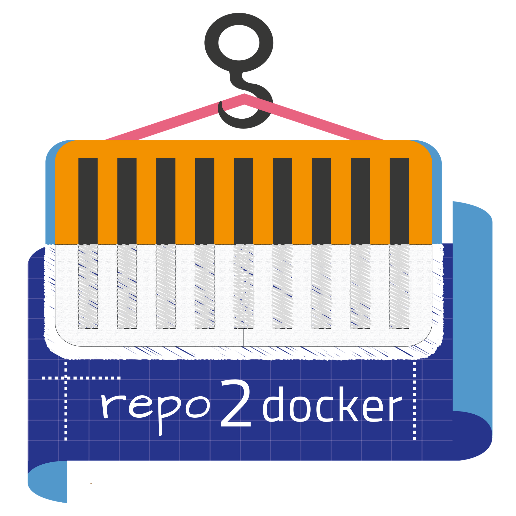
@betatim @agahkarakuzu how about something like this?
.sketch/.eps/.png bundle: repo2docker_v2.zip