Refined-github: Show latest commit message on project page
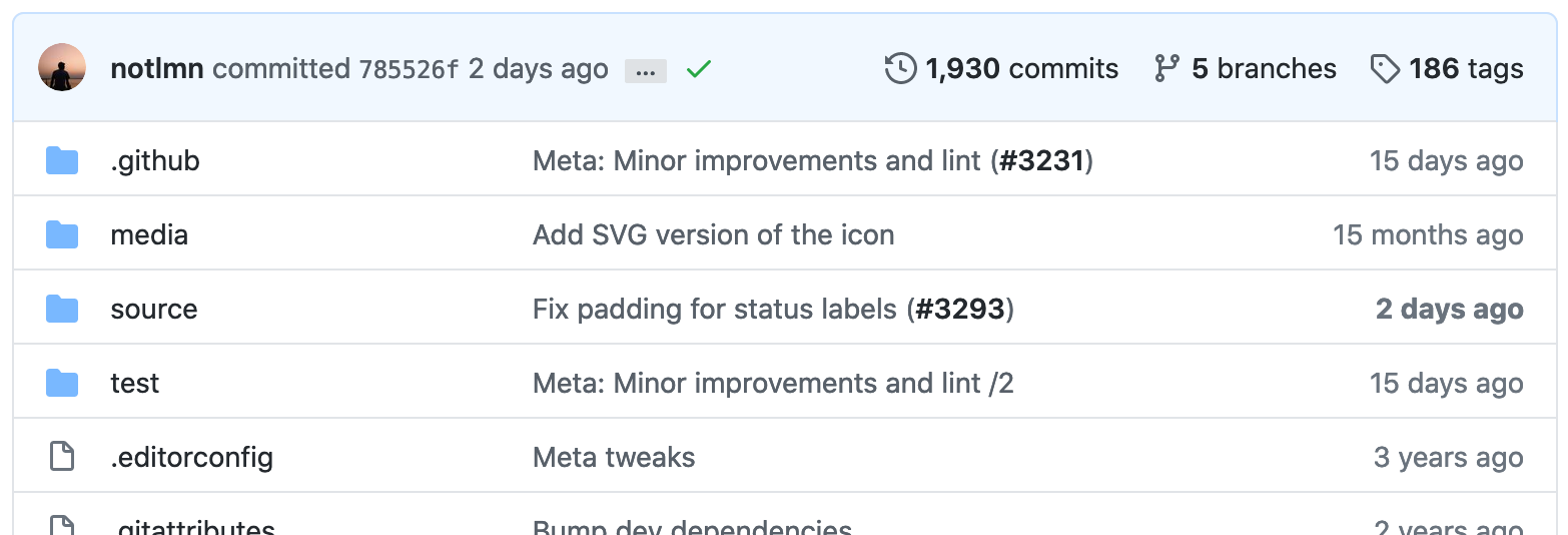
The most recent Github update hides the latest commit message on a project page. Instead, it only shows the author, commit date, and SHA:
This seems like a misfeature to me - there's always enough space to display at least part of the commit message. Seeing a commit message by default is much more useful than a SHA - I have no reason to want to copy a SHA until I know what the commit does.
I think it would be useful to hide the SHA and use the extra space to display as much of the commit message as will fit.
 Aaron1011
All 10 comments
Maybe we can just expand the commit message by default.
There is a problem that the commit message can be lengthy, like Linux kernel:

 kidonng
on 25 Jun 2020
kidonng
on 25 Jun 2020
@kidonng: That's what I ended up implementing: https://github.com/sindresorhus/refined-github/pull/3278
Aaron1011
on 25 Jun 2020
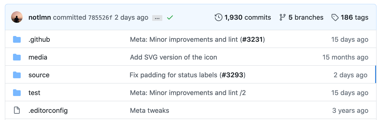
This piece of information is actually already on the page. What if we inconspicuously highlighted the latest commit in the filelist?
Bold:
Blue line:
 fregante
on 1 Jul 2020
fregante
on 1 Jul 2020
That's not much help for repositories with many top-level files (e.g. git), though it's an interesting idea.
 sersorrel
on 1 Jul 2020
sersorrel
on 1 Jul 2020
I agree with @sersorrel, it's hard to discover in my opinion.
Can we always show the first line of the commit message (and user click expand to see the rest of the message and description)? (https://github.com/sindresorhus/refined-github/pull/3278#issuecomment-649488947)
kidonng
on 1 Jul 2020
This doesn't look great

But messing with negative margins and text-gray might fix it:

- Can this feature be implemented with CSS only?
- Would the negative margins cause overlaps?
- Would this cause the content to jump? i.e. is the commit message lazily loaded?
If "yes no no," then this feature _could_ be added.
fregante
on 3 Jul 2020
I realized I want this. PR welcome to fix it as described above: only the commit title + centered on the avatar.
However the _centering_ might have to be inside a media query because in small windows the commit title _has to_ be on a second line:

fregante
on 6 Jul 2020
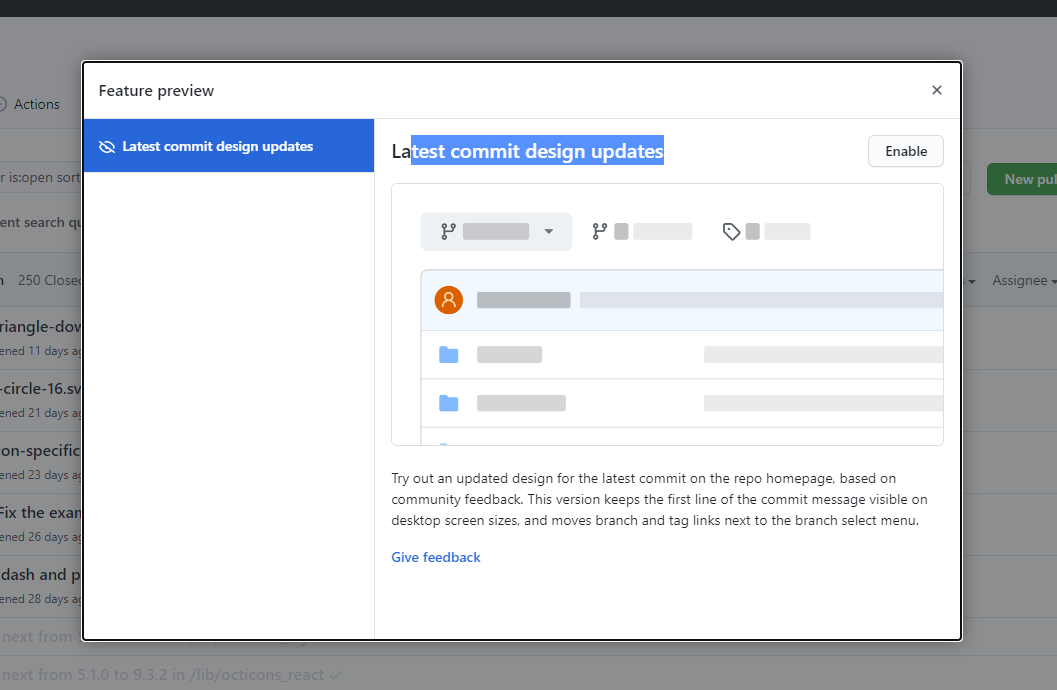
its comming back
 yakov116
on 7 Jul 2020
yakov116
on 7 Jul 2020
They're onto us!!
However that change moves 2 links next to the branch selector, breaking latest-tag-button
fregante
on 8 Jul 2020
@fregante Changing the selector from .breadcrumb to .file-navigation .flex-auto works on both layout, but...

Change it to #branch-select-menu (append it after the branch select button), better but still not ideal:

kidonng
on 8 Jul 2020
Related issues
 mareksuscak
·
3Comments
mareksuscak
·
3Comments
 shivapoudel
·
3Comments
yakov116
·
3Comments
shivapoudel
·
3Comments
yakov116
·
3Comments
 mischah
·
3Comments
mischah
·
3Comments
 alexanderadam
·
3Comments
alexanderadam
·
3Comments
Most helpful comment
its comming back
