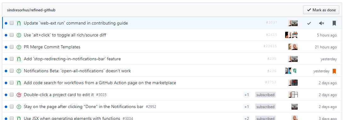
Refined-github: Make new notifications behave more like old notifications UI
Some people like the new UI, some people hate it.
GitHub (I don't know when) added "group by repository" which kinda makes the UI look like the old one (I personally like this view), but there are some things missing from this and some things that can be removed.
- Linkify
user/repowhen grouping by notifications is applied, allows you to quickly go to a repo (there is no link on notifications UI that lets you do this). - Remove redundant
user/repoon each notification when grouping by notifications is applied, also move issue/PR id down. - Move notification count and notification reasons on top of each other, thay should make more room for notification title
- Convert blue dots on the left to blue bars, similar to how it looks like on issue/PR lists
Why am I opening this issue: reading this https://twitter.com/ljharb/status/1253018009091731456 (/cc @ljharb)
Why don't I have any screenshots included: I'm opening this issue from mobile.
Some personal preferences in here, open to discussion and be proven wrong.
Related: #2891, #2961.
 notlmn
All 16 comments
- Linkify
user/repowhen grouping by notifications is applied
Definitely
- Remove redundant
user/repoon each notification when grouping by notifications is applied
Totally. This just needs 2 lines of CSS
- Move notification count and notification reasons on top of each other, thay should make more room for notification title
I don't understand this one. Which count and reasons? Can you take a screenshot?
- Convert blue dots on the left to blue bars
Maybe. We can try it but I suspect GH will eventually also bring the dots to the discussion list as well
 fregante
on 23 Apr 2020
fregante
on 23 Apr 2020
PR welcome to introduce at least 1 of these changes, probably clean-notifications or linkify-notification-repositories
fregante
on 23 Apr 2020
- Move notification count and notification reasons on top of each other, thay should make more room for notification title
I don't understand this one. Which count and reasons? Can you take a screenshot?
This stuff

- Convert blue dots on the left to blue bars
Maybe. We can try it but I suspect GH will eventually also bring the dots to the discussion list as well
In terms of visibility the dot might be more visible? Personally I like the bar. I mean, that's debatable!
Edit: Looks like GitHub is already using the blue bar on the left for highlighting on hover elements.

notlmn
on 26 Apr 2020
- Move notification count and notification reasons on top of each other, thay should make more room for notification title
I don't understand this one. Which count and reasons? Can you take a screenshot?
This stuff
I finally saw the count in real life.
This could also be done if:
- the viewport is small, and
- notifications are not grouped by repo (it would conflict with number 2)
But this isn't possible via CSS due to the DOM structure and I don't think it's worth it to move it via JS, just to save 20px
fregante
on 27 Apr 2020
Edit: Looks like GitHub is already using the blue bar on the left for highlighting on hover elements.
Indeed. So only suggestions 1 and 2 should be added.
fregante
on 27 Apr 2020
Quick testing with CSS for option 1:
Style 1

CSS
[id^="notification"] {
    flex-direction: row !important;
    align-items: center;
}

[id^="notification"] > .text-normal {
    order: -1;
    margin-right: 8px !important;
}

[id^="notification"] > .d-flex > .f6 {
    font-size: 0 !important;
}

[id^="notification"] > .d-flex > .f6 > span {
    font-size: 12px;
    word-break: keep-all;
    margin-right: 8px;
}
Style 2

CSS
[id^="notification"] {
    flex-direction: row !important;
    align-items: center;
}

/* [id^="notification"] > .text-normal {
    order: -1;
    margin-right: 8px !important;
} */

[id^="notification"] > .d-flex > .f6 {
    font-size: 0 !important;
}

[id^="notification"] > .d-flex > .f6 > span {
    font-size: 12px;
    word-break: keep-all;
    margin-right: 8px;
}
Some font-size trickery going on here, but IMO it's fine (considering GH moved to using utility classes for everything).
Style 2 looks good structurally, but only if all issue/PR numbers contain the same number of digits. This also fails for releases, invitations, vulnerabilities, and types of notifications.
Style 1 looks promising, considering that the id's are already all over the place.
WDYT?
For option 2, that would require JS.
notlmn
on 28 Apr 2020
I really dislike the new layout (but maybe that's because your addon doesn't work with the new UI yet?). I really hate all the new "DONE UNREAD SAVE" stuff, I just want to open everything in a new tab (and that option is now missing 👎 ) with it considering that as read.... not have to confirm it as read!
That way, I can comment and close tabs as I've worked on them... right now I'm having to use my mouse a tonne more than I ever used to and as a keyboard junkie, I really dislike it.
Also, I would say that being able to hide the plus count and reason is a good idea. My reason? Decluttering an already cluttered interface. Forget moving it, I just plain don't care about it, it gives me nothing (I may sound a little bitter about the changes but it's just because it's slowed my work down!)
Finally, on the styles of the IDs above, I think on the right looks good, but could it not be right aligned with a fixed width font replacing the said elements I would like to see removed?
 netniV
on 1 May 2020
netniV
on 1 May 2020
netniV
on 1 May 2020
Text font may need to be darker for the issue number, but it was more a layout example. The fact that it is on the right shouldn't matter given that github are using row highlighting so if you see the issue number, you can highlight all details.
I left the bottom three rows to show a comparison.
netniV
on 1 May 2020
@netniV We shouldn't hide the counter and the reason though. I like @notlmn’s solution 1
fregante
on 1 May 2020
Could we not make it optional ? It really doesn’t provide anything useful in my eyes. I can see that others may view the counter as a hotness of topic but I read everything anyway regardless and it declutters a busy interface making other things easier to read and find.
netniV
on 1 May 2020
Could we not make it optional ?
It's already optional, here's the CSS to paste in the Options page:
.notification-list-item-link .Label {
    display: none;
}
Refined GitHub doesn't have _options_ for things that might be useful
fregante
on 1 May 2020
Thanks for that. Didn't know about that feature... the CSS partially works, but does give me something to play with myself 👍
netniV
on 1 May 2020
Tweaked mine to:
.notifications-list-item .Label
{
    display: none;
}
Not sure what that'll do, but now gives me ideas on customising other bits I don't particularly like ;-)
netniV
on 1 May 2020
Actually, I tweaked it again so it's now:
.notifications-list-item .Label, .f6
{
    display: none;
}
And this gives me:

So much neater to me and I can see a lot more in one window than I could before, so again @fregante thanks for the idea
netniV
on 1 May 2020
@notlmn I just tested your option 2, it looks great. It's likely that issue numbers have the same length since they're all part of the same repo, with the exception of older issues
This CSS works best:
[id^="notification"] {
    flex-direction: row !important;
    align-items: center;
}

[id^="notification"] > .d-flex > .f6 {
    font-size: 0 !important;
}

[id^="notification"] > .d-flex > .f6 > span {
    display: block; /* <--- new */
    font-size: 12px;
    word-break: keep-all;
    margin-right: 8px;
}
Can you send a PR?
Edit: some changes:
- prepend each selector with
.js-notifications-groupso it doesn't apply to https://github.com/notifications?query=is%3Aread - align the number with the text, I think
align-items: baseline
fregante
on 2 May 2020
Related issues
 sompylasar
·
3Comments
sompylasar
·
3Comments
 hkdobrev
·
3Comments
hkdobrev
·
3Comments
 Arcanemagus
·
3Comments
Arcanemagus
·
3Comments
 shivapoudel
·
3Comments
shivapoudel
·
3Comments
 supremebeing7
·
3Comments
supremebeing7
·
3Comments
Most helpful comment
Quick testing with CSS for option 1:
Style 1
CSS
Style 2
CSS
Some
font-sizetrickery going on here, but IMO it's fine (considering GH moved to using utility classes for everything).Style 2 looks good structurally, but only if all issue/PR numbers contain the same number of digits. This also fails for releases, invitations, vulnerabilities, and types of notifications.
Style 1 looks promising, considering that the id's are already all over the place.
WDYT?
For option 2, that would require JS.