Refined-github: Bug on pull request files tab
RGH Version: 19.6.30 (Chrome)
GitHub recently added a new feature for marking files as viewed when reviewing a pull request.
The following bugs happen when Refined GitHub is enabled.
Confirmed by disabling all browser extensions but RGH.
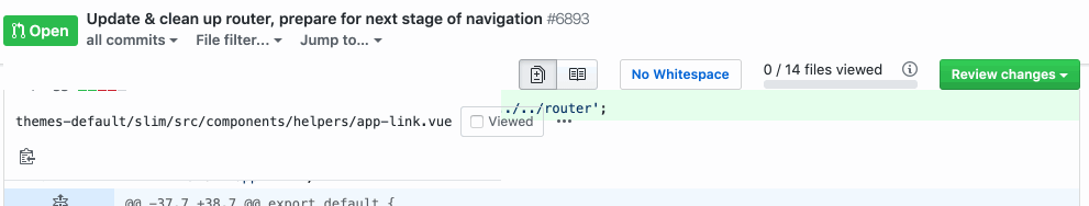
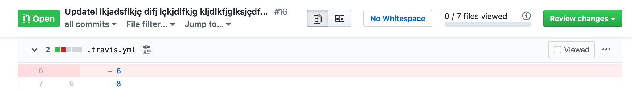
- When the length of the PR title + number is too long,
it wraps the right-floated elements to a new line. - When the filename of the file currently in view is too long,
the scrolling "file actions" bar is malformed (for lack of a better term).
Edit: It's possible that it only happens if the first filename is too long, as on the example PR below, the second filename is even longer, yet it looks just fine.
Edit 2: When I disable faster-pr-diff-options it fixes both bugs.
This is an example PR: https://github.com/pymedusa/Medusa/pull/6893/files
RGH disabled

RGH enabled

 sharkykh
All 17 comments
I'm seeing the same issue on RGH 19.6.30 on Firefox 67.0.3 on Windows.
 fjeremic
on 2 Jul 2019
fjeremic
on 2 Jul 2019
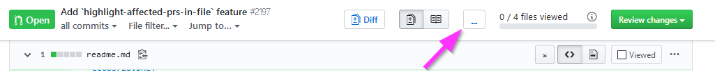
There's not enough space in the header, we'd have to reduce the title width:
Or rather... we should drop #1799. Instead of extracting the two pieces like we do now, we can keep the dropdown:

And just drop the "Apply and reload" button, making it a two-clicks operation.
cc @sindresorhus @hkdobrev @busches
 fregante
on 3 Jul 2019
fregante
on 3 Jul 2019
We can keep #1799, if we can reduce the "No Whitespace" button text. What if we use ␣ character (\u2423):
I used it in my UserScript.
 jerone
on 5 Jul 2019
jerone
on 5 Jul 2019
@jerone that still wouldn't fit with a long PR title:
Refined Github Enabled:
Refined Github Disabled:
You could also check it yourself here https://github.com/abdelrahmanrifai/git/pull/1
I'd suggest to drop #1799 as @bfred-it mentioned.
 rifaidev
on 8 Jul 2019
rifaidev
on 8 Jul 2019
My suggestion would still be to keep #1799, change the whitespace button text to ␣ and limit the length of the title.
a.js-issue-title.css-truncate.css-truncate-target.link-gray-dark {
-   max-width: 35em;
+   max-width: 30em;
}
Title max length can be shortened further because it's not important information in this context. You already know what you are reviewing. I rather keep those most used buttons while reviewing.
jerone
on 9 Jul 2019
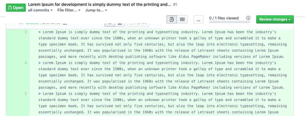
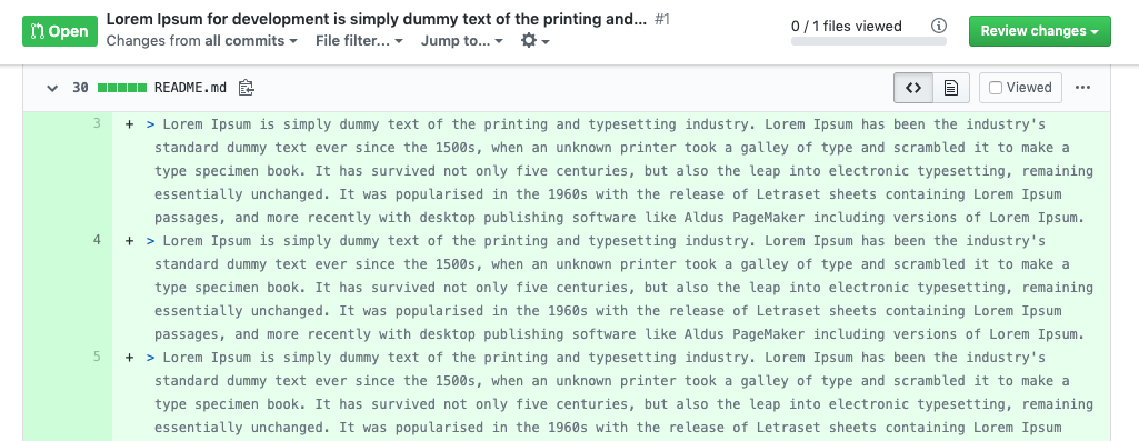
@jerone I too would prefer that solution. 🙏 30em doesn't seem to be sufficient in my experiments.24em (without shortening the whitespace button, thanks @sharkykh for the heads-up), and even then it looks long enough to provide the necessary context while scrolling through the page:
 waldyrious
on 9 Jul 2019
waldyrious
on 9 Jul 2019
@waldyrious I'm believe @jerone meant 30em + replacing No Whitespace with ␣
sharkykh
on 9 Jul 2019
Good point, I forgot that detail. Sorry for the noise :)
waldyrious
on 9 Jul 2019
My suggestion would still be to keep #1799, change the whitespace button text to ␣ and limit the length of the title.
Let's do that. But the button should have a tooltip as ␣ is not clear enough.
 sindresorhus
on 11 Jul 2019
sindresorhus
on 11 Jul 2019
How do you differentiate "Whitespace" from "No whitespace"? ␣ is the default state (visible) and ✕␣ is hidden?
fregante
on 11 Jul 2019
Use the selected class, just like "Unified diffs" buttons.
And maybe drop the btn-outline class...
jerone
on 11 Jul 2019
Use the
selectedclass, just like "Unified diffs" buttons.And maybe drop the
btn-outlineclass...
...as well as bg-gray-light and text-gray-light.
Here's how it'd look like:


waldyrious
on 11 Jul 2019
Looks good, but perhaps it should be the opposite:
- Whitespace visible:
.btn.selected - Whitespace invisible:
.btn
fregante
on 11 Jul 2019
This feature is not really about showing or hidding whitespace. It's about ignoring whitespace in code compare. With that in mind, what about:
- Don't ignore whitespace:
.btn - Ignore whitespace:
.btn.selected
jerone
on 11 Jul 2019
it's about ignoring whitespace in code compare
Yeah, that's what I meant.
Ignore whitespace:
.btn.selected
The current button has a "No" in front of it, so it makes sense: _selected_ "no whitespace" = whitespace ignored.
If we shorten it to a simple "Whitespace", its selected state shouldn't mean "ignore" IMHO. In your suggestion, it will be read as: Whitespace: selected while the whitespace is actually ignored.
fregante
on 11 Jul 2019
If we used literally -w instead of ␣ at least it might make sense to CLI users.
-w regular state: off
-w selected: on, ignore whitespace
Neither option makes sense without a label so I'd at least go for an option that has _some_ meaning in this context.
fregante
on 11 Jul 2019
Hey folks, this appears to have regressed, unfortunately. I opened a new issue to track: https://github.com/sindresorhus/refined-github/issues/2291.
 wearhere
on 31 Jul 2019
wearhere
on 31 Jul 2019
Related issues
 supremebeing7
·
3Comments
supremebeing7
·
3Comments
 shivapoudel
·
3Comments
sindresorhus
·
3Comments
shivapoudel
·
3Comments
sindresorhus
·
3Comments
 alexanderadam
·
3Comments
alexanderadam
·
3Comments
 hkdobrev
·
3Comments
hkdobrev
·
3Comments
Most helpful comment
Let's do that. But the button should have a tooltip as
␣is not clear enough.