Refined-github: Compact Discussions
Problem
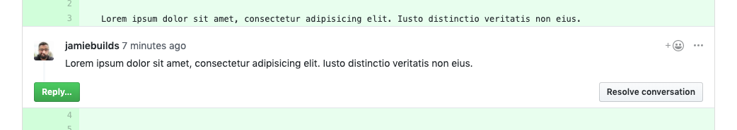
Right now on GitHub there is tons of visual noise around even a single inline comment on a diff:

Proposed Changes
Like why do we need double borders:

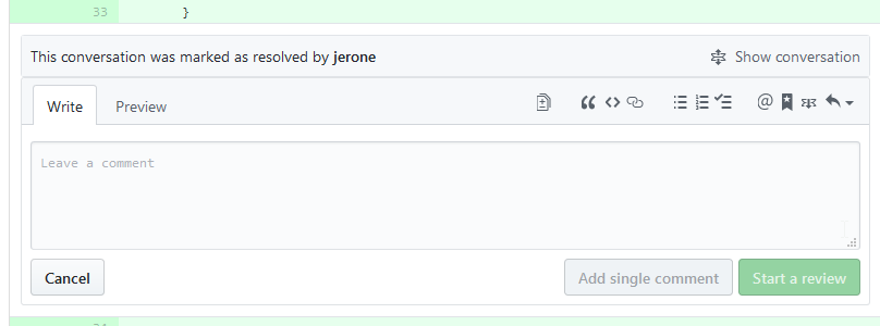
Why does "Resolve Conversation" need its own line:

If there's only a single comment, why even have the reply line? Just turn it into a button (reactions are already there...):

Resolve Conversations could also be a button or it could get the dropdown treatment:

This change would take the above comment from taking up 240px of vertical space to 120px.
On a pull request with 40 comments, this makes a huge difference.
 jamiebuilds
All 8 comments
I just fear it will be short lived because they’ve been messing with classes and design a lot lately.
However this would be nice to have, and it’s welcome.
But respond and resolve should stay there because they’re common actions. Perhaps just on a single line instead of two. And maybe both can be smaller buttons instead of a loooong input field.
 fregante
on 9 Jun 2019
fregante
on 9 Jun 2019
But respond and resolve should stay there because they’re common actions.
👍
 sindresorhus
on 10 Jun 2019
sindresorhus
on 10 Jun 2019
Like why do we need double borders
"Double borders" are there because people can start 2 or more conversations on a single line of code. Each conversation can be closed separately.
 jerone
on 10 Jun 2019
jerone
on 10 Jun 2019
There are better ways of achieving that. They don't do a particularly good job of it now anyways
jamiebuilds
on 12 Jun 2019
A fix for that would be to add margins just between them:
.discussion + .discussion { margin-top: 2em }
fregante
on 12 Jun 2019
So what if it looked something like this:
jamiebuilds
on 14 Jun 2019
PR welcome for compact-discussions.css
fregante
on 29 Jul 2019
The reason why they do this is because PR diff views can span the whole screen. If we add this feature, the "contextual" dropdown menu and the Resolve button can be very far from the content. Not a good idea
fregante
on 19 Mar 2020
Related issues
 Celthi
·
3Comments
Celthi
·
3Comments
 yakov116
·
3Comments
fregante
·
3Comments
yakov116
·
3Comments
fregante
·
3Comments
 juliocanares
·
3Comments
juliocanares
·
3Comments
 hkdobrev
·
3Comments
hkdobrev
·
3Comments