Refined-github: More friendly "Changes requested" state in PRs
See: https://twitter.com/ashfurrow/status/1056944193669599233
We could change the color and icon to something more friendly, while still keeping it obvious that it's not approved.
 sindresorhus
All 11 comments
My personal favourite approach would be an orange “pending” badge, like when CI is still running. That conveys the “request changes” idea far more accurately than a red x, which is more “reject changes” imo.
 ashfurrow
on 29 Oct 2018
ashfurrow
on 29 Oct 2018
What about somekind of a turning back arrow suggesting the idea of a feedback instead of a refusal?
 xavhan
on 30 Oct 2018
xavhan
on 30 Oct 2018
Could use the diff octicon?
 pqt
on 31 Oct 2018
pqt
on 31 Oct 2018
Not sure if it can be implemented, but I like the idea of specifying if the "changes requested" was in fact,
- just feedback
- good-to-have, or
- must-have
Anyway, it would be great to have the icon changed to a yellow alert ⚠ at least.
 manojchandrashekar
on 11 Nov 2018
manojchandrashekar
on 11 Nov 2018
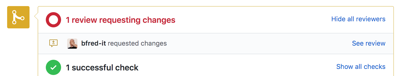
They did it. The color is still red, but it's no longer a ❌

 fregante
on 16 Jan 2019
fregante
on 16 Jan 2019
I think we should still change the color.
sindresorhus
on 16 Jan 2019
How about orange?
 vanniktech
on 16 Jan 2019
vanniktech
on 16 Jan 2019
I think we should still change the color.
for (const reviewChangesSvg of select.all('.octicon-request-changes')) {
  reviewChangesSvg.classList.remove('text-red');
  reviewChangesSvg.classList.add('text-pending');
}
where
.text-pending {
  color: #b08800!important;
}
->
 ?
?
 connorbrathwaite
on 20 Feb 2019
connorbrathwaite
on 20 Feb 2019
The red circle and text too.
sindresorhus
on 20 Feb 2019
I would not use the pending color IMO. It blends in too much with the icon on the left, and also blends in too much with other status checks that are in progress.
I'm in favor of keeping it as it is, as the red actually makes it stand out that changes are requested, and it's a blocker for the PR to be merged. Any blockers on a PR are red, therefore it makes sense to keep the color the same IMO.
 nesl247
on 20 Feb 2019
nesl247
on 20 Feb 2019
I would not use the pending color IMO
👍
Official colors to chose from: https://primer.style/css/support/color-system
Also this feature should be CSS-only, it's just easier in every way.
fregante
on 20 Feb 2019
Related issues
 supremebeing7
·
3Comments
supremebeing7
·
3Comments
 MilesBHuff
·
3Comments
MilesBHuff
·
3Comments
 olso
·
3Comments
vanniktech
·
3Comments
olso
·
3Comments
vanniktech
·
3Comments
 juliocanares
·
3Comments
juliocanares
·
3Comments
Most helpful comment
My personal favourite approach would be an orange “pending” badge, like when CI is still running. That conveys the “request changes” idea far more accurately than a red x, which is more “reject changes” imo.