Refined-github: Showing the latest release next to the current branch might be confusing
We might have to revert #1133

Is clear that we're on master and not _necessarily_ on 4.2.0?

Where are we? 4.1.0 or 4.2.0?
In short, both pieces look like buttons, but one shows the current one and the other one is a link.
 fregante
All 8 comments
I've been meaning to open an issue about this too. I find it very useful to quickly see the latest version, but we should find a better place to put the text. I think we should still keep the button though, just without the text.
 sindresorhus
on 21 Mar 2018
sindresorhus
on 21 Mar 2018
Perhaps we should move the tag on the left.
Or maybe move both _links_ away from the branch selector.


fregante
on 21 Mar 2018
Must agree this is very confusing at first.
 SuperSandro2000
on 21 Mar 2018
SuperSandro2000
on 21 Mar 2018
Why not use what GitHub is using on the their releases page and just say "Latest release" in a green box. Explicit is better than implicit. We can shorten to "

https://github.com/sindresorhus/refined-github/releases
I like the all the branch-related things to be together like now. Still not sure about the left chevron arrow.
 hkdobrev
on 21 Mar 2018
hkdobrev
on 21 Mar 2018
I still think that it wouldn't be 100% clear if you are on that tag or branch.
SuperSandro2000
on 22 Mar 2018
@hkdobrev not a terrible idea, but that green label is used by GitHub to mark "this is the latest release", so it's not much clearer. If we could detect that our current view is the latest release (even on master) it'd be nice to turn it green.
I think my last mockup (grouped separately, blue links) is slightly more clear about them being links. It'd also drop the chevron you're not sure about.
fregante
on 22 Mar 2018
I like @bfred-it’s mock-up.
sindresorhus
on 22 Mar 2018
Related: the buttons should probably be moved away from here as well, perhaps by "Find file"?
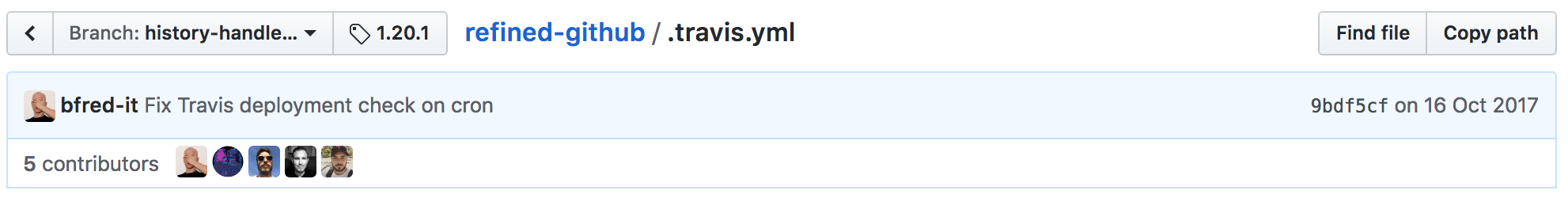
https://github.com/sindresorhus/refined-github/blob/history-handler-once-for-all/.travis.yml
fregante
on 22 Mar 2018
Related issues
hkdobrev
·
3Comments
 supremebeing7
·
3Comments
supremebeing7
·
3Comments
 durka
·
3Comments
durka
·
3Comments
 olso
·
3Comments
sindresorhus
·
3Comments
olso
·
3Comments
sindresorhus
·
3Comments
Most helpful comment
Related: the buttons should probably be moved away from here as well, perhaps by "Find file"?
https://github.com/sindresorhus/refined-github/blob/history-handler-once-for-all/.travis.yml