React-dates: DayPickerSingleDateController width 100%
I dont need the input field for what i am doing i just want the calendar part and i need it to be 100% of the parent div i have it in how would i go about this without basically re writing all the styles for it?
 The-Code-Monkey
All 5 comments
@The-Code-Monkey do you mean that you want to show months for the full width of the screen (dynamically based on screen width) or that you just want to center it on a screen?
For the latter I would pass the noBorder prop and center it in a wrapping div whose styles match the background.
 majapw
on 28 Jun 2018
majapw
on 28 Jun 2018
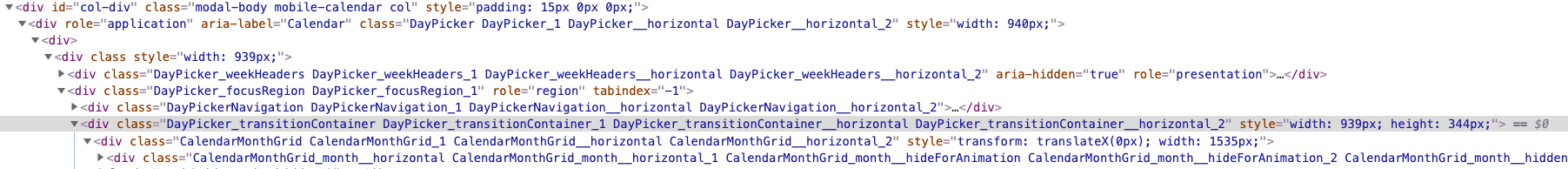
I am having the same issue. I am showing a three month view and there is this odd margin that i have been trying to get rid of. I tried setting the child div to 100% but it did not solved the issue as there are a lot of divs nested in there that are not clear how you can access them. ###

 lausellduane
on 9 Jul 2019
lausellduane
on 9 Jul 2019
@majapw @mmarkelov I want to show months for the full width of the screen (dynamically based on screen width). Screenshot of the example above. Thx!
 Yevhen-Kryvdiuk
on 10 Oct 2019
Yevhen-Kryvdiuk
on 10 Oct 2019
I'm encountering the exact same issue, and have tried a variety of things such as trying to set:
- dayPickerHorizontalPadding
- daySize
Neither are helping.
 davidpatters0n
on 16 May 2020
davidpatters0n
on 16 May 2020
I found a band aid for this a while ago. So I "override" the css file for react dates and aligned everything there with width: 33% !important. Excuse me its been a long time since I looked into this, you need to import the override css file like below If I am not mistaken the order was important.
import {DayPickerSingleDateController} from 'react-dates';
import 'react-dates/initialize';
import moment from 'moment';
import "../../../../styles/base/react_dates_overrides.css";
import "../../../../styles/base/_datepicker.css";
react_dates_overrides.css
.CalendarMonthGrid, .CalendarMonthGrid_1, .CalendarMonthGrid__horizontal, .CalendarMonthGrid__horizontal_2 {
    width: 100%;
}

.DayPicker, .DayPicker_1, .DayPicker__horizontal, .DayPicker__horizontal_2 {
    width: 100% !important;
}

.DayPicker_transitionContainer, .DayPicker_transitionContainer_1, .DayPicker_transitionContainer__horizontal, .DayPicker_transitionContainer__horizontal_2 {
    width: 100% !important;
}

.CalendarMonthGrid_month__hidden, .CalendarMonthGrid_month__hidden_2 {
    display: none !important;
}

.CalendarMonthGrid, .CalendarMonthGrid_1, .CalendarMonthGrid__horizontal, .CalendarMonthGrid__horizontal_2 {
    width: 100% !important;
}

.CalendarMonthGrid_month__horizontal, .CalendarMonthGrid_month__horizontal_1 {
    width: 33% !important;
}

.DayPickerKeyboardShortcuts_buttonReset, .DayPickerKeyboardShortcuts_buttonReset_1, .DayPickerKeyboardShortcuts_show, .DayPickerKeyboardShortcuts_show_2, .DayPickerKeyboardShortcuts_show__bottomRight, .DayPickerKeyboardShortcuts_show__bottomRight_3 {
    margin-right: 15px;
    display: none;
}

.DayPicker_weekHeaders, .DayPicker_weekHeaders_1, .DayPicker_weekHeaders__horizontal, .DayPicker_weekHeaders__horizontal_2 {
    width: 100% !important;
}

.DayPicker_weekHeader, .DayPicker_weekHeader_1:first-child {
    width: 33% !important;
    left: 0 !important;
    /*position: static !important;*/
}
.DayPicker_weekHeader, .DayPicker_weekHeader_1:nth-child(even) {
    width: 33% !important;
    left: 355px !important;
    /*position: static !important;*/
}
.DayPicker_weekHeader, .DayPicker_weekHeader_1:last-child {
    width: 33% !important;
    left: 710px !important;
    /*position: static !important;*/
}


.DayPicker_weekHeaders, .DayPicker_weekHeaders_1, .DayPicker_weekHeaders__horizontal, .DayPicker_weekHeaders__horizontal_2 > div {
    width: 100% !important;
}

#datepicker-container > div > div > div {
    width: 100% !important;
}
Component.js
<Row
    id="datepicker-container"
    className="mobile-calendar"
    style={{
        flex: 1,
        flexDirection: 'row',
        justifyContent: 'space-between',
        margin: '0',
        width: '100%',
        textAlign: 'center'
    }}
>
    <DayPickerSingleDateController
                                    onDateChange={this.onDateChange}
                                    onFocusChange={this.onFocusChange}
                                    focused={focused}
                                    date={date}
                                    numberOfMonths={3}
                                    isDayHighlighted={day => highlightedDays.has(day.format('YYYY MM DD'))}
                                    noBorder={true}
                                    daySize={40}
    />
</Row>
Related issues
 cemremengu
·
3Comments
cemremengu
·
3Comments
 arthurvi
·
3Comments
arthurvi
·
3Comments
 swaritkohli
·
3Comments
swaritkohli
·
3Comments
 AsasinCree
·
3Comments
AsasinCree
·
3Comments
 Jesus-Gonzalez
·
3Comments
Jesus-Gonzalez
·
3Comments
Most helpful comment
I am having the same issue. I am showing a three month view and there is this odd margin that i have been trying to get rid of. I tried setting the child div to 100% but it did not solved the issue as there are a lot of divs nested in there that are not clear how you can access them. ###

