React-admin: ReferenceArrayInput ignores withStyles and doesn't have fixed size of width by default
What you were expecting:
either be able to set width with withStyles or it shouldn't be width: 100%/ display:flex all the time
demo here shows chips that wrap: https://github.com/TeamWertarbyte/material-ui-chip-input
What happened instead:
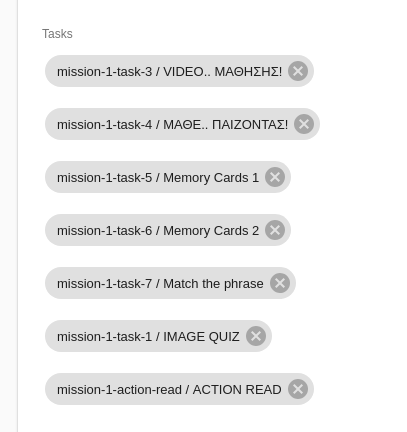
chips are floating left to each other ever-expanding the screen size
Steps to reproduce:
Here is a codesandbox that I tried to use withStyles without any result: https://codesandbox.io/s/1oj3j8yj0j - please click on a post and try to add as many tags as possible to see the effect
Related code:
import { withStyles } from '@material-ui/core/styles';


const styles = {
    maxInputSize: {
        maxWidth: 600,
        width: 600,
    },
};

const MaxWidthReferenceArrayInput =  withStyles(styles)(
    ({ classes, ...props }) =>
    <ReferenceArrayInput label="Tasks" source="tasks" reference="tasks"
        allowEmpty={true} className={classes.maxInputSize} {...props}>
        <AutocompleteArrayInput optionText="alias" className={classes.maxInputSize}
            options={{ allowDuplicates:false}}/>
    </ReferenceArrayInput>
);

[...]
<MaxWidthReferenceArrayInput/>
[...]
Other information:
days ago was posted here as well: https://stackoverflow.com/questions/52915392/how-to-set-maxwidth-in-referencearrayinput
 zifnab87
All 10 comments
You can probably style it by overriding the classes prop of the <AutocompleteArrayInput> and setting your own value for the following properties:
- container
- suggestionsContainerOpen
- suggestionsList
- suggestion
I suggest you look at the implementation of <AutocompleteArrayInput> and react-autosuggest to figure out how to style it.
 fzaninotto
on 31 Oct 2018
fzaninotto
on 31 Oct 2018
@fzaninotto thanks I will have a look shortly
zifnab87
on 31 Oct 2018
@fzaninotto I was able to pass information to chip and container but I need the child of container / parent of chip so I can say for example flexWrap: 'wrap' which seems it is not possible
zifnab87
on 31 Oct 2018
Hey there @zifnab87! I had the same exact problem and stumbled on this issue. I managed a way through it using the classes prop and nested selectors:
import { withStyles } from '@material-ui/core/styles'

const styles = {
    chip: {
        margin: '3px'
    },
    container: {
        '& div': {
            flexWrap: 'wrap',
            marginTop: '18px'
        },
        marginBottom: '8px'
    }
}

export const myAutocompleteArrayInput = withStyles(styles)(({ source, classes }) =>
    <AutocompleteArrayInput
        source={source}
        optionText="nome"
        classes={classes}
    />
)
Hope it also works for you!
 eaverdeja
on 14 Nov 2018
eaverdeja
on 14 Nov 2018
@eaverdeja Thanks I will give it a try :)
zifnab87
on 15 Nov 2018
@eaverdeja this worked great! more specifically I did:
const styles = {
    chip: {
        margin: '3px',
    },
    container: {
        '& div': {
            flexWrap: 'wrap',
            marginTop: '18px',
            maxWidth: '400px'
        },
        marginBottom: '8px'
    }
}

export const myAutocompleteArrayInput = withStyles(styles)(({ source, classes }) =>
    <AutocompleteArrayInput
        source={source}
        optionText="nome"
        classes={classes}
    />
)
@zifnab87 Glad to hear it :)
@fzaninotto @djhi do you guys have any suggestions as to how we could make this easier or clearer? Despite having no experience in doing so, I would be glad to submit a PR.
eaverdeja
on 16 Nov 2018
Thanks for taking the time to give your feedback!
I think this component packs way too many moving parts to be able to offer a sane API allowing to configure everything. Our take is to offer a simple API for most use cases, and let the user replace the component by their own for corner cases. It seems the current API is enough to let you do what you want, so I think we can close this issue.
fzaninotto
on 12 Dec 2018
I don't think AutocompleteArrayInput should be non-wrapping by default and provide some better defaults. Are the current defaults right for some situations?
 jorrit
on 2 Jan 2019
jorrit
on 2 Jan 2019
It seems the component <AutocompleteArrayInputChip /> inside <AutocompleteArrayInput /> can't be styled. It would be awesome if this could be made posssible.
jorrit
on 3 Jan 2019
Related issues
 waynebloss
·
3Comments
waynebloss
·
3Comments
 marknelissen
·
3Comments
marknelissen
·
3Comments
 alukito
·
3Comments
alukito
·
3Comments
 nicgirault
·
3Comments
nicgirault
·
3Comments
 kikill95
·
3Comments
kikill95
·
3Comments
Most helpful comment
Hey there @zifnab87! I had the same exact problem and stumbled on this issue. I managed a way through it using the
classesprop and nested selectors:Hope it also works for you!