Rawtherapee: Slider tooltips get in the way, move them to labels
Originally reported on Google Code with ID 2237
Some of RT's sliders have tooltips. When I hover the cursor over a slider the tooltip
always pops up, which can sometimes irritate. I would suggest moving all tooltips off
the slider widget and over the slider's label instead. What do you think?
Reported by entertheyoni on 2014-02-06 09:51:39
 Beep6581
All 18 comments
Some tooltips cant be converted to labels. Especially if we talk about translations.
Reported by kromanov on 2014-02-06 11:42:22
Beep6581
on 11 Aug 2015
No, I don't want to convert tooltips to labels. I'm suggesting sliders stop being hot-spots
for tooltips appearing, and instead the labels which describe the sliders become the
hotspots.
Reported by entertheyoni on 2014-02-06 11:59:53
Beep6581
on 11 Aug 2015
Oh, now I see your point.
Yes, I agree with this, it will be much better.

Sorry for misunderstanding.
Reported by kromanov on 2014-02-06 13:50:19
Beep6581
on 11 Aug 2015
Reported by entertheyoni on 2015-04-12 14:27:02
- Status changed:
Started
Beep6581
on 11 Aug 2015
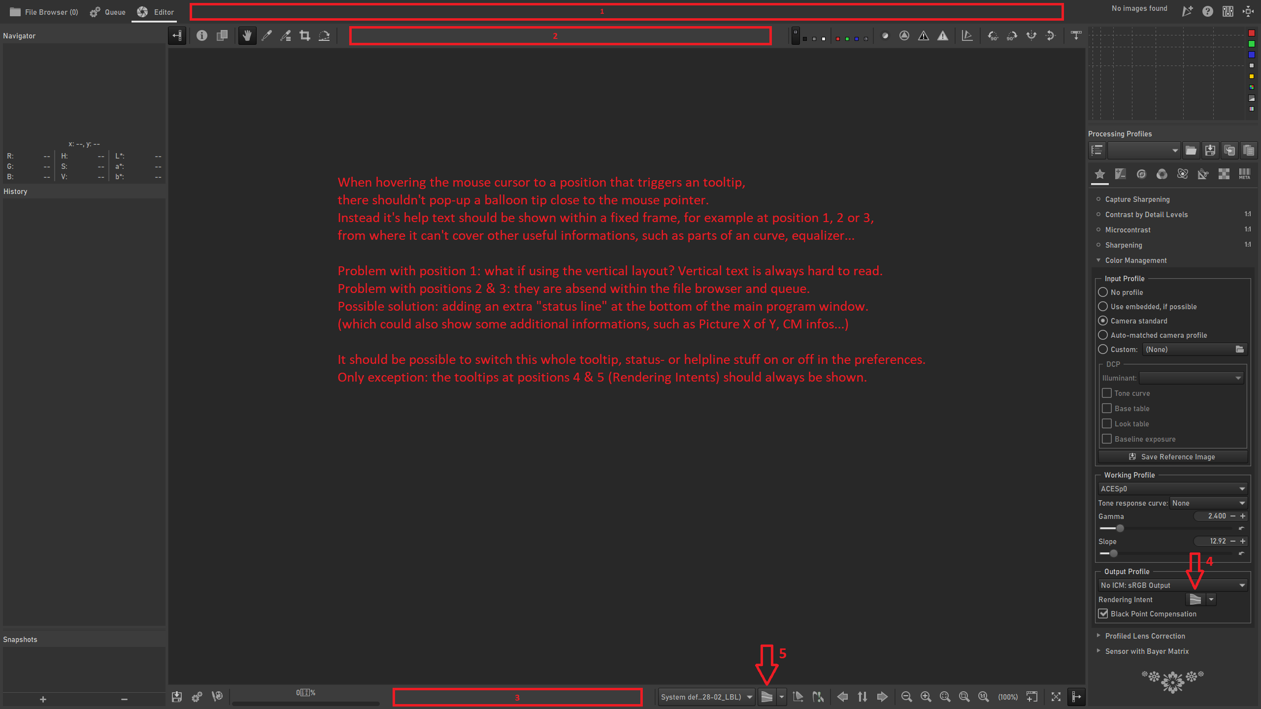
RT has some pretty intrusive tooltips...
e.g.:
- Try adjusting a point in the Retinex Transmission curve, and tooltips keep appearing and getting in the way.
- Use the Tone-Mapping (EPD) tool, a large tooltip shows up if you pause the cursor anywhere in the frame.
- Leave your cursor above the Noise Reduction > Chrominance Method combo for a second too long, and an enormous tooltip blocks your view.
- Use the White Balance > Blue/Red Equalizer, impossible for the tooltip not to appear.
We need a policy for tooltips.
Question of placement: I was thinking that maybe the tooltip should only be tied to the label, not to the active widget (combo, curve, hbox, etc), where possible.
Question of content: They should only show crucial information which you are likely to forget even if you read (or wrote :P ) the documentation, such as the keyboard shortcut, and information which is unavailable elsewhere, e.g. the point values for the threshold adjusters (see Sharpening > Threshold). They should not show information which the user is better-off reading about in full in RawPedia, and they should not state the obvious (see Black-and-White > Gamma Correction, the red, green and blue sliders tell you "Correct gamma for each RGB channel", this does not tell me anything I didn't know already, even if I never used that tool before).
What do you think?
Beep6581
on 8 Jan 2018
 blackfoxx79
on 13 Feb 2020
blackfoxx79
on 13 Feb 2020
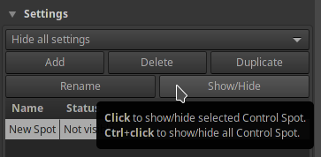
Tooltips in the Local Adjustments tool are constantly popping up when one just wants to use a slider, and their content offers little value, so I will be working on deleting them in the coming days.
Beep6581
on 7 Jul 2020
@Beep6581 Removing tooltips entirely, or making them available only for the labels?
It would be a shame for all the hard work @Desmis has put in if you unilaterally decide to remove these.
Edit: if anything, this is quite an old issue without much discussion with the team so far. So maybe we need some more opinions first.
 Thanatomanic
on 7 Jul 2020
Thanatomanic
on 7 Jul 2020
@Beep6581
You can disable tooltip whithout delete.
in Preferences : "Show local adjustments advice tooltips"
jacques
 Desmis
on 7 Jul 2020
Desmis
on 7 Jul 2020
So maybe we need some more opinions first.
@Thanatomanic I've been waiting at least 6 years.
The arguments stand that:
- Many tooltips are invasive.
- Their content is not particularly helpful.
- This has been an ongoing issue for years (issue opened in 2014, it's been ongoing since before then) and no one has done anything about it.
- I tried to do something about it, but there was no response and the suggestions are not being followed.
- Documenting how a tool works should be done in the documentation, where it can be explained fully and with images.
- Paragraph-long tooltips are an anti-pattern.
- Stuff in
defaultneeds to be translated, currently into 17 languages. We should avoid bloating a text file with information which better belongs in the documentation where it is more easily translatable and more clearly explainable. - Time put into something doesn't justify that thing, though it sure may feel like that from a first-person perspective. That's a sunk cost fallacy.
- Adding options to Preferences to disable tooltips for one specific tool is a workaround that screams of there being a bigger problem.
Clearly, doing nothing means that problematic tooltips will keep being added, so it's time to do something.
Beep6581
on 7 Jul 2020
Example of a good tooltip:
Concise and tells me something that is immediately useful and easily forgotten.
Examples of bad tooltips:
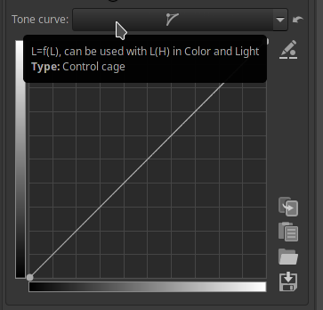
- Why do I need a tooltip to tell me this is "L=f(L)"? The curve widgets in the Lab Adjustments tool state what data the curves operate on (L*, LH, CL, etc.), so if this info is important and unintuitive with regards to this curve then the curve's widget should show that (and in doing so be consistent with the Lab Adjustments curve widgets).
- What is "L(H)"? If this curve is "L=f(L)", why is a different notation used for "L(H)"? Shouldn't it be "L=f(H)"? What am I missing? Rhetorical question.
- The "Color & Light" tool has no "L(H)" so this tooltip does not help me.
- Referencing other tools in a toolip means that when we rename that other tool, we then have to remember to update this tooltip. And this must be done for all 17 translations. So referencing other elements should not be done lightly.
Offers no crucial information.
And now the ultimate example. Let's see what the tooltip for "Lightness" says:
Ok, how about "Contrast":
And "Chrominance":
And let's try to use the grid:
etc.
Beep6581
on 7 Jul 2020
@Beep6581 I'm not at all opposed, in fact, you can wake me any time of night for an interface that doesn't need explanation. 😄 Also, thank you for the extensive replies, you're getting your point across for sure.
I was merely pointing out that even though the discussion has not taken place, that doesn't mean it cannot happen now. I for one have never seen this issue before and wasn't part of the team when it was proposed nor when you wanted to take action. And I may have misinterpreted you now, but I got the feeling you simply wanted to nuke all tooltips for lack of any other opinions on the matter. I don't think that is the right way to do it.
So I support the idea that, indeed, we need a policy for tooltips and maybe even a general GUI guideline. Importantly, this should be documented. My preference would be here https://github.com/Beep6581/RawTherapee/wiki since GitHub is about development.
Question of placement: I was thinking that maybe the tooltip should only be tied to the label, not to the active widget (combo, curve, hbox, etc), where possible.
Agreed. There are also other solutions to make things less invasive. We could introduce small (?) icons for situations where an explanation is actually useful, with the only downside being a slightly more cluttered interface. However, for example, DxO Photolabs does this quite unobtrusively imo. So that may be possible.
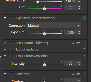
Question of content: They should only show crucial information which you are likely to forget even if you read (or wrote :P ) the documentation, such as the keyboard shortcut, and information which is unavailable elsewhere, e.g. the point values for the threshold adjusters (see Sharpening > Threshold). They should not show information which the user is better-off reading about in full in RawPedia, and they should not state the obvious (see Black-and-White > Gamma Correction, the red, green and blue sliders tell you "Correct gamma for each RGB channel", this does not tell me anything I didn't know already, even if I never used that tool before).
Wholeheartedly agree. It will become a matter of carefully going through all tooltips and deciding their need and/or rephrase where necessary. Not an easy task, but definitely doable. We might even try experimenting with https://github.com/Beep6581/RawTherapee/projects
Thanatomanic
on 7 Jul 2020
In your last two examples with the walls of text, a (?) marker could be particularly helpful imo.
So, a little off-topic, but I'm interested to know how you approach software design. I have no education in design, and have probably not been using computers as long as you have, so all of this is mostly gut feeling. For me, any complex tool should ideally still have an easy interface. And with respect to tooltips I saw quoted someplace else "never use [tool]tips as a substitute for good design". Still, if such an ideally simple interface is not available, for whatever reason, I think it would always be more beneficial for the user to find the information he/she needs to understand the tool from _within the software_ and not by having to browse through the documentation or having to watch video tutorials. In my experience, documentation is useful to get from a basic to intermediate level, and video tutorials are useful only when you either don't want to play and learn, or the interface is so confusing that you _have_ to see somebody else use.
For me the key is simple: you should always be able to learn the basics through what the interface provides you (i.e. labels, visual cues, and tooltips where necessary).
Thanatomanic
on 7 Jul 2020
Do what you want to do with tooltips...!
If I added tooltips, it's because I was asked ... The time spent has no importance ...
But please, avoid authoritarian positions, it's very unpleasant ... and very very very far from project management (reminder, it was one of my jobs ...)
jacques
Desmis
on 7 Jul 2020
I propose:
- Every tooltip in
defaultis put on some platform which allows collaboration (suggestions? Google Sheets could suffice). - Every entry is rated "required", "simplify" or "delete".
- Every tooltip marked "required" or "simplify" is revised, to make sure it contains only the necessary information, and that it's understandable.
defaultis updated.- Tooltip hot-spots are moved off of active widgets and onto labels where possible or necessary.
Beep6581
on 7 Jul 2020
Ah, oh, the tooltip discussion again.
Technically (gtk) a tooltip is a text showing up when hovering over a gui element and stop hovering for a while, like in this case, which imho is a good use case for a tooltip:
 heckflosse
on 7 Jul 2020
heckflosse
on 7 Jul 2020
It would be helpful to write a set of recommendations and put them somewhere like CONTRIBUTING.md. Here are my thoughts on tooltips.
DOs
- Prefer good labels, icons, and visual cues over tooltips.
- Include keyboard combinations and shortcuts.
- Place any tooltips in labels, unless there is an obviously better place.
- Be concise.
- Use tooltips to convey important information which can easily be forgotten.
DON'Ts
- Write something obvious or easily discoverable.
- Make large tooltips.
- Write anything which only needs to be learned once. Write it in the manual instead.
- Explain use cases, how the tool works.
- Place tooltips in sliders or large widgets.
 Lawrence37
on 8 Jul 2020
Lawrence37
on 8 Jul 2020
Hello,
Know that I am neutral in this issue, for my personal use, this may seem obvious, I don't need any tooltip
So I have no problem with erasing everything.
However some remarks:
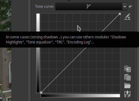
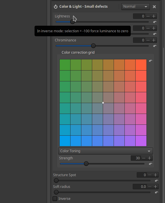
- tooltip : "In inverse mode selectiion= -100 force luminance to zero"...I was asked about this behavior about 3 years ago
And the question : If you do not read documentation, and if there is no tooltip..How the user will know ?
By divine revelation (I do not take myself for God), by transmission of thought... :)
It seems difficult to me that ergonomics or labels can make it possible to "guess" this behavior...
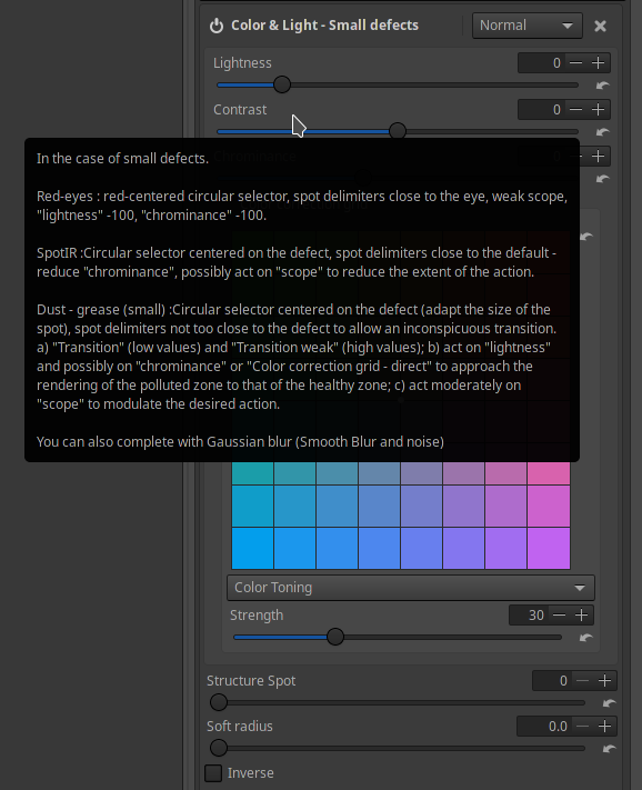
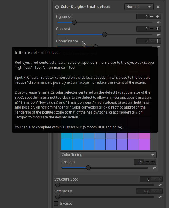
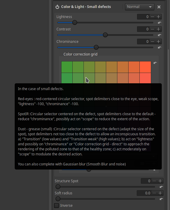
tooltip : big tooltip with "red eyes, spot IR, Dust"..Same problem...perhaps we could (with explanation...where ?)
I admit that it's not ideal, and that we have to find a solution...
Make a specific tool or specific pp3, however it will be necessary to explain well.
This tooltip, in this form has been present for at least 1 yeartooltip L(H), beyond semantics (should we write LH, L(H), L=f(H)...),this proves, either I made a mistake, or I lose my mind :), or :
The user has not read the documentation, or he didn't use this feature ... which he ignores
And yet there is indeed a curve L(H) in "Color and light"
jacques
Desmis
on 8 Jul 2020
Related issues
heckflosse
·
4Comments
 Floessie
·
5Comments
Floessie
·
5Comments
 jade-nl
·
4Comments
Lawrence37
·
3Comments
heckflosse
·
3Comments
jade-nl
·
4Comments
Lawrence37
·
3Comments
heckflosse
·
3Comments
Most helpful comment
@Thanatomanic I've been waiting at least 6 years.
The arguments stand that:
defaultneeds to be translated, currently into 17 languages. We should avoid bloating a text file with information which better belongs in the documentation where it is more easily translatable and more clearly explainable.Clearly, doing nothing means that problematic tooltips will keep being added, so it's time to do something.