Automatic contact colors is a great feature. It looks like the assigned colors are light colors. Could we choose solid colors instead? Just a matter of personal preference.
 polonaref
All 6 comments
Hmm, could you clarify what "solid colors" means?
 moezbhatti
on 22 Mar 2020
moezbhatti
on 22 Mar 2020
does polonaref mean more saturated colors?
 Junky228
on 22 Mar 2020
Junky228
on 22 Mar 2020
That would make the most sense here. Just want to double check
moezbhatti
on 22 Mar 2020
Yes, that's what I meant!
"Solid colors" is used as an option in another app for that specific purpose.
polonaref
on 22 Mar 2020
Maybe we could have sliders for brightness and saturation? I dislike high saturation and prefer muted/darker colors, but sliders would let us both get what we want.
This would be awesome since I completely ignore "automatic colors" at the moment due to this exact reason and preference. Would love to use it if I could set the brightness/saturation of the colors like this.
 Gymcap
on 28 Mar 2020
Gymcap
on 28 Mar 2020
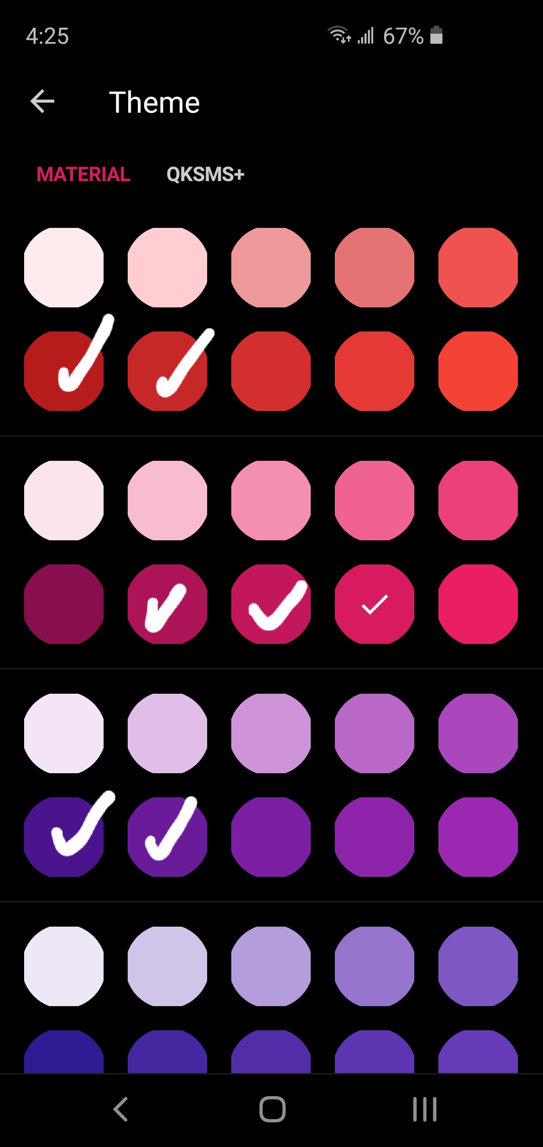
Another solution might be to allow the user to choose, in the list of material colors, which colors they would like to be included in the automatic contact colors.
Would look something like this:
 hmilgraum
on 15 May 2020
hmilgraum
on 15 May 2020
Related issues
 spocko
·
3Comments
spocko
·
3Comments
 zawyer1
·
5Comments
zawyer1
·
5Comments
 nosoop
·
4Comments
nosoop
·
4Comments
 vhoen
·
5Comments
vhoen
·
5Comments
 SeriousTube
·
3Comments
SeriousTube
·
3Comments
Most helpful comment
Yes, that's what I meant!
"Solid colors" is used as an option in another app for that specific purpose.