Puppeteer: window inner size not equal to viewport size
Tell us about your environment:
- Puppeteer version: 0.13.0-alpha
- Platform / OS version: macos high sierra 10.13
- URLs (if applicable):
What steps will reproduce the problem?
_Please include code that reproduces the issue._
// start.js

const puppeteer = require('puppeteer')

const run = async () => {
  const browser = await puppeteer.launch({
    headless: false,
    slowMo: 250,
    args: [
      '--disable-infobars',
    ],
  });

  const page = await browser.newPage();

  await page.goto('https://www.google.com/');

  await page.waitFor(60000)
  await browser.close();
}

run()
node start.js
What is the expected result?
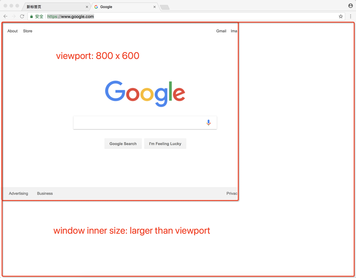
- window inner size and viewport should be equal, all the default 800px x 600px
What happens instead?
- window inner size is larger than the viewport size
 chanjsq
All 56 comments
To add more salt into it, opening devtools will make the viewport lose the predefined size. For example,
 entrptaher
on 28 Oct 2017
entrptaher
on 28 Oct 2017
It has a param can be reset the window viewports in launch method.
Sent from my iPhone
On 29 Oct 2017, at 5:41 AM, Abu Taher notifications@github.com wrote:
To add more salt into it, opening devtools and closing it will make the viewport lose the predefined size. For example,
—
You are receiving this because you are subscribed to this thread.
Reply to this email directly, view it on GitHub, or mute the thread.
 zicongxie
on 29 Oct 2017
zicongxie
on 29 Oct 2017
@zicongxie await page.setViewport({ width: 600, height: 400 }) only change the viewport size, but the window size will not changed to 600px x 400px too.
chanjsq
on 29 Oct 2017
@entrptaher I noticed that too.
chanjsq
on 29 Oct 2017
@chanjsq what's your usecase? Why would you need to change the window size?
 aslushnikov
on 31 Oct 2017
aslushnikov
on 31 Oct 2017
For me, say I will want to test responsiveness.
entrptaher
on 31 Oct 2017
@aslushnikov When setting the viewport size larger than the default window size, we also need to set the window size with the same value to see the whole page width, it's convenient if the window size can change with viewport size accordingly.
chanjsq
on 1 Nov 2017
Have the same issue on Windows 8.
 mike-aungsan
on 1 Nov 2017
mike-aungsan
on 1 Nov 2017
@entrptaher isn't viewport enough for responsiveness?
@chanjsq so this is mostly for debugging purposes?
aslushnikov
on 1 Nov 2017
@aslushnikov yes, smart can be better
chanjsq
on 1 Nov 2017
can i make the viewport equal to the size of the window by default, and adjustable while resizing? i don't want the viewport which is not equal to the window size :( +1 on this one
 z-vr
on 15 Nov 2017
z-vr
on 15 Nov 2017
I'm using this code:
await page.setViewport({height, width});
// Window frame - probably OS and WM dependent.
height += 85;
// Any tab.
const {targetInfos: [{targetId}]} = await browser._connection.send(
'Target.getTargets'
);
// Tab window.
const {windowId} = await browser._connection.send(
'Browser.getWindowForTarget',
{targetId}
);
// Resize.
await browser._connection.send('Browser.setWindowBounds', {
bounds: {height, width},
windowId
});
I think that Tab window + Resize parts could be part browser API such as:
browser.resize({height, width})
 radekmie
on 1 Dec 2017
radekmie
on 1 Dec 2017
Definitely also need this, fwiw.
 tnoetzel
on 13 Dec 2017
tnoetzel
on 13 Dec 2017
this function is very necessar
 ganfubin
on 15 Jan 2018
ganfubin
on 15 Jan 2018
+1
 leachimsumiri
on 6 Feb 2018
leachimsumiri
on 6 Feb 2018
https://peter.sh/experiments/chromium-command-line-switches/#window-size
const puppeteer = require('puppeteer')
const run = async () => {
// Viewport && Window size
const width = 400
const height = 600
const browser = await puppeteer.launch({
headless: false,
args: [
`--window-size=${ width },${ height }`
],
defaultViewport: {
width,
height
}
});
const page = await browser.newPage();
await page.goto('https://www.google.com/')
// await browser.close()
}
run()
 akylkb
on 6 Feb 2018
akylkb
on 6 Feb 2018
I am using the following to achieve the desired effect.
const chrome = { x: 0, y: 74 }; // comes from config in reality
args.push(`--window-size=${width+chrome.x},${height+chrome.y}`);
puppeteer.launch({ headless, sloMo, args });
// ...
page.setViewport({ width, height });
 Mehuge
on 10 Feb 2018
Mehuge
on 10 Feb 2018
Based on https://github.com/GoogleChrome/puppeteer/blob/v0.13.0/docs/api.md#pagefocusselector and @Mehuge asnwer
const chrome = { x: 0, y: 74 }; // comes from config in reality
args.push(`--window-size=${width+chrome.x},${height+chrome.y}`);
puppeteer.launch({ headless, sloMo, args });
// ...
page.setViewport({ width, height });
(correcting typo in setViewport above)
 tomholub
on 16 Feb 2018
tomholub
on 16 Feb 2018
Thanks, guys!!! I combined @akylkb with @Mehuge and got the perfect solution!
And fwiw, for people who didn't understand why viewport size is important. It was stopping me dead in my tracks, because a common practice in many websites is to change the layout from pc / laptop to mobile based on viewport size, and the default size was causing it to go to the mobile layout, which did not have the login button available without an extra menu, involving two extra clicks. The entire DOM and navigation path can be completely different depending on how many different responsive designs the website designers have in place; they could have several, from smart watches to mobile, to ipads and tablets, touch screens and kiosks as well. The world includes much, much more than just laptops and pcs, and each and every layout will have a completely different DOM structure.
So, again, THANK YOU, @akylkb and @Mehuge, your solutions deserve a lot more attention imo!!
 I-keep-trying
on 26 Feb 2018
I-keep-trying
on 26 Feb 2018
Think this is actually a bug when connecting over a websocket as I can't find a way to set the window size when on web socket. This means that some sites render incorrectly as they seem to look at the window size and not that set viewport, i.e:
Launch the browser
Connect to it via websocket
Set the viewport to be bigger than the window size of the websocket browser
Screenshot is based on window size.
I'm not 100% sure of this, but would seem to be the case and would appreciate anybody who could confirm.
 grantstephens
on 1 Mar 2018
grantstephens
on 1 Mar 2018
Hi, thx guys for solutions, but screen.width and screen.height are in headless: true always 800x600 and for headless: false is always resolution of actual screen. Any suggestions to solve this other than manually do it so in evaluate() method? Code:
await Page.evaluateOnNewDocument((screenWidth, screenHeight) => {
screen.__defineGetter__('width', function () {
return screenWidth;
});
screen.__defineGetter__('height', function () {
return screenHeight;
});
}, width, height);
 PayteR
on 19 Mar 2018
PayteR
on 19 Mar 2018
This might be related issue,
When saving as PDF (have to use headless mode), the window size triggers the incorrect media query. For example, if page.setViewport(1200,960), then load below HTML page and save to PDF. Will expect the DIV has a gray background. But it actually shows a yellow background.
<body>
<script>
document.write("Window width: "+window.innerWidth);
</script>
<style>
div{
background: gray;
}
@media (max-width: 767px) {
div{
background: yellow;
}
}
</style>
<div>gray indicates window > 767px, yellow indicates window <=767px</div>
</body>

 winterli
on 10 Apr 2018
winterli
on 10 Apr 2018
I am now using @radekmie's solution, as well as the --window-size argument.
In my test environment, the browser size may be specified before the browser window is open, and may be altered afterwards. So in the case where it is specified before the browser window is open, I remember the size and use --window-size when launching the browser. If the test scripts later specify a new size, I then use the resize code provided by @radekmie.
Mehuge
on 13 Apr 2018
As workaround, the default 800x600 viewport can be disabled by calling Emulation.clearDeviceMetricsOverride after page is created
args.push(`--window-size=${width},${height}`);
puppeteer.launch({ headless: false, args });
...
await page._client.send('Emulation.clearDeviceMetricsOverride')
This way there is no need to explicitly call page.setViewport or to rely on OS dependent values for the chrome size, since the viewport will automatically be equal to the window inner size.
 Maluen
on 23 Apr 2018
Maluen
on 23 Apr 2018
@Maluen this solution worked for my problem getting window.devicePixelRatio in #2372.
 TheCloudlessSky
on 26 Apr 2018
TheCloudlessSky
on 26 Apr 2018
Definitely the same issue that I have.
Would make sense to disable the viewport emulation in headful mode.
Or provide an option like in the linked PR.
 DanielRuf
on 17 May 2018
DanielRuf
on 17 May 2018
@Maluen the Emulation.clearDeviceMetricsOverride solution seems not working in headless mode which is the only mode support Save to PDF feature :(
winterli
on 23 May 2018
@winterli which version of Puppeteer do you use?
Should normally work with this.
https://github.com/DanielRuf/website-checks/blob/master/index.js#L131
DanielRuf
on 23 May 2018
@DanielRuf I'm using v1.4.0 from NPM. Below is the code I'm using,
const puppeteer = require('puppeteer');

(async () => {
  const browser = await puppeteer.launch({
      headless: true,
      args: [
          `--window-size=1280,960`
      ],
  });
  const page = await browser.newPage();
  await page._client.send('Emulation.clearDeviceMetricsOverride');
  const url="http://winterli.atwebpages.com/test.html";
  await page.goto(url, {waitUntil: 'networkidle2'});
  await page.pdf({path: 'viewport_test.pdf', format:"A4", printBackground:true});
  await browser.close();
  console.log("done!");
})();
Did I miss anything here?
winterli
on 23 May 2018

DanielRuf
on 23 May 2018
In general I do not see any viewport metatag. Please add one.
DanielRuf
on 23 May 2018
DanielRuf
on 23 May 2018
@DanielRuf thanks for your response. In the test page, I put some CSS media query to test the viewport. If the viewport is wider than 767, the second line should have a gray background. If the viewport is narrower than 767, the second line should have a yellow background. In my example, the window width is 1280, I should see a gray background for the second line. But as the screenshot you shared shows, it's not the case.
PS: I have added the viewport tag in the test page also.
winterli
on 23 May 2018
I've tested it out, the max viewport height I could do was around 20000px from my computer. I tried to take a ultra fullpage screenshot :D ...
entrptaher
on 24 May 2018
@Maluen solution has worked for me just now; also I did discover that if you go into debug model (ctrl-shift-I) that has the required effect. Useful for manual testing etc.
 mbwhite
on 29 May 2018
mbwhite
on 29 May 2018
I'm having this same problem and it effects the way that css with vw and vh work, since they go based on the window size not the viewport size. It's a problem in both headless and not.
 silkcom
on 19 Jul 2018
silkcom
on 19 Jul 2018
Awesome!
chanjsq
on 2 Aug 2018
I'm having this same problem with [email protected]. When you launch the browser with defaultViewport null and headless true, nothing change, but with headless false, the viewport is affected.
 danielmello
on 14 Aug 2018
danielmello
on 14 Aug 2018
Surely some strange things still going on.
 hegelstad
on 16 Aug 2018
hegelstad
on 16 Aug 2018
Same problem, is there any solution to change the options in puppeteerlaunchoptions?
When I set the value like below:
        defaultViewport: {
          width: 1920,
          height: 1080
        }
The viewport is still 800*600, this is not convenient to debug by viewport.
 junguchina
on 17 Sep 2018
junguchina
on 17 Sep 2018
See https://github.com/GoogleChrome/puppeteer/commit/25632133e2683c613c97d9088968c48e3c07a086 @junguchina
DanielRuf
on 17 Sep 2018
Please also try the latest release.
DanielRuf
on 17 Sep 2018
@DanielRuf Thanks, my version of puppeteer is the latest version(1.8.0).
It still has this problem.I use codeceptjs with puppeteer.
The viewport size of chromium is 800x600,but inner homepage size is 1920x1080.

junguchina
on 17 Sep 2018
I'm facing the same issue as above.
 fergardi
on 24 Sep 2018
fergardi
on 24 Sep 2018
Mh weird, it seems this was not resolved as I am still getting the narrow / small viewport even if I resize. Is there some regression?
DanielRuf
on 24 Sep 2018
I want to share my personal experience. This will be a long trip.
I'm using [email protected] and Google Chrome V69.0.3497.100 in a Windows10 environment.
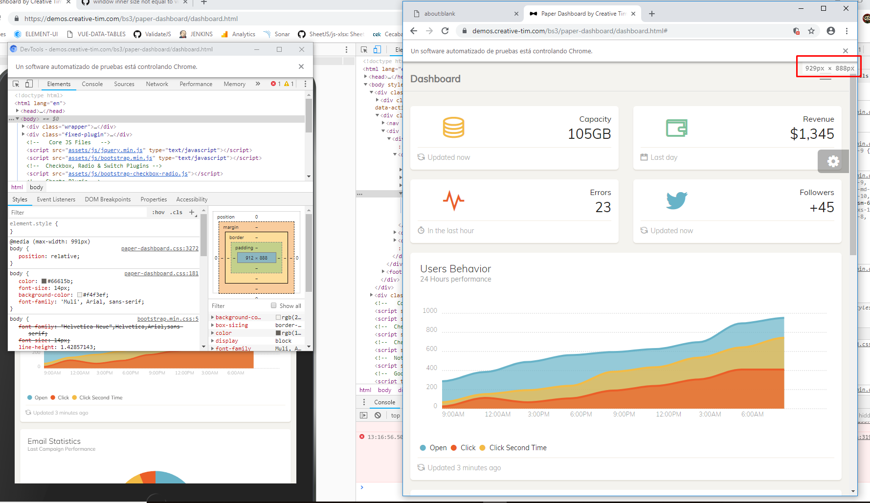
Let's say I am new to Headless Chrome, and I want to print a dashboard in PDF. I searched for a typical responsive template dashboard and found this one I will be using as an example, credits to the original author: https://demos.creative-tim.com/bs3/paper-dashboard/dashboard.html
Then I create a new fresh script to work with:
const puppeteer = require('puppeteer');
(async () => {
  const browser = await puppeteer.launch({headless: false}) // debug
  const page = await browser.newPage()
  await page.setViewport({width: 768, height: 1024, deviceScaleFactor: 2})
  await page.goto('https://demos.creative-tim.com/bs3/paper-dashboard/dashboard.html', {waitUntil: 'networkidle0'})
  await page.waitFor(1000)
  await page.click('button.close') // remove notification
  await page.click('a.navbar-brand') // click on page to close advertisement
  await page.emulateMedia('screen') // force screen CSS
  await page.waitFor(1000) // wait for every modal to dissapear
  await page.pdf({path: `${Date.now()}.pdf`, format: 'A4', printBackground: true})
  await browser.close()
})()
After that, I prove that in _headful_ mode, and it gives me this result:

Firstly, why that blank space? Is that the difference between the default 800px width viewport minus my 768px viewport? I don't think so. However, this does not show in the final PDF, only in _headful_ mode, but it stills bugs me a lot. In _headless_ mode, it shows at follows:

Secondly, why the media CSS flex is not triggering as showed in the intial picture? There should be two columned layout, not the single one. As I inspect them, they show as classic '@media' queries. Maybe the 'screen' forced mode instead of 'print' is causing this? I do not know.
Thirdly, why my pixel resolution is not being respected? If, in _headful_ mode, I show the DevTools and extract them from the page (which seems, by the way, to re-render the page to the expected behaviour), I can see the pixel resolution is not at all the one I setted of in the initial step.
In fact, I could even increase the pixel resolution to have no results on the output:

Ah, that seems the old 800x600 viewport issue we were talking about. So I started to test every solution in this post, with these results:
- Force puppeteer to launch to a nulled defaultViewport? No changes either in headless or headful.
- Force puppeteer to launch to a defaultViewport with exactly the same resolution as I wanted? No changes either in headless or headful.
- Force puppeteer to launch to a defined --window-size arg commands? That seems indeed to change the headful result and fix the strange blank space, leaving me with my desired initial resolution (to test responsiveness, for example). That leads me to the next issue. If I'm visiting this website with 768px width, which effectively triggers the corresponding \@media query, why in _headful_ I see one result and in _headless_ I see another different result?

Maybe the float is affecting the behaviour? But again, why am I not achieveing the exact same result being in _headful_ or in _headless_, as this is the whole point? I do not know. That will be an entirely different issue.
fergardi
on 24 Sep 2018
Is there any way we can get this opened? It's still an issue, and @fergardi's comment describes the issue nicely.
cc @aslushnikov
 paynecodes
on 9 Apr 2019
paynecodes
on 9 Apr 2019
I was knocking my head over this for some time, until i realised (at least for my particular use case) is that this is all i needed to do to break out of the default 800 x 600 size:
const puppeteer = require("puppeteer");

(async () => {

  const browser = await puppeteer.launch();

  const page = await browser.newPage();

  await page.emulateMedia("screen"); // <- optional but super useful

  await page.goto("http://localhost:3000", {
    waitUntil: "networkidle2"
  });

  await page.pdf({
    path: "filename.pdf",
    pageRanges: "1",
    width: 1600, // <- set width
    height: 1240, // <- set height
    printBackground: true
  });
})();
 samburgers
on 11 Apr 2019
samburgers
on 11 Apr 2019
why is this issue closed, while the problem is still there?
 redochka
on 20 May 2019
redochka
on 20 May 2019
tested, still an issue.
 shawnnaquin
on 7 Jun 2019
shawnnaquin
on 7 Jun 2019
Everybody: the reason this issue is closed is because you can actually disable viewport emulation with defaultViewport: null option.
Here's an example:
const browser = puppeteer.launch({
  defaultViewport: null, // <= set this to have viewport emulation off
});
const page = await browser.newPage();
// ...
thanks for the tip @aslushnikov
 meeple142
on 7 Jun 2019
meeple142
on 7 Jun 2019
FWIW
My workaround was to add:
_beforeSuite() {
this.helpers.Puppeteer.resizeWindow(1200, 960)
}
This way the view port is always set the size I want. You can go a step further and read out the values from the config file.
 KotieSmit
on 15 Jul 2019
KotieSmit
on 15 Jul 2019
As of today @aslushnikov method still works for anyone having this problem.
const browser = puppeteer.launch({
  defaultViewport: null, // <= set this to have viewport emulation off
});
 AlexSimpler
on 29 May 2020
AlexSimpler
on 29 May 2020
Everybody: the reason this issue is closed is because you can actually disable viewport emulation with
defaultViewport: nulloption.Here's an example:
const browser = puppeteer.launch({
  defaultViewport: null, // <= set this to have viewport emulation off
});
const page = await browser.newPage();
// ...
THANK YOU SO MUCH YOU ARE AN ANGEL
 destroyer22719
on 20 Jul 2020
destroyer22719
on 20 Jul 2020
having fought with this for a few days, none of the googled solutions worked for me.
Although some of what's been posted will result in the window size being set, the values won't be readable from window.outerWidth after a page navigation.
However...
function setWindowDimensions ({width, height}) {
  window.outerWidth = width;
  window.outerHeight = height;
}

(async () => {
  const dimensions = await page.evaluateOnNewDocument(setWindowDimensions, {width, height});
})();
Executing this before navigating to the target URL will allow a script on that page to properly read the window size.
Tested in both headless and non-headless mode (Chromium)
 jonwilliams-bluescape
on 14 Nov 2020
jonwilliams-bluescape
on 14 Nov 2020
Related issues
 knandraina
·
57Comments
knandraina
·
57Comments
 KJ1i
·
46Comments
KJ1i
·
46Comments
 ghost
·
84Comments
ghost
·
84Comments
 lpellegr
·
63Comments
aslushnikov
·
77Comments
lpellegr
·
63Comments
aslushnikov
·
77Comments
Most helpful comment
As workaround, the default 800x600 viewport can be disabled by calling Emulation.clearDeviceMetricsOverride after page is created
This way there is no need to explicitly call
page.setViewportor to rely on OS dependent values for the chrome size, since the viewport will automatically be equal to the window inner size.