Pulseeffects: Better application icon
Now that PulseEffects is more mature and popular I think it would be nice to have a better application icon. I did the current one but I am by no means an graphic designer. There are probably guidelines for icon design and I didn't follow any. If there is anyone out there that can do a better icon feel free to do so :-)
 wwmm
wwmm
All 34 comments
I am no expert but I do find it fun to make SVG icons in Inkscape. Although I am sure there are much more qualified people out there I could give it a shot. Do you have any ideas or preferences?
I actually like the idea of the current base motif. Perhaps one could stick with that and simply spice it up a bit and maybe put some musical note or something else that represents sound in there?
From what I read the most important aspect of an icon will always be to convey what the application does.
If you want a reference I made the icon for Gydl.
 AsavarTzeth
on 16 Sep 2017
AsavarTzeth
on 16 Sep 2017
I agree that the icon should represent what the application does and that was what I tried to do. I also agree that improving the current icon is enough. There is no need to do something completely different.
What I would like to do but is beyond my capabilities is to make this icon more similar to the controls of a hardware equalizer. Something like was done in this icon example. The concept is the same but you immediately think about the controls of a hardware equalizer when you see it. For some reason the icon I did makes me think more about a scatter plot than an equalizer. Maybe it is because I am a physicist and I see plots all the time... But in any case the current concept could definitely be improved.
wwmm
on 16 Sep 2017
I should be able to make something similar to that. Maybe not as quickly as one with more experience, but still.
I am guessing we are sticking with the same base colour's?
Wellington Wallace notifications@github.com skrev: (16 september 2017 17:43:51 CEST)
I agree that the icon should represent what the application does and
that was what I tried to do. I also agree that improving the current
icon is enough. There is no need to do something completely different.What I would like to do but is beyond my capabilities is to make this
icon more similar to the controls of a hardware equalizer. Something
like was done in this icon
example.
The concept is the same but you immediately think about the controls of
a hardware equalizer when you see it. For some reason the icon I did
makes me think more about a scatter plot than an equalizer. Maybe it is
because I am a physicist and I see plots all the time... But in any
case the current concept could definitely be improved.--
You are receiving this because you commented.
Reply to this email directly or view it on GitHub:
https://github.com/wwmm/pulseeffects/issues/73#issuecomment-329976243
--
Skickat från min Android-enhet med K-9 Mail. Ursäkta min fåordighet.
AsavarTzeth
on 16 Sep 2017
Feel free to change the colors. I do not have any reason to keep the current ones.
wwmm
on 16 Sep 2017
How about some icons from this site?
https://www.flaticon.com/free-icon/mixer_535172#term=equalizer&page=1&position=37
Free to use as long as proper attributions are given.
 jeffshee
on 25 Oct 2017
jeffshee
on 25 Oct 2017
I didn't know about this site. Thanks!
I see no problems in giving the proper attributions. Did you get time to work on an icon @AsavarTzeth ? If you are working on it I will wait till you finish it. In case you did not have time I can choose an icon from this site. They are decent.
wwmm
on 27 Oct 2017
I did have time to start working on it, but then I got busy with my RHCSA certification studies. A slight miss-judgment of available time on my part.
There isn't really anything stopping me from working on it this weekend. I am actually quite fond of my current design ideas, which is why I have not given up on it.
If you are not in too much of a hurry I would like to try and finish my work. But if I have not finished it some time soon it is nice to know we have a fallback.
AsavarTzeth
on 27 Oct 2017
There is no hurry. Take as much time as necessary to finish it.
wwmm
on 27 Oct 2017
Okay I managed find some time to work on this recently. The icon still needs a lot of polish and adjustments, but it is at least possible to see the general idea behind it.
I am also personally happy with the choices of color, but I would of course be happy with feedback on this.
You can find the file on my Google Drive. The preview is awful, so download it and view locally.
So, what do you think so far?
AsavarTzeth
on 6 Nov 2017
I like it :-). It is way better than the one we have now.
wwmm
on 6 Nov 2017
Today I made some tests on how well it scales. As I expected, I tend to make objects too small, making details tiny when it is scaled down.
In order to fix this I had to increase the size of most objects. I also had to make room for this, so I decided to use 3 bars and buttons instead of 4. Originally I tried to keep the four bars because I felt it made it stand out a bit. Turns out there are good reasons most similar icons use 3, one of them being it scales better.
I have uploaded the revised icon to my Google Drive, as before (again, browser preview is bad).
If everything looks good to you, I would be happy to make a pull request.
AsavarTzeth
on 19 Nov 2017
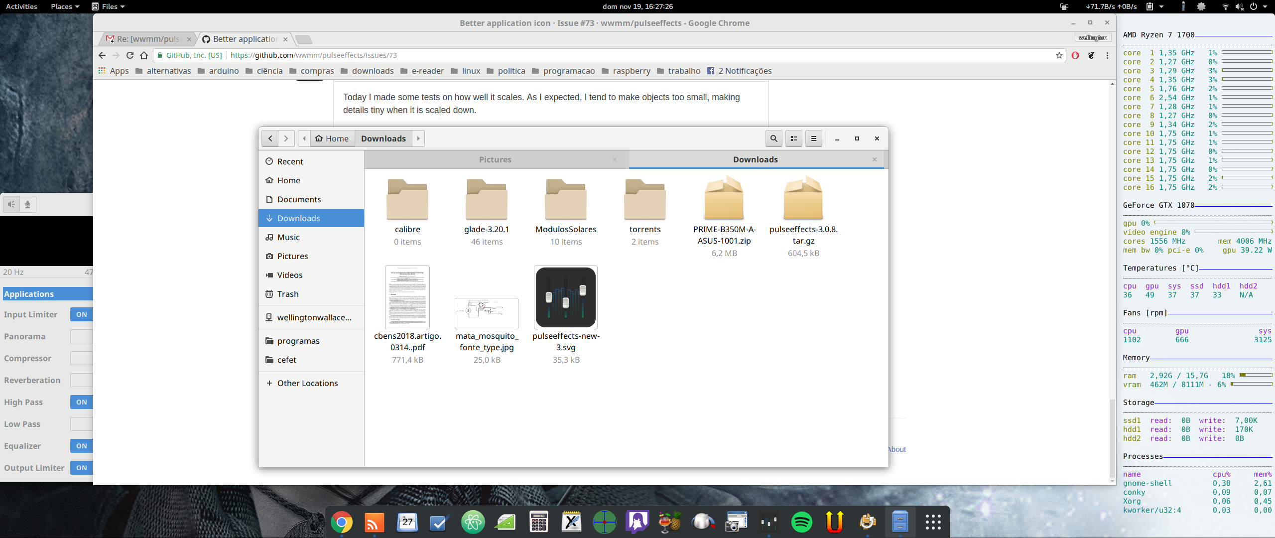
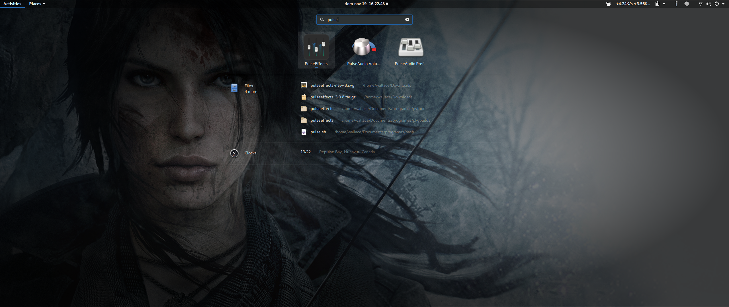
Hi! I did some tests here and based on the attached screenshots I would only suggest brighter colors. I really liked the idea of blending the controls with an audio spectrum but unless we see the icon at larger sizes, like the image showing app search in gnome, we miss all the hard work you put on the details. Maybe it will be easier to appreciate the spectrum with a brighter background.
As you can see in the images it could also help to see the icon borders over a dock with dark background like the one in the standard gnome theme. Of course this may change with user theme. But I think that a brighter background will make this icon look good in any theme and not only the brighter ones.
These are the only issues I saw. Good work! :-)

wwmm
on 19 Nov 2017
Those are some good and valid points. Anything that helps to show the details is a good idea in my opinion.
Initially I think I made the background darker to avoid it being too much grey. Also since I made the buttons white (or close enough), I could not make it too bright. However I will see if I can find a good middle ground.
AsavarTzeth
on 20 Nov 2017
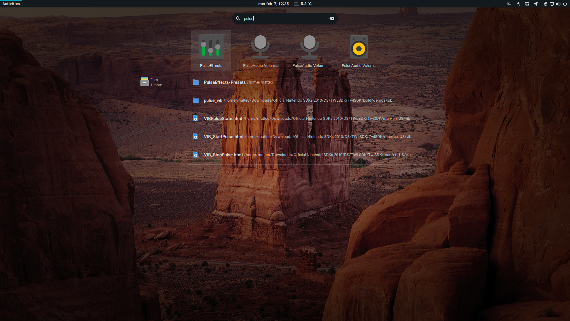
Hey @wwmm have you seen the nice icon that team Papirus have created? https://github.com/PapirusDevelopmentTeam/papirus-icon-theme/issues/1116
 JackHack96
on 7 Feb 2018
JackHack96
on 7 Feb 2018
I didn't know about it. Nice icon! :-)
wwmm
on 7 Feb 2018
Nice icon
 servimo
on 7 Feb 2018
servimo
on 7 Feb 2018
The guys from the la-capitaine icon theme made one: https://github.com/keeferrourke/la-capitaine-icon-theme/pull/367
 flipwise
on 17 Jun 2018
flipwise
on 17 Jun 2018
@flipwise Yeah, but I forked this from the AlsaMixer icon, so the pulseeffect icon I made in the La Capitaine Icon Theme is not unique. @wwmm If you want, I can create a unique icon for pulseeffects in the same style like this (Maybe with other colors :smile:)
 zencubic
on 6 Jul 2018
zencubic
on 6 Jul 2018
Feel free to do it @zencubic :-) There is no need to keep the current colors
wwmm
on 6 Jul 2018


@wwmm
As you can see I created 2 versions of the icon, so you can decide in which direction the icon should go. I rather like the icon with text, because PulseEffects can differ itself so clearly from other equalizers and this icon is really unique. They are still a long way from the final icon, so this is just a sketch. Everyone should feel free to criticise :wink:
zencubic
on 19 Jul 2018
Well since you asked for it, here is my opinion.
Remembering some rules I learnt about icon design, I see some issues, mainly with the text version.
- It should visually relay what the application is or does.
- It should not be redundant to the title/name.
- Including text is generally contradictive to the role of an icon.
If anything I was hoping a new icon would somehow include more information, but not so much that it looks cluttered.
Perhaps it could be clearer by somehow visualizing sound; maybe make it look like it is moving from some sound/beat (think speaker).
As a starting point I like it though. Good choice of colors and the style does seem unique enough.
AsavarTzeth
on 19 Jul 2018
I like both icons but I am more inclined to the second because it makes me remember a wave packet :D But like most physicist I think it would look better if it were symmetric (without the first line from left to right).
At least to me both icons seem unique. And I like the choice of colors and gradient too.
wwmm
on 19 Jul 2018
@wwmm So after your feedback I will drop the idea with the text and will focus on the "wave" icon.
@AsavarTzeth do you mean with the speaker something like this?

What I wanted to say is that I don't want to put too many details into the icon, because it can appear very small, especially in desktop environments. I also wonder how to delimit the PulseEffects icon from music players, because they might look similar. Do you have any ideas on how best to do this?
zencubic
on 19 Jul 2018
I know, it is a tricky icon to add more to. I tried as you can see in earlier posts. My problem was scaling it down.
What I was thinking was subtle rings within the circle. When I said speaker i meant from the front, like the Rhythmbox icon.
Now though, I am thinking @wwmm may be having a better idea with the wave packet. Maybe just make it symetric and add some horizontal (still tilted) lines on each side?
AsavarTzeth
on 19 Jul 2018
I don't know if it is possible to do at small sizes but something that would make the icon distinct from the ones in other audio apps is using a water ripple. This came to my mind after looking at this Rhythmbox icon from faenza.
Of course we can stick to your second icon concept if doing a water ripple is an impossible task.
wwmm
on 19 Jul 2018
@wwmm @AsavarTzeth I tried a lot of different things to realize your ideas but none of them looked satisfying (I tried about 7 different approaches)
So I was working on the wave packet idea:
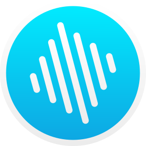
But I have the feeling that something doesn't look quite right. :thinking:
zencubic
on 20 Jul 2018
It seems that replicating a wave packet with separated lines is not as easy as I thought it would be. Maybe if you reduce the size of the 3 lines at the center while keeping the size of the others it will look more like a packet.
I think it is looking more like a square because we do not have a continuous line to guide the eyes like in the plot of wave packets in the link I posted.
wwmm
on 20 Jul 2018
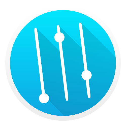
So I tried a lot with the wave packet but it just didn't fit on smaller sizes. Now I have taken a new approach (a more conventional one :sweat_smile: ) and this has come out:
zencubic
on 3 Aug 2018
I like it :-) Is it finished?
wwmm
on 3 Aug 2018
I think most of it's done. If you want to use it then only some fine work.
zencubic
on 3 Aug 2018
Yes. Let me know when the fine work is done :-)
GTK about window has a section for artists that contributed to the project. With which name do you want to be mentioned there?
wwmm
on 3 Aug 2018
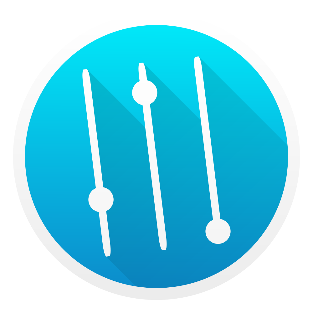
So now it should be ready. I thought that the icon could be introduced as 2000. commit. :smile: (Because you are 3 commits away) If you're okay with it I will open a pull request that will update the icons (I found 2 icons, is the number correct?)
Preview of the (hopefully) final icon:
zencubic
on 3 Aug 2018
And for the name you can take simply ZenCubic
zencubic
on 3 Aug 2018
You can do the pull request :-)
Yes there are two icons. One is shown only in the about menu and must have a smaller size
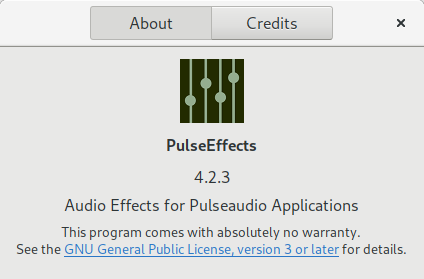
Honestly I don't know which size is recommended to the about icon. I just reduced till it seemed small enough
wwmm
on 4 Aug 2018
Related issues
 Ygarr
·
6Comments
Ygarr
·
6Comments
 Deividhp13
·
3Comments
Deividhp13
·
3Comments
 WarpspeedSCP
·
4Comments
WarpspeedSCP
·
4Comments
 marioortizmanero
·
5Comments
marioortizmanero
·
5Comments
 Mlocik97-issues
·
4Comments
Mlocik97-issues
·
4Comments
Most helpful comment
Hi! I did some tests here and based on the attached screenshots I would only suggest brighter colors. I really liked the idea of blending the controls with an audio spectrum but unless we see the icon at larger sizes, like the image showing app search in gnome, we miss all the hard work you put on the details. Maybe it will be easier to appreciate the spectrum with a brighter background.
As you can see in the images it could also help to see the icon borders over a dock with dark background like the one in the standard gnome theme. Of course this may change with user theme. But I think that a brighter background will make this icon look good in any theme and not only the brighter ones.
These are the only issues I saw. Good work! :-)