I am learning to use Prophet for my projects.
The biggest question i have right now is about the plot components (weekly, monthly, yearly ...)
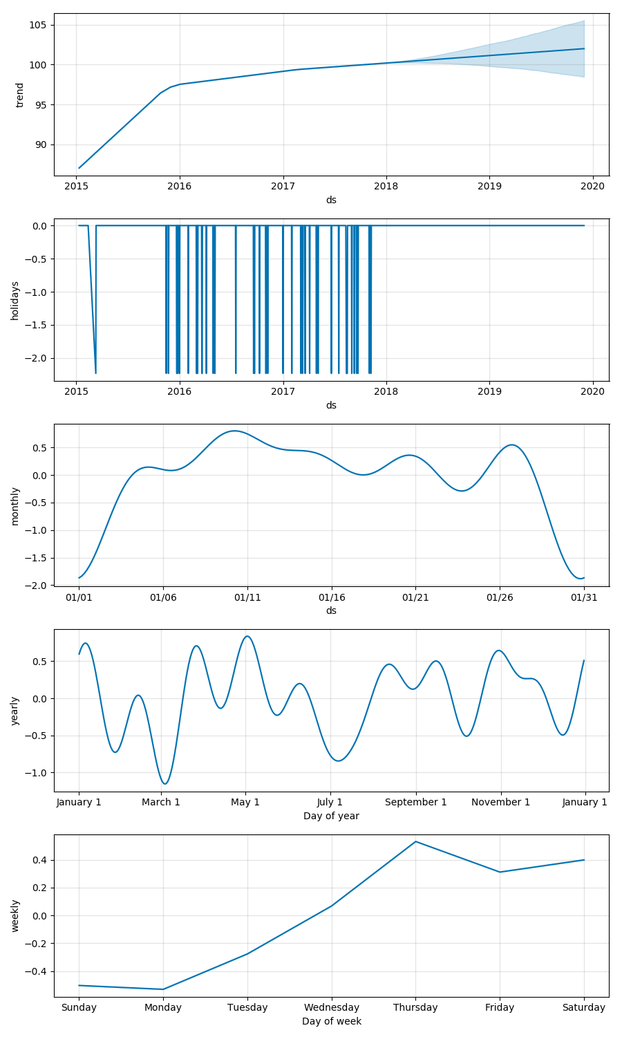
In the plot chart, what does the negative values mean in Y axis?
https://facebook.github.io/prophet/docs/seasonality_and_holiday_effects.html
On this page, it is unclear to me of the way that seasonality values are negative although the trend values are quite positive and understandable. To summarise, if you can help me understand thse questions below, that would be much appreciated.

1) Explanation of the negative values in seasonality graph
2) difference between changepoint_prior_scale and interval_width
3) A complete guide or documentation of every parameter usage of Prophet
 Kalesberg
All 6 comments
Let's take weekly seasonality. The value in the plot for any particular day is how much y is added to the trend on that day, just due to weekly seasonality. So every Monday we add 0.33 to the trend for weekly seasonality, and every Saturday we subtract -0.25. You can think of it as, for each day, the change from what y would be if there were no weekly seasonality at all.
changepoint_prior_scale determines the flexibility of the trend. Increasing it allows the trend to be more flexible, decreasing it removes flexibility from the trend. You would increase it if it looked like there were trend shifts in the history that are being missed by the model. You would decrease it if it looks like the model is overfitting the history (for instance by fitting seasonal changes with the trend). There are some examles of the effect of changepoint_prior_scale here: https://facebook.github.io/prophet/docs/trend_changepoints.html
The uncertainty intervals shown in the plots come from posterior sampling. You can choose what posterior interval you want to show with interval_width. By default it will be 0.8 to show 80% intervals. This is described here: https://facebook.github.io/prophet/docs/uncertainty_intervals.html
A complete list of all Prophet functions and descriptions of all of their arguments can be found here: https://cran.r-project.org/web/packages/prophet/prophet.pdf
The Python version will have all the same functions, but often as methods of a Prophet object. The arguments will be the same, but possibly with "." replaced by "_" in variable names. In Python you can use the help function to view the documentation for each function. For instance,
from fbprophet import Prophet
help(Prophet)
will give descriptions of all of the inputs to Prophet(). You can see documentation for other methods that same way, e.g.
help(Prophet.make_future_dataframe)
 bletham
on 23 Dec 2017
bletham
on 23 Dec 2017
@bletham , thank you for your detailed description.
However, I am still unsure about the use of interval_width
What does posterior interval represents ,i.e in the graph above?
Kalesberg
on 23 Dec 2017
The uncertainty intervals are computed by simulating possible future outcomes, weighted by their probability of occurring. An 80% interval means that 80% of the time the simulated outcome fell within that interval.
One thing to keep in mind is that the 80% number will only be accurate if there is no model misspecification. There is almost certainly model misspecification in this setting, so 80% would only be an approximation of the actual probability that the future outcome lies within the interval.
bletham
on 24 Dec 2017
@bletham
I tried to add a monthly seasonality to the existing components. However the label of the graph is a bit confusing.
- Does each plot in the monthly component represent each day of the month every year and adds/subtracts the
yamount to the trend? - Can you explain a bit more about what each
dsvalue means? I am not sure why thedslabels are like01/xxinstead of justxx. - Also is there any way to customise the labels of
dsaxis to be more familiar? (For example, instead of01/01, I want to use1st Day of the Month)
I appreciate your valuable support.
Kalesberg
on 27 Dec 2017
- Correct, the plot for monthly cycle shows 31 days and is the amount added or subtracted from the base trend on each of those 31 days. Every month, every year.
- The reason the label is 01/xx instead of just xx is just because of how the plotting is implemented. It shows the seasonality in January, but it will be the same every month. (Because it is a custom seasonality, it's not that easy to know what the 'right' label should be. Here we'd want it to be 'Day of month' and have just day labels, but if we had specified a quarterly seasonality then we'd probably be more interested in seeing month/day labels.)
- You can adjust the x label of a component plot using matplotlib commands. The main one is the
get_childrenmethod, which will give you access to matplotlib axes from which you can customize the plots as you wish. This would give you a label change:
fig = m.plot_components(forecast)
fig.get_children()[3].set_xlabel('Day of month')
and similarly you could use the matplotlib set_xticklabels method to adjust those as well.
bletham
on 3 Jan 2018
Thanks @bletham
Kalesberg
on 3 Jan 2018
Related issues
 davidjayjackson
·
3Comments
davidjayjackson
·
3Comments
 L471
·
3Comments
L471
·
3Comments
 kimhale
·
3Comments
kimhale
·
3Comments
 ahash52
·
3Comments
ahash52
·
3Comments
 robertdknight
·
3Comments
robertdknight
·
3Comments